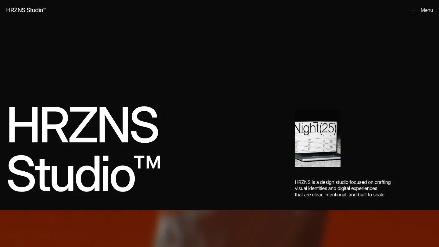
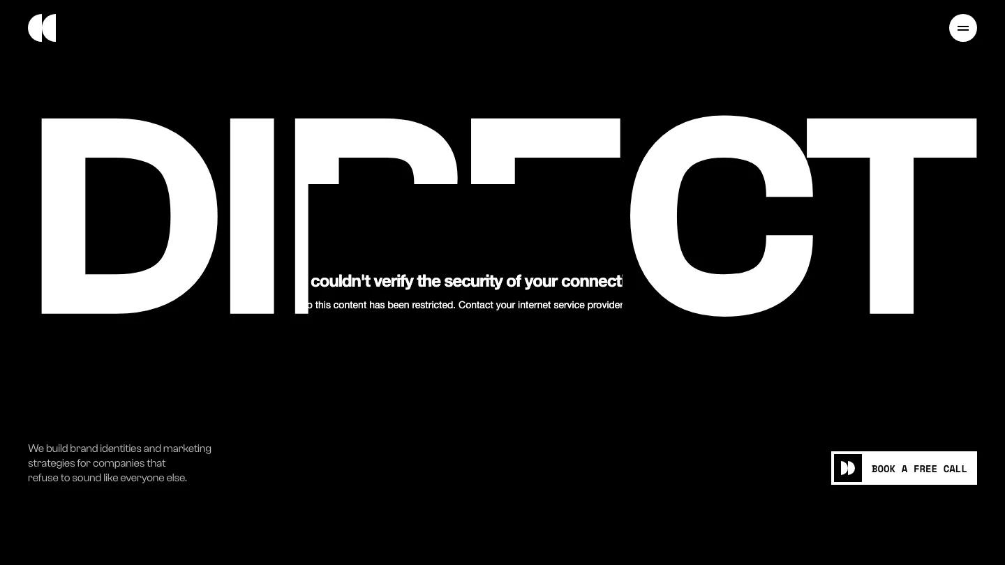
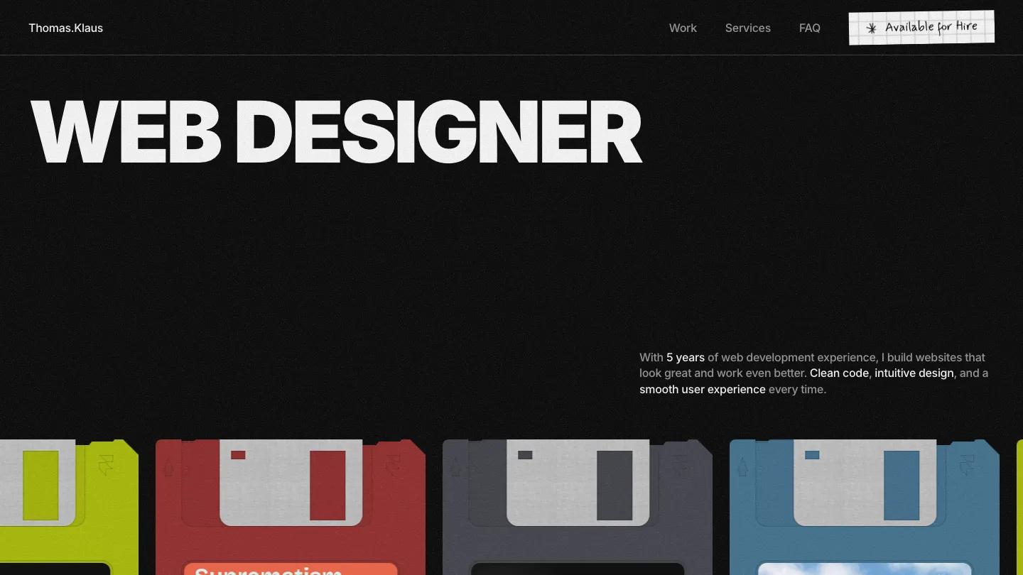
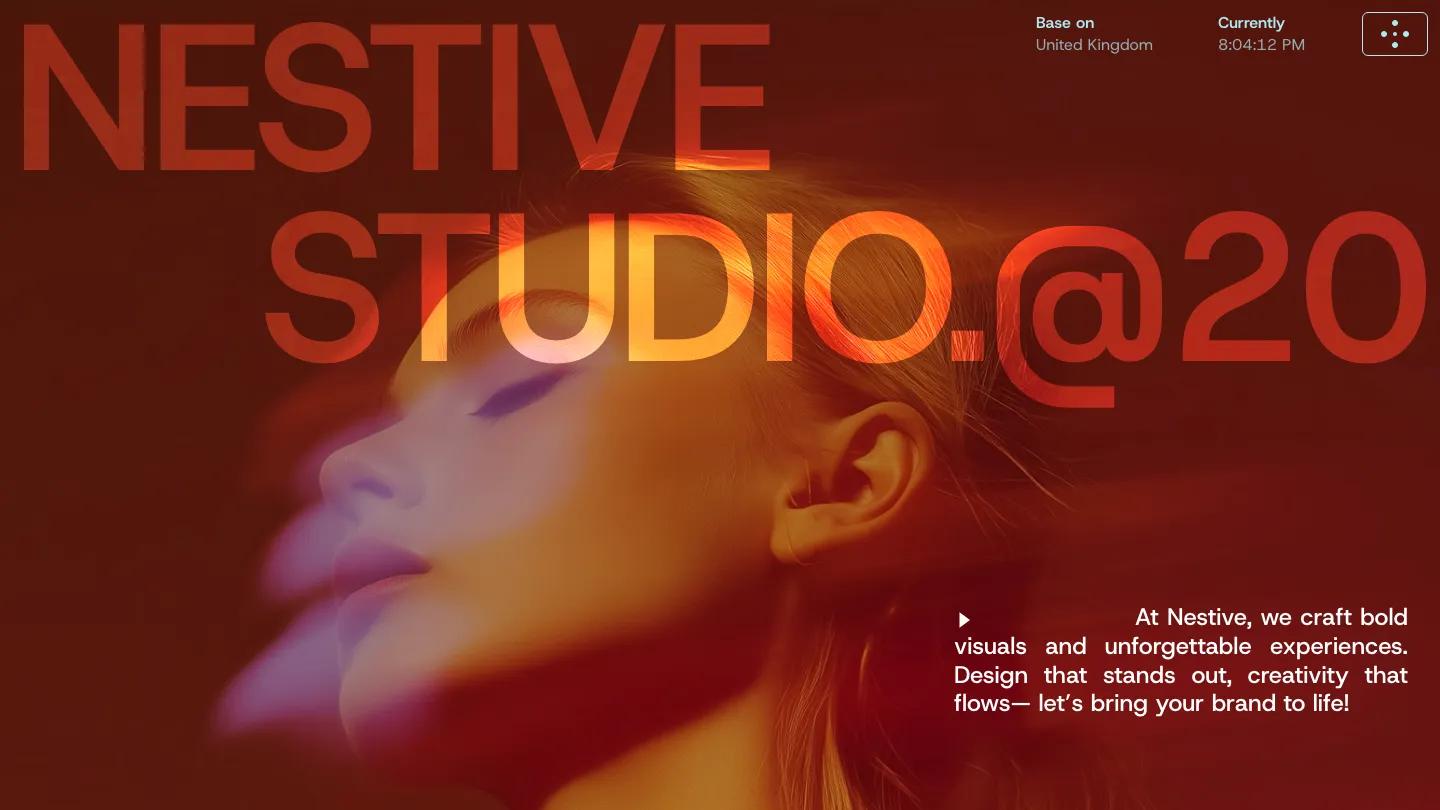
Kirro is a high-quality Framer template for Portfolio & Agency, Business & Startup, Professional Services, Technology & Software, Art & Design by Oval Studio.

Our Review of Kirro
Kirro is a Framer site for a small digital agency that wants to look confident from the first second. The hero is a full-bleed portrait of a man in orange-tinted glasses and an orange jacket, motion-blurred so the color smears across the frame, with "Kiro agency" set over it in huge white Inter Display. A small contact card in the top right pairs a team lead's photo with a Let's Talk link, and the header keeps things short: Home, About, and Project in soft grey pills, plus a black Get a quote button with a round arrow.
Below the fold, Oval Studio switches to a calm light grey. An intro paragraph sits beside a team photo, then the Work section stacks large rounded project images that overlap as you scroll, like cards being dealt. Services appear as an accordion of big labels such as UI/UX, Development, and Marketing, each with a small plus. A team grid of portrait cards with names and roles follows, then a dark band with customer reviews beside a round award badge, a numbered Process, a pricing card with a checklist of inclusions, and a black Let's Talk contact form. The About page opens with an oversized "About." finished with an orange dot.
On a phone, the blurred portrait fills the screen, the wordmark drops to two lines at the bottom, and the menu folds into a hamburger icon. It keeps the hero's drama well.
We'd pick Kirro for branding studios, web agencies, and freelance teams who sell design and development as a package. The homepage is long, so trim sections you don't need. We'd also replace the badge-style claims and the pricing card copy with your own before launch, since they read as demo filler.
Based on the live demo, viewed on desktop and on a phone. The Design and Dev scores come from separate independent reviews. See how we score templates.
Independently evaluated by our team of 6 designers and 5 developers.











Designers score design, developers score development, and each score is the average of their independent ratings. Read about our review team and how we score templates.