SwissMono is a high-quality Framer template for Portfolio & Agency, Professional Services, Personal, Business & Startup by Swiss Themes.
Our Review of SwissMono
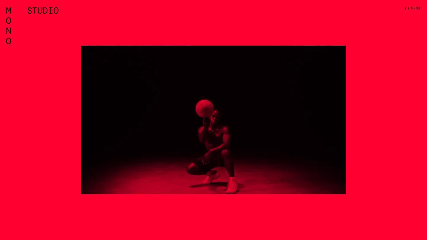
SwissMono is a single-page Framer portfolio for a small design studio, and it commits completely to two ideas: signal red and monospaced type. The page opens on a flat red field with a red-tinted photo of a basketball player spinning a ball in the dark, while the word MONO runs down the left edge one letter at a time beside STUDIO. "Less noise, more power" is the opening line, set like everything else in DM Mono. There is no visible menu bar, just a small three-line Menu label tucked in the top right corner.
Swiss Themes builds the scroll around huge words and slow reveals. Service headings such as Design, Studio, Identity, and Motion fill the width in thin mono capitals, each with a tiny numbered label like 02 Shape on the left and a red-washed video or image underneath. Short uppercase paragraphs cover web, print, and packaging work. Then the background flips to white for Featured Client Projects, where the heading stacks and slides as you scroll. Each project gets a giant name, a campaign tag, a centered caption, and a run of black-and-white photography in offset frames, from aerial views of open country to surf shots. The page returns to red for an About Us section with team portraits, names, and roles like Creative Director and Lead Designer.
On a phone, the red frame and the vertical MONO stay put, and the hero photo crops into a tall portrait that suits the narrow screen.
We'd pick SwissMono for designers, motion studios, and photographers who want a loud, poster-like site and have the imagery to feed it. The demo projects use famous brand names, so swap those for your own clients. The homepage is extremely long, and all-caps mono paragraphs tire the eye, so we'd keep captions short.
Based on the live demo, viewed on desktop and on a phone. The Design and Dev scores come from separate independent reviews. See how we score templates.
Independently evaluated by our team of 6 designers and 5 developers.











Designers score design, developers score development, and each score is the average of their independent ratings. Read about our review team and how we score templates.