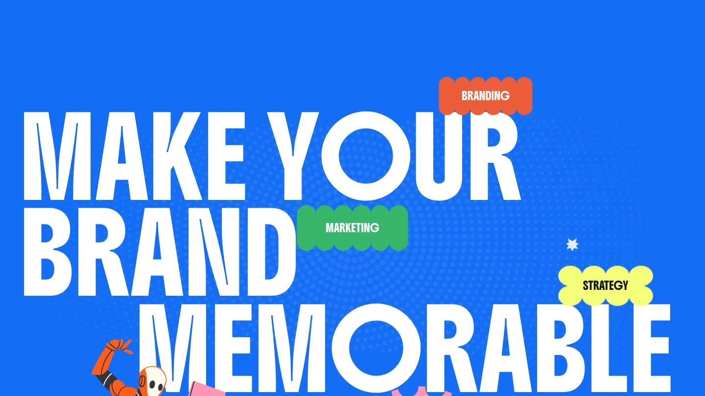
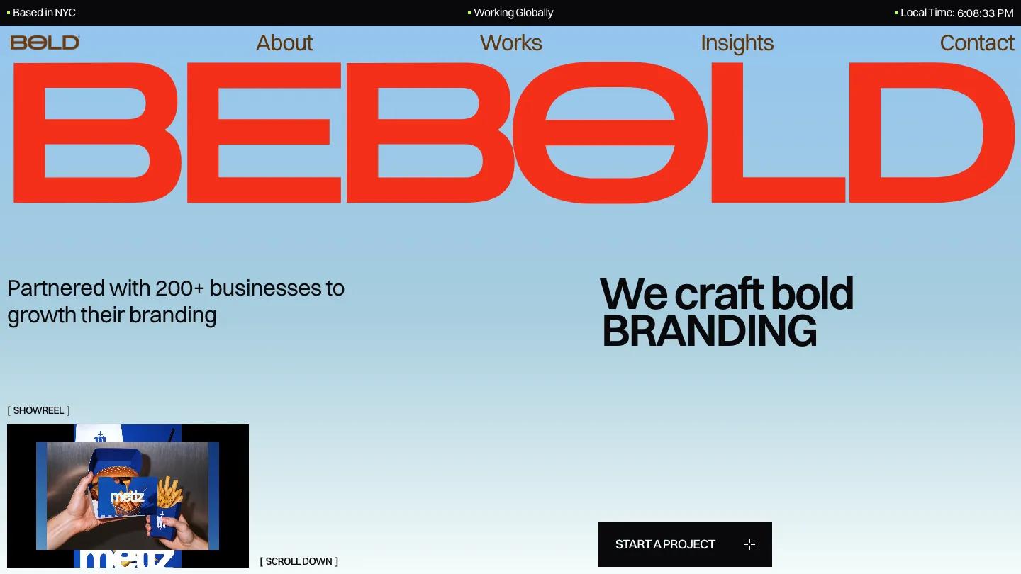
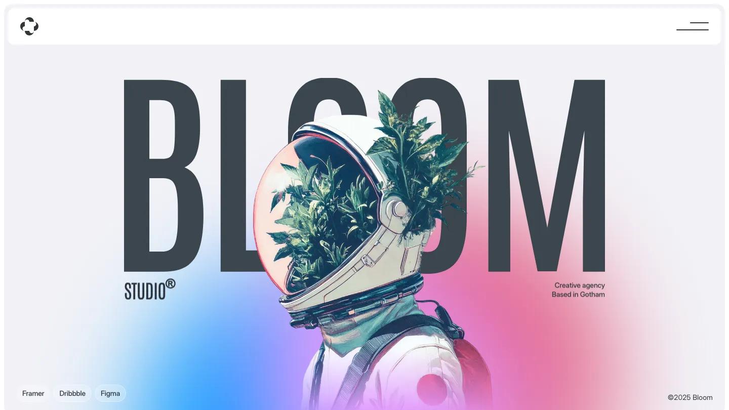
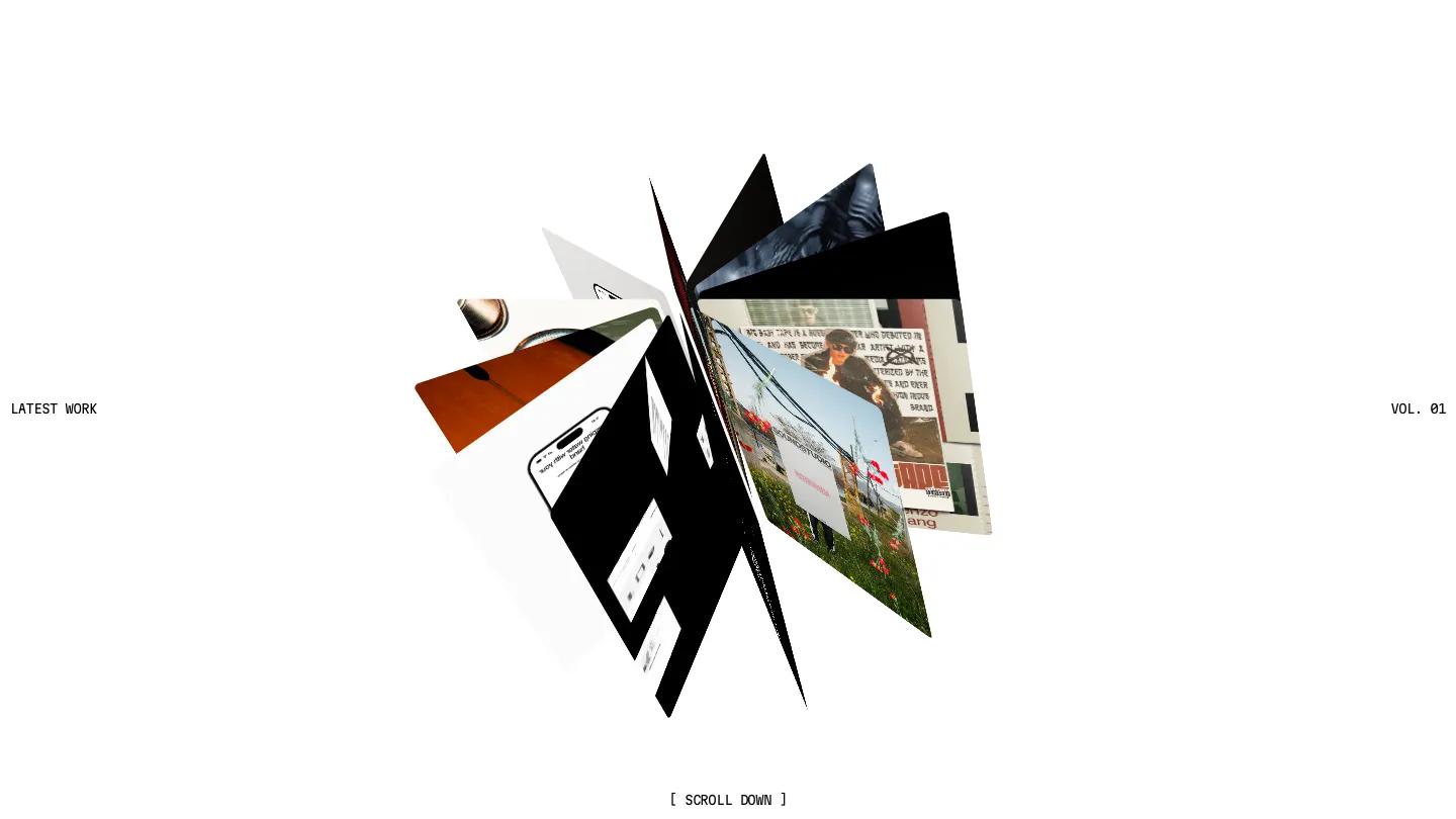
Bungee is a high-quality Framer template for Portfolio & Agency, Professional Services, Business & Startup, Art & Design, Photography & Videography by Clonify.
Our Review of Bungee
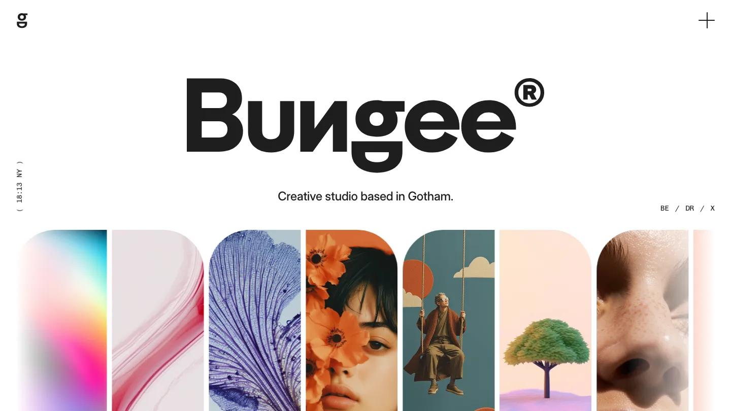
Bungee is a creative agency site that leads with a logo and a wall of color. The hero is a huge black wordmark with a registered mark at its corner, "Creative studio based in Gotham" underneath in Inter Display, and a row of tall arched image tiles showing trees, skin, and neon gradients. A sideways clock label sits on the left edge. The header is nearly empty, just a g monogram and a thin plus icon that opens a full menu with numbered entries such as ( _02 ) Works.
Clonify builds the homepage as a long, scroll. Latest Projects runs as a two-column grid of big rounded cards with a caps project name and a date tag under each. Services follows with soft pastel cards in lavender, lime, and coral, each topped by a small mono label like Branding. A short studio statement leads into a wide image, then a split testimonial card sets a portrait on plum beside a large quote. An accordion FAQ, a Creative dispatch row of blog cards, and a pale grey footer with a newsletter signup close it out. The Projects page centers a big "Projects." heading over a Let's Talk link and repeats the rounded card grid.
On a phone, the wordmark still spans the width with the tagline below, and the arched tiles crop into a side-scrolling strip. The plus icon stays in the corner as the only way into the menu.
We'd pick Bungee for small branding and web studios that want a friendly, colorful first impression. The hero depends on that row of rich imagery, so plan for strong visuals of your own. The menu is hidden behind the plus icon at every screen size, and the homepage runs long, so we'd consider cutting a section or two.
Based on the live demo, viewed on desktop and on a phone. The Design and Dev scores come from separate independent reviews. See how we score templates.
Independently evaluated by our team of 6 designers and 5 developers.











Designers score design, developers score development, and each score is the average of their independent ratings. Read about our review team and how we score templates.