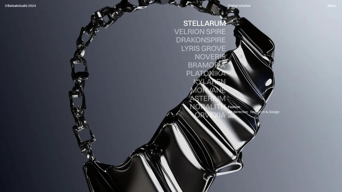
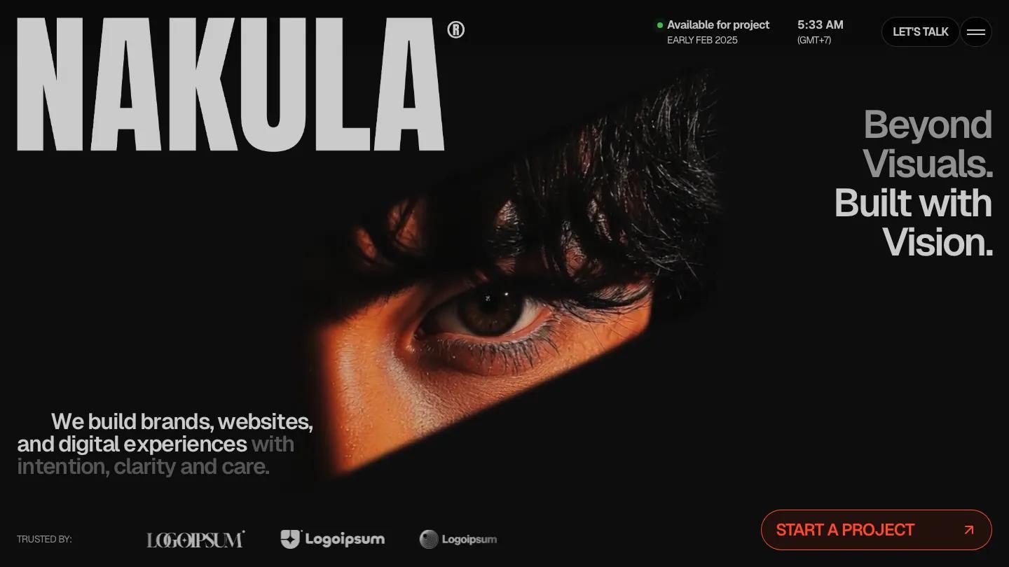
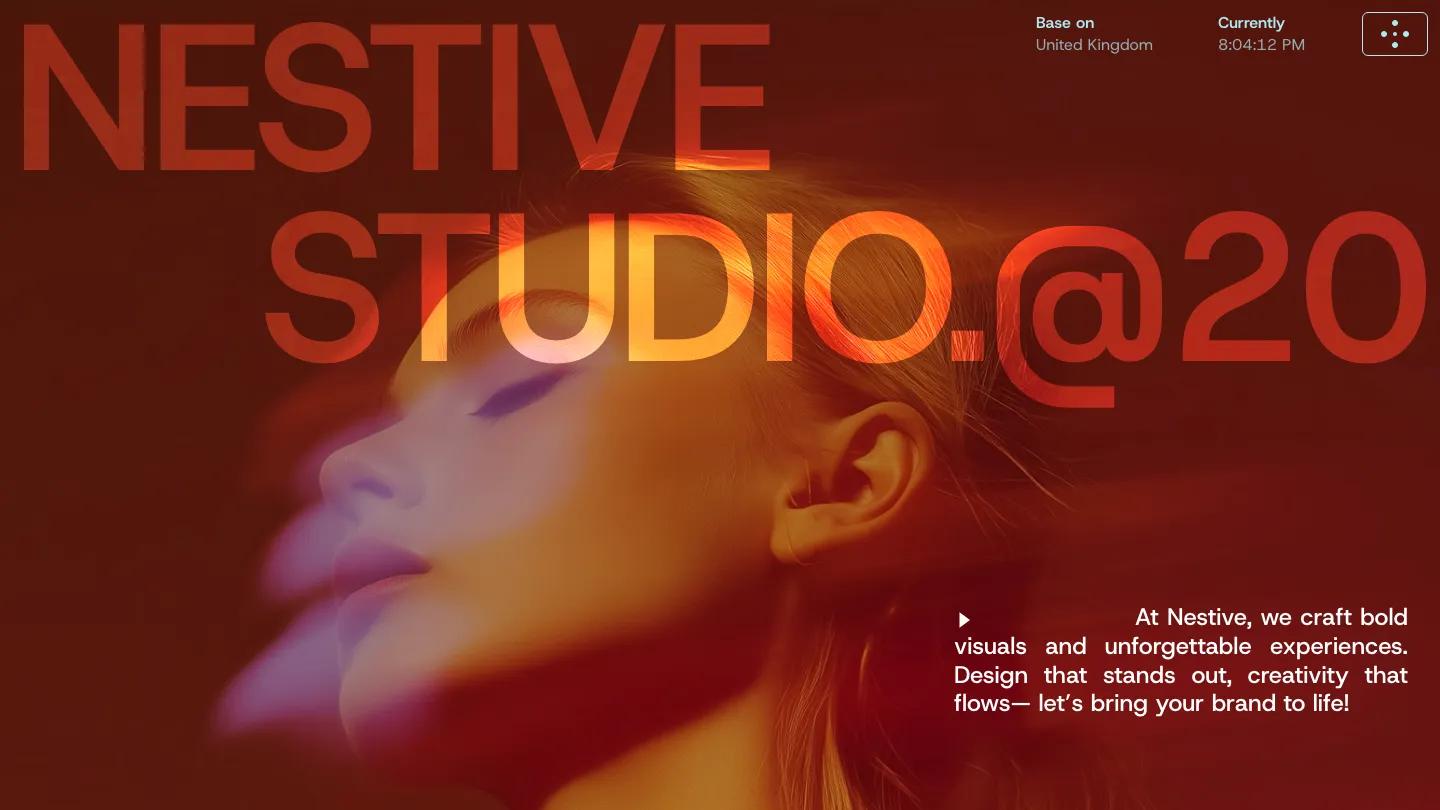
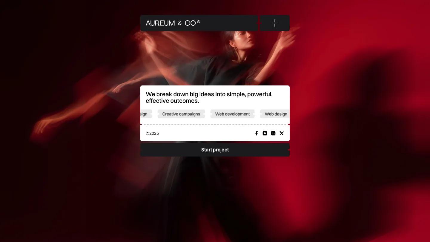
Arqos is a high-quality Framer template for Portfolio & Agency, Technology & Software, Art & Design, Business & Startup by FTC Studio.
Our Review of Arqos
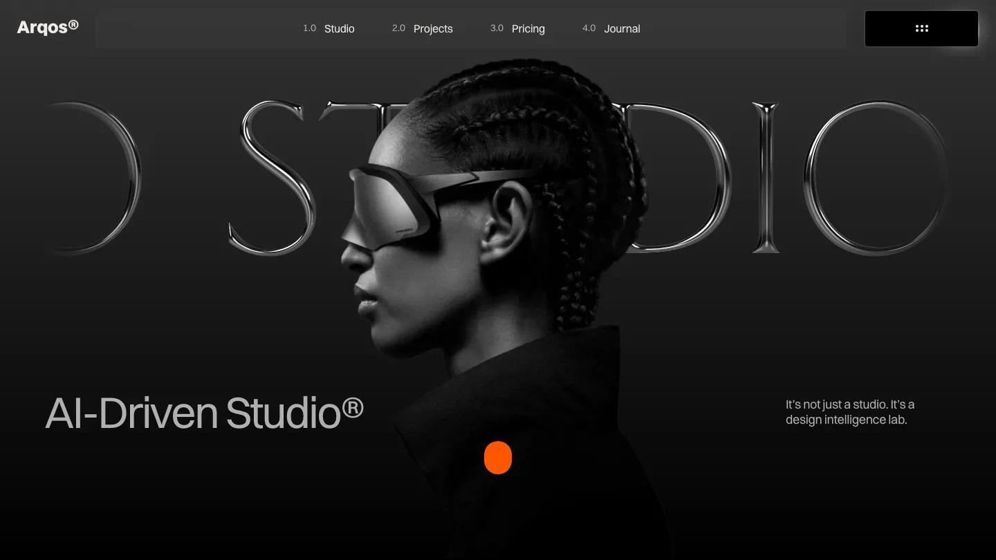
Arqos is an agency site written for a studio that sells AI-assisted design, and it dresses the part. The hero is charcoal fading to black, with a monochrome profile of a woman in wraparound visor glasses standing in front of giant serif letters in polished chrome. "AI-Driven Studio" sits to the left in light grey Switzer, a short tagline sits to the right, and a small orange pill glows at the bottom. The header starts as just the Arqos wordmark and a black menu box, then shows numbered links for Studio, Projects, Pricing, and Journal once you scroll.
FTC Studio switches between dark and warm off-white sections, tied together by orange plus marks and orange numbered pills. Services run as wide rows separated by dotted rules, each with a title such as Brand Identity or AI Product Design, a one-line formula, grey tag chips like Logo and Typography, and a large image. A Why Choose Arqos block stacks big cards for ideas like Infinite Iteration. Projects sit in a two-column grid with the name set over each image and a white caption bar showing industry and year. Testimonials, Starter, Growth, and Studio pricing tiers, an FAQ, journal rows with square thumbnails, and a Let's Talk form with underlined fields close it out. The Redshift case study opens with a title, a short brief, and a client, industry, year, and services row above full-width car imagery.
On a phone, the chrome letters crop to a fragment, the portrait fills the screen, and the tagline drops into small capitals below the heading.
We'd pick Arqos for digital studios with a tech or product angle. The AI messaging runs through nearly every heading, so expect a heavy rewrite if that isn't your pitch. The homepage is also very long.
Based on the live demo, viewed on desktop and on a phone. The Design and Dev scores come from separate independent reviews. See how we score templates.
Independently evaluated by our team of 6 designers and 5 developers.











Designers score design, developers score development, and each score is the average of their independent ratings. Read about our review team and how we score templates.