Sensa is a high-quality Framer template for Wellness & Health, Business & Startup, Medical by ena supply.
Our Review of Sensa
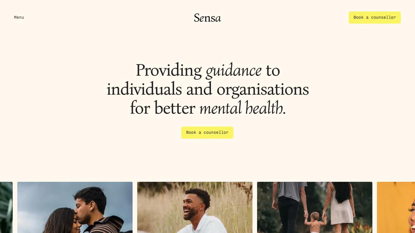
Sensa is a site for a counselling practice or a small therapy network, and it sets a calm, bookish tone from the first line. The headline, "Providing guidance to individuals and organisations for better mental health", is centered in Bona Nova on warm cream, with guidance and mental health switched to italic. A soft yellow Book a counsellor button sits under it and again in the header, beside a plain Menu label and a serif wordmark. Below, a row of warm, candid portraits slides in from the edges.
The homepage by ena supply moves at an unhurried pace. Types of therapy sets each approach in an image card with a long serif title, a short description, and a mono Read more link. Who we are pairs a wide beach photo with a short mission paragraph. Mindfulness on the go is a beige panel promoting a companion app, with download badges and a phone mockup. The Journal shows article cards, then a full-width photo carries a closing statement, followed by a big italic Mental Health Matters marquee and an email signup with a yellow Subscribe button. The booking page opens with "Here to support you" and a side-scrolling row of counsellor cards, each with a square headshot, a large serif name, mono specialty chips, and a short bio.
On a phone, the headline wraps to five comfortable lines with the italics intact, and the booking button stays centered above the portrait row.
We'd pick Sensa for therapists, counselling collectives, and wellbeing coaches who want a gentle, editorial look rather than a clinical one. The counsellor names, bios, and qualifications are placeholders, so have real profiles and photos ready. We'd also remove the app panel if you don't have an app, since it sits right in the middle of the homepage.
Based on the live demo, viewed on desktop and on a phone. The Design and Dev scores come from separate independent reviews. See how we score templates.
Independently evaluated by our team of 6 designers and 5 developers.











Designers score design, developers score development, and each score is the average of their independent ratings. Read about our review team and how we score templates.