Kroma is a high-quality Framer template for Portfolio & Agency, Blog & Editorial, Business & Startup, Professional Services by Clonify.
Our Review of Kroma
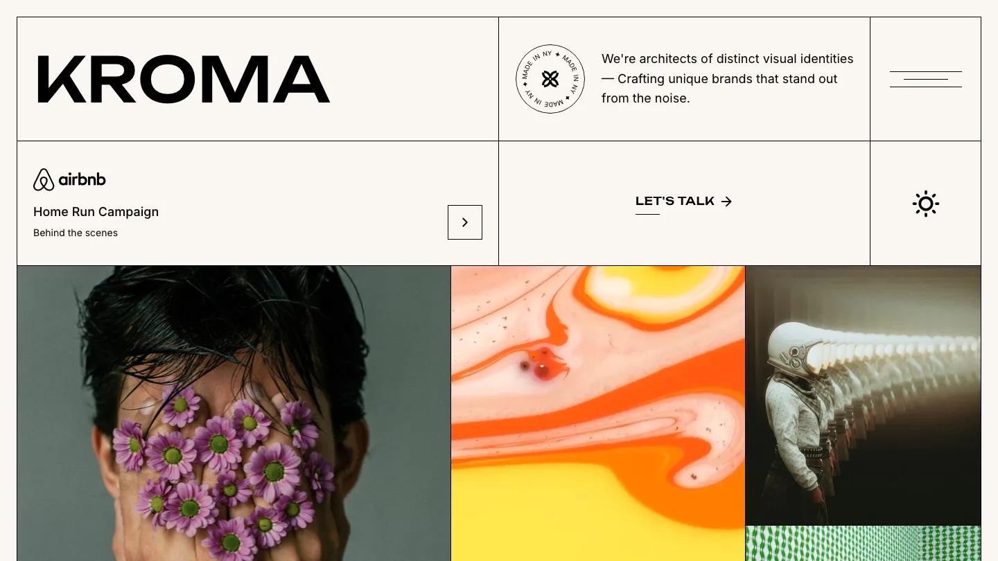
Kroma is a branding agency site laid out like a ruled notebook. Every block on the homepage sits inside thin black borders on warm off-white, so the top of the page reads as a stack of boxes: the wide Kroma wordmark in Unbounded beside a square menu button drawn as three uneven lines, a round "Made in NY" stamp next to a one-line pitch about visual identities, a featured campaign row with a client logo and an arrow button, a small sun icon, and an underlined Let's Talk link. Then the photography takes over, starting with a close-up of a face covered in purple daisies.
Clonify fills the rest of the page with full-width work panels, one after another, each a big image or video with a client name laid over it in white. A figure painted green against patterned wallpaper, sculptural pink ribbons, and a child in a corduroy jumpsuit give the reel an art-school edge. A Partners grid follows, with client logos in bordered cells, then Kind Words pairs a tall portrait with each testimonial, a logo, and a name. The page closes on a wide "We're here, Let's talk" band. The Works page reuses the boxed header, adds a large Works title and a one-sentence intro, and sets projects as the same edge-to-edge images.
On a phone, the bordered grid holds up well: the wordmark breaks over two lines, each box stacks in order, and the menu button keeps its own square cell.
We'd pick Kroma for branding and creative studios with a deep bank of striking campaign images. The homepage is very long, so we'd trim the work reel to the best projects. The featured campaign row also uses a famous travel brand's logo as placeholder, so swap that for a real client before launch.
Based on the live demo, viewed on desktop and on a phone. The Design and Dev scores come from separate independent reviews. See how we score templates.
Independently evaluated by our team of 6 designers and 5 developers.











Designers score design, developers score development, and each score is the average of their independent ratings. Read about our review team and how we score templates.