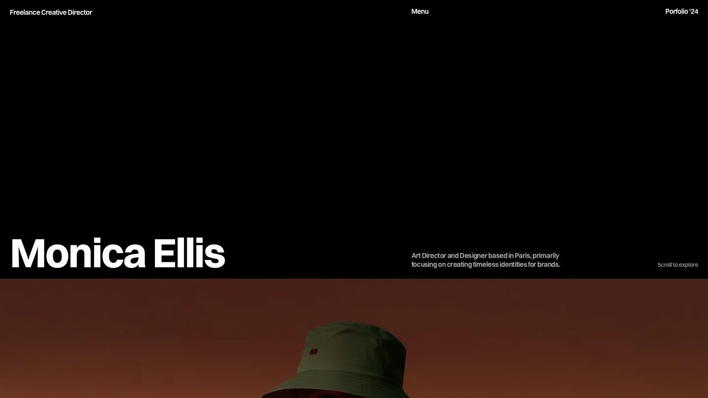
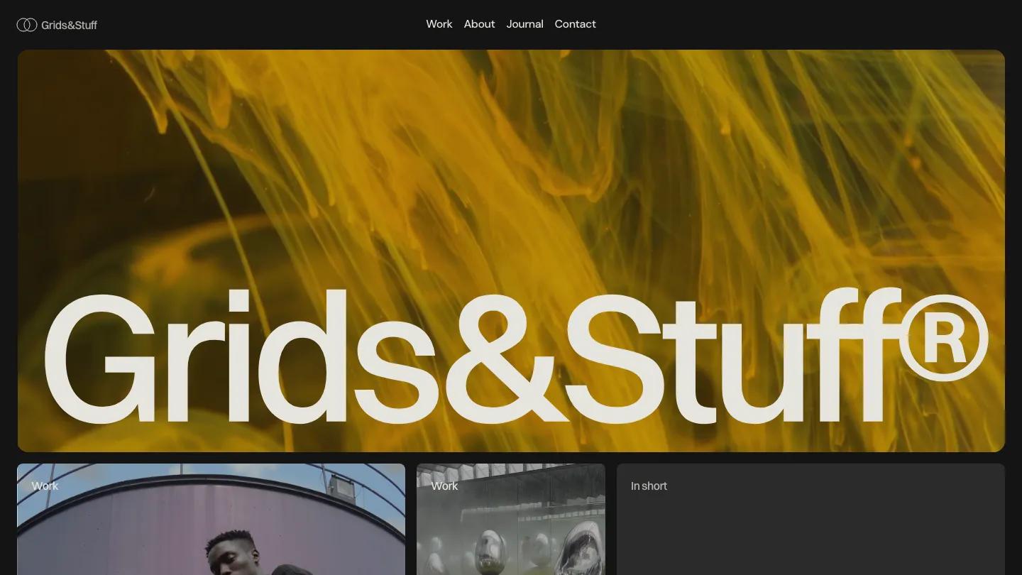
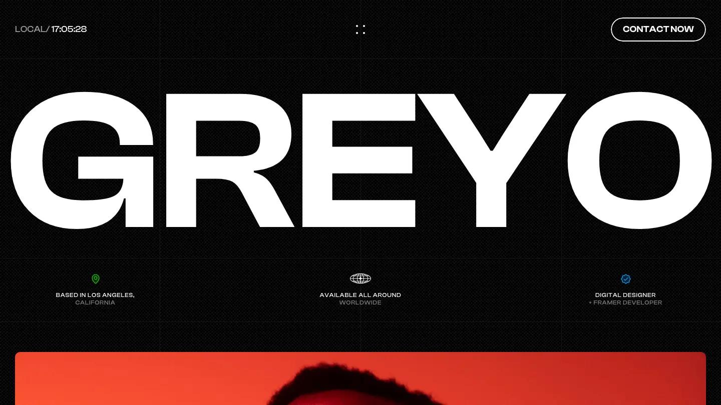
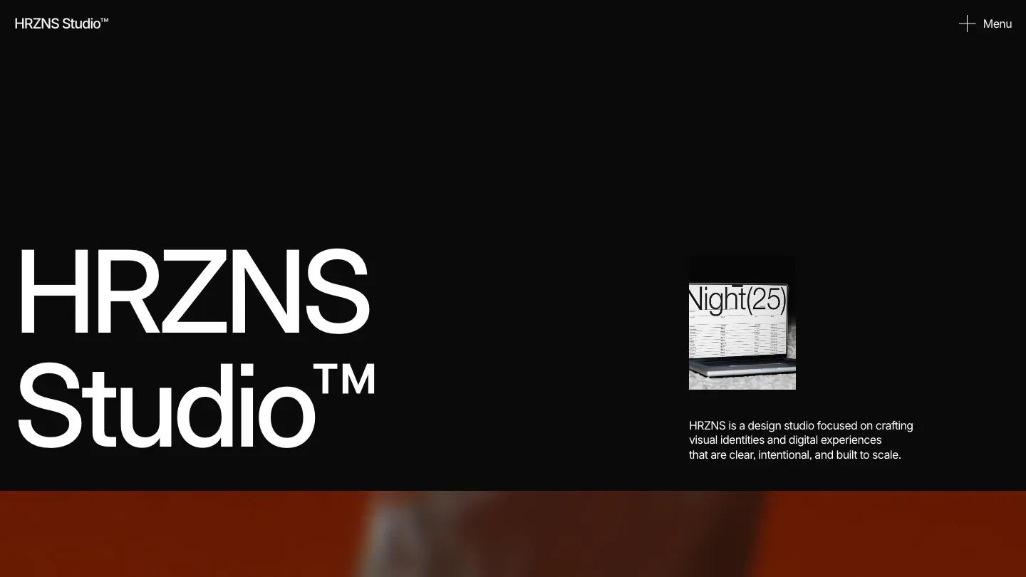
Rowan is a high-quality Framer template for Portfolio & Agency, Personal, Art & Design, Photography & Videography by Flowit Supply.
Our Review of Rowan
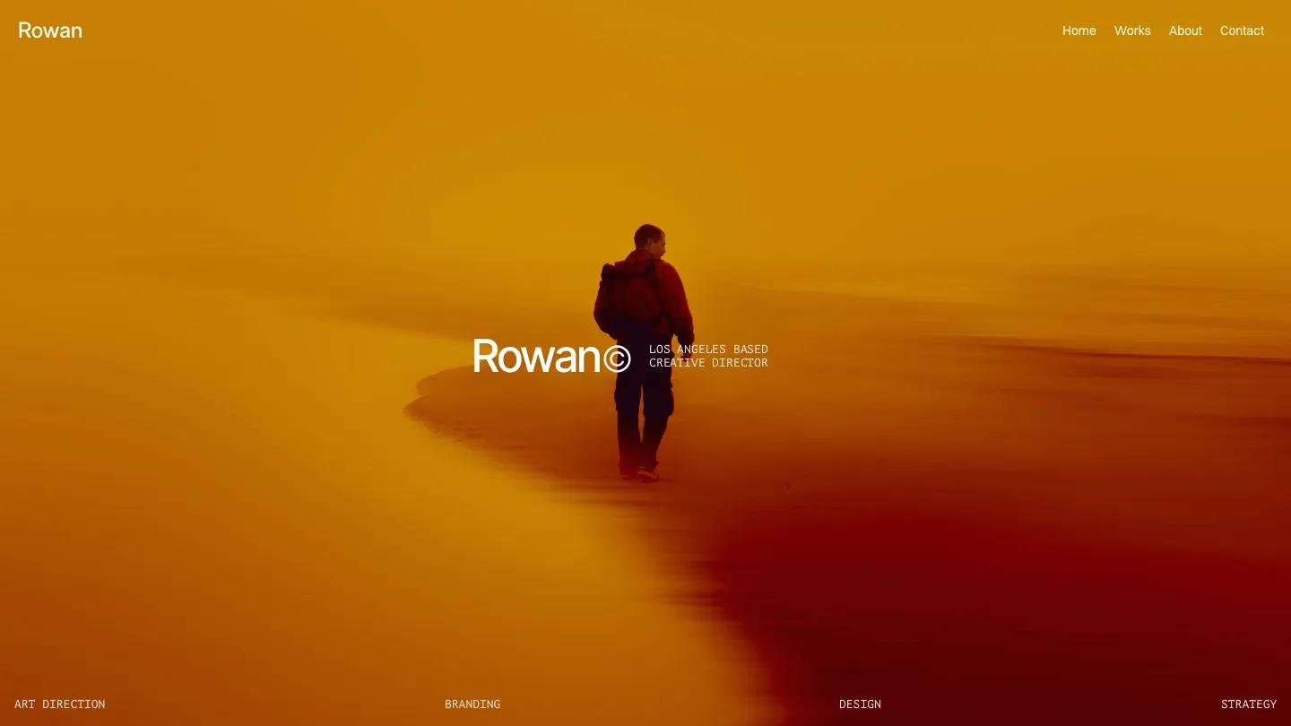
Rowan opens like a film still. Flowit Supply built this Framer portfolio for a creative director, and the hero is a full-screen photo of a lone figure walking across a beach washed in saturated orange and deep red. "Rowan" sits in the center in white Inter Display with a copyright mark, beside a small monospaced line about being a Los Angeles based creative director, and art direction, branding, design and strategy run along the bottom in the same mono type.
After that the site goes almost entirely black. A short About paragraph introduces the director, then Selected Works stacks wide project panels one after another: a boat deck over dark water, a perfume bottle on soft green, a woman in a floral dress in a blue room, an SUV on black sand under a misty mountain. Each panel carries the project name and year on the left, a one-line summary in uppercase mono on the right, and an arrow in the corner. The Works page repeats them as a two-column grid. Near the bottom, a large underlined Contact link sits above a pair of press features with square photos, and the footer adds a newsletter field. We like the pairing of the clean sans with that typewriter-style mono. It gives captions a quiet, editorial texture without adding any color.
On a 390px phone the hero photo still fills the screen, the name and title stack in the lower left, and the navigation shrinks to a single Menu link.
We'd pick Rowan for an art director, photographer or brand designer whose work already looks cinematic. One honest caveat: there's very little copy and no services or client list, so the site only works if your project images can carry the pitch on their own.
Based on the live demo, viewed on desktop and on a phone. The Design and Dev scores come from separate independent reviews. See how we score templates.
Independently evaluated by our team of 6 designers and 5 developers.











Designers score design, developers score development, and each score is the average of their independent ratings. Read about our review team and how we score templates.