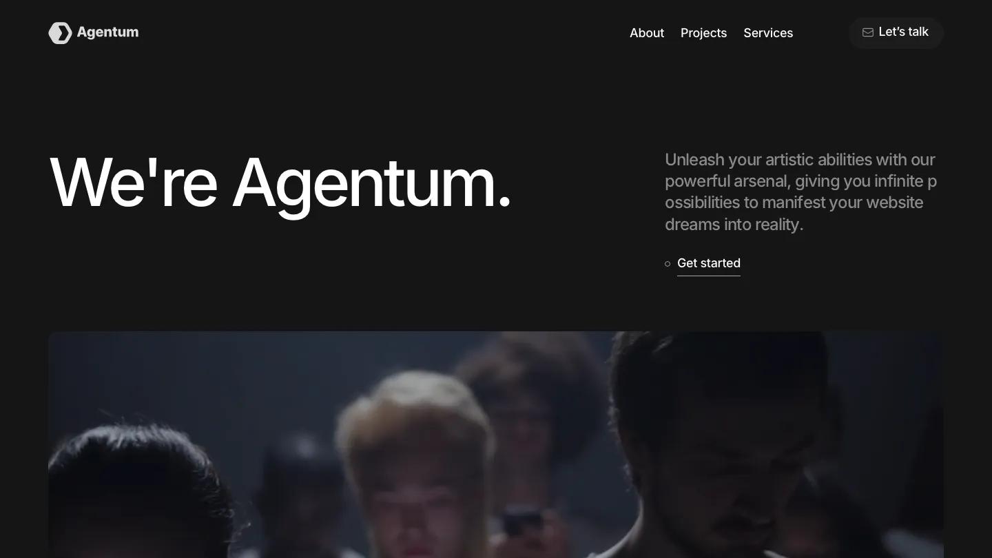
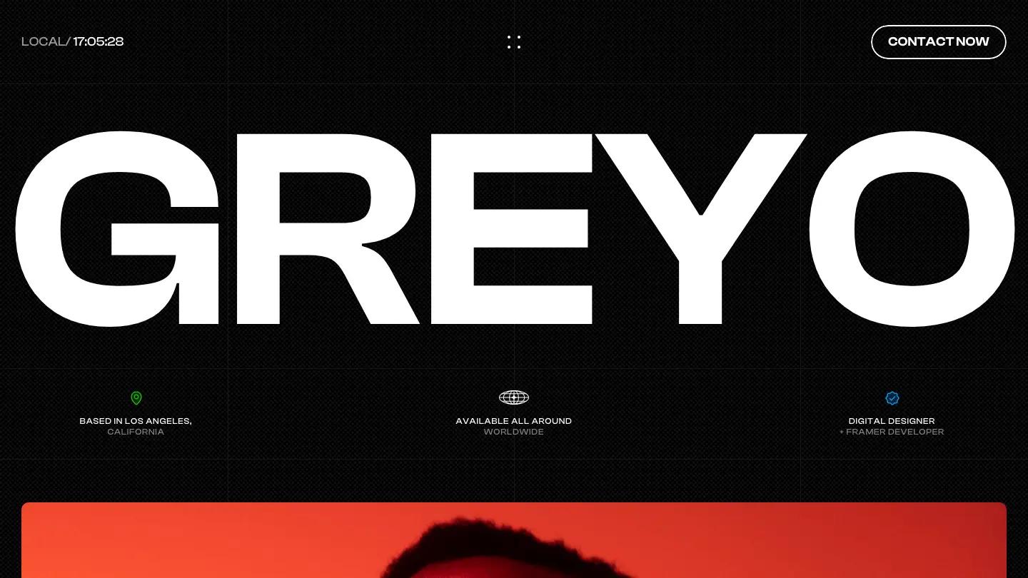
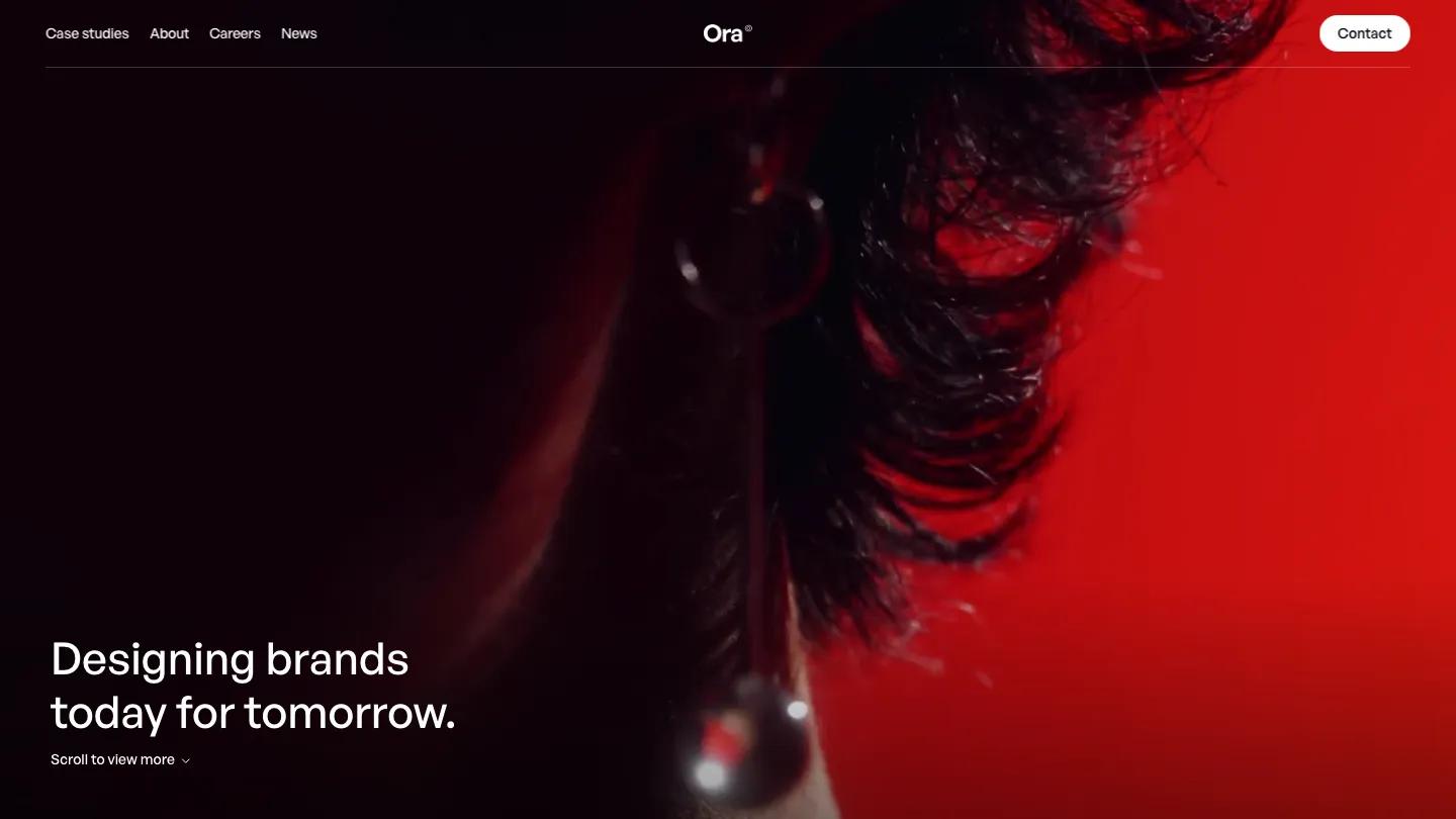
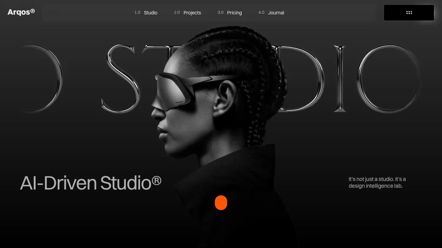
Portz is a high-quality Framer template for Portfolio & Agency, Professional Services, Personal, Art & Design, Business & Startup, Photography & Videography by FramerCafe.
Our Review of Portz
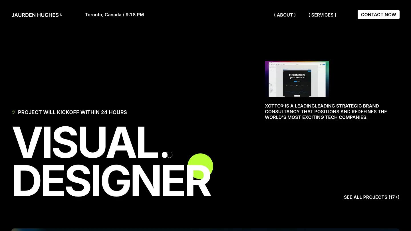
Portz is a black, all-caps portfolio for a visual designer who likes a loud first impression. "Visual Designer" fills the lower left of the hero in heavy white Inter, with a lime green circle drifting behind the last letters and a small kickoff promise above it. The header keeps a name with a registered mark, a city and live time, About and Services in round brackets, and a white Contact Now button. Lime is the only accent, used for small highlighted tags.
FramerCafe packs a lot into the homepage. Selected Work opens with a big two-line heading, a lime Explore tag and wide, dark project images. About pairs a moody seated portrait with an About Me paragraph and a ruled list of awards with years and arrow links. Motivation runs a long personal note beside a handwritten signature, followed by a short motto quote. Services is an accordion of rows like UX/UI Designing and Brand Design with small icons and plus toggles, then a stat row and a full-width city photo. Experience lists roles under a lime date tag, Favourite Stack shows tool logos with skill percentages, and testimonials, an FAQ accordion and a big closing call to action wrap things up. The project page sets the title in stacked caps with a lime dot over a wide photo.
On a phone, the headline stays huge across two lines, the menu reduces to the name and Contact Now button, and a project preview card appears above a short studio blurb.
We'd pick Portz for designers who want a confident, dark personal site with plenty of room for credentials. The homepage is very long, so cut what you don't need. Replace the lorem ipsum, the famous tech founder's quote and several demo typos before launch.
Based on the live demo, viewed on desktop and on a phone. The Design and Dev scores come from separate independent reviews. See how we score templates.
Independently evaluated by our team of 6 designers and 5 developers.











Designers score design, developers score development, and each score is the average of their independent ratings. Read about our review team and how we score templates.