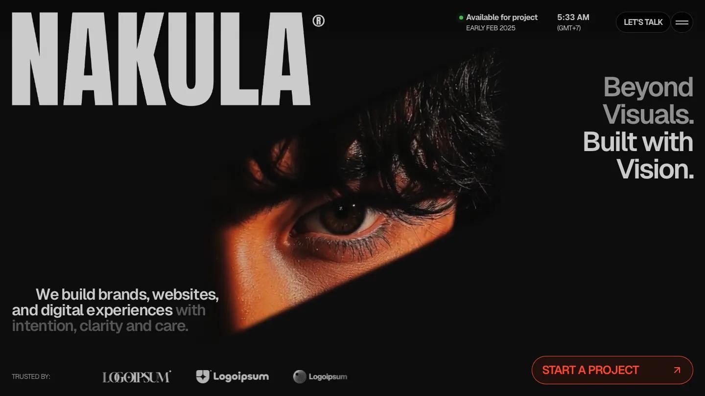
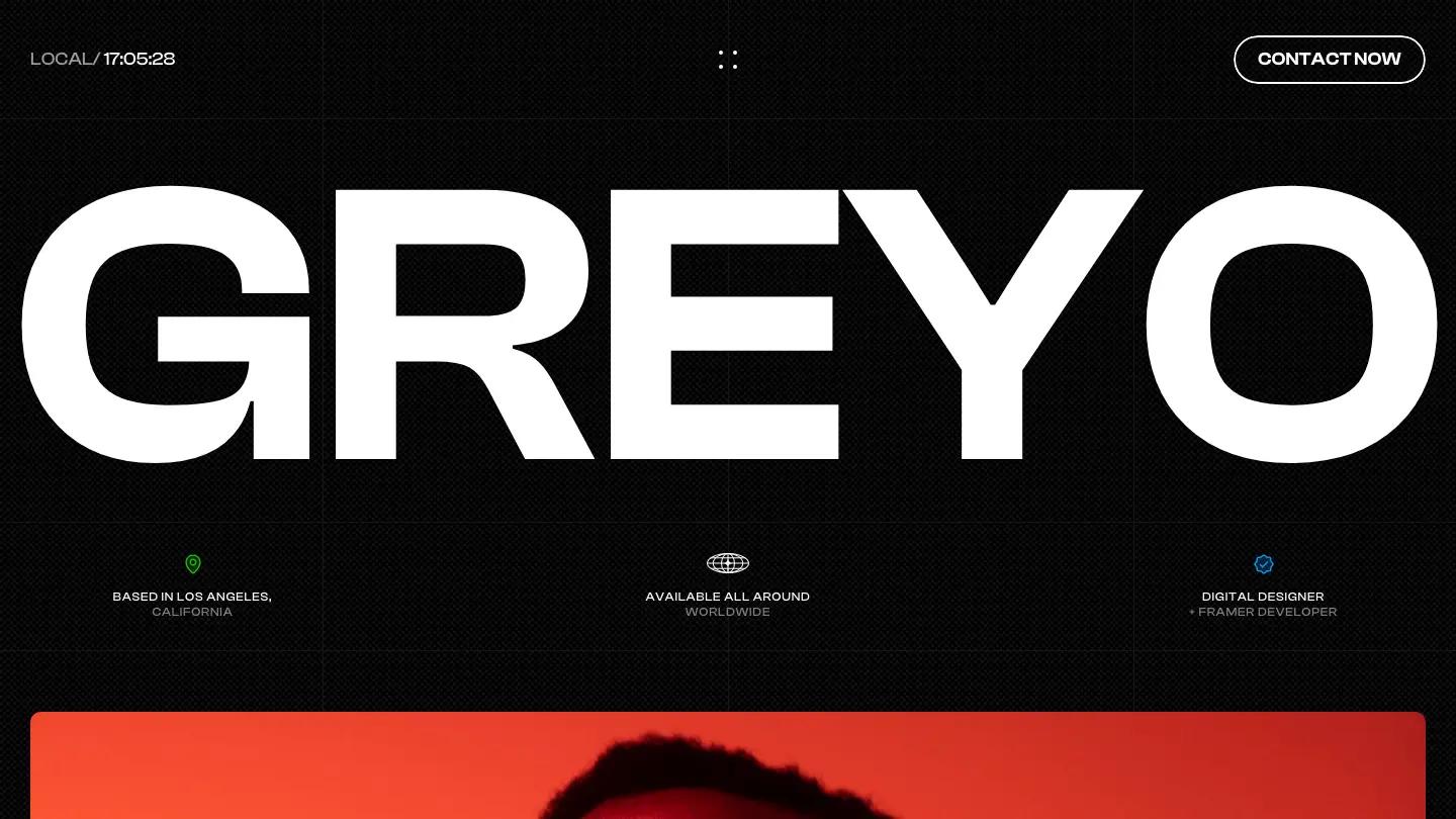
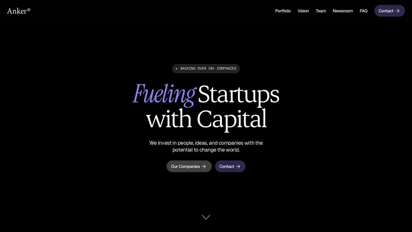
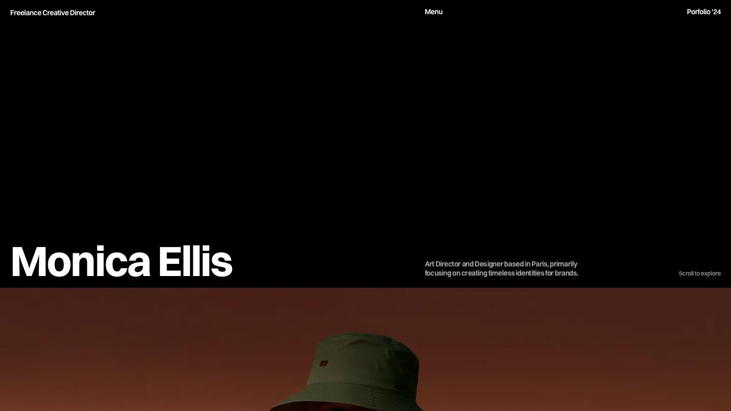
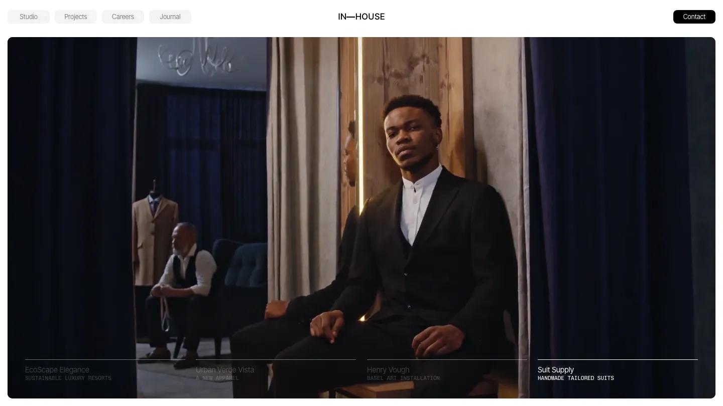
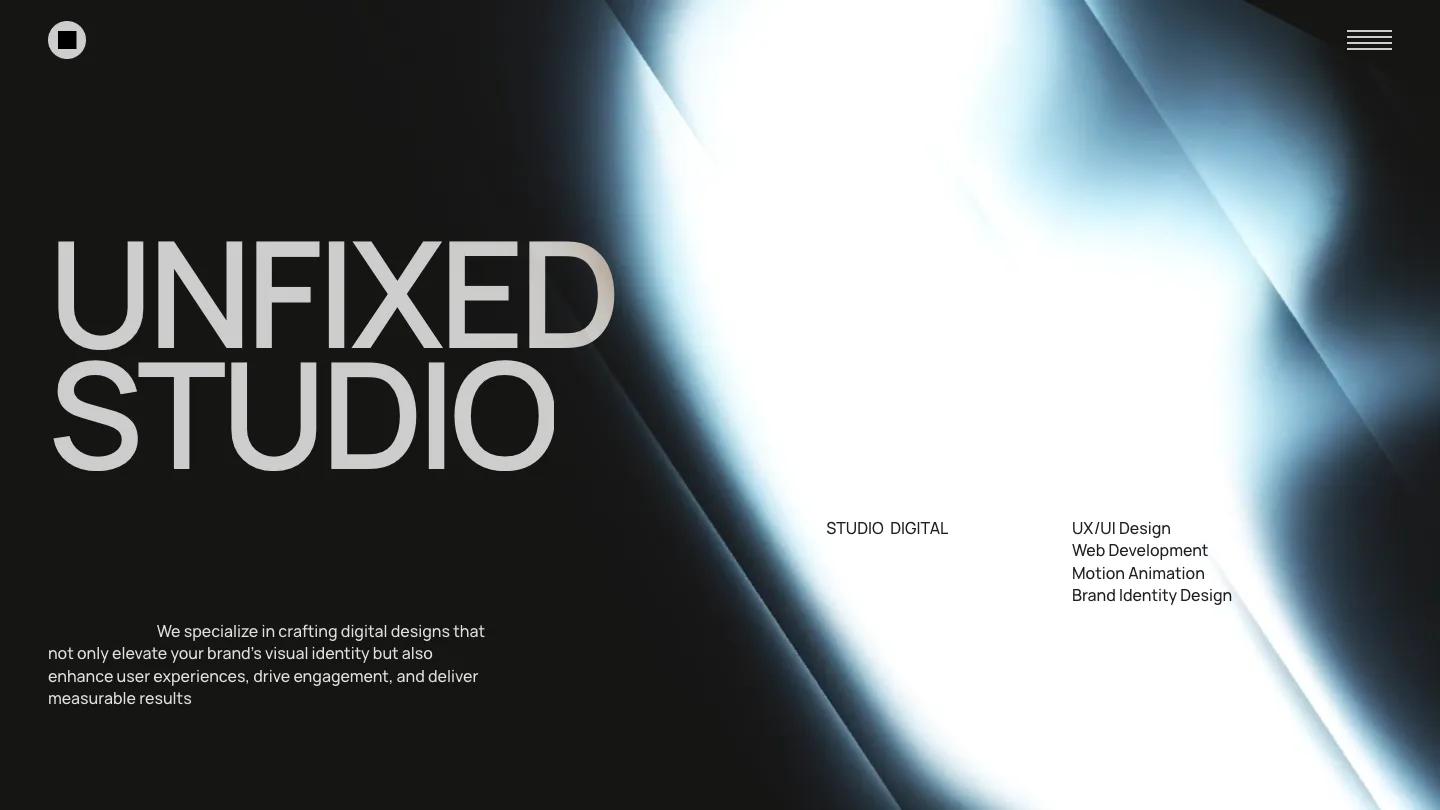
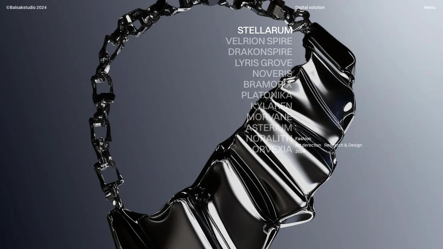
Prism is a high-quality Framer template for Portfolio & Agency, Technology & Software, Art & Design, Personal, Professional Services, Business & Startup by Victor Adedini.
Our Review of Prism
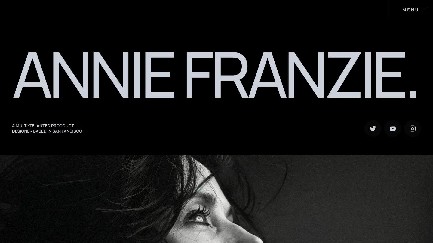
Prism is a Framer portfolio template by Victor Adedini for a single product designer, and it leads with a name in wide, light-gray capitals that spans the whole first screen. Under it sit a short role line in small caps and three round social buttons, then a full-width black and white portrait takes over. Headings are set in Manrope, the palette moves between white, pale gray and near-black, and the only menu up top is a boxed Menu button in the corner.
The homepage runs in clear bands. Selected Case Studies is a two-column grid of soft, bright product photos, each with a project name and a two-line description underneath. A Brands I Have Worked With section follows, then Awards and Recognitions on a dark band laid out as a table of category, award and year. People Are Impressed lists client quotes as accordion rows, each with a plus icon, a small avatar, a name, role and company. A blog row titled My Thoughts and a Let's Work Together form with name, email and message fields close things out, and the footer puts the phone number and email in large type. The works page opens on a giant Works heading with a slim text navigation across the top. We like the accordion testimonials: they keep social proof on the page without a wall of quotes.
On a 390px phone the name breaks onto two lines, the social buttons line up under the role line, and the menu shrinks to a two-line icon beside a short name tag.
We'd pick Prism for a product or UX designer who wants a quiet, grayscale portfolio. Proofread before you publish: the demo's role line and the awards table both contain typos, and the brands section shows empty placeholder boxes rather than real logos.
Based on the live demo, viewed on desktop and on a phone. The Design and Dev scores come from separate independent reviews. See how we score templates.
Independently evaluated by our team of 6 designers and 5 developers.











Designers score design, developers score development, and each score is the average of their independent ratings. Read about our review team and how we score templates.