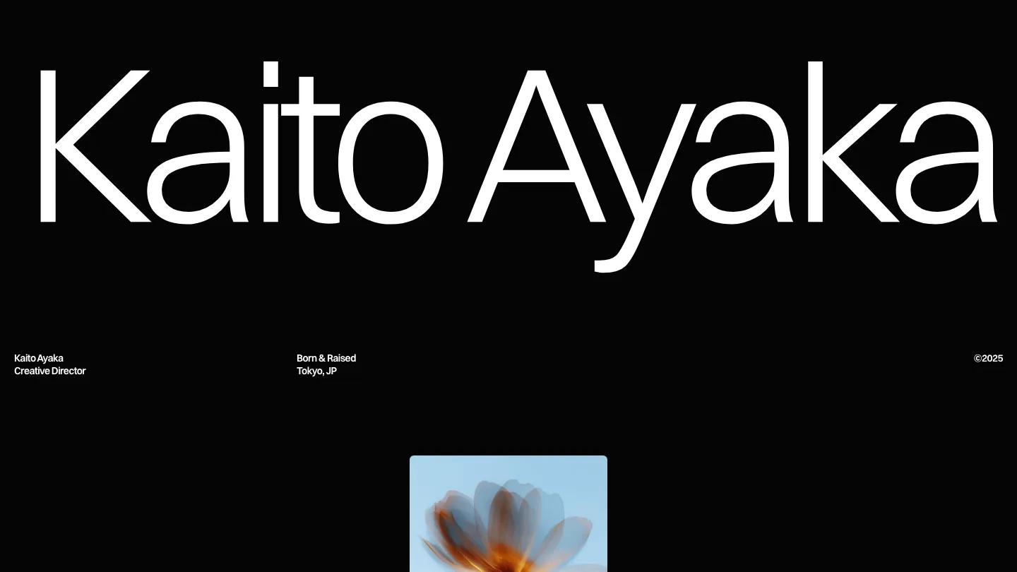
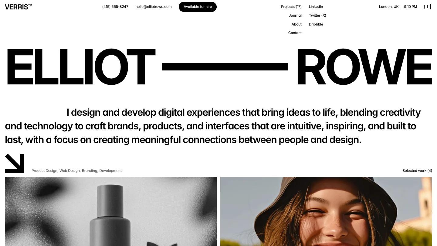
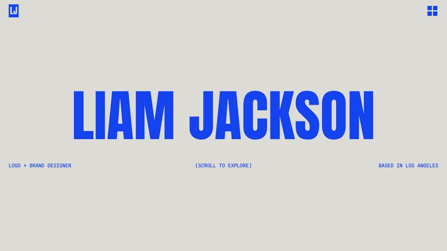
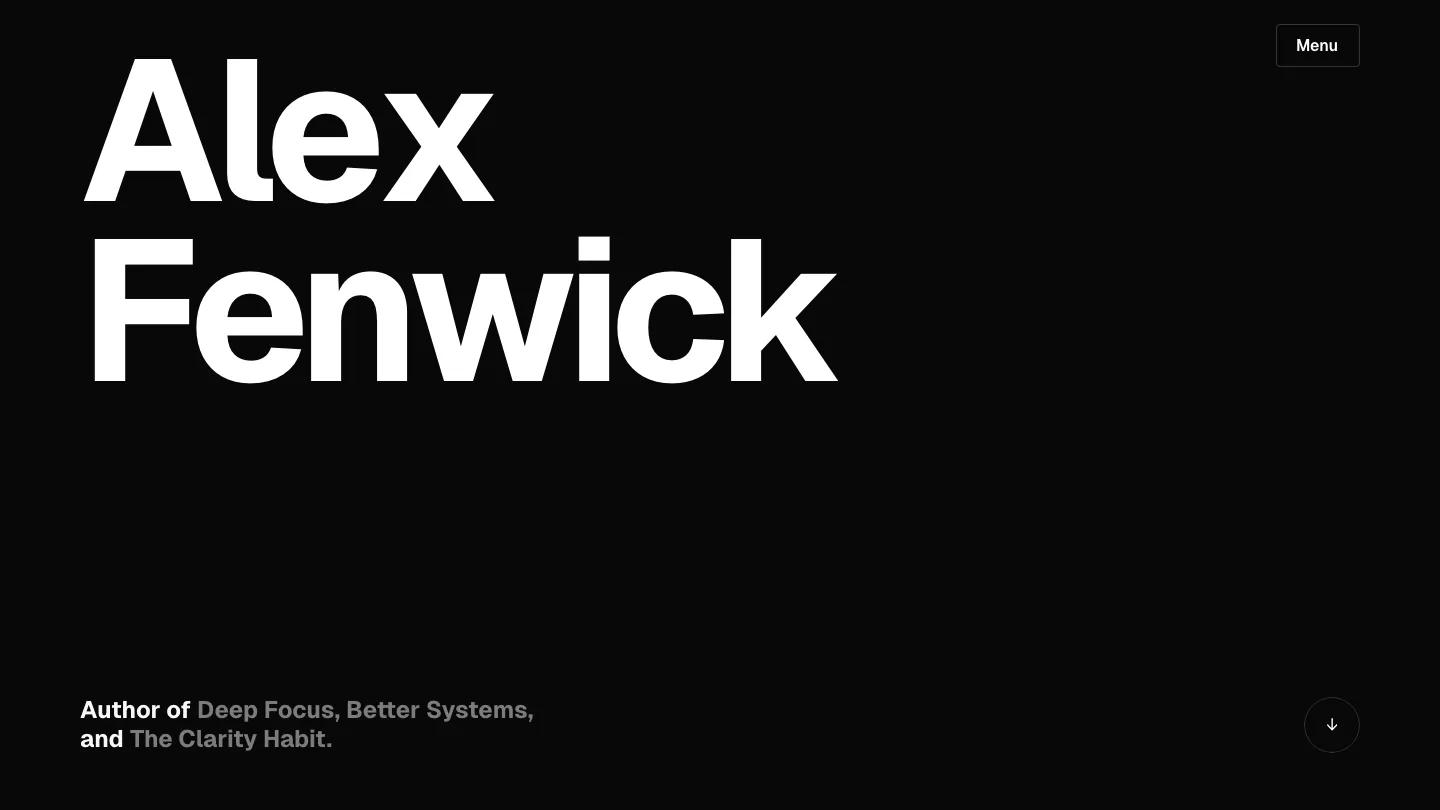
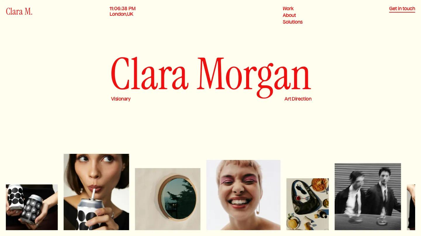
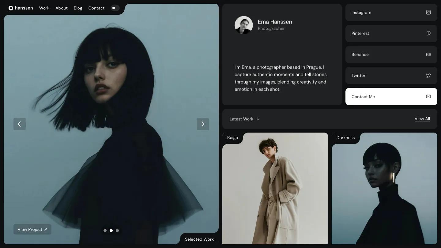
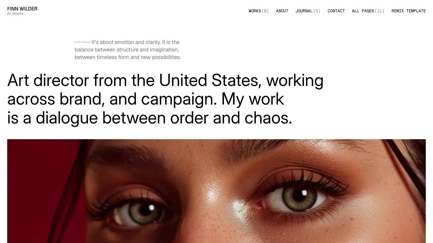
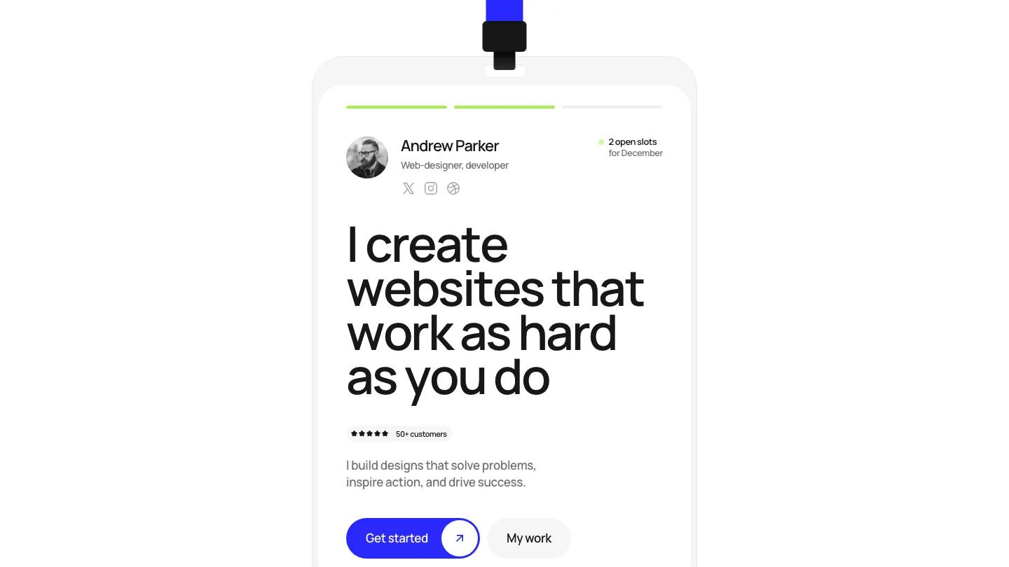
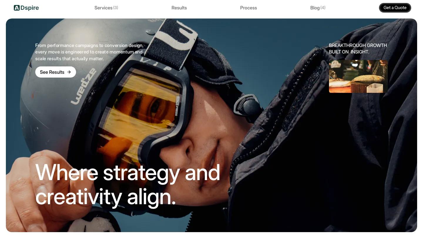
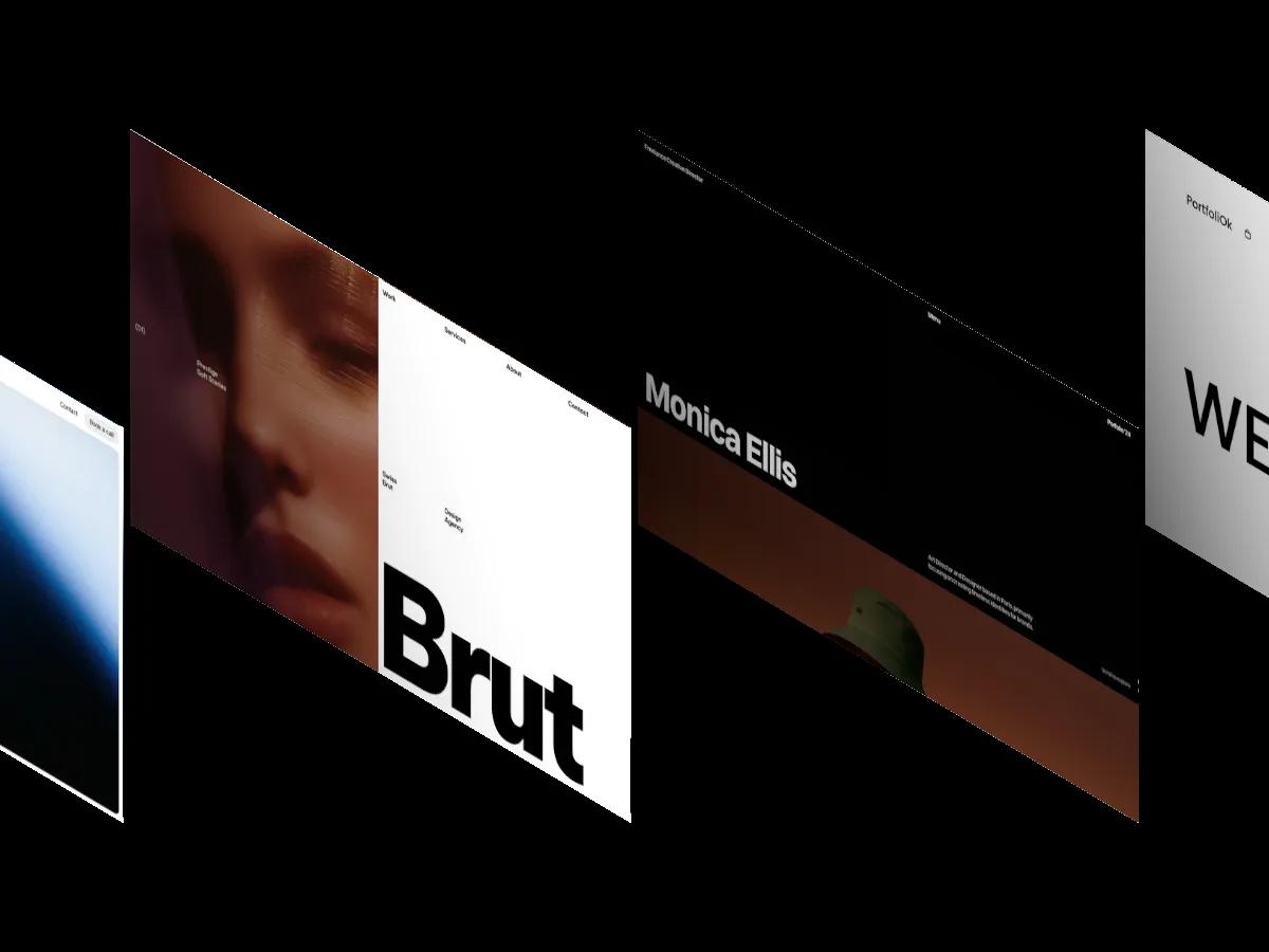
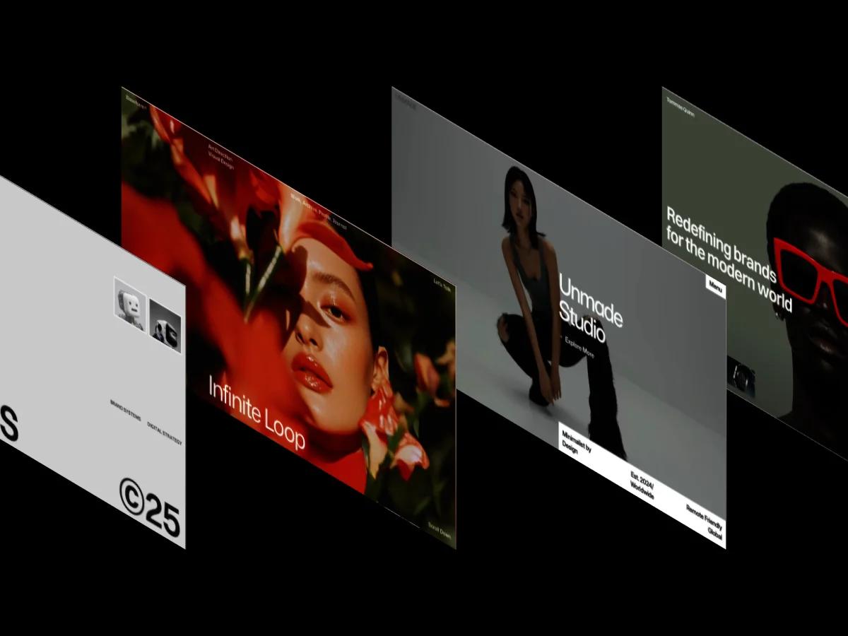
Nolan is a high-quality Framer template for Personal, Portfolio & Agency, Professional Services, Art & Design, Business & Startup, Photography & Videography by Omakase.
Our Review of Nolan
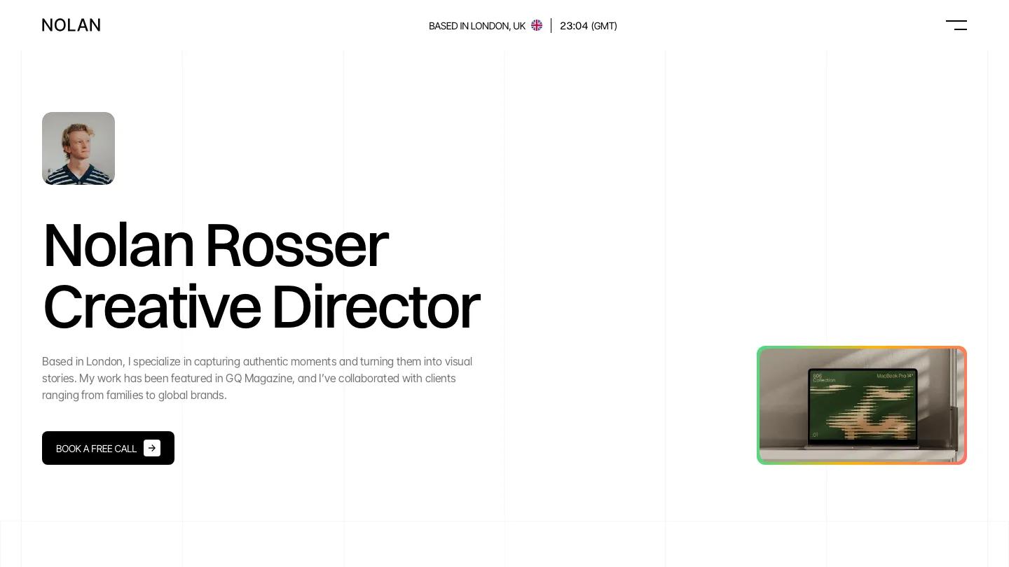
Nolan is a personal site for a creative director or senior designer who wants a calm, editorial front door. Faint vertical grid lines run down a white page, and the hero stacks a small rounded portrait, a two-line name and job title in big black Switzer, a grey bio, and a black Book a Free Call button. Off to the right floats a small image card with a green-to-orange gradient border. The header is spare: a light NOLAN wordmark, a centered city label with a flag and a live clock, and a two-line menu icon instead of visible links.
Omakase numbers each homepage section, so the long scroll has a clear rhythm. Selected Works sets projects in a two-column grid of rounded mockup images, with the name on the left and a grey discipline like UI/UX Design or Creative Direction on the right. About Me pairs a short bio and three small counters with a snowy travel photo. Focus lists services as wide rows with colorful square icons, Awards uses four light grey tiles with a multiplier and an award name, and Testimonials leads with a large portrait. Blog cards follow, then a Clients logo row, a sliding strip of project images, and a footer that repeats the name beside contact details and social links. The Works page opens with a huge Selected Works heading and the same large two-up project cards.
On a phone, everything stacks neatly in one column, with the portrait, name, and call button all visible on the first screen.
We'd pick Nolan for art directors and brand designers with polished case studies. The bio mentions a famous magazine and the awards name real web award programs, so rewrite both, and note that every card in the image strip shares one project name.
Based on the live demo, viewed on desktop and on a phone. The Design and Dev scores come from separate independent reviews. See how we score templates.
Independently evaluated by our team of 6 designers and 5 developers.











Designers score design, developers score development, and each score is the average of their independent ratings. Read about our review team and how we score templates.