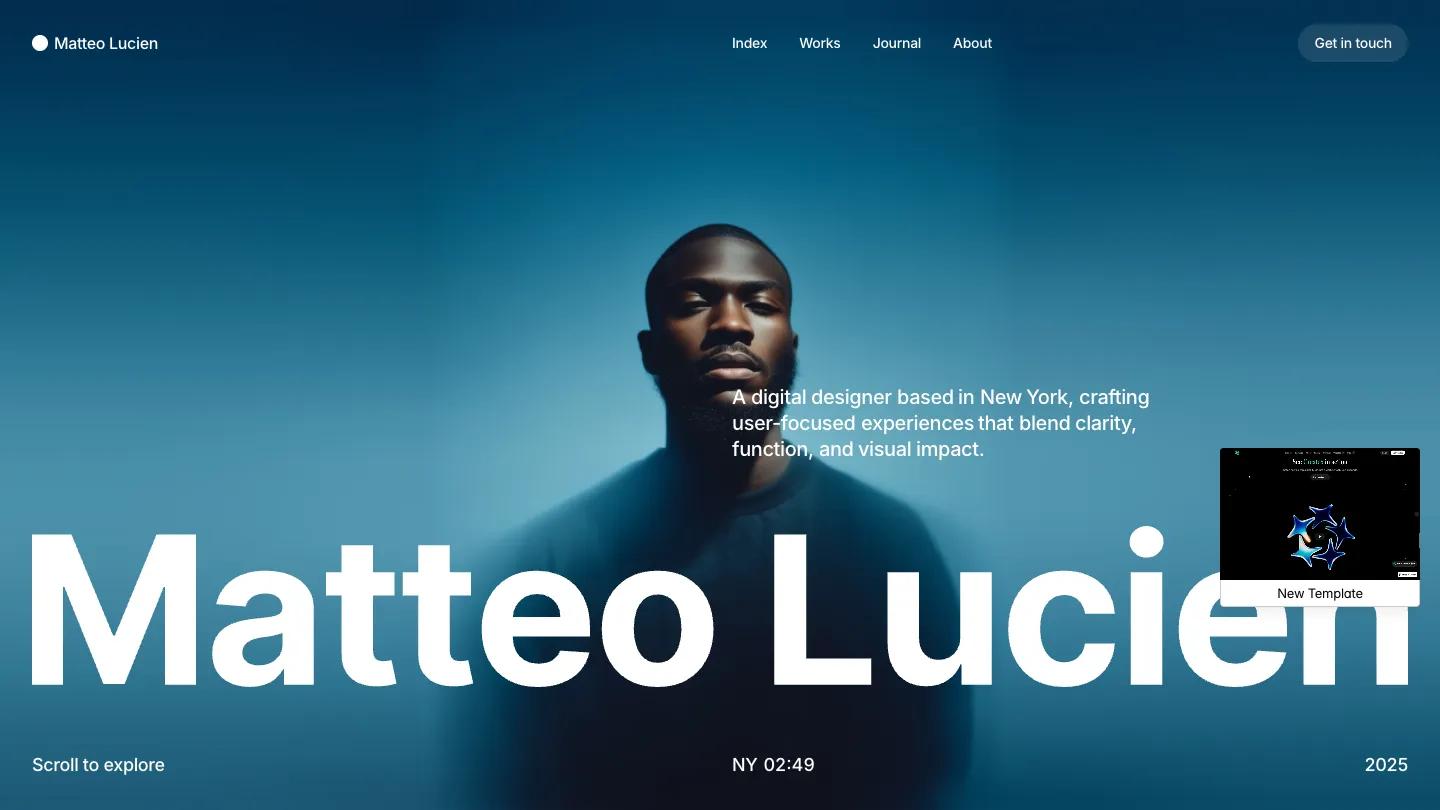
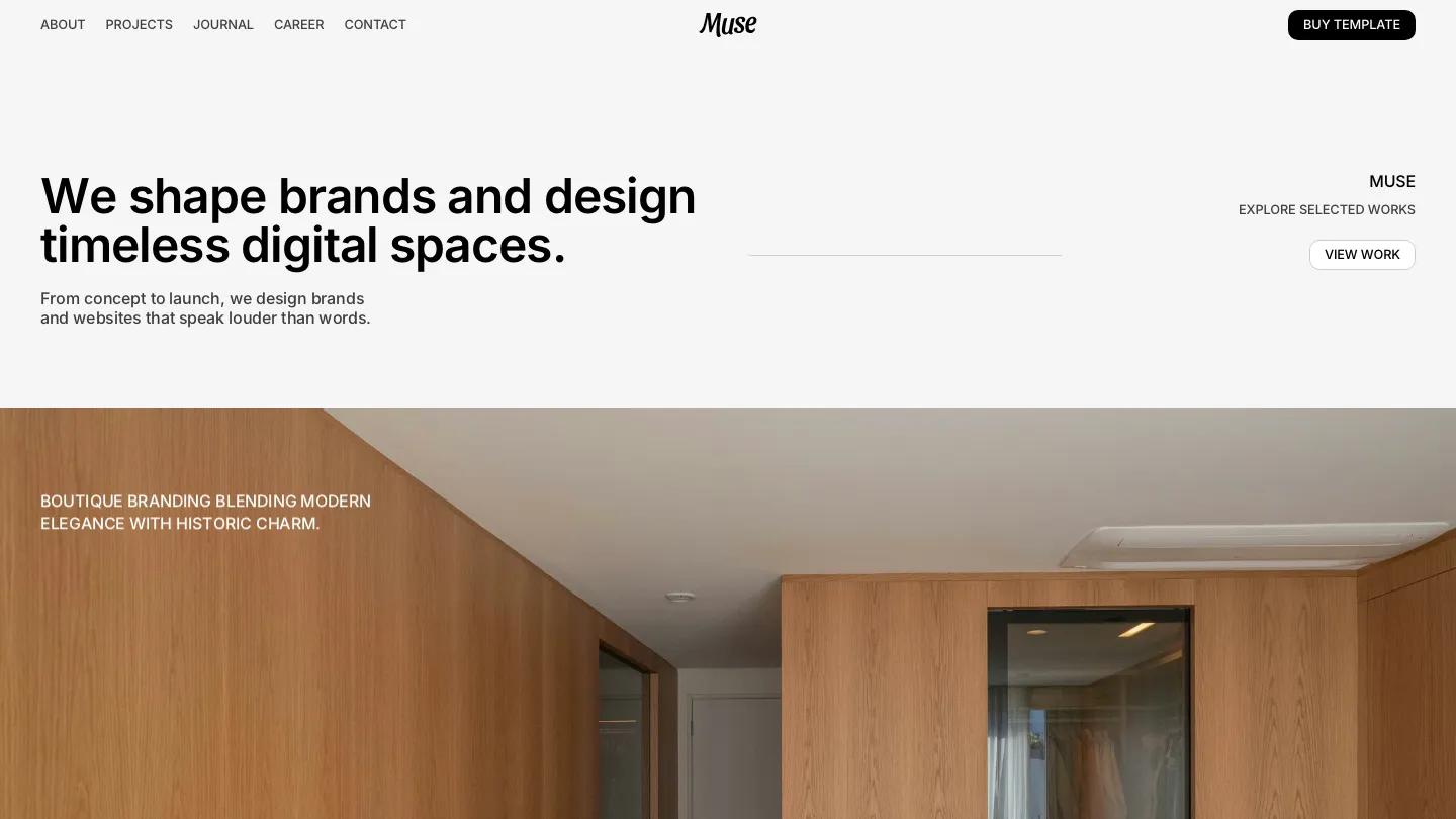
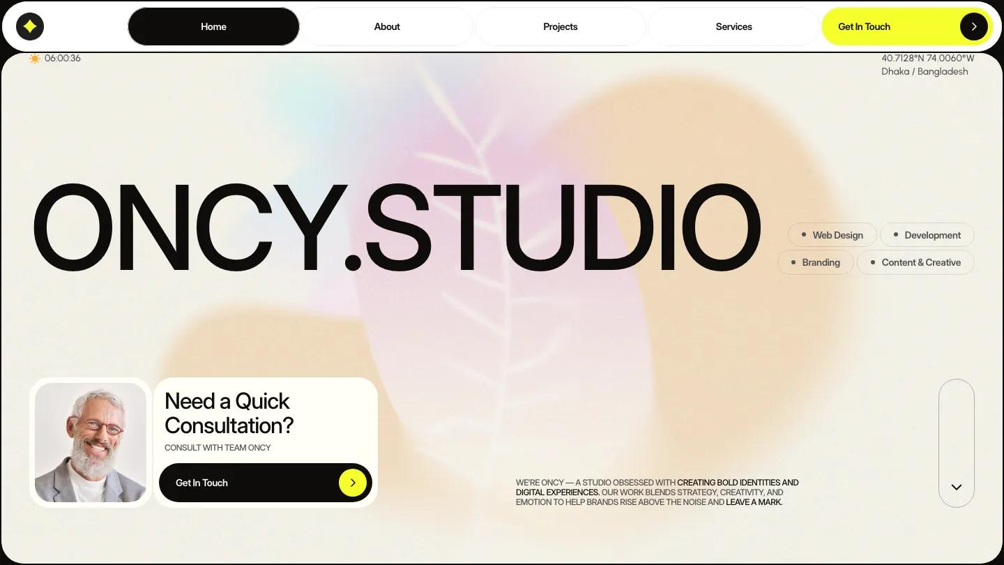
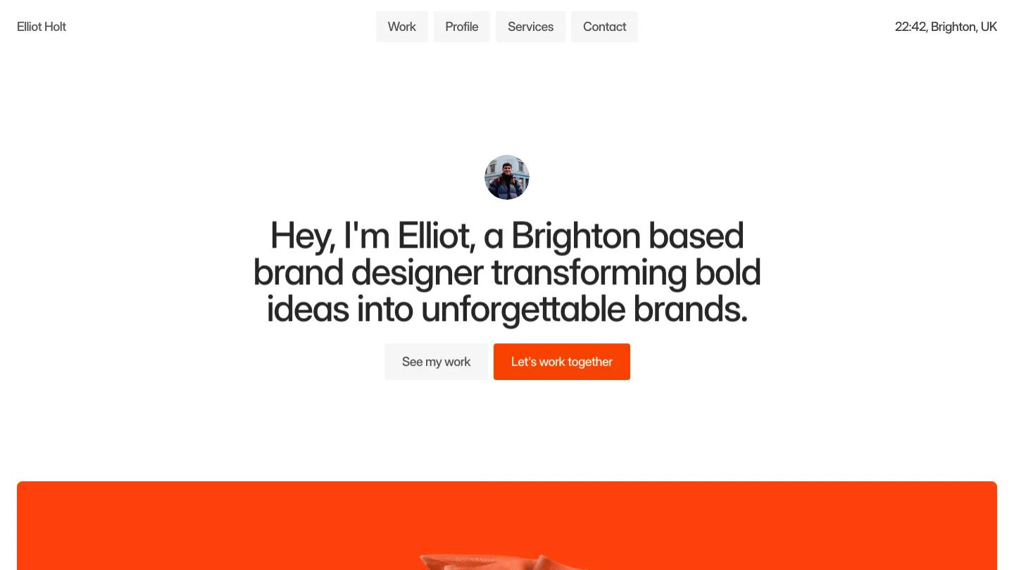
Verris is a high-quality Framer template for Personal, Portfolio & Agency, Art & Design, Professional Services, Technology & Software, Business & Startup by Isaac.
Our Review of Verris
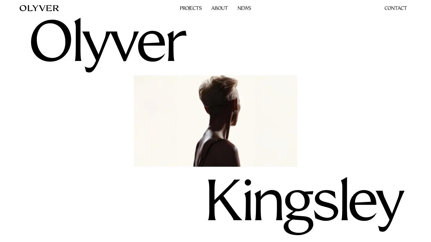
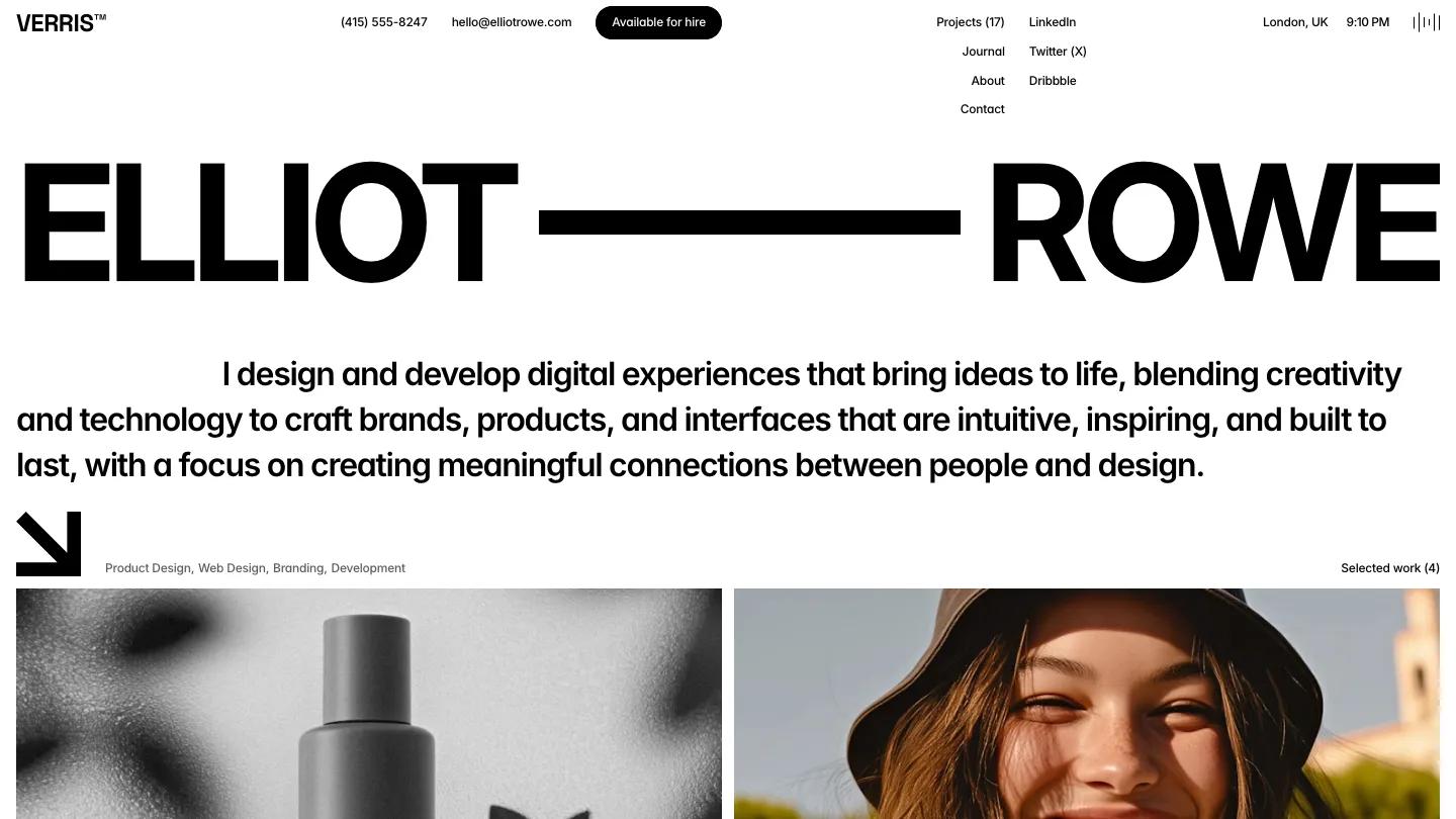
Verris is a black-and-white portfolio for a designer who also builds, and it reads like a well-set résumé. The hero spreads a first and last name across the full width in heavy Inter Display capitals, joined by a thick black bar, with a long intro paragraph in large type beneath it. A chunky arrow points down to the first projects. The header packs a lot into one row: the Verris wordmark, a phone number, an email, a black Available for hire pill, the menu with a live project count, and a city with local time on the right.
Isaac lets the work arrive early. Selected projects sit in a two-column grid of large square images, each captioned with a client and country, and a big View all projects link closes the set. A years of experience counter sits beside a What I do statement, followed by a cloud of grey pill tags running from Product Design to no-code development. Lower down, client logos sit over moody product photos, a large Start a project link stands at the right, and the footer pairs a newsletter field and black Subscribe button with a stack of social links. Contact stays quiet too: a short invitation, underlined Name and Email fields, budget ranges as radio buttons, and a portrait tucked into the lower right.
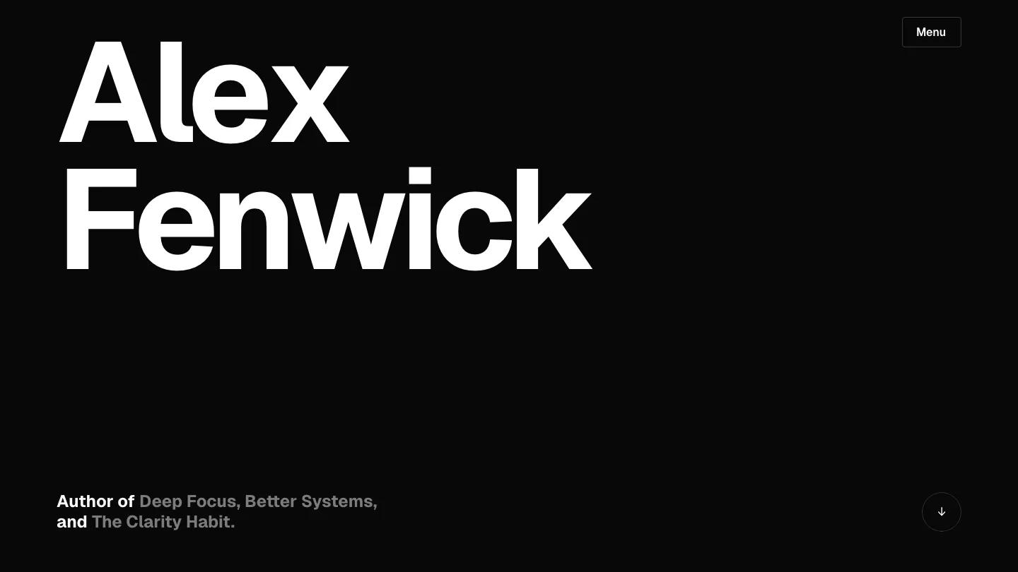
On a phone, the name stacks onto two lines with the bar beside the first, the menu shrinks to an outlined Menu button, and the intro stays large and readable.
We'd pick Verris for product designers and creative developers who want a typographic, no-fuss portfolio. Proofread the service pills before launch, since a couple of the demo labels contain spelling slips. And the long header row assumes you want your phone and email public on every page.
Based on the live demo, viewed on desktop and on a phone. The Design and Dev scores come from separate independent reviews. See how we score templates.
Independently evaluated by our team of 6 designers and 5 developers.











Designers score design, developers score development, and each score is the average of their independent ratings. Read about our review team and how we score templates.