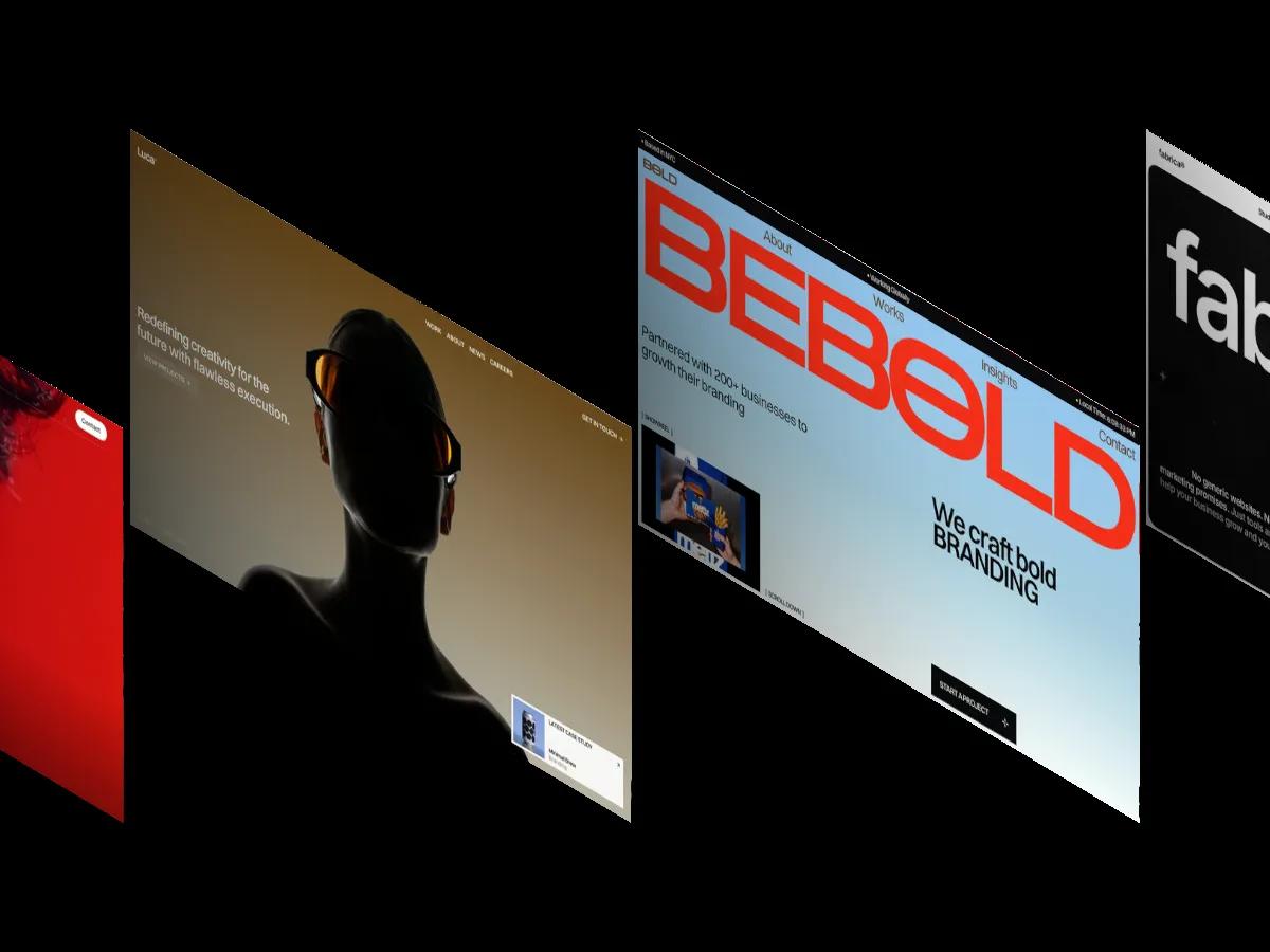
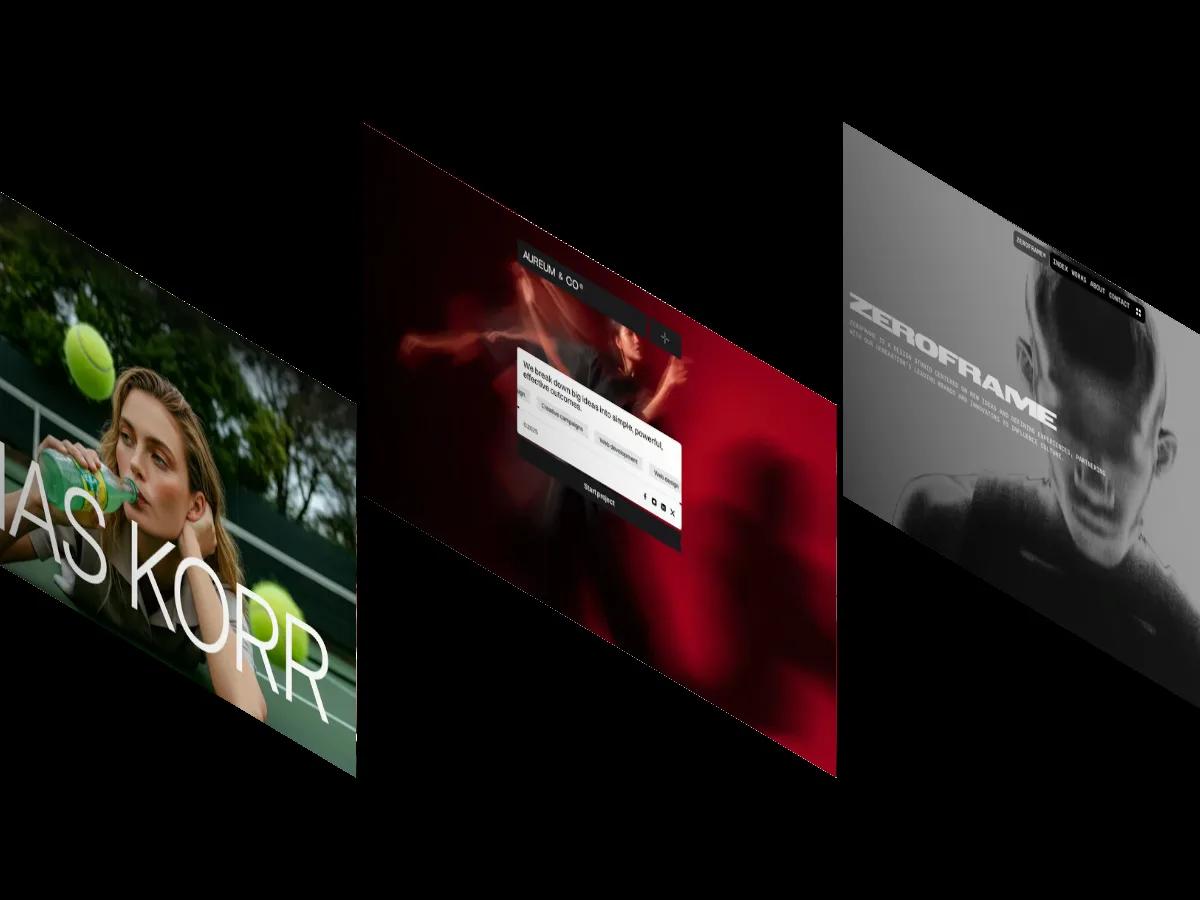
Hanssen is a high-quality Framer template for Personal, Portfolio & Agency, Photography & Videography, Art & Design, Blog & Editorial, Professional Services by Pawel Gola.
Our Review of Hanssen
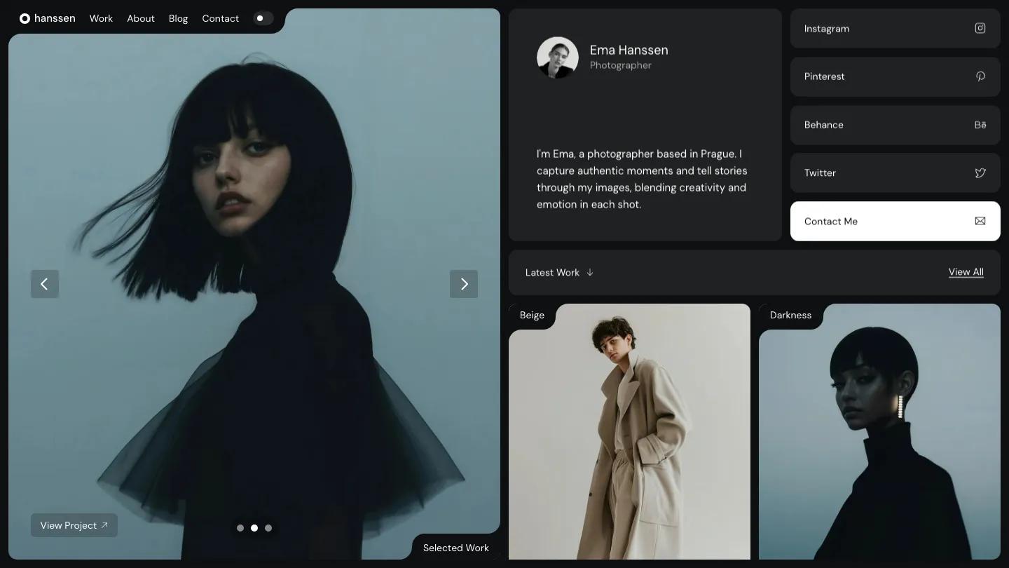
Hanssen is a split-screen portfolio for photographers, and it keeps the work in view at all times. The left half of the screen is a large image slider that stays put while you scroll, with arrow buttons, small dots, a View Project link, and a Selected Work label tucked into a notched corner. The right half scrolls through a bento of soft grey cards: a profile with a round portrait, the photographer's name and a short bio, a column of social link tiles, and a solid black Contact Me tile.
Pawel Gola uses that notched-tab detail throughout, and it ties the layout together nicely. Below the profile, a Latest Work bar with a View All link leads into a grid of tall photos, each labeled with a small tab in the corner, from Beige and Darkness to Gentlemen and City. A toggle in the navigation switches the whole site between light and dark modes, and the dark version makes fashion and portrait work look especially rich. The Work page keeps the big image on the left and lists every project on the right as a simple row with its category and year. The demo also includes about, blog, and contact pages.
On a phone, the slider moves to the top with its controls and label intact, and the profile, social tiles, and project grid stack underneath in the same rounded cards.
We'd pick Hanssen for portrait, fashion, and editorial photographers who want a polished site with very little setup. The project grid crops everything into tall portrait frames, so wide, horizontal shots will lose a lot. The fixed slider also halves the space for text, which suits short captions more than long blog posts.
Based on the live demo, viewed on desktop and on a phone. The Design and Dev scores come from separate independent reviews. See how we score templates.
Independently evaluated by our team of 6 designers and 5 developers.











Designers score design, developers score development, and each score is the average of their independent ratings. Read about our review team and how we score templates.