Web Design Trends 2027: What 1,005 Real Website Templates Actually Show

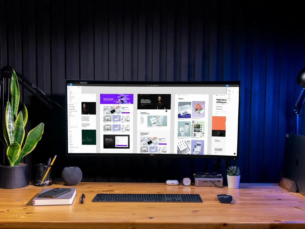
Most trend lists are guesses. We checked the web design trends for 2027 against the 1,005 templates in our library, the fonts measured on 263 live demos and 574 written reviews, so you can see which trends real sites use and which ones are mostly talk.
Last updated: November 22, 2026
Every December, new lists of web design trends come out, and most of them repeat each other: 3D, brutalism, glass, retro, AI. We read the 12 strongest lists ranking for 2026 and 2027, and not one measured how common any of these trends actually are. They name a few award-winning brand sites and call it a direction.
So we counted. Our library holds 1,005 reviewed templates for Webflow, Framer and Shopify, all live sites that designers are building and selling right now. We measured the fonts on 263 of their live demos, and our team has written reviews of 574 of them from their live pages. This page puts each 2027 trend next to the numbers, and says which ones we'd use, which ones we'd skip, and what each one costs in speed and accessibility.
Key Findings
- One font family is the norm. 61.6% of the 263 live demos we measured use the same font family for headings and body text. (our font study, see Methodology below)
- Inter still leads, but it's spreading thin. The Inter family (Inter, Inter Display, Inter Tight) sets the main heading on 15.2% of demos and the body text on 23.2%. Satoshi, Switzer and Geist follow.
- Serif headings are a store trend. 15.6% of demos use a serif for the main heading. In Shopify themes the share is 28.4%, three times the rate in Webflow (9.4%) and Framer (8.9%) templates.
- Big type is everywhere. 34.3% of our 574 written reviews describe oversized headline type in the hero.
- The hyped styles are rare. Only 1.2% of the 1,005 templates carry a 3D style tag, 0.7% Retro and 0.3% Brutalism. Frosted glass shows up in 2.4% of reviews.
- Dark is a portfolio thing. 29.4% of templates are tagged Dark: 36.3% on Framer and 35.5% on Webflow, but only 6.6% on Shopify. Just 5.9% offer a light and dark switch.
- Mobile is most of the web. 59.9% of worldwide web traffic in October 2026 came from phones. StatCounter
- Accessibility is getting worse, not better. 95.9% of the top one million home pages had detectable accessibility failures in 2026, up from 94.8% in 2025. WebAIM Million 2026
What Are the Biggest Web Design Trends for 2027?
The ten trends with the most support, from what's already common to what's just starting: oversized type, single-family sans fonts, serif headlines for brands and stores, motion with a purpose, dark themes for portfolios, modular bento grids, a human-made look, accessibility as a baseline, phone-first layouts, and design for AI search and AI agents. Below, each one comes with what our data shows, a few templates that do it well, and what it costs.
The trends lists we studied cover the same ground. Motion appears in 11 of 12, a human-made or imperfect look in 9, bold typography in 8, and accessibility in 7. Where we disagree with them is weight: several of the most talked-about styles barely exist in sites people actually buy and launch.
| Trend | How common in our library | Our call for 2027 |
|---|---|---|
| Oversized headline type | 34.3% of reviews describe it | Use it |
| One font family for everything | 61.6% of measured demos | Use it, pick carefully |
| Serif headlines | 15.6% of demos, 28.4% in stores | Use it for brands and stores |
| Dark theme | 29.4% of templates | Portfolios yes, stores rarely |
| Bento grids | 11.9% Grid tag | Use it for features, not stories |
| 3D, retro, brutalism | Under 2% combined | Skip unless it's your brand |
1. Why Is Oversized Type Still Growing?
Oversized type is growing because it does the work of a hero image without the weight. A headline that fills the screen loads in milliseconds, reads on any phone and gives a small business a strong first screen without a photo shoot. In our 574 written reviews, 34.3% describe oversized headline type, and 58.5% of the 1,005 templates carry our Typographic style tag.
The best examples pair one huge line with very small supporting text. GLINTIFY (Design: 9.3/10, Dev: 9.1/10), a fashion store, leaves the hero mostly empty: one line in tall, narrow Instrument Serif above a tiny uppercase caption. Elias (Design: 9.5/10, Dev: 9.5/10) sets a photographer's name in oversized, ultra-thin capitals over a full-screen photo.
What it costs: almost nothing in speed. The risk is on phones: a headline sized for a 1440px screen can break into one word per line at 390px. Check the hero at phone width before you launch, and keep the headline under about eight words.
2. Is One Font for Everything the New Default?
Yes. 61.6% of the 263 live demos we measured use the same family for headings and body text, and the share is even higher on Webflow (72.9%) and Framer (68.9%). Modern families like Inter, Satoshi, Switzer and Geist ship many weights, so one family can carry a whole site and load faster than two.
The most used heading fonts in our sample were Satoshi and Inter (21 demos each), Switzer (15), Inter Display and Poppins (12 each) and Instrument Serif (11). For body text, Inter alone covers 43 demos, far ahead of Satoshi (25).
What it costs: sameness. When a quarter of sites set their body text in the Inter family, your site looks like everyone else's at a glance. If you go with one family, give it character through size and weight contrast, or pick a less common family. Our font pairing tool shows the pairs real templates use, so you can see what's overused before you choose.
3. Are Serif Fonts Coming Back in Web Design?
They're coming back for headlines, not for body text. 15.6% of the demos we measured use a serif for the main heading, but only 2.3% use one for body copy. The pattern is clear: an editorial serif on top, a plain sans underneath. Instrument Serif is the most used serif heading font in our sample by a wide margin.
The split by platform is the interesting part. In Shopify themes, 28.4% of main headings are serif, against 9.4% on Webflow and 8.9% on Framer. Stores selling beauty, food and fashion use serifs to look premium and editorial. Blush (Design: 9.3/10, Dev: 9.4/10) and Press (Design: 9.3/10, Dev: 9.6/10) both pair Instrument Serif with a clean sans or mono. On Webflow, Olio (Design: 9.7/10, Dev: 9.0/10) opens a freelance designer's one-page site with a large Instrument Serif greeting.
What it costs: thin display serifs lose detail at small sizes and on low-quality screens. Keep them for text above roughly 32px and leave paragraphs in a sans.
4. What Does Motion With a Purpose Mean in 2027?
It means animation that explains something: a section that builds as you scroll, a button that responds when tapped, a page that slides into the next one. 78.8% of the templates in our library list animation as a feature, and 20.6% of our reviews describe a scrolling marquee or logo strip, the most common single motion pattern we see.
What changes in 2027 is how motion gets built. The browser makers' shared plan for 2026, Interop 2026, includes scroll-driven animations and smooth transitions between pages as built-in features. That means less heavy animation code and smoother sites on cheap phones. Builders are adding it too: Framer's 3.0 release in June 2026 brought AI agents that generate pages inside the editor.
What it costs: speed and comfort. Heavy scroll effects can delay the first screen and make some visitors feel sick. Respect the "reduce motion" setting on phones and computers, and never hide the main message behind an animation that has to finish first.
5. Is Dark Mode Still a Web Design Trend?
Dark themes are firmly established for portfolios, agencies and software, and still rare for stores. 29.4% of our 1,005 templates are tagged Dark: 36.3% on Framer and 35.5% on Webflow, but only 6.6% on Shopify, where product photos and prices read better on white.
Few templates let visitors choose. Only 5.9% list a light and dark switch, so offering both is still a way to stand out. Minimuline (Design: 9.6/10, Dev: 9.4/10) puts light, dark and mood theme switches right in its navigation, and Le Reve (Design: 9.5/10, Dev: 9.6/10) pairs a black, white and red agency look with a light and dark option.
What it costs: contrast. Grey text on black is the most common way dark sites fail accessibility checks. WebAIM found low-contrast text on 83.9% of the top million home pages in 2026, so test every text color against its background.
6. Are Bento Grids Still Popular?
Yes, as a way to show several features at once. A bento grid splits a section into tiles of different sizes, each holding one idea: a stat, a screenshot, a short quote. 11.9% of our templates carry a Grid style tag, rising to 24.2% on Framer, where software and AI product templates use tiles to explain features.
Grids&Stuff builds a whole studio portfolio from rounded tiles, and Clark uses a modular grid for a personal portfolio.
What it costs: on phones, a bento grid becomes a long stack of boxes. Decide the order the tiles should appear in on mobile, and keep each tile readable on its own.
7. What Is the Human-Made Look?
It's the reaction to AI sameness: hand-drawn marks, real photos instead of generated ones, visible texture and slightly imperfect layouts. Nine of the 12 trend lists we studied mention it in some form, and several say generic AI imagery is already fading.
In shipped templates it's still small. 2.4% carry an Illustration style tag, and 3.1% of reviews mention grain or noise texture. That gap is the opportunity: a site with real photos of real people and one hand-drawn detail stands out more in 2027 than one more AI gradient. La Flora (Design: 8.4/10, Dev: 8.8/10), a florist template, shows how far a few illustrations go: white line drawings of flowers curl in from both edges of its green hero panel.
What it costs: time, not speed. Your own photos and drawings take effort, but they're the one thing a competitor can't copy from the same template.
8. Why Is Accessibility a 2027 Design Trend?
Because the gap and the legal risk are both growing. 95.9% of the top one million home pages had detectable accessibility failures in 2026, with 56.1 errors per page on average WebAIM. In the US, 5,114 digital accessibility lawsuits were filed between January 1 and December 15, 2025 UsableNet.
The most common failures are basic: low-contrast text (83.9% of pages), images with no description (53.1%) and form fields with no label (51%). A widget doesn't fix them. UsableNet's own report says accessibility widgets did not slow lawsuits in 2025. The rules also ask for tap targets of at least 24 by 24 pixels WCAG 2.2.
What to do: treat accessibility as part of the design, not an add-on. Check contrast for every color pair, describe every image, label every field and test the menu with a keyboard. Doing this well looks just as good, and the site works for more people.
9. What Does Phone-First Design Mean Now?
It means designing the phone version first and treating the desktop as the larger version, because that's where most visitors are. 59.9% of worldwide web traffic in October 2026 came from phones, 38.5% from desktops and 1.6% from tablets StatCounter. None of the 12 trend lists we read cited that number, and few showed a trend at phone width.
What to do: before you buy a template, open its demo on your phone, not only your laptop. Check that the menu is easy to reach with a thumb, the hero headline fits, and buttons are big enough to tap.
10. How Will AI Search and AI Agents Change Web Design?
Fewer people will click through from search, so the visits you get must count, and AI tools need to read your site clearly. Pew found that Google users clicked a regular result on 8% of visits when an AI summary appeared, against 15% when none did Pew Research 2025. Ahrefs measured 58% fewer clicks for the top result when an AI Overview shows Ahrefs 2026.
For design, that favors clear structure over clever layouts: one real heading per section, text as text rather than baked into images, plain language and answers near the top. AI is also changing how sites get made: in Figma's survey of 906 designers, 91% said AI tools improve their designs and 89% said they work faster (Figma State of the Designer 2026, a survey by a design-tool maker).
Which Web Design Trends Are Overhyped?
3D, brutalism, retro and glass get far more attention than use. Across our 1,005 templates, 1.2% are tagged 3D, 0.7% Retro and 0.3% Brutalism, and 2.8% Gradient. Frosted glass appears in 2.4% of our written reviews and custom cursors in 3.7%. These styles look great on award sites built by agencies with big budgets. On a small business site they usually cost speed and clarity for little gain.
| Style | Share of our library | Why it stays small |
|---|---|---|
| 3D | 1.2% of templates | Heavy files, slow on phones |
| Retro | 0.7% of templates | Dates quickly |
| Brutalism | 0.3% of templates | Hard to read, hard to sell |
| Frosted glass | 2.4% of reviews | Text contrast fails over busy images |
| Custom cursors | 3.7% of reviews | Useless on phones |
If one of these is your brand, use it. Otherwise, put the effort into type, photos and speed.
How Do You Use These Trends on a Template?
Start with a template that already does the trend well, then change the parts that make it yours. Buying a well-built template and adding your own photos, words and one strong color is faster and safer than adding trend effects to a site that wasn't built for them.
- Pick for structure, not decoration. Choose a template whose sections fit your business, then check its fonts and colors against the trends above.
- Change the type first. Swapping the heading font or making the hero headline bigger changes a site's look more than anything else, at almost no cost.
- Use your own photos. It's the fastest route to the human-made look.
- Test on a phone and for contrast before you publish.
You can browse every template mentioned here, with both scores, in our portfolio template roundup and our study of 860 scored templates.
Methodology
All library figures come from BestWebsiteTemplate.com's own data on November 22, 2026:
- Style tags: the 1,005 Webflow (349), Framer (430) and Shopify (226) templates live in our library. Every template in the library scored 7.0 or higher overall in our review, so the data reflects well-built templates, not the whole web.
- Fonts: measured in October 2026 by loading 263 live template demos in a browser and reading the font actually shown for the main heading and for paragraph text. Font categories (serif, sans) come from Google Fonts. 92 heading fonts weren't on Google Fonts and weren't classified, so the serif share is a lower bound.
- Review patterns: we searched our 574 written template reviews, each written from the live demo, for descriptions of each pattern. Reviews are about 250 words and don't mention everything, so these shares are lower bounds.
- Trend lists: we read 12 of the top-ranking 2026 and 2027 trend articles (Webflow, Figma, Wix, Squarespace, Elementor, Hostinger, IONOS, DesignRush, Bubble, WebFX, Lovart, Fueler) and counted which trends each one covers.
Outside figures link to their original sources. A shorter version of this study is also on our LinkedIn page. The Figma survey comes from a company that sells design tools.
How to Cite This Data
You're welcome to use any number on this page. Please credit BestWebsiteTemplate.com and link to this page, for example: "According to BestWebsiteTemplate.com's study of 1,005 website templates, 61.6% of live template demos use one font family for both headings and body text."