Touchscreen MacBook Pro: What It Means for Your Website

Apple's first touchscreen MacBook Pro reaches buyers on November 6, 2026. Here is how touch works on a Mac, and a short checklist to make sure your website works when visitors tap it.
Last updated: November 2, 2026
For as long as there have been Macs, anyone visiting your website from one was holding a mouse or a trackpad. Hover menus, tiny icon buttons and cards that reveal a button only when the cursor passes over them all worked, because a Mac visitor always had a pointer. On November 6, 2026, that stops being true.
Apple's new MacBook Pro has a touchscreen, the first on a Mac. Some of the people who visit your site from a laptop will soon reach out and tap it. This page explains what Apple announced, how touch actually works in macOS, and the six things worth checking on your website before those taps start arriving.
Key Facts
- Apple announced the MacBook Pro with a tandem OLED "PROLED XDR" display and touch on October 28, 2026. It reaches customers on Friday, November 6. Apple Newsroom
- Prices start at $2,899 for the 14-inch model and $3,399 for the 16-inch model, with M5 Pro or M5 Max chips. Apple Newsroom
- macOS converts touches into clicks, so existing apps respond to touch without being updated. Apple Newsroom
- Apple lists swiping to scroll a web page and pinching to zoom among the supported gestures. Apple Newsroom
- Touch is optional: the keyboard and trackpad work exactly as before. CNBC hands-on
- The web accessibility standard WCAG 2.2 asks for tap targets of at least 24 by 24 CSS pixels at level AA, and 44 by 44 at level AAA. W3C 2.5.8 W3C 2.5.5
What Is the Touchscreen MacBook Pro?
Apple announced a redesigned MacBook Pro on October 28, 2026, with a tandem OLED display, touch input built into the screen, a Dynamic Island in place of the notch, and M5 Pro or M5 Max chips. Pre-orders opened the same day in 30 countries and regions, and the laptops reach buyers and stores on Friday, November 6. It ships with macOS 27, which Apple calls Golden Gate.
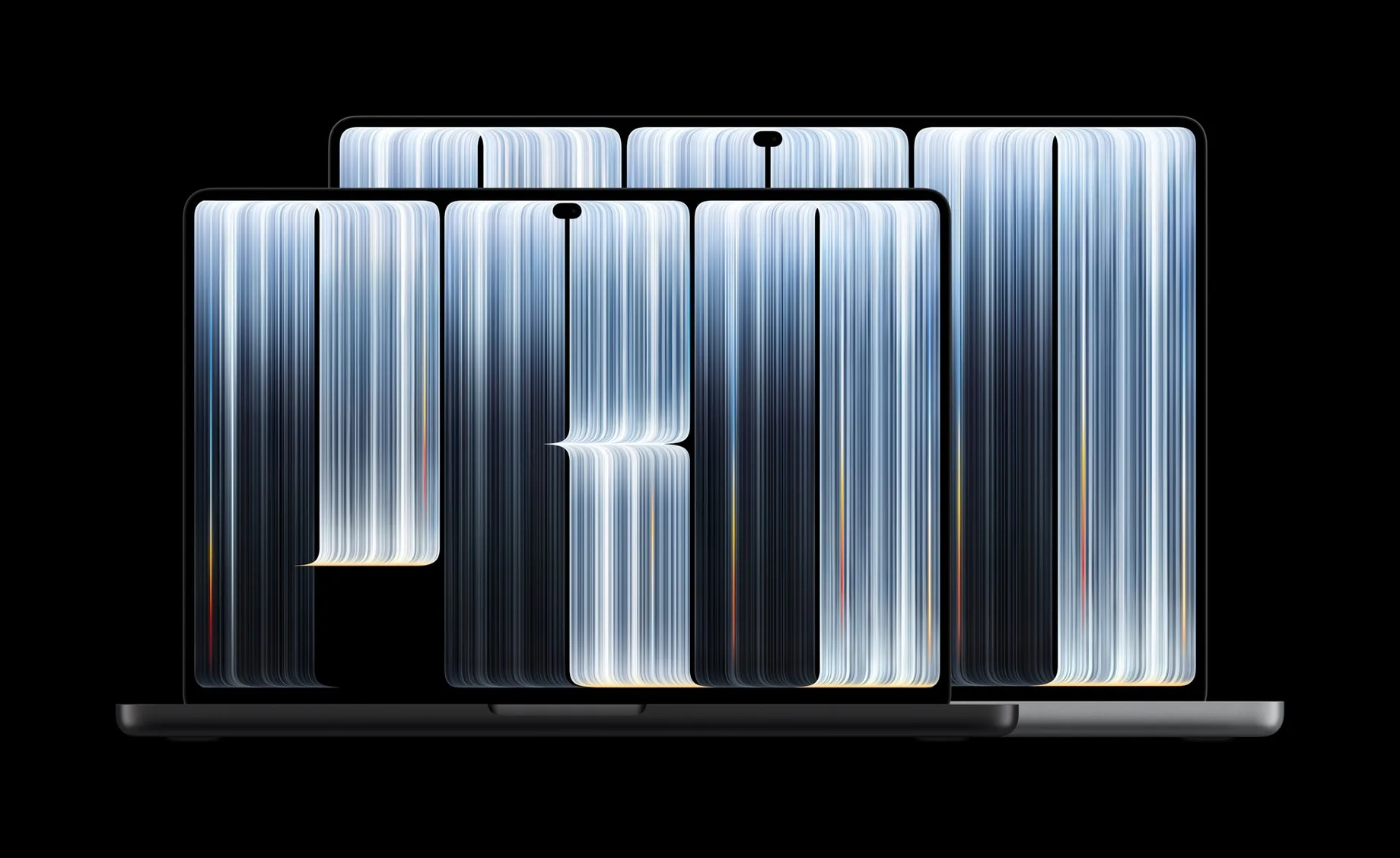
Image: Apple Newsroom
Apple's own figures for the four US configurations:
| Model | Chip | Price (US) |
|---|---|---|
| 14-inch | M5 Pro | $2,899 |
| 16-inch | M5 Pro | $3,399 |
| 14-inch | M5 Max | $4,499 |
| 16-inch | M5 Max | $4,799 |
The display reaches up to 2,000 nits of brightness and refreshes at 10Hz to 120Hz. Apple says the touch sensor sits inside the display panel rather than on top of it, which it says reduces latency. Battery life is rated at up to 24 hours, and the 14-inch model weighs 3 pounds, half a pound less than before. All figures come from Apple's announcement.
How Does Touch Work on a Mac?
Touch on the new MacBook Pro works as an extra way to click, not a new interface. macOS turns every tap into a click, so any button or link that works with a trackpad also works with a finger. On top of that, Apple supports gestures such as swiping to scroll a page, pinching to zoom, double-tapping a window to fill the screen and flicking a window to tile it.
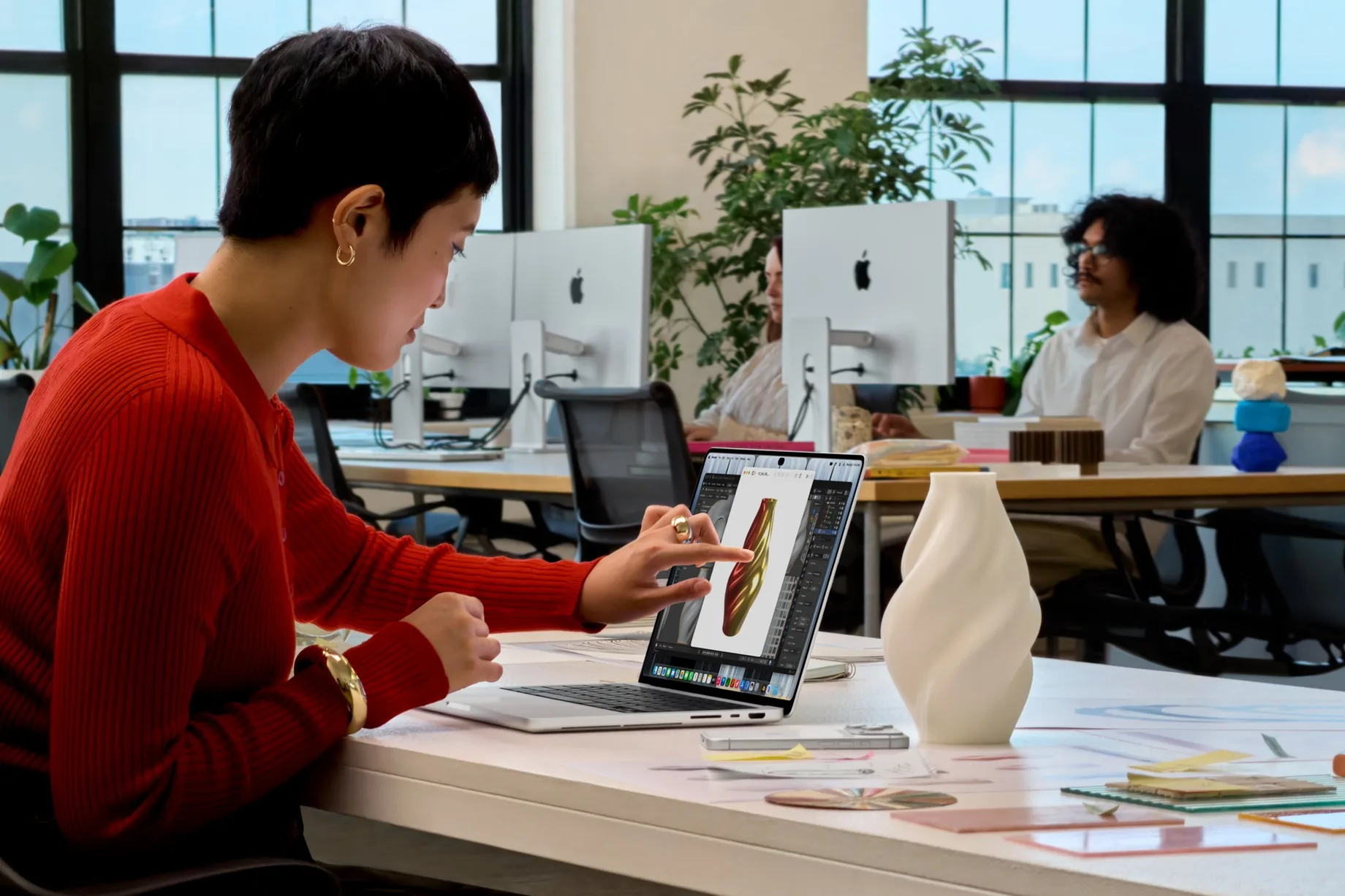
Image: Apple Newsroom
The rest of macOS adapts in small ways rather than turning into an iPad. In Apple's demos reported by MacRumors, menu items expand as a finger moves over them, and the red, yellow and green window buttons grow when touched so they are easier to hit. MacRumors also reports that macOS 27 adds iPhone-style pull-to-refresh in Safari, Mail and Calendar.
Early impressions suggest touch will be an occasional habit rather than the main way people use the laptop. CNBC, which tested both sizes briefly at Apple's event, wrote that touch is "entirely optional" and expects it to be most useful for scrolling through websites and documents CNBC. Scrolling and tapping links is exactly where your website comes in.
Why Does a Touchscreen Mac Matter for Websites?
A touchscreen Mac matters because many websites quietly assume that a wide screen means a mouse. They show phone-friendly menus and big buttons on narrow screens, and switch to hover menus, small icons and hover-only effects once the screen is wide enough to be a laptop. A MacBook Pro that can be tapped breaks that assumption: a full desktop layout, used with a finger.
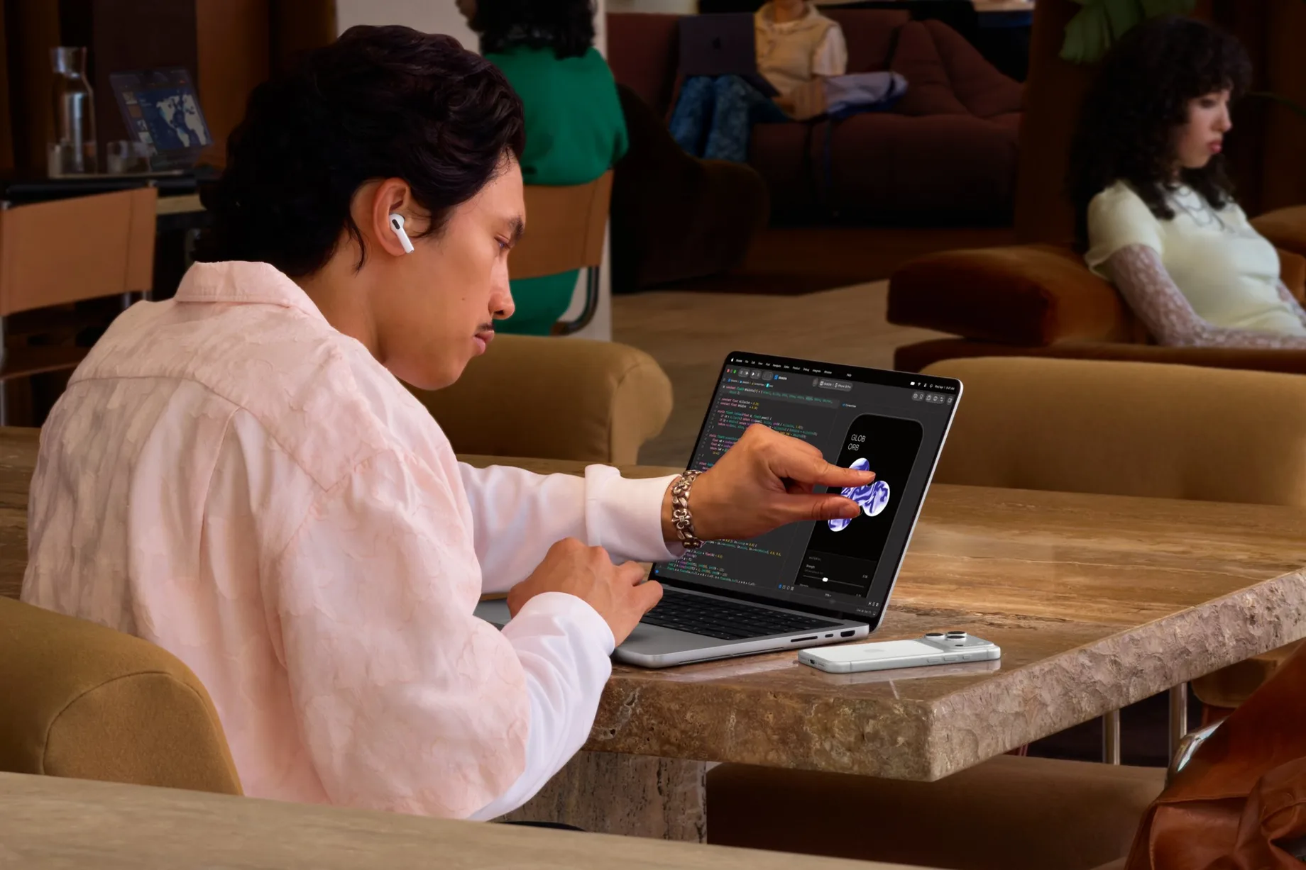
Image: Apple Newsroom
Touchscreen Windows laptops have exposed this gap for years. A touchscreen Mac adds the visitors many portfolio, agency and template sites are designed around, and the people who build those sites, to the group who can tap a desktop layout.
Three patterns break most often under a finger:
- Hover-only menus and tooltips. A finger has no hover state. If a dropdown opens only when the cursor rests on it, a tap may open and close it in one motion, or follow the top-level link before the menu ever appears.
- Content revealed on hover. Product cards and portfolio grids that show a "View" button, a price or a caption only on hover can leave that information hidden from someone who taps.
- Small targets packed close together. Social icons, close buttons and carousel dots sized for a precise cursor are easy to miss with a fingertip, and easy to hit the wrong one.
What Should You Check on Your Website Before November 6?
Open your site on any touchscreen you have (a phone in desktop mode, a touchscreen Windows laptop or an iPad with a keyboard) and work through these six checks. Each one helps phone visitors too, so none of it is wasted if few of your visitors buy the new Mac.
- Make every menu open on tap or click. A dropdown that opens on hover should also open on a click, and stay open until the visitor taps elsewhere. Never put the only link to a page inside a menu that needs hover to appear.
- Show hover-only information all the time, or on tap. If a card reveals its button or price on hover, show it by default on devices that can't hover, or reveal it on the first tap.
- Check your tap targets. Aim for at least 24 by 24 CSS pixels for every link and button, the level AA minimum in WCAG 2.2, and 44 by 44 for important controls such as menu buttons and close icons, the stricter level AAA target.
- Base hover styles on the input, not the screen width. CSS can ask whether any input can hover, rather than guessing from the width of the window. The any-hover and any-pointer media features exist for exactly this. A finger counts as a "coarse" pointer, a mouse as a "fine" one.
- Make sliders and carousels swipeable. Galleries that only move with small arrow buttons feel broken when a visitor tries to swipe them. Check that a horizontal swipe moves the slider and a vertical swipe still scrolls the page.
- Leave zoom alone. Apple lists pinch to zoom among the Mac's touch gestures. Don't disable zooming on your pages; visitors on any device may need it to read small text.
What Don't We Know Yet?
Several details will only become clear once the laptops reach buyers on November 6. Apple's announcement doesn't say how Safari and other browsers will describe a touchscreen Mac to websites: whether a site asking "can this device hover?" will hear yes because of the trackpad, or see the touchscreen as well. Test your own pages on the real hardware, or ask a visitor who has one, before relying on either answer.
It also isn't known how often owners will actually touch the screen. Hands-on reports so far are based on short sessions at Apple's event. Apple says touch-updated versions of apps such as Notion, Canva, Lightroom and DaVinci Resolve arrive "later this year", so the habit may grow as more software is designed for fingers.
Does This Affect Website Templates?
It does, because many templates lean on hover effects to look polished in a demo. Before you buy one, open the live demo on a touchscreen and tap through the menu, the cards and any slider. When we score templates, development quality includes how a site behaves on phones and tablets, and that same test now covers tapping a desktop layout. Our scoring method explains what we check, and our guide to comparing templates without opening 30 tabs shows how to shortlist faster.
If you're not sure which platform a site you like was built with, our website builder checker tells you in a few seconds.
Touch-Readiness Checklist
| Check | Problem it prevents | Target |
|---|---|---|
| Menus open on tap | Pages hidden behind hover menus | Every dropdown |
| Hover info shown on touch | Hidden prices, buttons, captions | Cards and grids |
| Tap target size | Missed or wrong taps | 24px minimum, 44px for key controls |
| Hover styles by input | Desktop layout that can't be tapped | any-hover, any-pointer |
| Swipeable sliders | Galleries that won't move | Every carousel |
| Zoom allowed | Unreadable small text | All pages |
How to Cite
You're welcome to use this checklist and these figures in your own writing. Please credit BestWebsiteTemplate.com and link to this page.