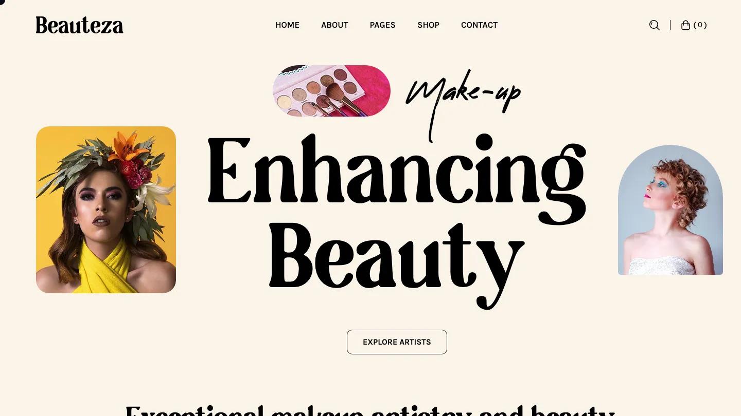
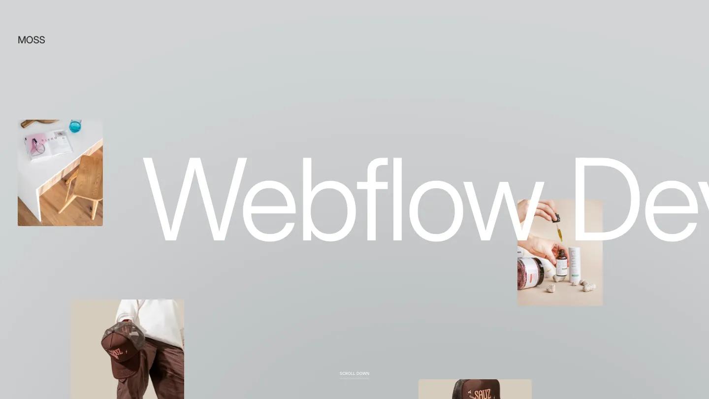
GLINTIFY is a high-quality Webflow template for Retail & E-commerce, Digital Products, Fashion & Accessories by STUDIOP DIGITAL DESIGN.
Our Review of GLINTIFY
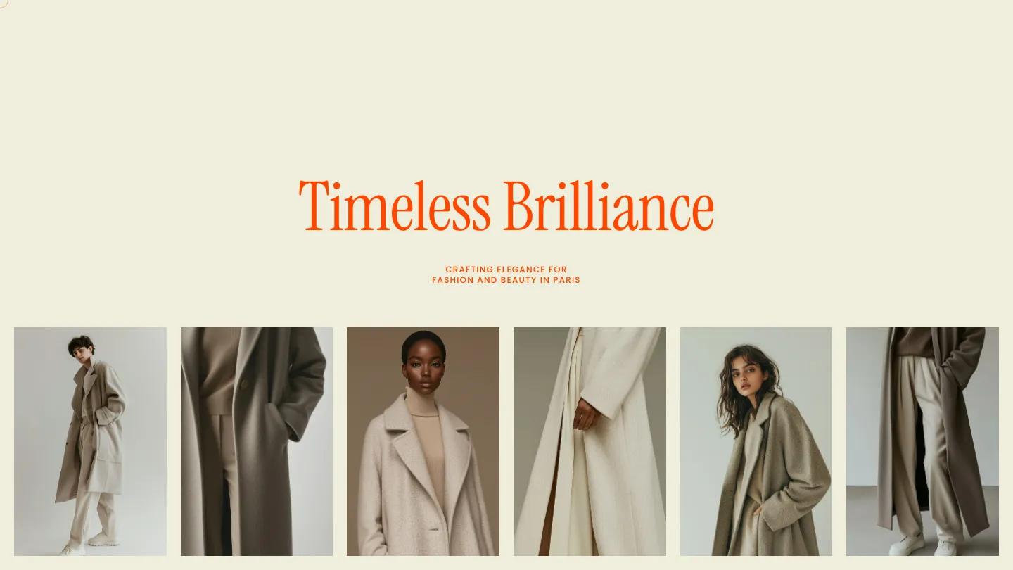
GLINTIFY is a small fashion store built for a label that sells a tight edit of clothes and wants the page to feel like a lookbook. The whole site uses one bright red-orange on warm cream. The hero is mostly empty space: "Timeless Brilliance" in tall, narrow Instrument Serif, a tiny uppercase line about fashion and beauty in Paris, and a row of portrait photos of models in camel and oatmeal coats running edge to edge underneath. The header spreads Menu, Shop, Collection, and Cart across the top with a chunky custom wordmark in the middle.
STUDIOP DIGITAL DESIGN keeps the homepage short and calm. A 25 SS Collection heading splits across the full width with the words pushed to opposite edges, and two large product tiles layer a smaller portrait over a cropped close-up of the fabric, with the product name and price set in white serif. A centered About paragraph follows, then a stacked list of category words, Shoes, Acc, Bag, and Wear, set huge in the serif with an outlined Shop All pill below. The footer repeats the brand line and links to Article, About, and Stockist pages. The Shop page lines the categories up in one row as filters over a four-column product grid with serif names and small caps prices, and a thin circle follows the cursor.
On a phone, the header trims to Menu, wordmark, and Cart, though the hero opens with a tall stretch of empty cream before the headline appears.
We'd pick GLINTIFY for boutique clothing labels with a small, carefully shot collection. The single orange carries every word on the page, so it has to suit your brand. And the design leans entirely on matching, muted product photography, which means a mixed catalog will look out of place.
Based on the live demo, viewed on desktop and on a phone. The Design and Dev scores come from separate independent reviews. See how we score templates.
Independently evaluated by our team of 6 designers and 5 developers.











Designers score design, developers score development, and each score is the average of their independent ratings. Read about our review team and how we score templates.