Melrose Beans is a high-quality Webflow template for Food & Drink by Head and Heart.
Our Review of Melrose Beans
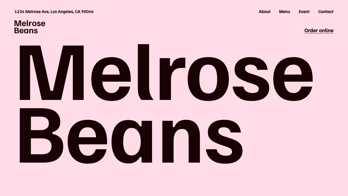
Melrose Beans is a café website with a big, cheerful voice. The hero is the shop name and nothing else, set in heavy Familjen Grotesk so large that the two words fill the whole screen in dark brown on a soft pink. An address and stacked logo sit at the top left, and About, Menu, Event, Contact plus an underlined Order online link line up on the right. Scroll a little and a slow, close-up coffee video takes over the screen under a short white tagline.
Head and Heart builds most of the homepage around the menu itself. Hot Drinks, Cold Drinks, and Baked Treats each get a giant heading followed by a clean price list on a lime green background, with thin white rules between rows, size columns for drinks, a tiny "hits!" tag next to favorites, and a note on add-ons. Each list ends with a Go to menu link. More short video bands break up the lists, an Event section covers café happenings like a local art show, and the page closes on "Every cup is made just for you" in pink and lime over a blurred photo, then a coffee bean footer with contact details. The About page opens with an oversized About heading and a little steaming cup icon on lime.
On a phone, the name still takes over the pink screen in two lines, and the links fold into a two-line menu icon beside the address.
We'd pick Melrose Beans for a neighborhood coffee shop or bakery with a short, stable menu. The homepage runs very long because every menu item is listed, so we'd shorten the lists to favorites. The sticky header also has no background, and on scroll the logo overlaps the menu rows behind it. Worth fixing early.
Based on the live demo, viewed on desktop and on a phone. The Design and Dev scores come from separate independent reviews. See how we score templates.
Independently evaluated by our team of 6 designers and 5 developers.











Designers score design, developers score development, and each score is the average of their independent ratings. Read about our review team and how we score templates.