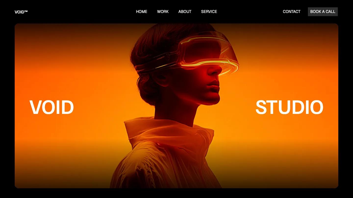
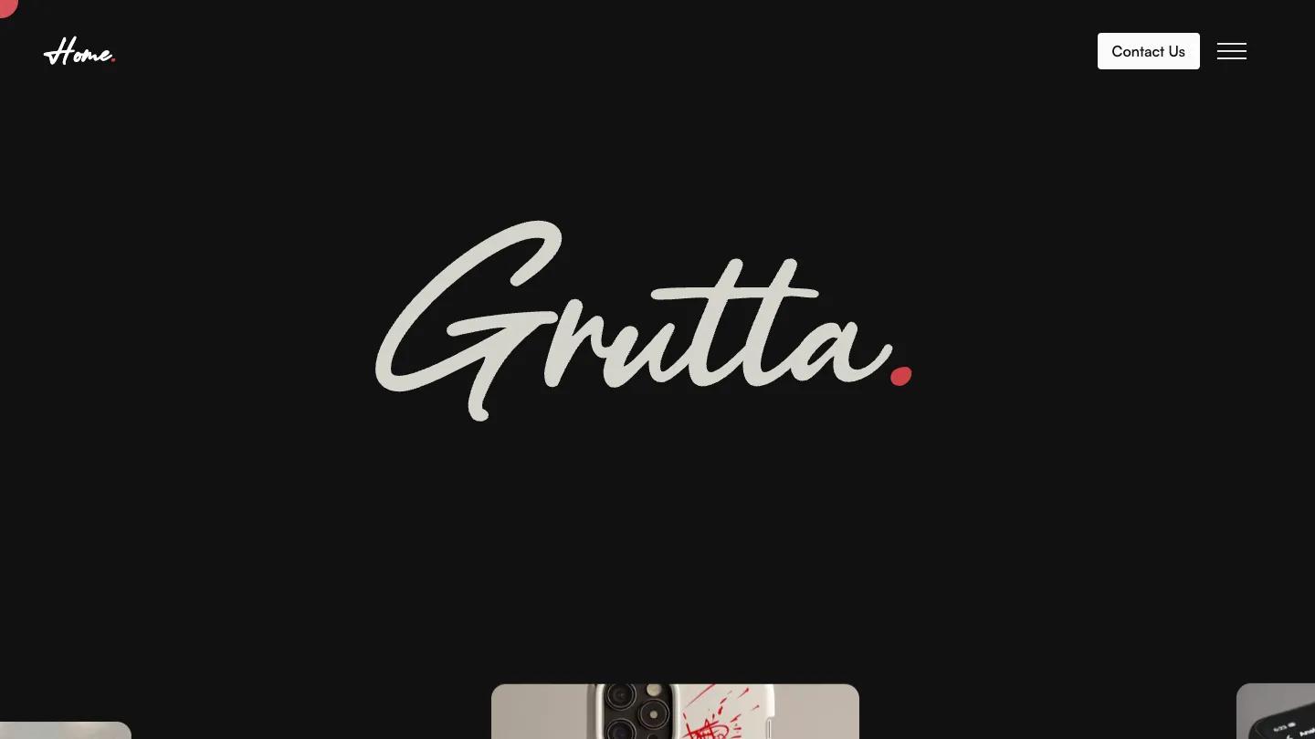
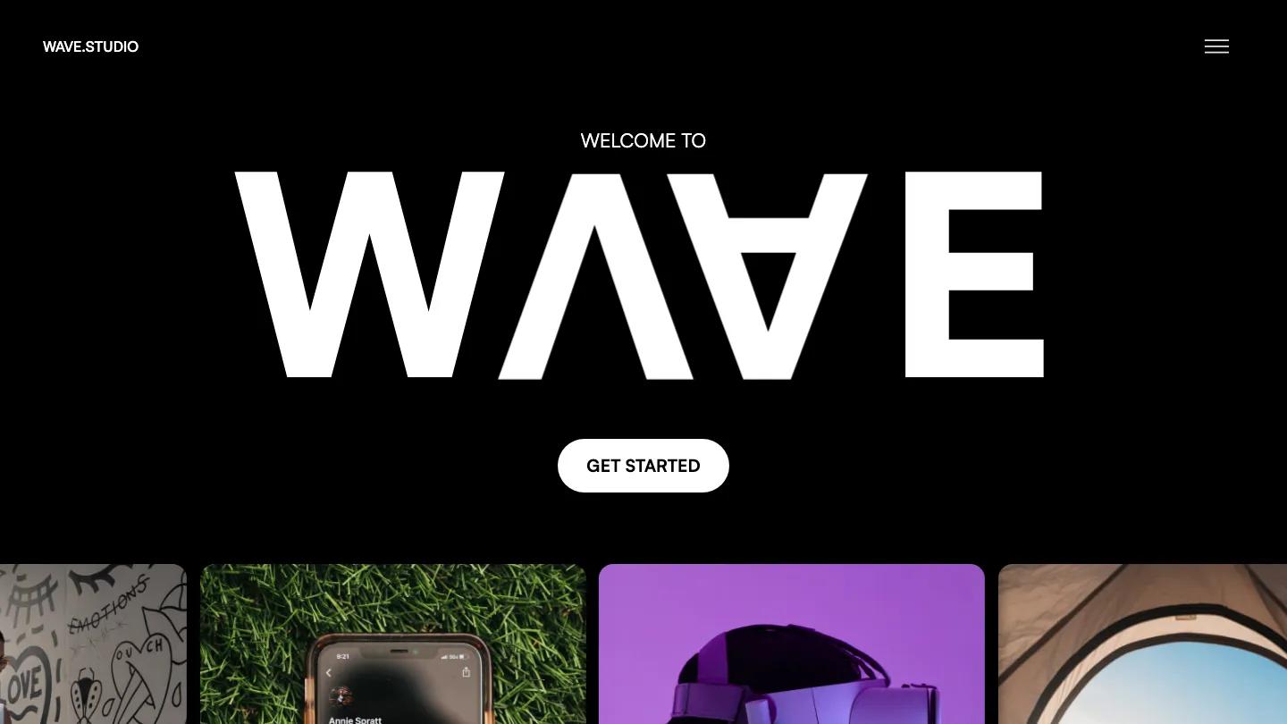
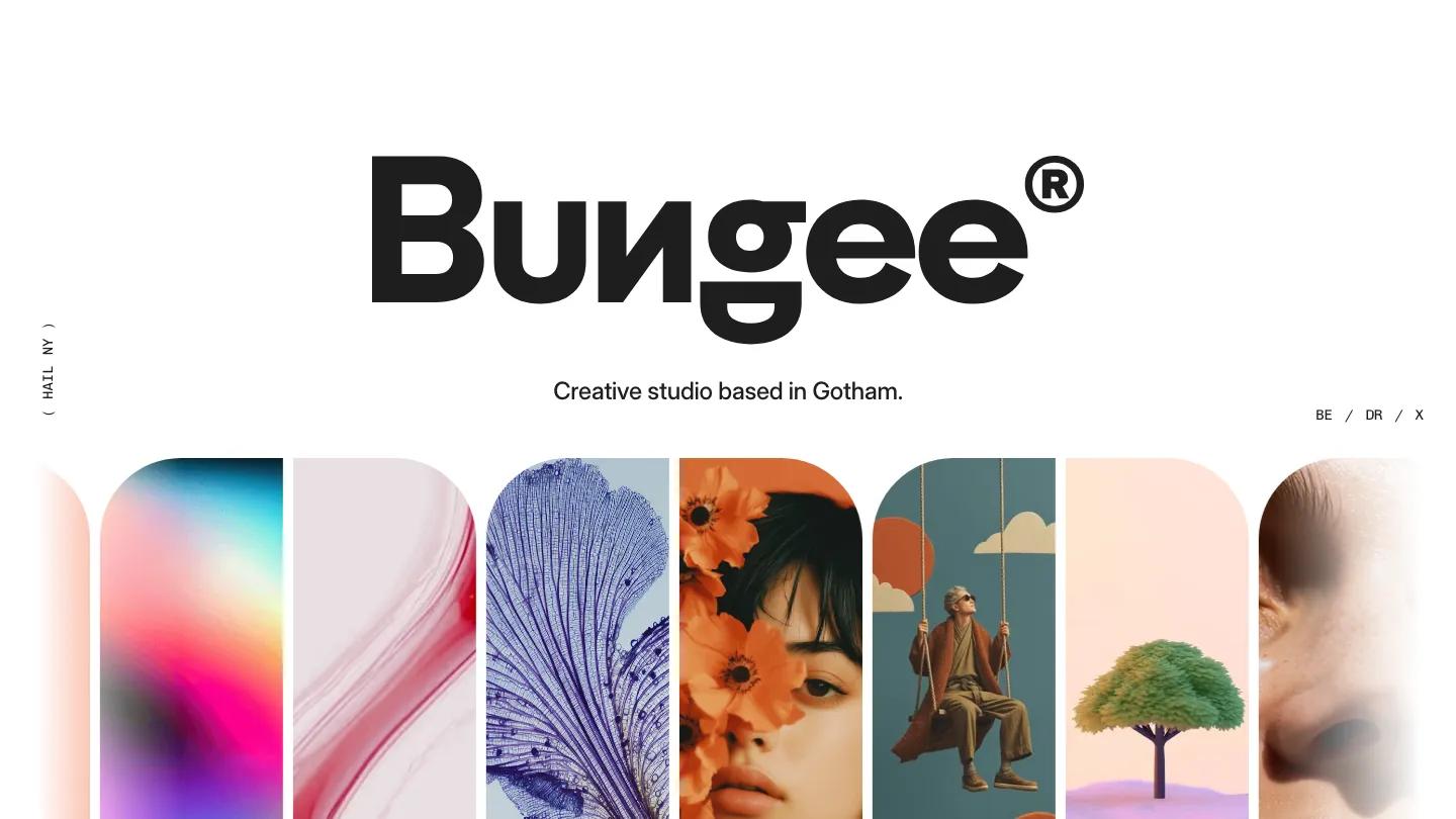
Two is a high-quality Webflow template for Portfolio & Agency, Professional Services, Business & Startup by Jacob Nielsen.
Our Review of Two
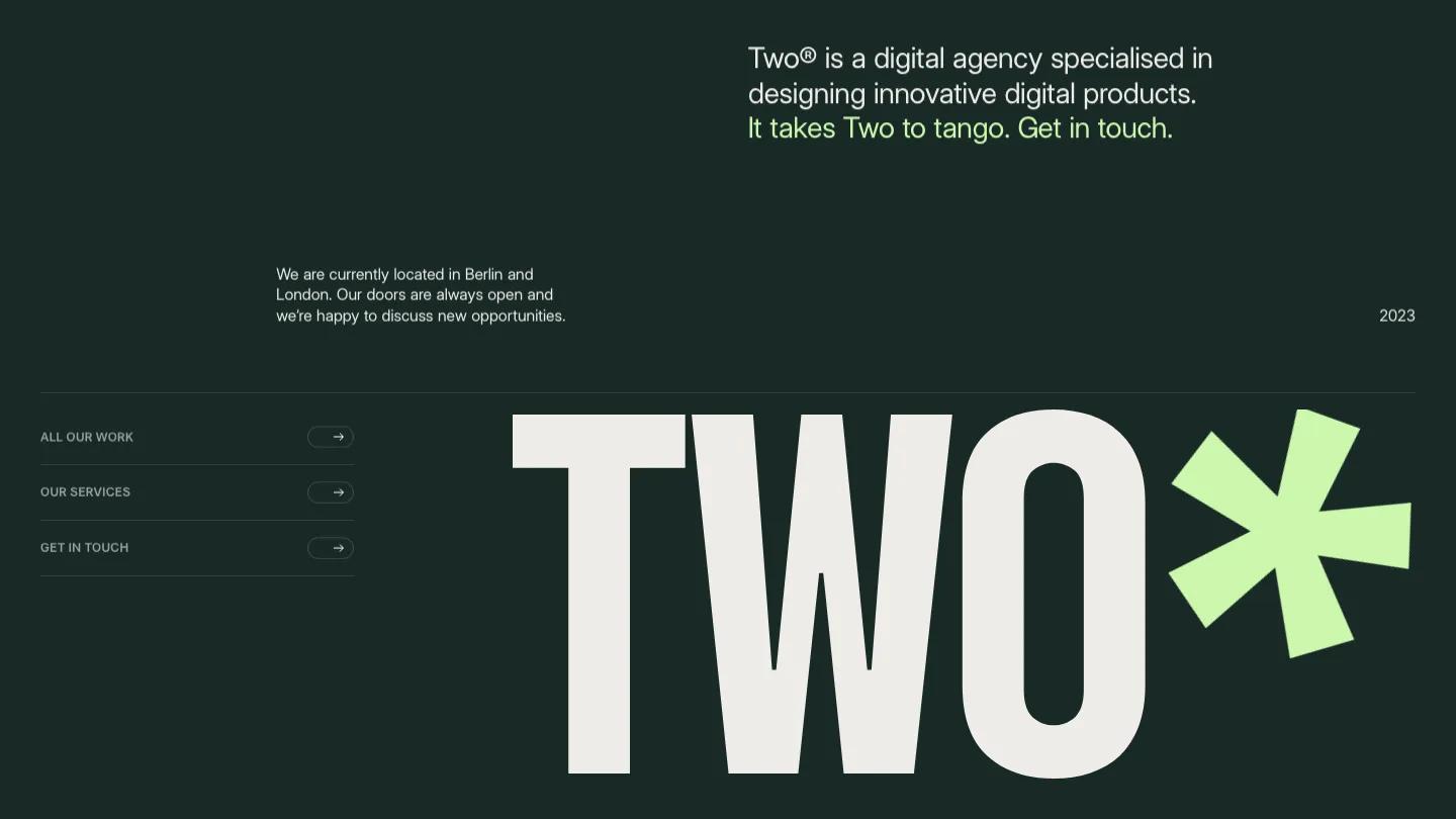
Two is a Webflow template by Jacob Nielsen for a small digital or branding agency, and it opens with the studio name in towering condensed capitals next to a big lime green asterisk. The background is a deep forest green, nearly black, with off-white type and that soft lime used sparingly for the asterisk and one line of the intro. Above the wordmark, a short agency description and a location note sit in clean Inter Display, and three outlined arrow links point to work, services and contact.
Below the hero, a wide video panel with a Play Video label introduces the team, then a Hello section pairs a giant greeting with a paragraph about the agency. Featured work runs as full-width project cards with the name in the corner, a one-line summary and the year. Services are listed as huge numbered words, Strategy, Design and Coding, divided by thin rules, followed by a testimonial slider, a light journal block with two posts, and a Get in Touch line that scrolls across the screen above a big lime arrow. The work page repeats the giant heading with a two-column project grid. We like how much the type does here: with only the big words, a few rules and the asterisk, the site looks confident without a single decorative graphic.
On a 390px phone the wordmark and asterisk still fill the width, the intro moves above them, and the three arrow links stack as full-width rows.
We'd pick Two for a two or three person studio with strong mockup and packaging shots. It needs that imagery, though: every project card is a full-width photo, so a portfolio of screenshots or small graphics will feel thin in this layout.
Based on the live demo, viewed on desktop and on a phone. The Design and Dev scores come from separate independent reviews. See how we score templates.
Independently evaluated by our team of 6 designers and 5 developers.











Designers score design, developers score development, and each score is the average of their independent ratings. Read about our review team and how we score templates.