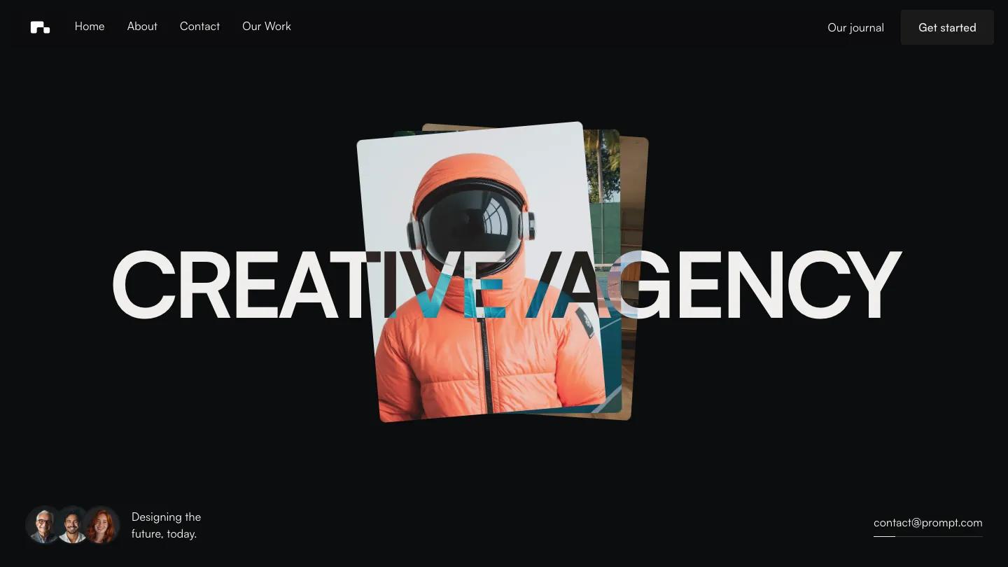
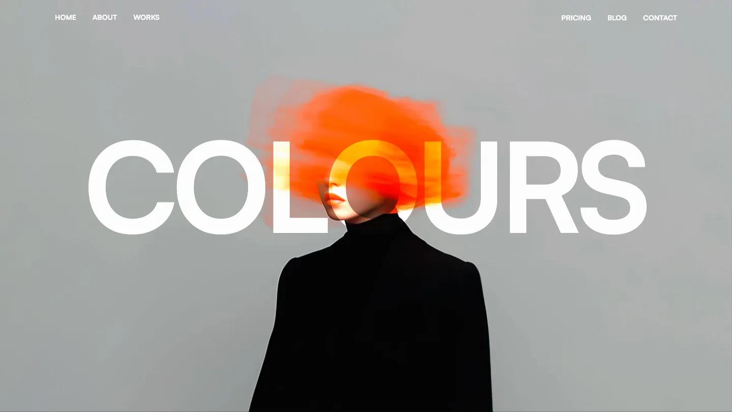
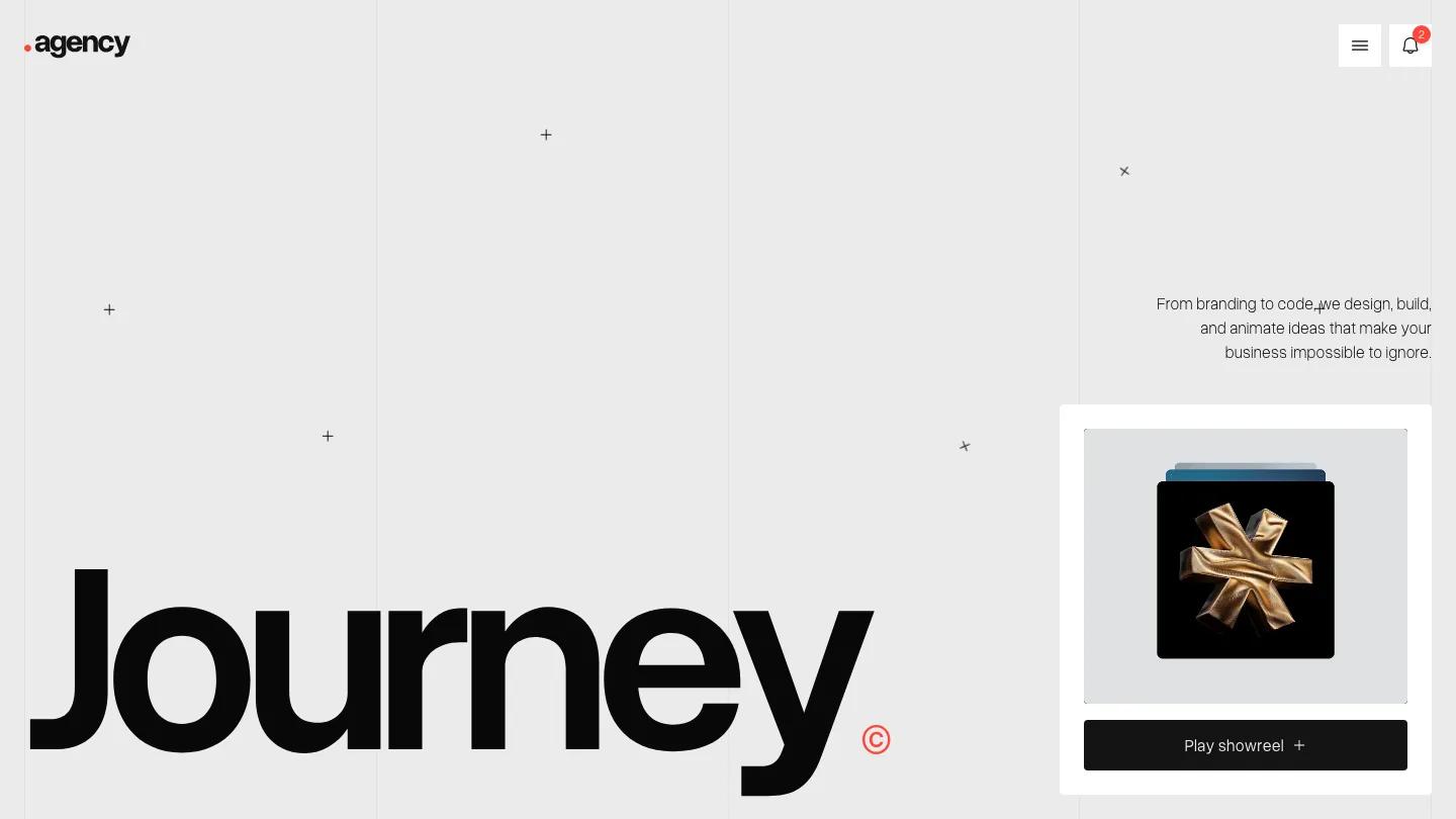
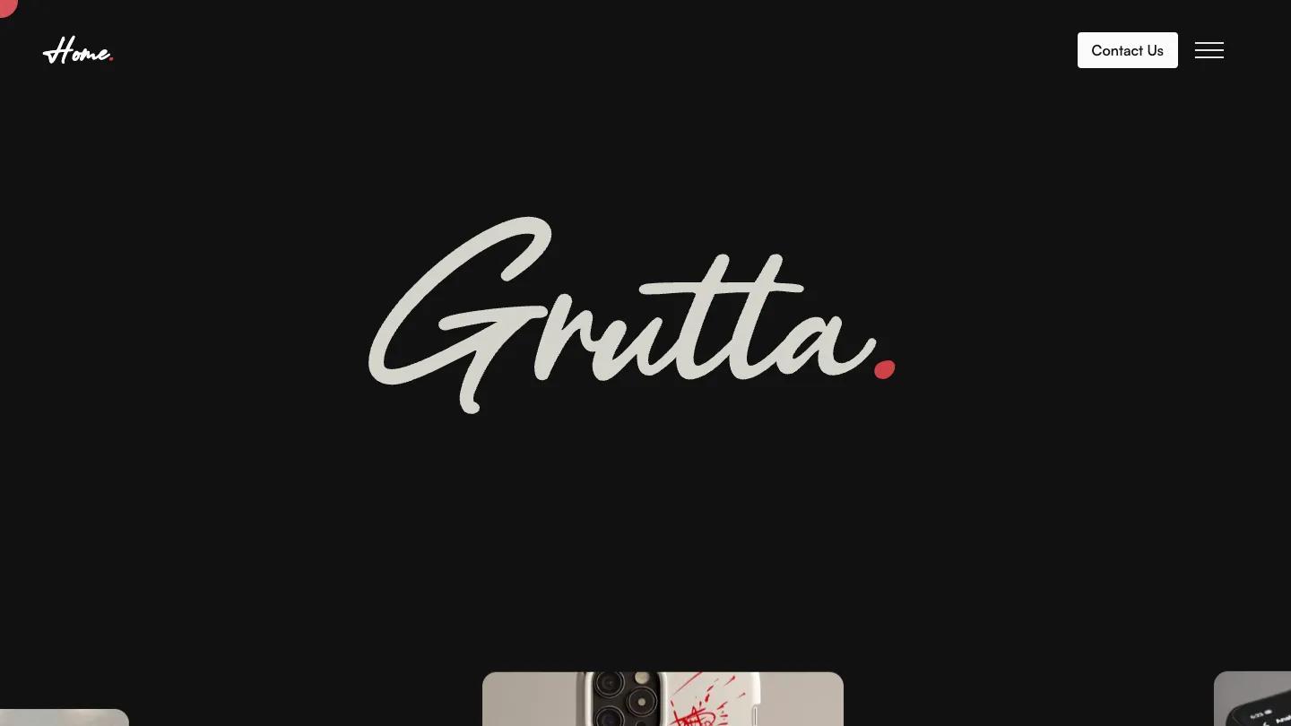
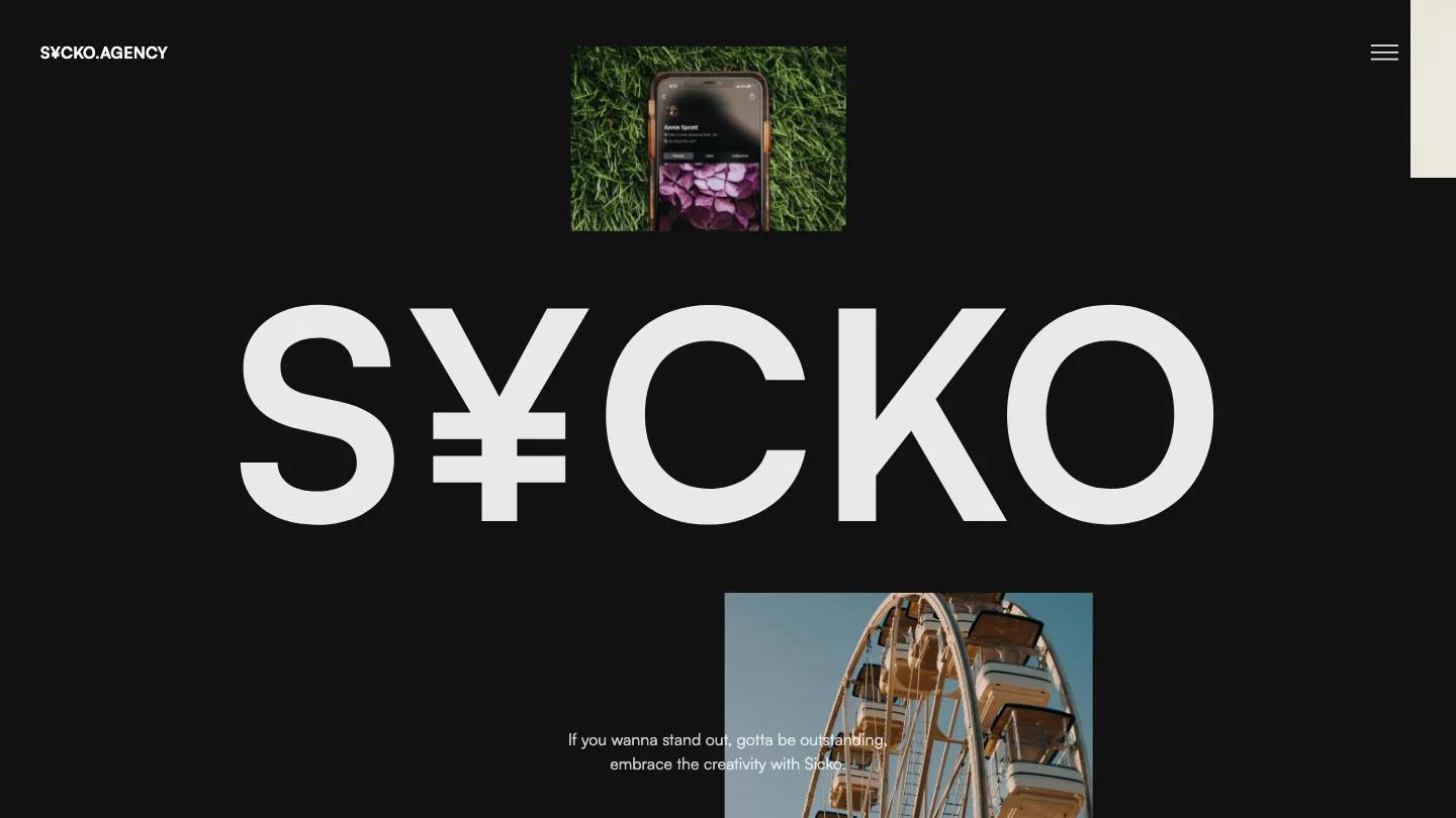
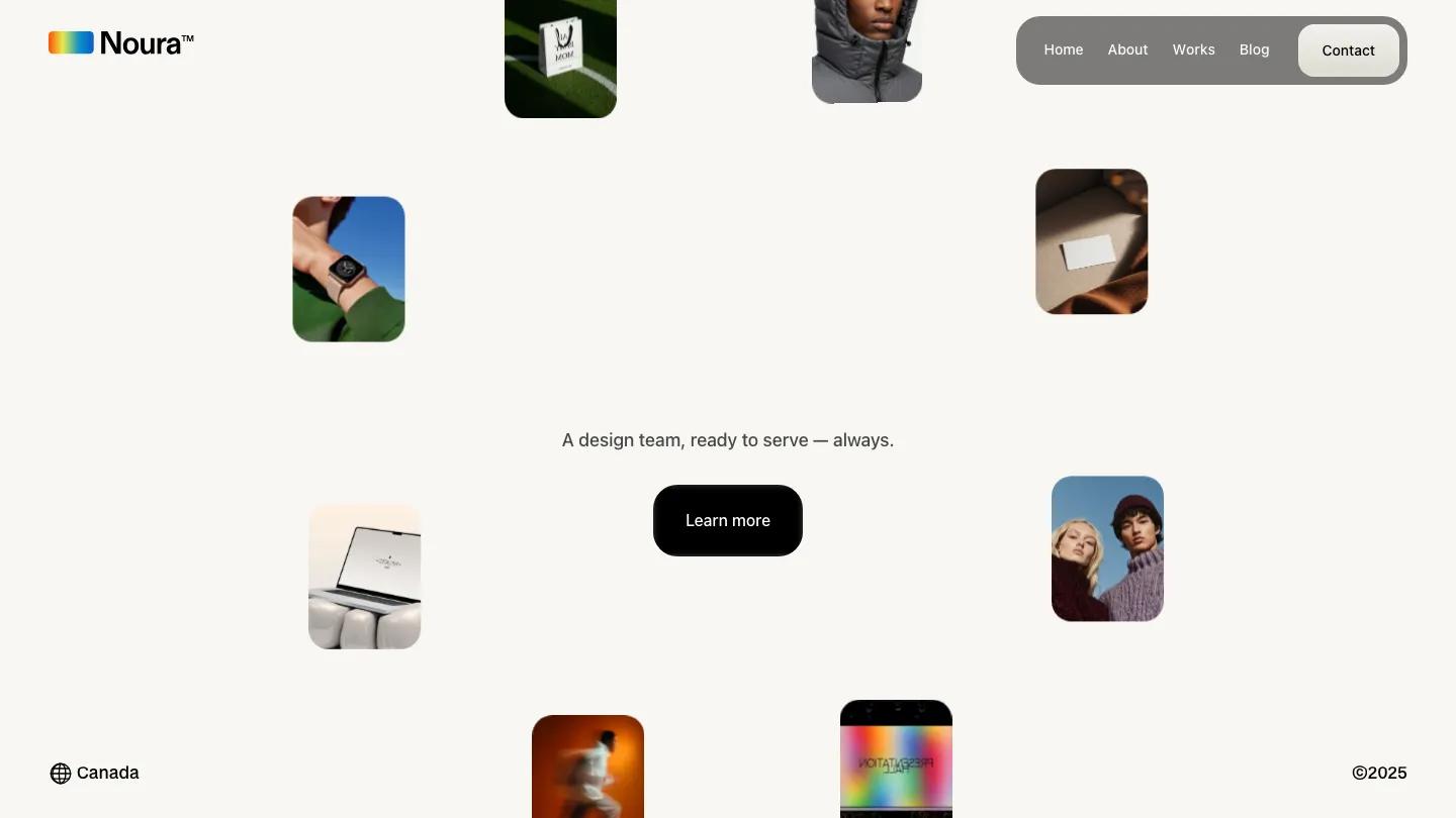
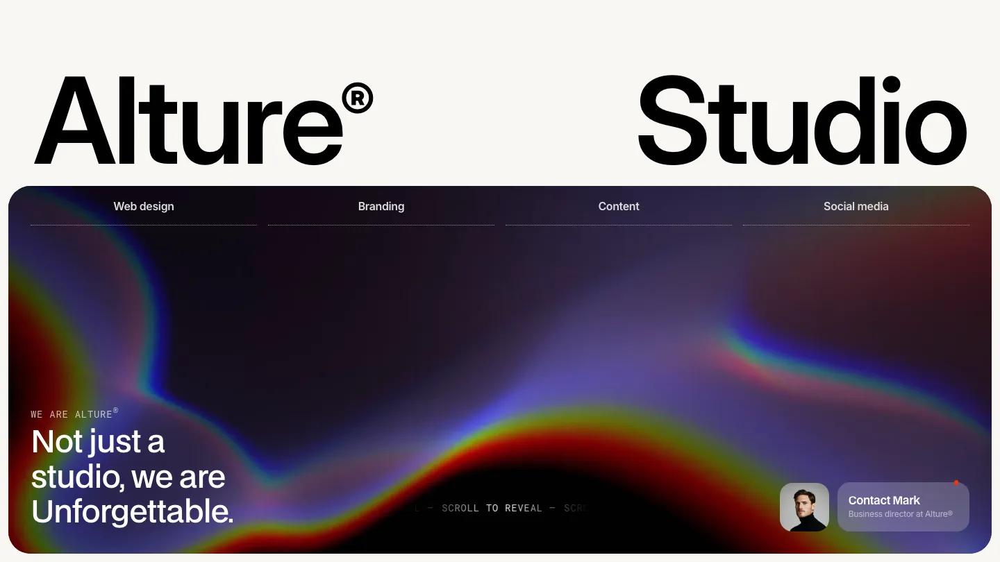
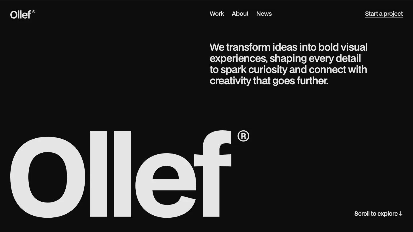
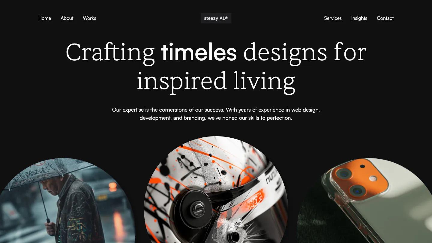
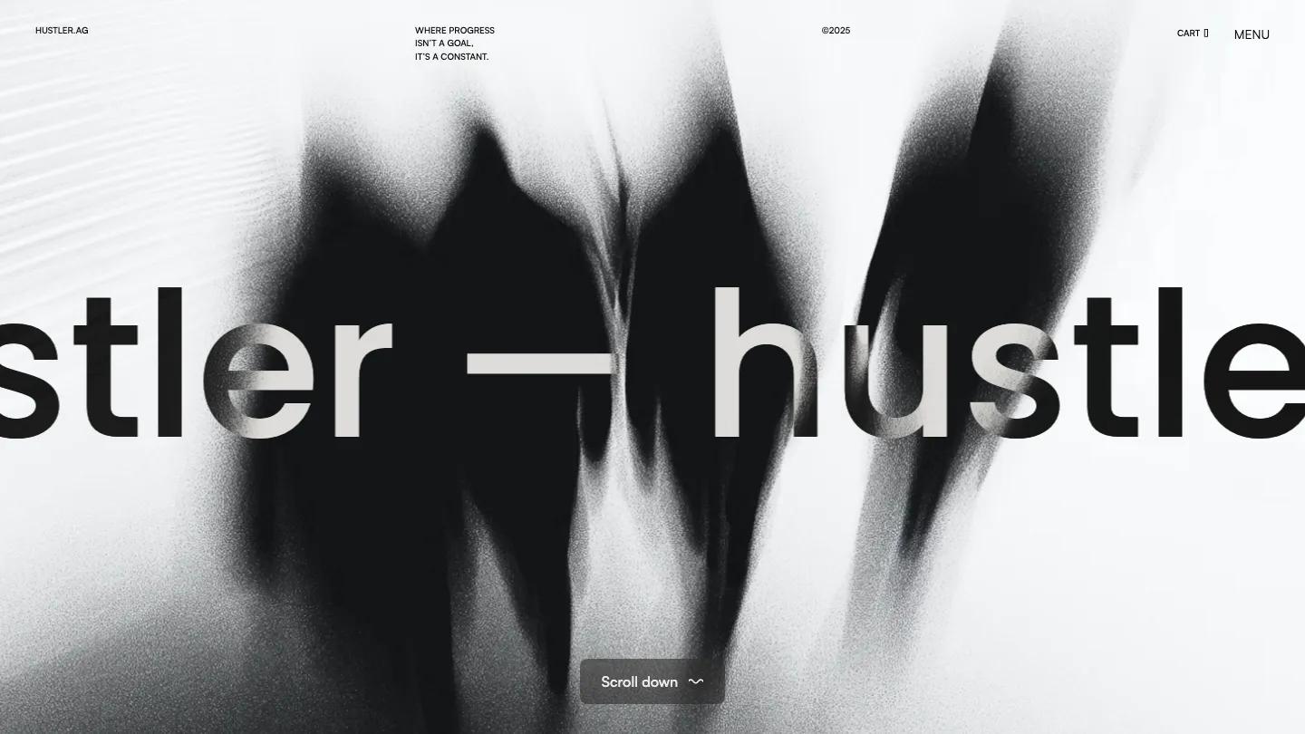
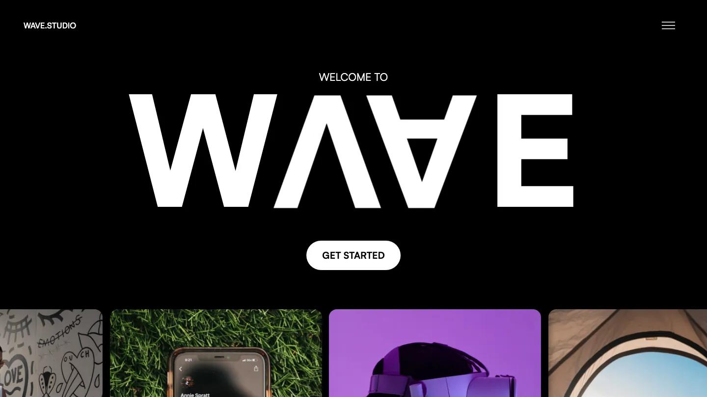
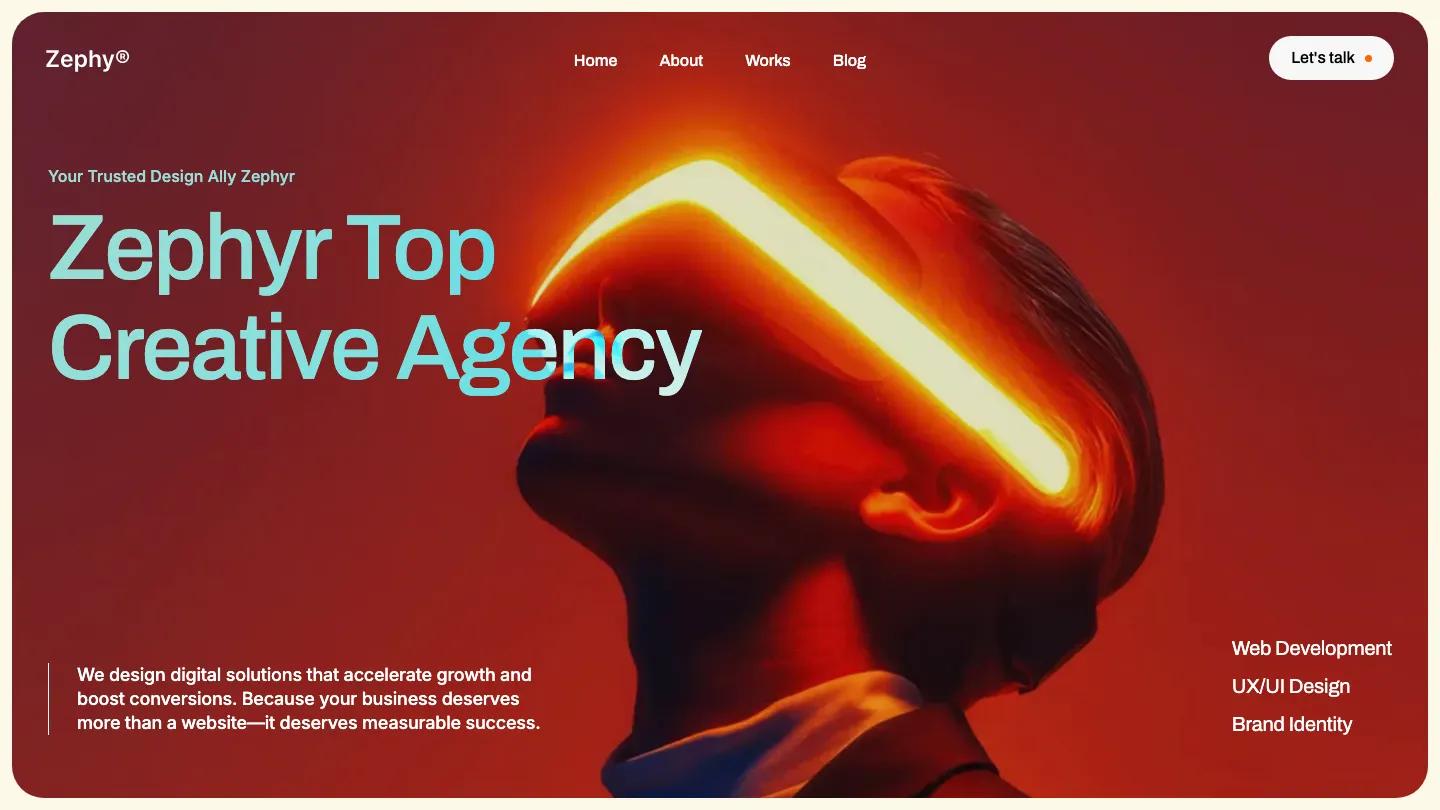
Inertia is a high-quality Webflow template for Portfolio & Agency, Professional Services, Business & Startup, Art & Design, Photography & Videography by Lucas Gusso.

Our Review of Inertia
Inertia is a dark, motion-heavy site for creative agencies and digital studios, and its first screen is calm before things start moving. A small white square with a four-point star sits above the headline, "We give brands the momentum to grow", set in light Satoshi on near-black. Below it, a strip of rounded photo tiles overlaps like a fanned deck, with a handwritten Hover me note and arrow inviting you to play. A single Get Started button and a scrolling row of client logos finish the hero, and the header holds only a copyright year and a Menu link.
Lucas Gusso's demo homepage is a showcase of every page, with each layout shown in a dark card, so buyers launch from one of the home variants. Ours opens with a statement line that tucks tiny inline photos between the words, then a large black and white portrait of a figure in a white hooded jacket with a small Let's work together cursor label. Selected Projects stacks wide cards with small pill tags like Motion, Web Design, and Branding over saturated imagery, from a pink and yellow 3D Horizon cover to a teal shot of a high jumper. A journal row of photo cards follows, and giant Digital Stories and Inertia Studio wordmarks scroll across the lower page.
On a phone, the headline wraps to three centered lines, the photo strip squeezes into a compact row, and the Get Started button stretches full width.
We'd pick Inertia for studios with colorful case study imagery and a taste for animation. Check the closing banner and contact pages before launch: they still mention another template's name and email addresses, and the client logos are placeholders to swap out.
Based on the live demo, viewed on desktop and on a phone. The Design and Dev scores come from separate independent reviews. See how we score templates.
Independently evaluated by our team of 6 designers and 5 developers.











Designers score design, developers score development, and each score is the average of their independent ratings. Read about our review team and how we score templates.