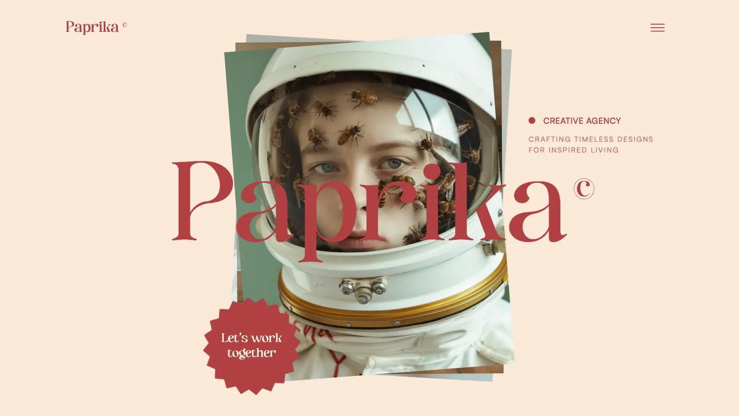
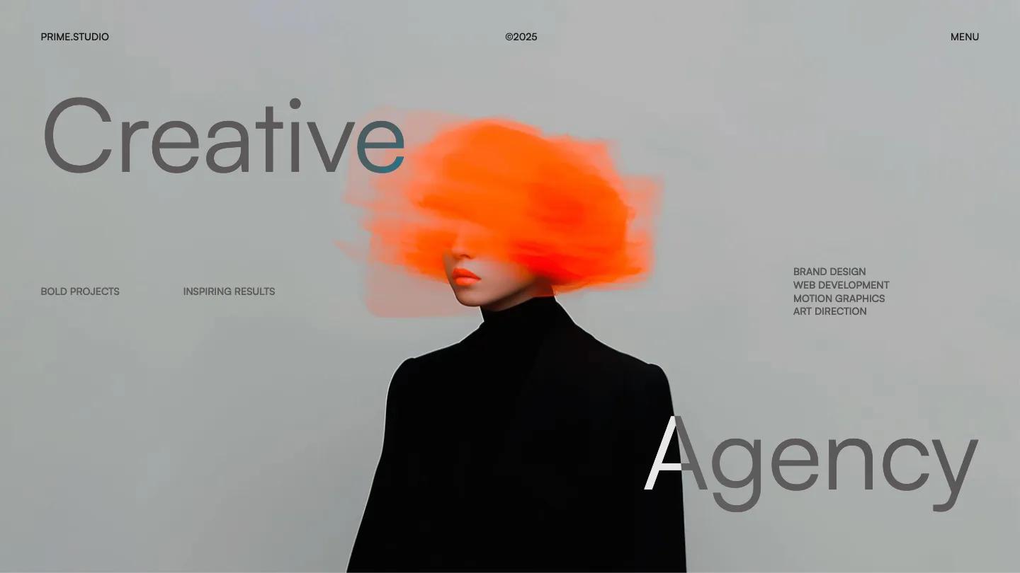
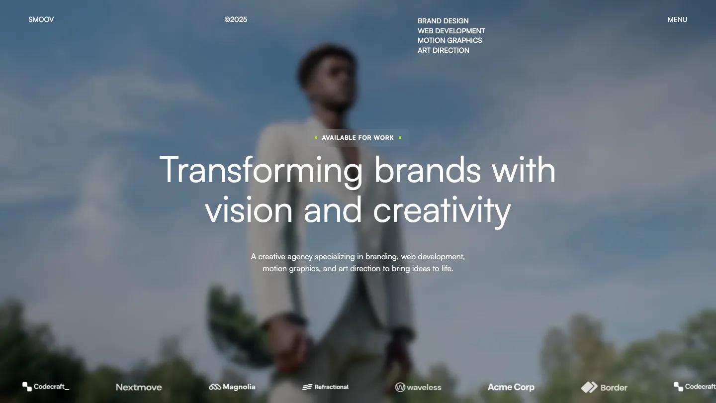
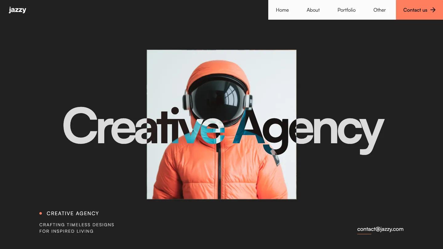
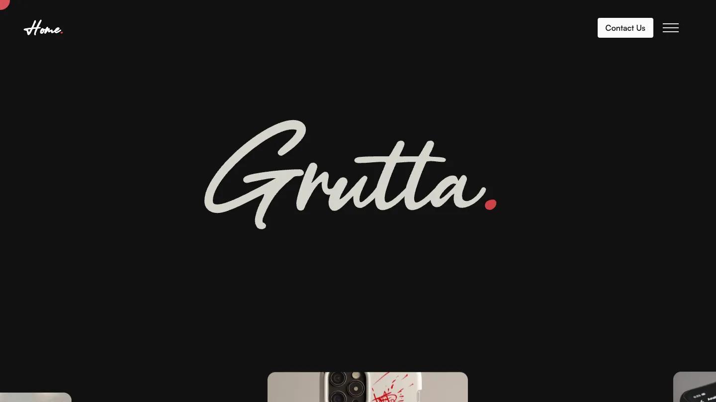
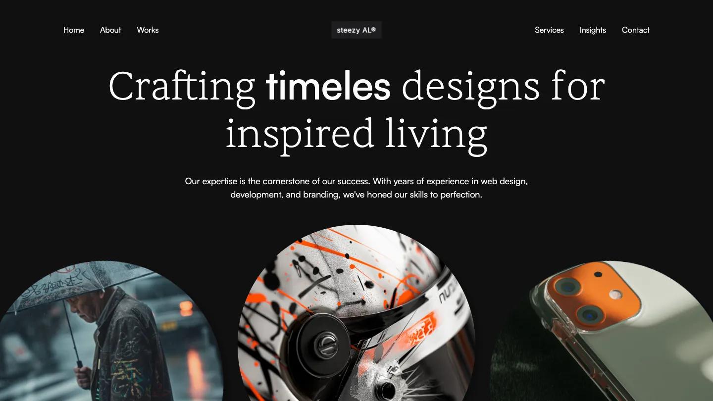
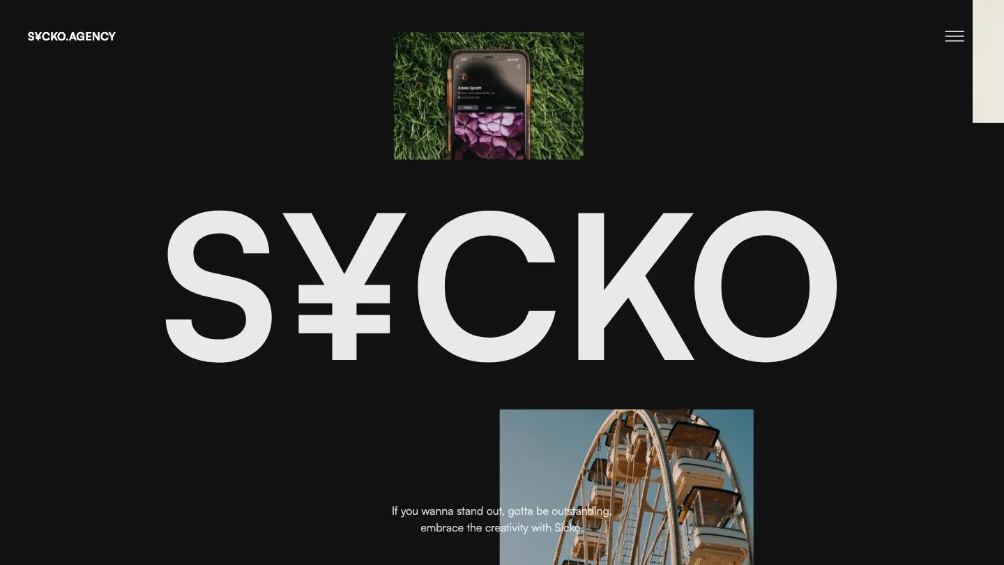
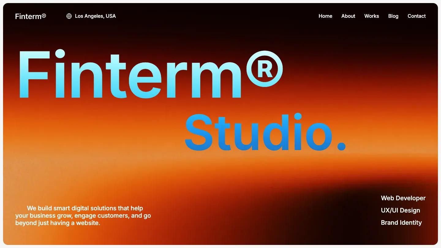
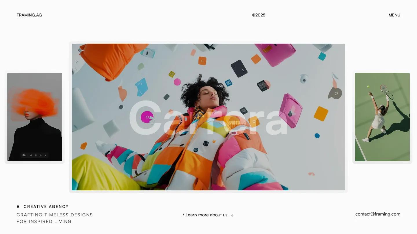
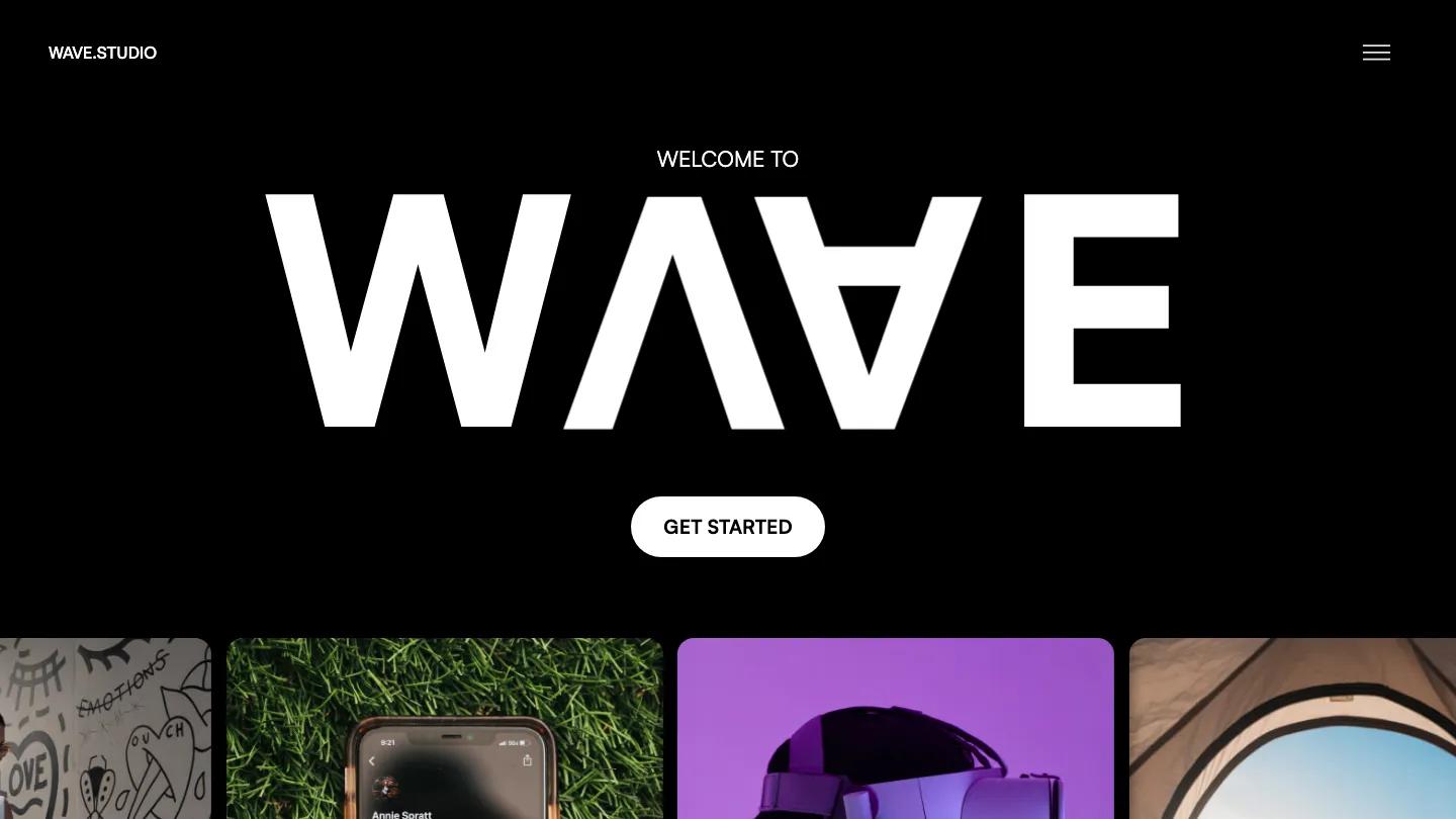
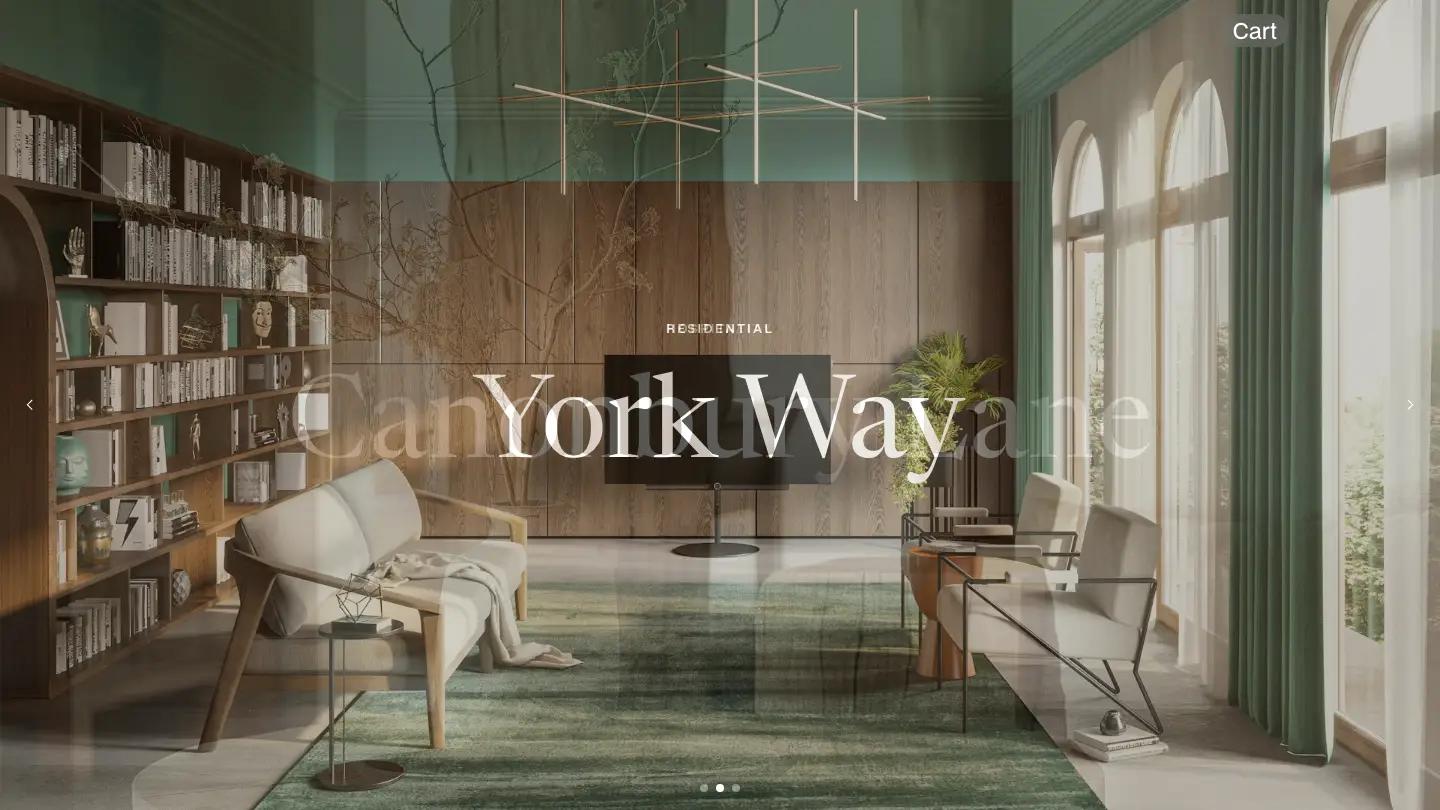
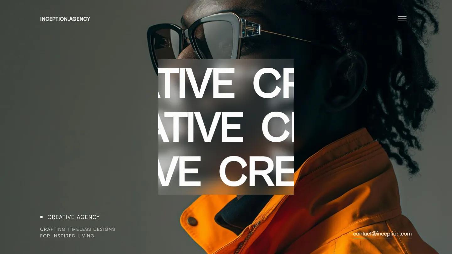
Klink is a high-quality Webflow template for Portfolio & Agency, Art & Design, Professional Services, Personal, Photography & Videography by Lucas Gusso.
Our Review of Klink
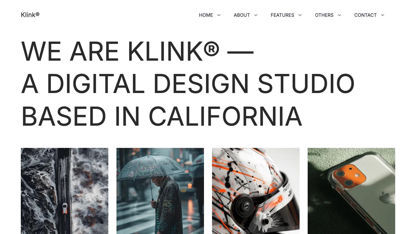
Klink is a light, typographic Webflow template for a small design studio, and it opens like an agency pitch. The hero is a single statement set in thin, uppercase Inter at a very large size, "We are Klink, a digital design studio based in California", on plain white. Below it sit four portrait project images in a tidy row. The header is minimal too, a Klink wordmark on the left and Home, About, Features, Others and Contact on the right, each with a small dropdown arrow.
Lucas Gusso builds the rest from simple, well-spaced blocks. Each project card carries a tiny category label and year above a short uppercase title, so the row reads like an index. A centered manifesto paragraph leads into a wide office photo cropped into a soft pill shape, then a bordered grid of client logos with a short line of copy under each. A big uppercase line about the team introduces the featured work, set as a staggered collage of different-sized images, each captioned with a bold title and a discipline. A grey marquee of Available for Work and Buy Klink runs across a black band before "Let's work together" and outlined buttons for an email and the template. The alternate home layouts open with a short Klink loader that counts up to a percentage.
On a phone, the hero headline centers and wraps over several lines, the menu becomes a hamburger icon, and the project images stack one per row.
We'd pick Klink for small studios and freelance designers who want a quiet, editorial site that lets project photography lead. The demo work uses famous brand names as project titles, so swap those out for your own clients. We'd also tone down the playful filler copy in the logo grid.
Based on the live demo, viewed on desktop and on a phone. The Design and Dev scores come from separate independent reviews. See how we score templates.
Independently evaluated by our team of 6 designers and 5 developers.











Designers score design, developers score development, and each score is the average of their independent ratings. Read about our review team and how we score templates.