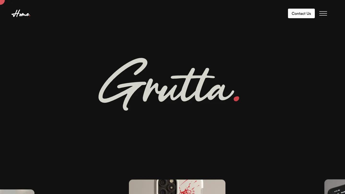
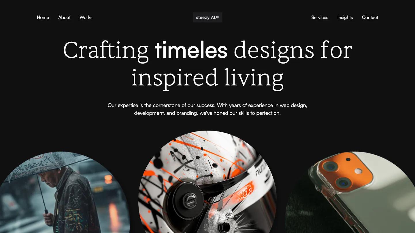
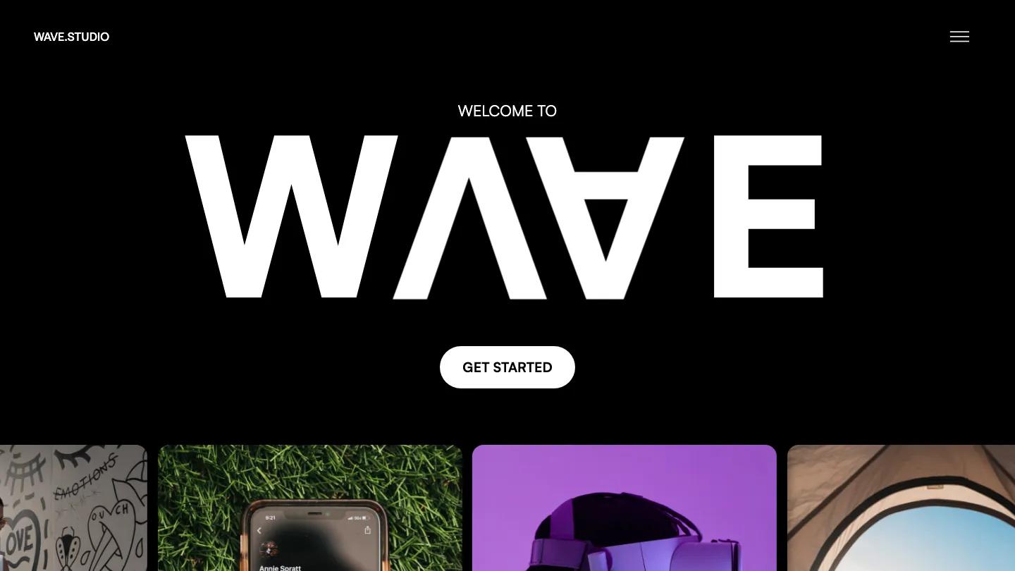
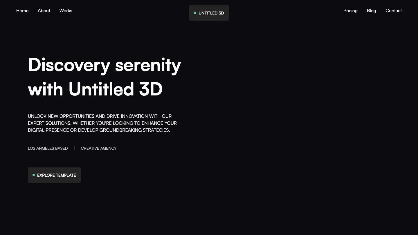
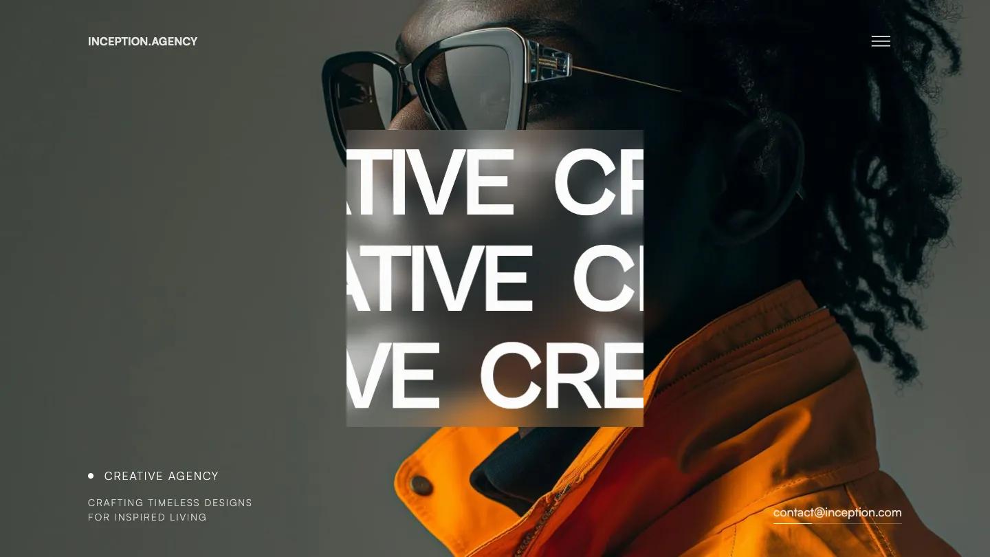
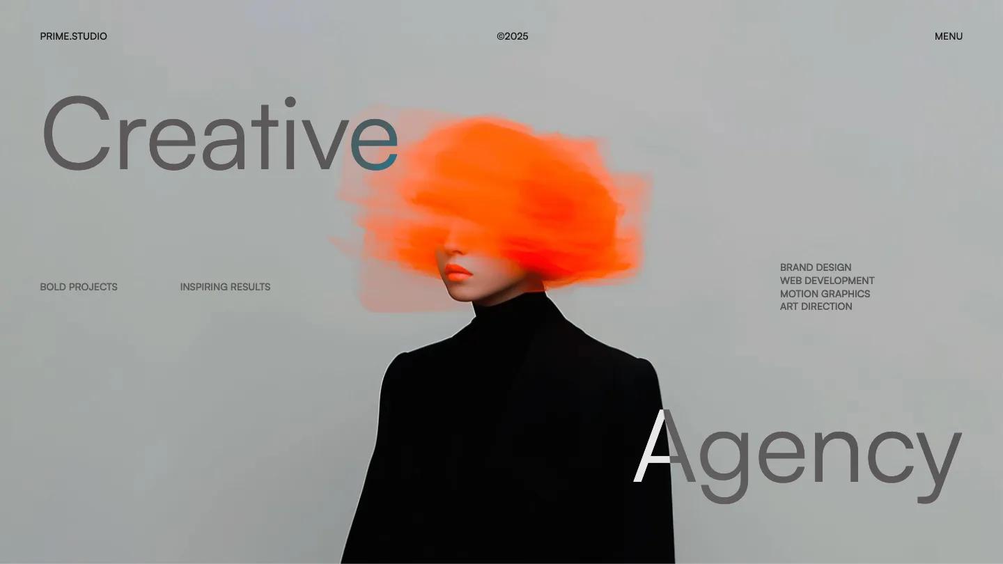
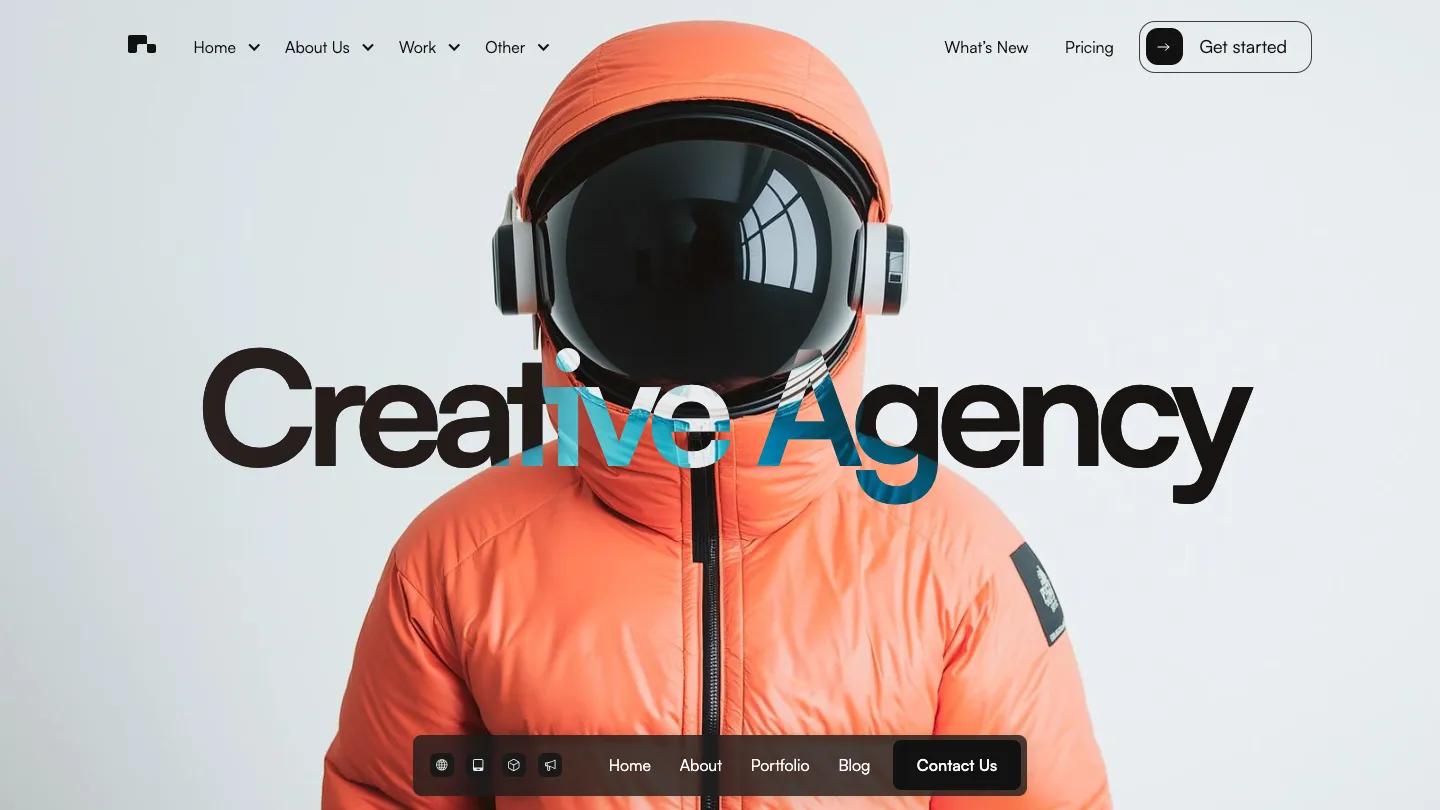
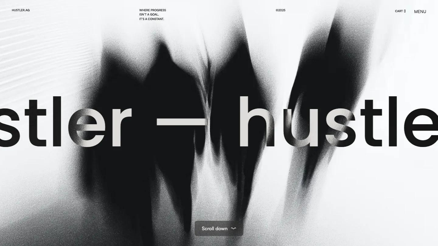
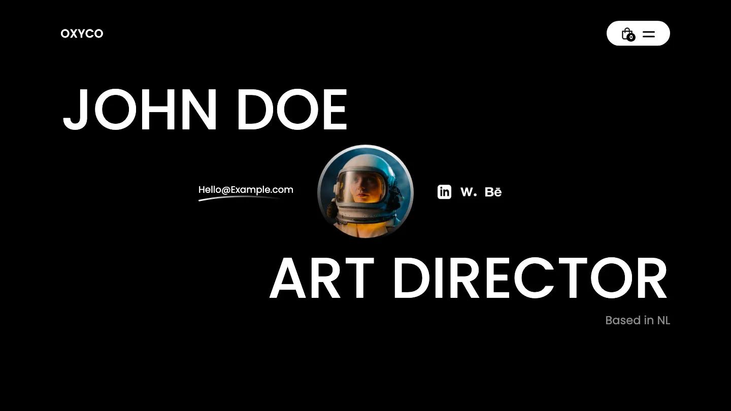
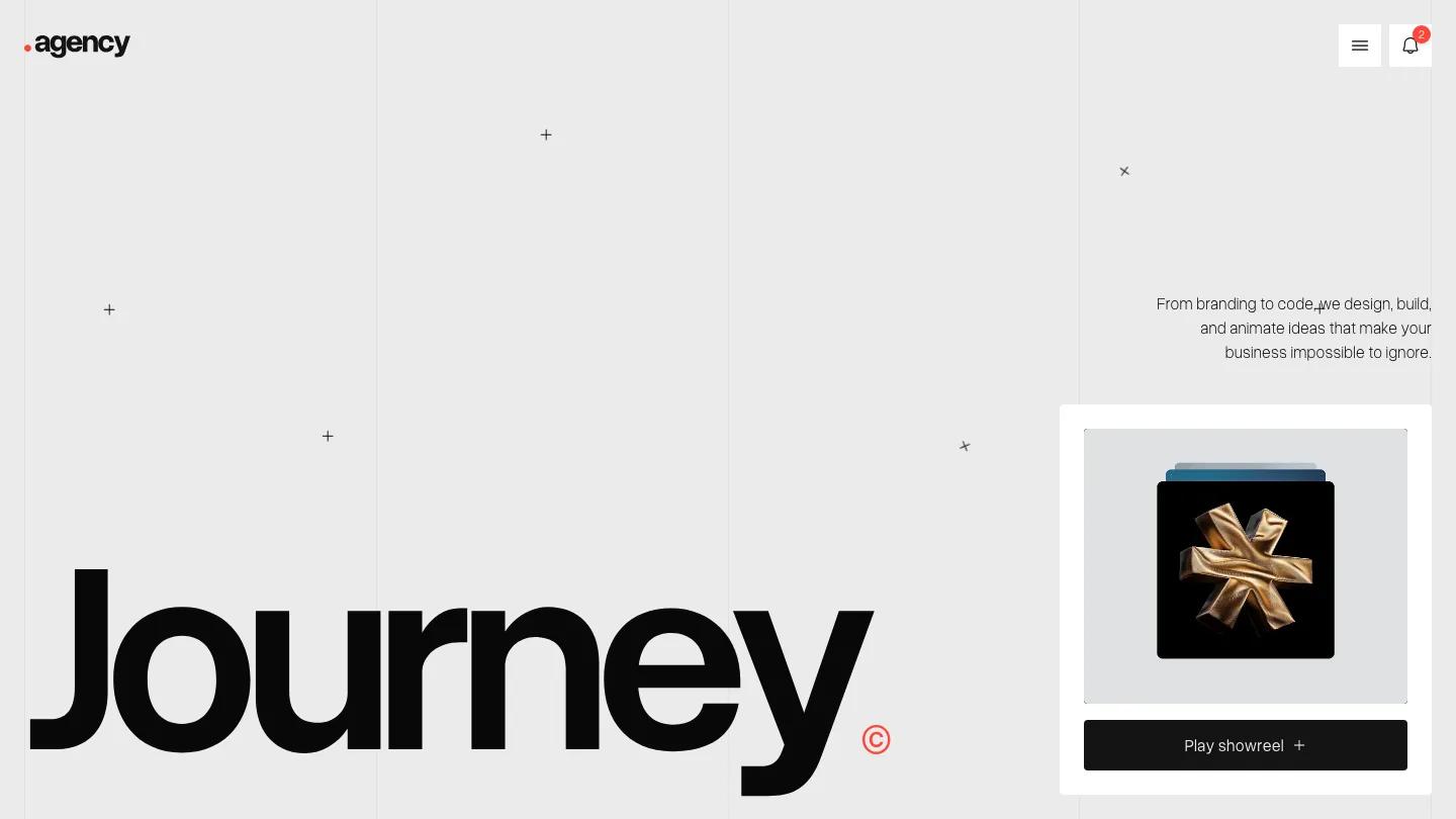
Sicko is a high-quality Webflow template for Portfolio & Agency, Art & Design, Professional Services, Business & Startup, Blog & Editorial by Lucas Gusso.
Our Review of Sicko
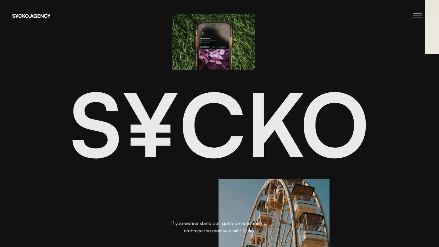
Sicko is a dark, collage-driven agency template that comes with an unusually large set of layouts, each in both dark and light versions. The first homepage puts a massive S¥CKO wordmark, with a yen sign standing in for the I, in the middle of a near-black screen while photo tiles drift around it: a portrait in amber light, a phone mockup lying on grass, a Ferris wheel against a blue sky. A short line about standing out sits centered underneath, and the only navigation is a menu icon in the corner.
Lucas Gusso builds the kit around that scattered, magazine-collage feel and Satoshi type. The demo's front page works as a gallery of every included page: several homepage, about, and works layouts, blog index, category, and post pages, a pricing page, a work detail page, a style guide, a changelog, a license page, a password page, and a 404. The about headers like "A S¥CKO & Creative Agency" carry the same currency-symbol trick, and the light versions swap the black for white without losing the character. That range makes it easy to find a direction that fits a studio's mood, and the pricing page and shop pages give agencies room to sell packages too.
On a phone, the floating images and wordmark compress into a tighter collage. A portrait slides partly over the wordmark and the tagline sits on top of the photos, which looks busy at that size.
We'd pick Sicko for creative agencies and freelancers who want a bold, editorial look and lots of layout choice. The name and its yen-sign styling are built into headlines across the pages, so rebranding means editing type throughout. Hidden navigation and the crowded phone hero are also worth simplifying before launch.
Based on the live demo, viewed on desktop and on a phone. The Design and Dev scores come from separate independent reviews. See how we score templates.
Independently evaluated by our team of 6 designers and 5 developers.











Designers score design, developers score development, and each score is the average of their independent ratings. Read about our review team and how we score templates.