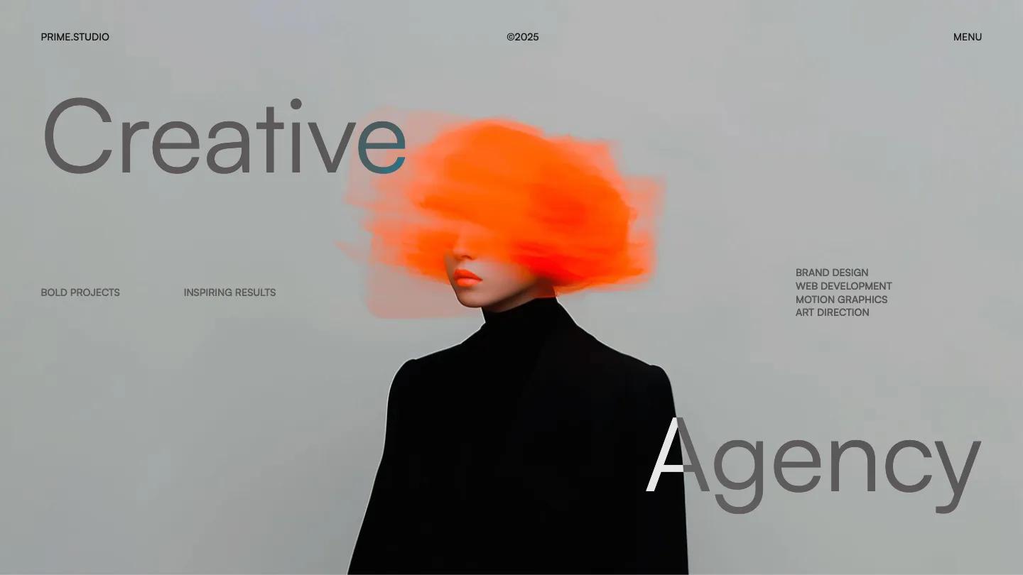
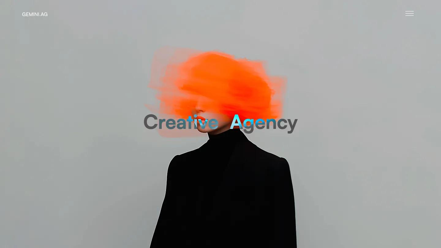
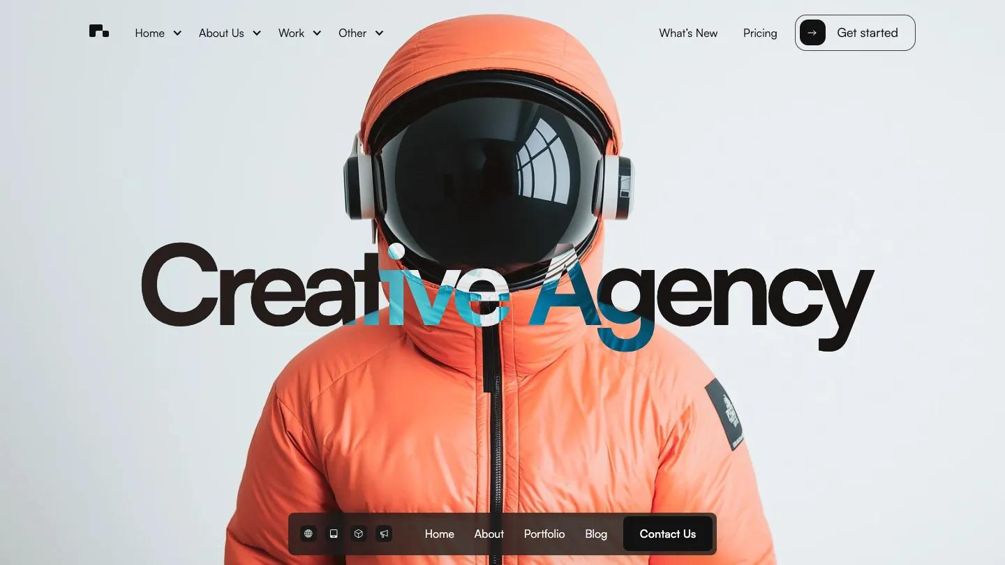
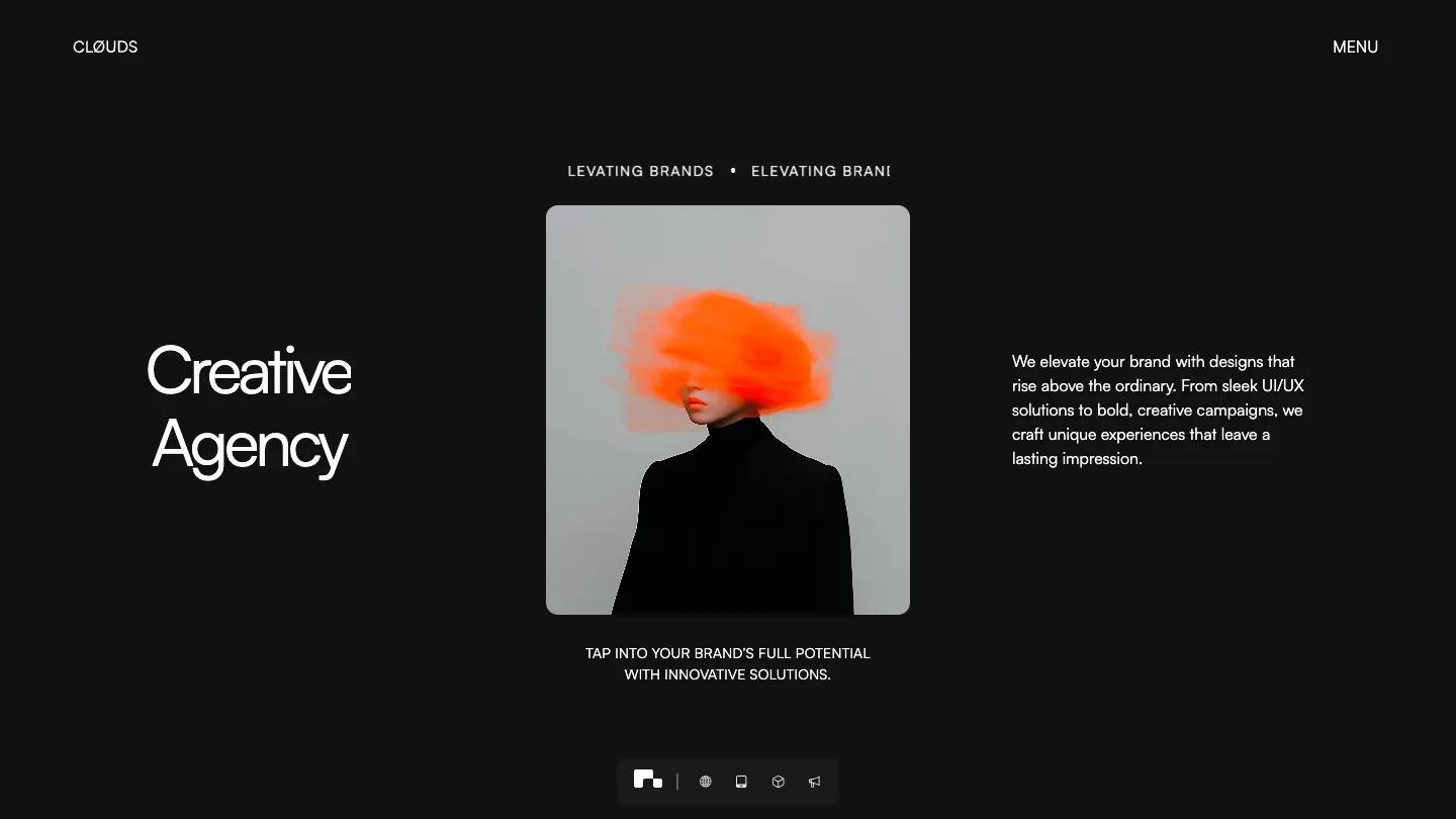
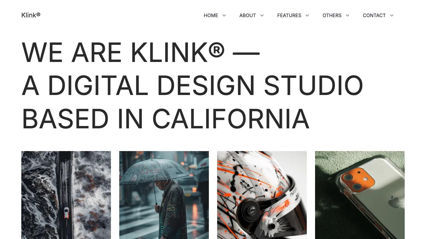
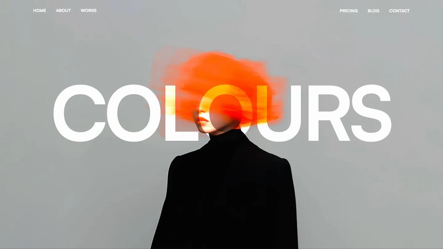
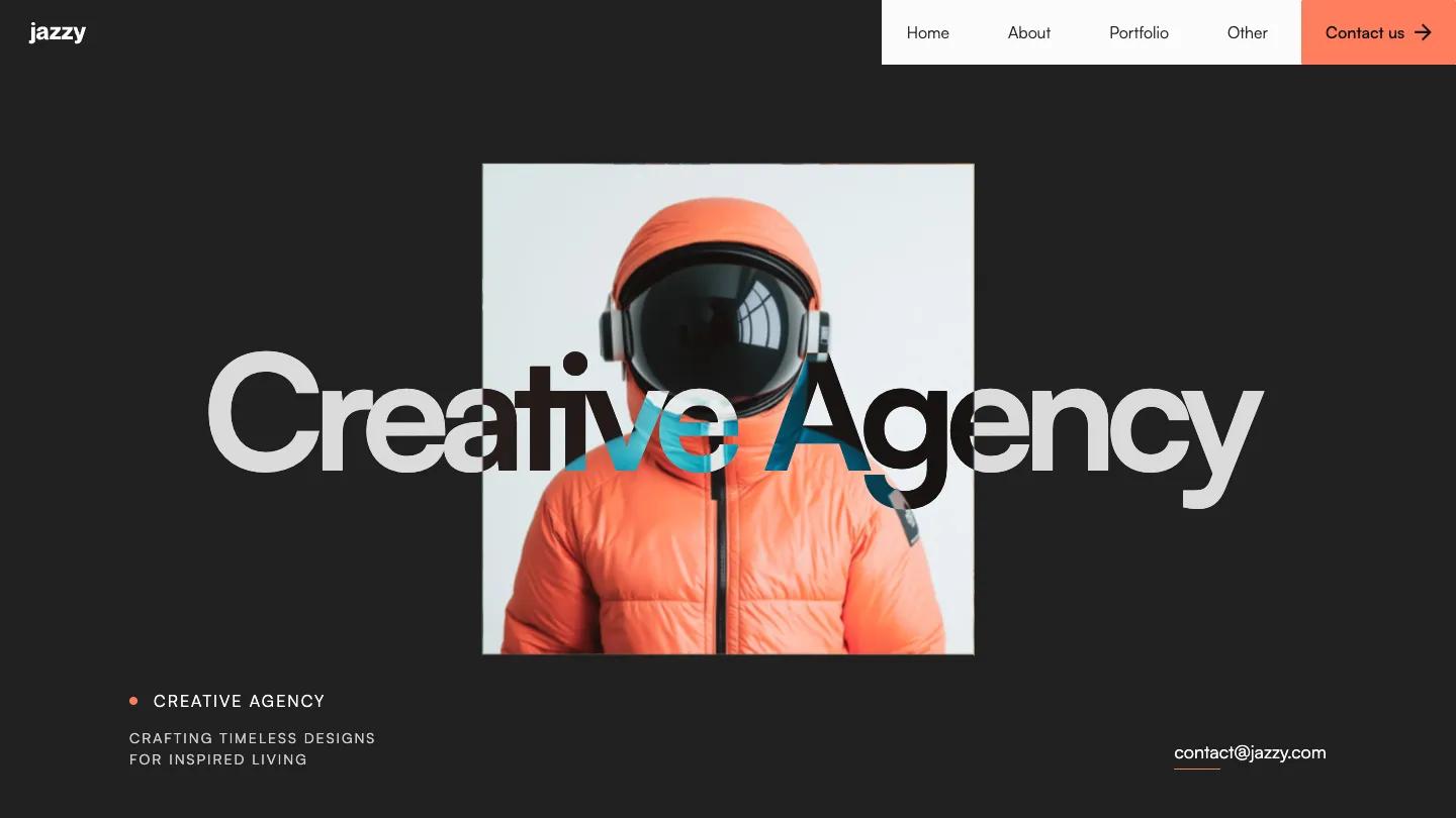
Framing is a high-quality Webflow template for Portfolio & Agency, Professional Services, Art & Design, Business & Startup by Lucas Gusso.
Our Review of Framing
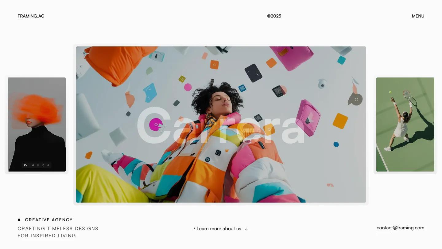
Framing is a light, airy Webflow template for small creative agencies, and its demo opens on a showcase page that previews every layout before you pick a home variant. The first home design sets the tone. A row of portrait image cards slides sideways across a near-white page, with thin corner brackets framing whichever card sits in the center, like a viewfinder. Below it, a big Satoshi headline about creating unique strategies tucks a tiny rounded photo between its words, and a dark Let's Collaborate button with a small avatar sits on the right. The header is just FRAMING.AG, a copyright year, and a MENU link.
Lucas Gusso keeps the rest calm. A wide photo leads into a narrow intro column where grey text turns black as you read, then a strip of client logos. Our design specialties sets its heading on two offset lines, then lists Branding, Marketing, and Development as white rows with short descriptions and a small icon. The page then flips to black for Selected Projects, a two-column grid of rounded image cards with category pills like Marketing, tilting slightly as they arrive. From the Journal shows tall article cards, and a closing banner with glowing orange diagonal stripes carries a Discuss Project button above a simple footer. The showcase page also helps buyers, with preview cards for the work, contact, blog, and pricing pages.
On a phone, the card carousel stays centered with its brackets, and the headline wraps into large lines with the inline photo intact.
We'd pick Framing for branding studios and freelance teams who want something minimal with a bit of motion. The blog titles carry typos and the service copy is filler, so we'd rewrite both, and the hero depends on a set of strong portrait images to look this good.
Based on the live demo, viewed on desktop and on a phone. The Design and Dev scores come from separate independent reviews. See how we score templates.
Independently evaluated by our team of 6 designers and 5 developers.











Designers score design, developers score development, and each score is the average of their independent ratings. Read about our review team and how we score templates.