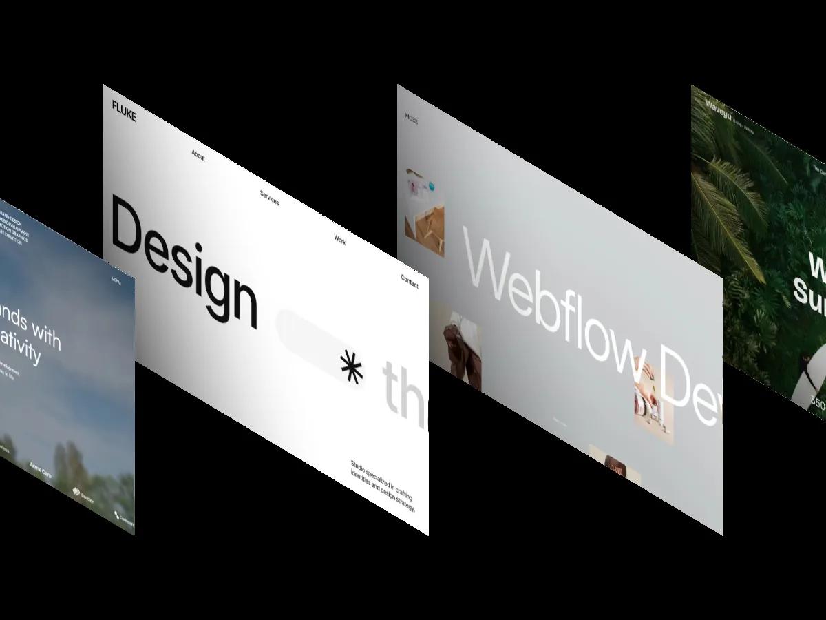
Karo is a high-quality Webflow template for Portfolio & Agency, Photography & Videography, Personal, Art & Design, Professional Services by Robin Granqvist.
Our Review of Karo
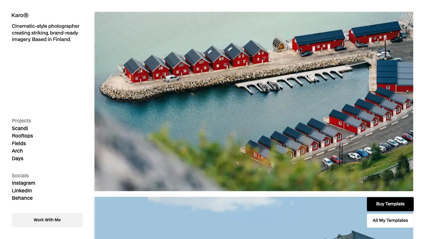
Karo is a portfolio for a single photographer, and it skips the usual hero. A fixed left column holds everything you'd normally find in a header: a small Karo wordmark, a one-line bio about cinematic, brand-ready imagery from Finland, a Projects list, social links, and a grey Work With Me button at the bottom. The right side is just photographs, stacked full width, starting with an aerial shot of red fishing cabins on a turquoise harbor. BDO Grotesk handles all the type in black on white.
Robin Granqvist lets that photo stack run for most of the homepage, from a brick facade at dusk to snowy treetops, so the work reads like a contact sheet rather than a grid of thumbnails. What I Do comes next as numbered rows, 01 Wedding Photography, 02 Portraits, then Editorial & Brand, each with a grey paragraph and checkmarked services. Client tabs with round portraits switch testimonials, and one quote is set huge in the center above a strip of product shots. A grey footer closes with a contact prompt, arrow links, and the name in giant letters. Each project page repeats the side column and adds a title with the year in grey, a large lead image, and an info row for location, client, and camera gear.
On a phone, the side column becomes a short header with a menu icon, and each photo gets its title, year, and city above it, a tidy touch.
We'd pick Karo for wedding, portrait, and editorial photographers who want the images to carry the site. The fixed column eats a fifth of the screen on desktop, so it suits strong horizontal shots best. The demo names a famous camera brand in the gear field and sample clients in the testimonials, so swap those out.
Based on the live demo, viewed on desktop and on a phone. The Design and Dev scores come from separate independent reviews. See how we score templates.
Independently evaluated by our team of 6 designers and 5 developers.











Designers score design, developers score development, and each score is the average of their independent ratings. Read about our review team and how we score templates.