Finn Folio is a high-quality Webflow template for Portfolio & Agency, Personal, Art & Design, Photography & Videography, Professional Services by Slate Dept.
Our Review of Finn Folio
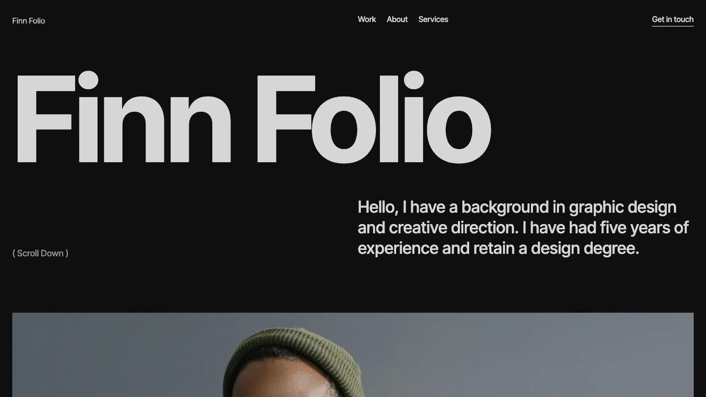
Finn Folio is a dark, text-first portfolio for a single designer or photographer, built from one typeface and a few greys. The name sits at the top left in heavy Inter Tight, big enough to fill most of the first screen, and a two-line greeting in a lighter weight answers it from the right column. A small "( Scroll Down )" note sits at the bottom left, then a wide portrait in a canvas jacket fills the page edge to edge. The header is tidy: the name on the left, Work, About, and Services in the middle, and an underlined Get in touch link on the right.
Slate Dept labels every section with a little bracketed tag, like ( About me ) or ( Recent work ), and gives the content the right half of a two-column grid, which keeps the page orderly. The about block pairs a short bio with a row of four big stat figures and small captions. Recent work follows as a two-up grid of square-cornered mockup photos, mostly business cards and stationery, each with a project name and discipline underneath and a View more link at the top. Services ends in an accordion of service names with plus icons. The style guide shows the whole palette in five swatches, from pure black to pale grey, along with the type scale.
On a phone, the name still dominates the top, the bio stacks right under it in large text, and the menu folds into a Menu label with a two-line icon.
We'd pick Finn Folio for designers who want a serious, low-color portfolio. The stats and bio are placeholder copy and read a little awkwardly, so rewrite them. And because nearly everything is grey on black, colorful project images will do most of the work.
Based on the live demo, viewed on desktop and on a phone. The Design and Dev scores come from separate independent reviews. See how we score templates.
Independently evaluated by our team of 6 designers and 5 developers.











Designers score design, developers score development, and each score is the average of their independent ratings. Read about our review team and how we score templates.