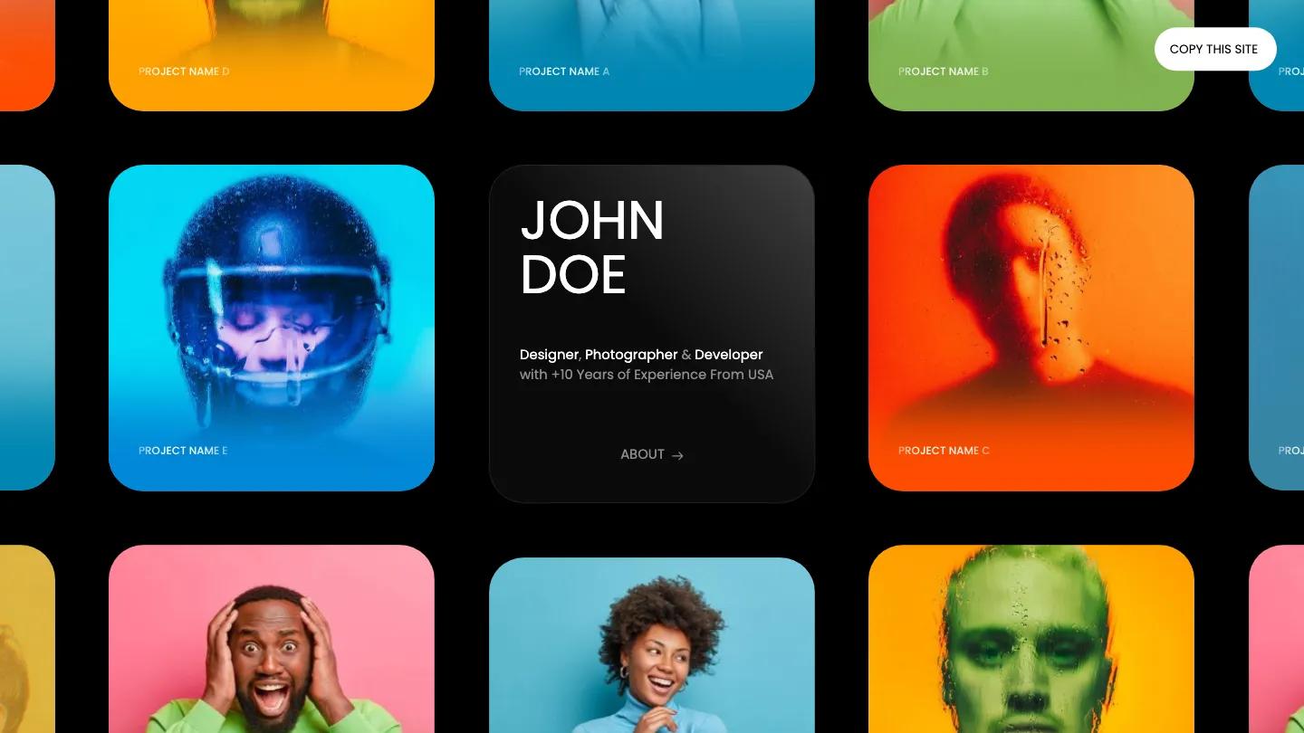
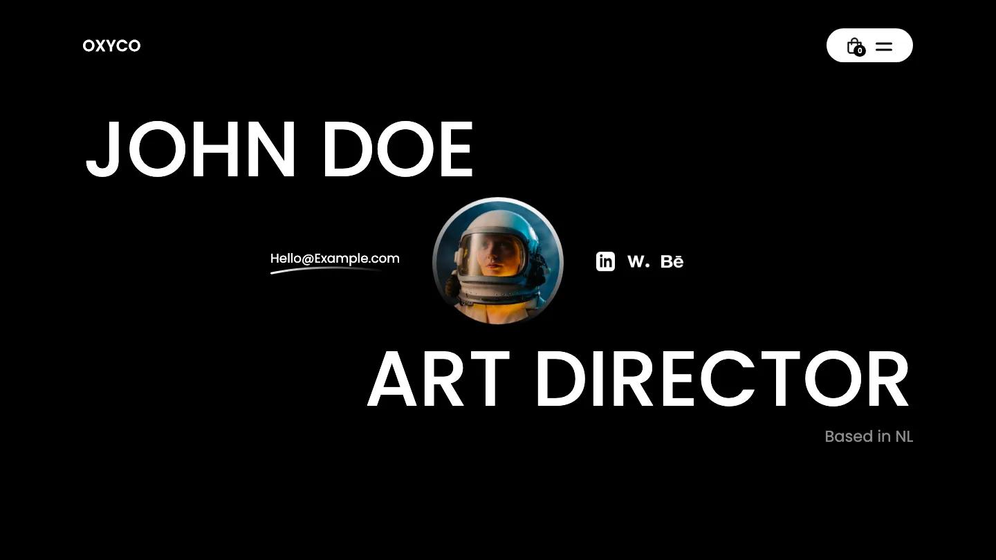
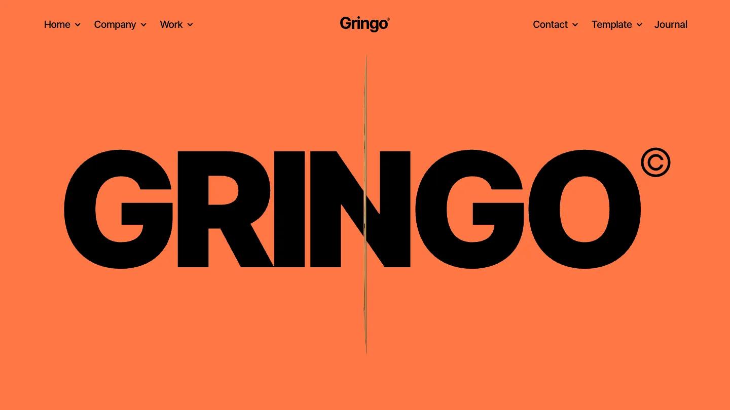
Bryant is a high-quality Webflow template for Portfolio & Agency, Professional Services, Business & Startup, Art & Design, Personal by JP.
Our Review of Bryant
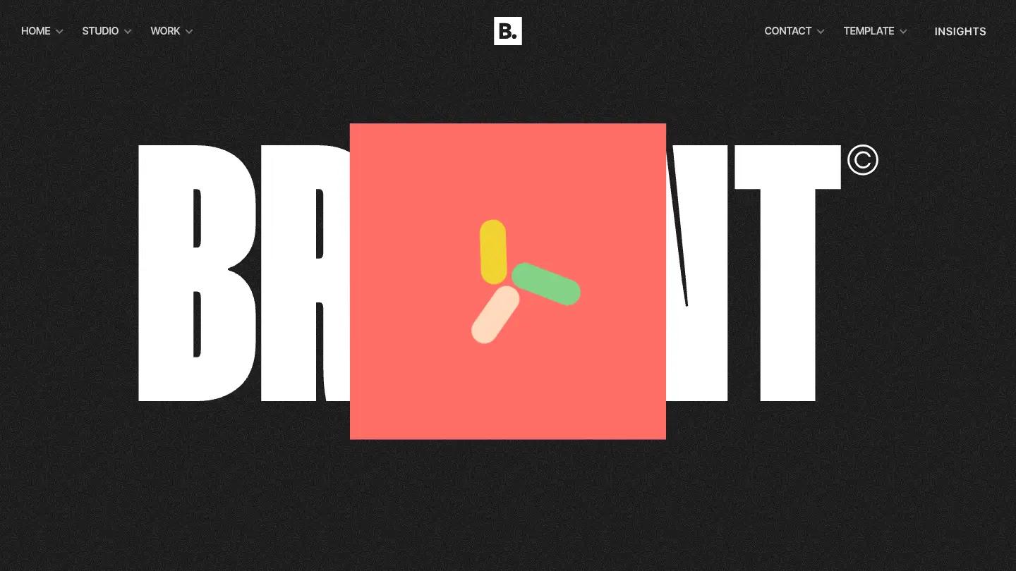
Bryant is a dark Webflow template for creative studios and branding agencies, and it pairs type styles you would not expect to get along. The demo's front door sets "Bryant." in bold sans, then "We help you grow. We make your brand success." in light, airy Zodiak serif, all on a near-black background with a faint film grain. An electric blue circle serves as the button. The header centers a white square B. logo, with Home, Studio, and Work dropdowns on the left and Contact, Template, and Insights on the right.
JP uses that front page as a catalogue, laying out preview cards for the homepage, studio, works, and case study layouts, each tagged Bold, Joyful, or Clean so you can pick a mood. The Bold homepage is the showpiece. A spinning cube in purple and green sits over a giant condensed BRYANT wordmark, then a serif statement in tall capitals drops a small round portrait into the middle of a sentence. Tilted color cards in coral, pink, and purple slide past, single words like Engage fill the whole width, and a light serif paragraph introduces the studio with a More About Us link. An Our Team row, a View All Cases link, and a marquee mixing condensed sans and high-contrast serif lead into a footer with columns for every page group.
On a phone, the serif headline wraps cleanly, the grain stays, and the menu folds into a hamburger beside the B. logo.
We'd pick Bryant for small design studios and freelancers who want a dark, editorial site with plenty of motion and attitude. The team cards use cartoon avatar placeholders and filler names, so plan real portraits. And with three type styles in play, we'd keep body copy short so the page doesn't feel busy.
Based on the live demo, viewed on desktop and on a phone. The Design and Dev scores come from separate independent reviews. See how we score templates.
Independently evaluated by our team of 6 designers and 5 developers.











Designers score design, developers score development, and each score is the average of their independent ratings. Read about our review team and how we score templates.