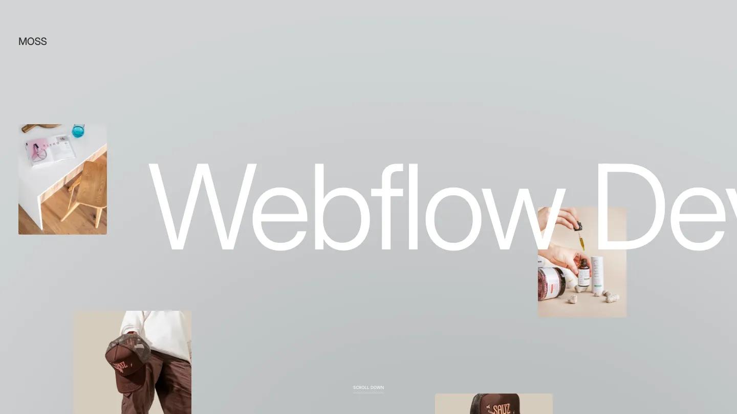
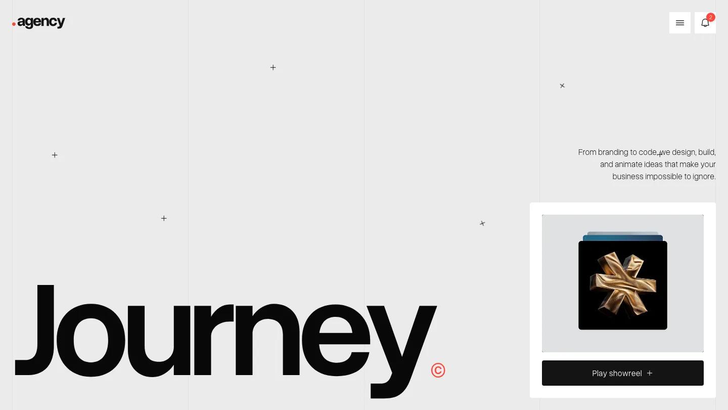
Aubrey is a high-quality Webflow template for Portfolio & Agency, Professional Services, Art & Design, Business & Startup by Slate Dept.

Our Review of Aubrey
Aubrey is a quiet, almost Swiss studio portfolio for small design agencies, and nearly everything about it is black Inter Tight on white. The hero is a centered three-line statement, "We are a London based digital studio working to create unique experiences worldwide,". Then a wide photo takes over: two people in white T-shirts against a pale wall, one blurred in the foreground and one in sharp profile behind. The header is just as restrained, with an Aubrey® wordmark on the left and Works, About, Services, and a grey Get in Touch pill on the right.
Under the photo, a short studio intro sits in the right half of the page with an underlined More About Us link. Featured Work follows as a two-column grid of large, borderless images, each captioned in three plain lines: project name, a short tagline, and the discipline in grey, such as Brand Identity, Motion Design, or Packaging. The demo work is all moody mockups, like a black business card on speckled stone. A thin rule introduces "Ready to bring your ideas to life? Let's connect and create something," a footer with simple link columns, and a giant pale Aubrey® wordmark across the bottom. Slate Dept carries the same grid onto the Works page, which centers an All Works heading with a small superscript count beside it.
On a phone, the headline stays centered on three lines, a plain Menu label replaces the links, and the photo and intro stack neatly below.
We'd pick Aubrey for branding studios and freelance designers who want their work to carry the page. With so little color or decoration, it needs consistent, high-quality project imagery. We'd also rewrite the intro copy, which leans on generic studio phrases.
Based on the live demo, viewed on desktop and on a phone. The Design and Dev scores come from separate independent reviews. See how we score templates.
Independently evaluated by our team of 6 designers and 5 developers.











Designers score design, developers score development, and each score is the average of their independent ratings. Read about our review team and how we score templates.