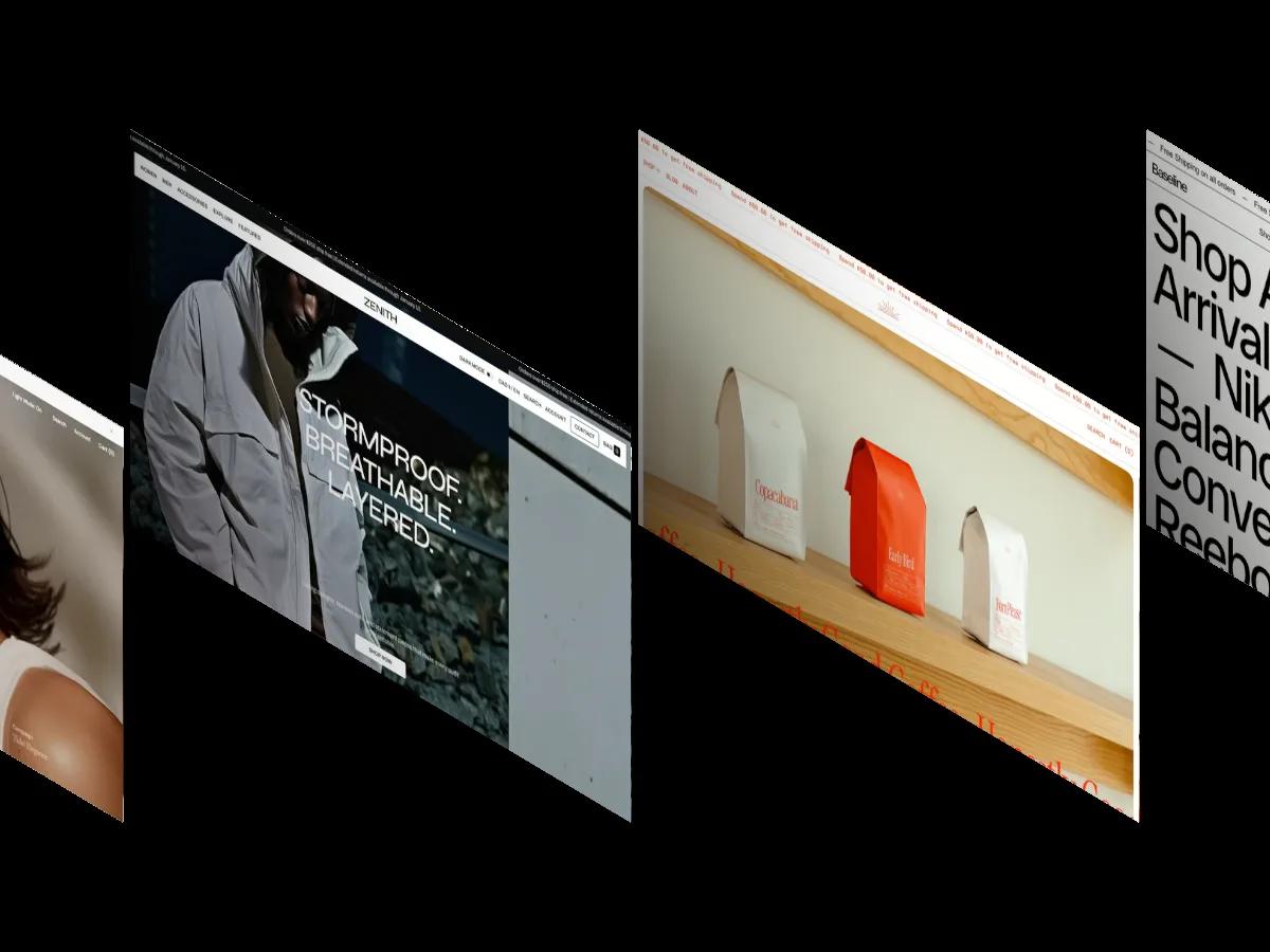
Split is a high-quality Shopify template for Retail & E-commerce, Fashion & Accessories, Business & Startup, Blog & Editorial, Photography & Videography by Krown Themes.
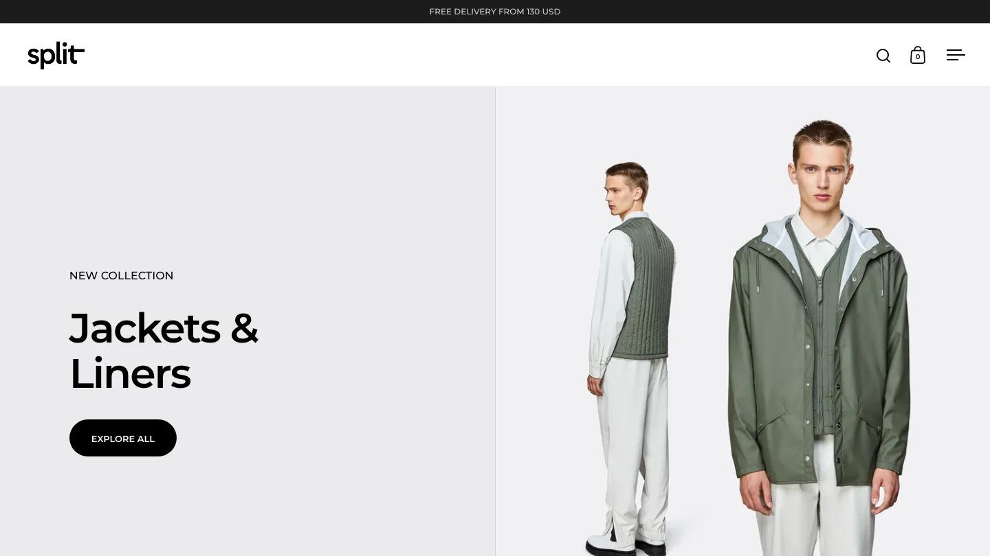
Our Review of Split
Split lives up to its name. Krown Themes built it around a screen cut down the middle, and almost every section on the homepage uses that divide. The hero puts "Jackets & Liners" in heavy Montserrat on a pale grey left half, with a New Collection label and a black pill Explore All button, while the right half shows a model in a green rain jacket over a quilted liner. The header is minimal: a chunky lowercase wordmark, a few icons, and a hamburger menu.
The rest follows the same two-column rhythm, separated by hairline rules. A Lookbook panel pairs a seasonal label with a model in a translucent coat, product cards sit in ruled cells with small New tags, and Function & Fashion leads into side-by-side Shop Men and Shop Women panels. A video band, Shop The Look, and testimonials in white type on charcoal follow. Latest Articles keeps its heading on the left while dated posts fill the right. The product page splits too, with a tall image column and dot scroller beside the vendor link, price, and size buttons.
On a phone, the split folds away: the hero photo fills the width with the headline and a white Explore All button on top, and a slide counter with arrows sits right under it.
We'd pick Split for clothing and accessories brands with clean studio photography on light grey. The menu hides behind the hamburger even on desktop, so make sure the homepage links to your main collections. And the demo copy belongs to a real outerwear brand, so all of it needs to go.
Based on the live demo, viewed on desktop and on a phone. The Design and Dev scores come from separate independent reviews. See how we score templates.
Independently evaluated by our team of 6 designers and 5 developers.











Designers score design, developers score development, and each score is the average of their independent ratings. Read about our review team and how we score templates.
More Like This

13 Best Photography Website Templates for Webflow and Framer (2026)
14 Best Beauty and Skincare Website Templates (2026)
10 Best Wellness Website Templates for Studios, Therapists and Brands (2026)
14 Best Fintech Website Templates for Finance Apps (2026)
9 Best Consulting and Professional Services Website Templates (2026)

AI and Writing Statistics 2026: What the Research Actually Says