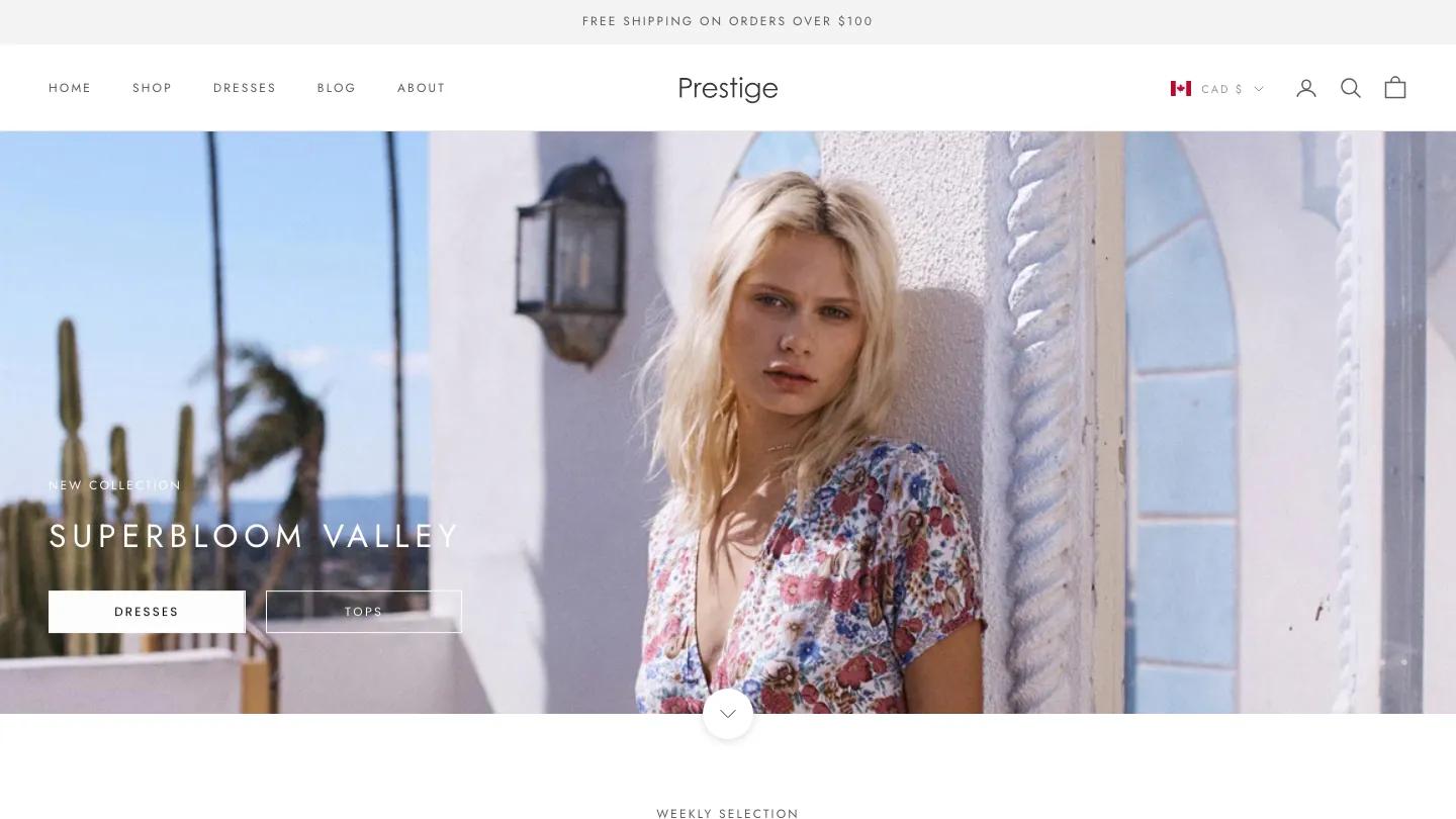
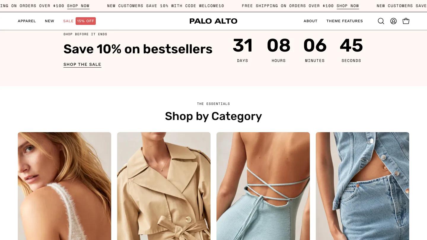
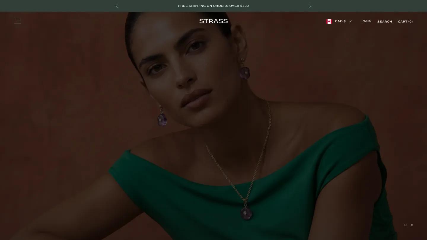
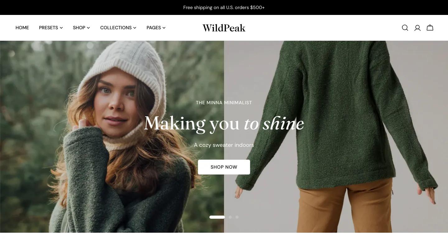
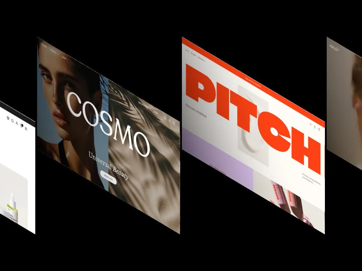
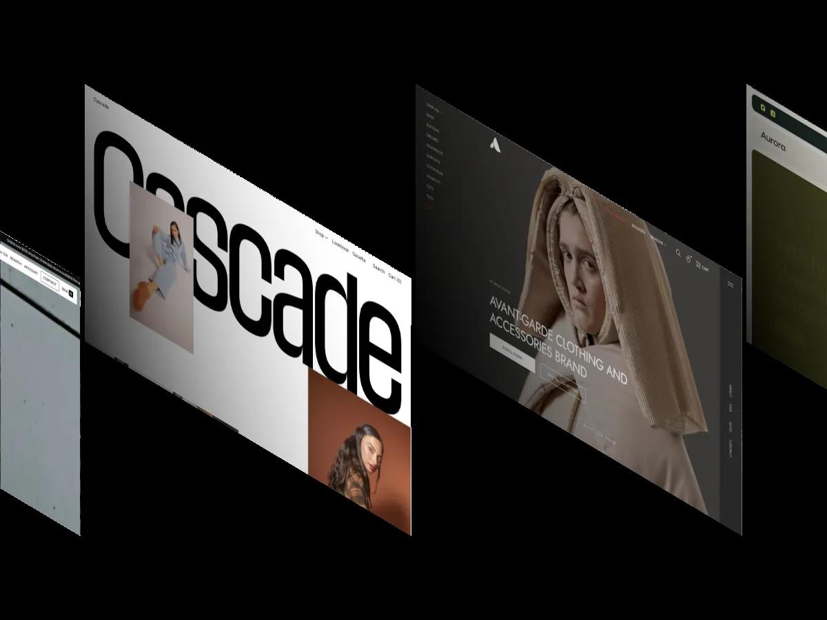
Shapes is a high-quality Shopify template for Retail & E-commerce, Food & Drink, Fashion & Accessories, Blog & Editorial by Switch.
Our Review of Shapes
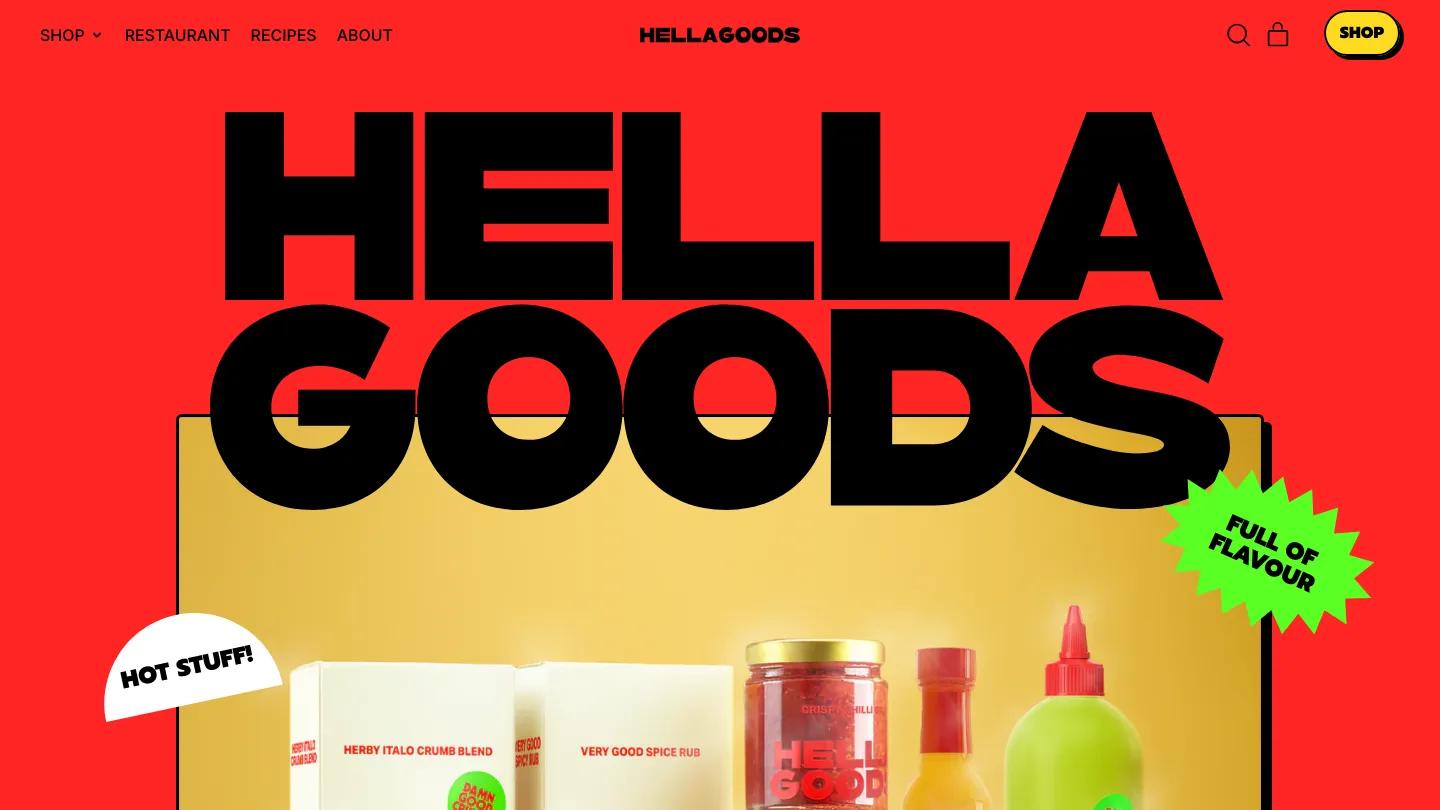
Shapes is Switch's loudest Shopify theme, and its pantry preset turns it into a hot sauce and spice brand that refuses to whisper. The hero is a fire-engine red page with the store name in enormous black Prompt capitals, overlapping a framed photo of jars, bottles and boxes on a golden backdrop. Stickers do a lot of the talking: a lime starburst reading Full of Flavour, a white half-moon reading Hot Stuff, and a chili pepper poking out of the frame. The header keeps Shop, Restaurant, Recipes and About on the left, the wordmark centered, and a yellow Shop button with a hard black shadow on the right.
Every section ends in a wavy edge, so the page feels cut from paper. "Everyday pantry goods for the everyday chef" leads into a featured product, a product slider, and a lime green quote band in huge capitals. Tabs for Hot Sauces, Spices & Rubs and Oils sit over product cards with thick black outlines and round On Sale badges. A comparison block surrounds an olive oil bottle with feature boxes like Harvested at Peak Season, then come a restaurant teaser, a mustard yellow recipe section with a wiggly framed taco photo, a merch row and a newsletter form. The product page keeps the energy: a huge product name, Ingredients, Shipping and Wholesale tabs, dot scales for flavor, and a lime Buy It Now button under an outlined Add to Cart.
On a phone, the stacked name and framed photo still fill the red hero, and the tagline breaks into big, easy lines over a lime Shop Now button.
We'd pick Shapes for food, drink and snack brands with playful packaging and a confident color. A quiet brand will feel shouted over. The quote band credits a famous fictional chef's name, so swap in a real customer.
Based on the live demo, viewed on desktop and on a phone. The Design and Dev scores come from separate independent reviews. See how we score templates.
Independently evaluated by our team of 6 designers and 5 developers.











Designers score design, developers score development, and each score is the average of their independent ratings. Read about our review team and how we score templates.