12 Best Shopify Themes for Clothing and Fashion Stores 2026
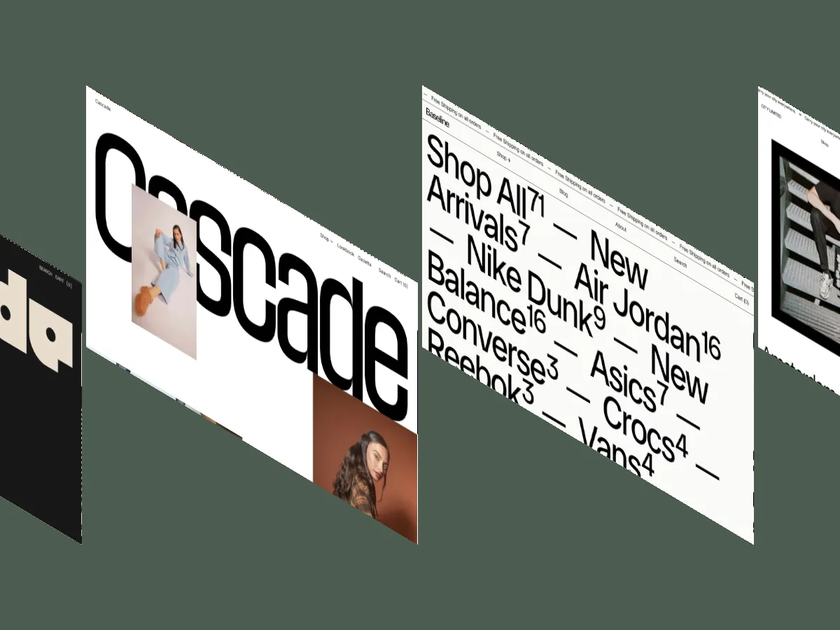
Theme demos hide the two things a clothing store depends on: dense product grids and a mobile checkout that doesn't fight the shopper. We scored 98 fashion-ready Shopify themes and these 12 came out on top, every one at Overall: 9.3/10 or higher.
A clothing store lives or dies on two things most Shopify theme demos are built to hide: how product photography holds up at real grid density, and how the buying flow feels on a phone. Demo stores show eight products, polished lifestyle shots, and a desktop walkthrough. The best Shopify themes for clothing stores are the ones that still work when your catalog hits 200 SKUs and most of your traffic arrives on mobile.
Fashion & Accessories is the largest category in our Shopify library. 98 of the 166 themes on our Shopify listing support it, which means a fashion theme has to beat serious competition to make any shortlist. The 12 below did. Every one carries an Overall Score of 9.3/10 or higher, assigned by multiple reviewers who tested lookbook layouts, variant selection, and mobile behavior before publication.
All 12 are paid, priced from $290 to $420. If your budget is zero, our 15 best free Shopify themes covers that ground. This list is for stores ready to pay for build quality.
What are the best Shopify themes for clothing stores in 2026?
Zenith is the best Shopify theme for clothing stores in 2026 at Overall: 9.5/10, followed closely by Aurora and Pebble. All 12 themes in this list score at least 9.3/10 overall, cost between $290 and $420, and come from the 166 Shopify themes we've independently reviewed and scored. Each entry below lists both scores, the price, and the specific type of fashion store it fits.
A quick note on the standard we held them to. A fashion theme earns its place on four fronts: lookbook layouts that present a collection as a story rather than a grid, photography handling that keeps image quality intact at density, variant and size selection that doesn't bury the shopper in dropdowns, and mobile layouts that treat the phone as the primary storefront. Where a theme does something specific on those fronts, we say so in its entry.
Zenith
- Design: 9.6/10
- Dev: 9.5/10
- Price: $380
- Best for: apparel brands with strong original photography that want the interface invisible, not stores that need quick-view convenience
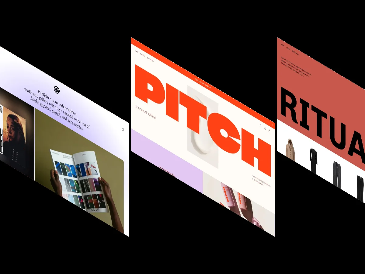
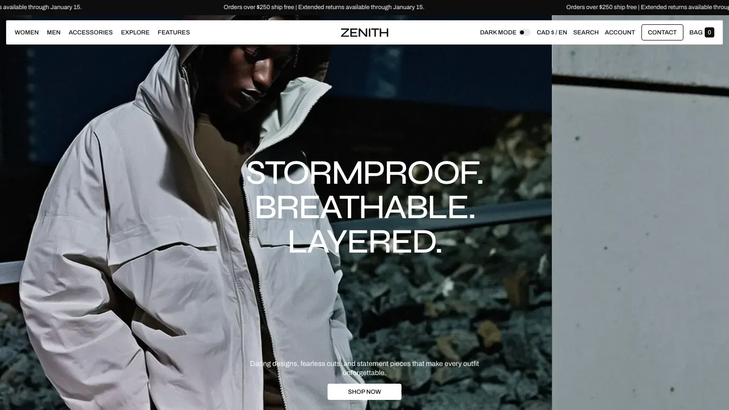
Zenith holds the highest Design Score of the twelve, and the layout shows why. Apparent Collective kept the interface nearly invisible: a light palette, generous spacing between sections, and full-width slideshows that work as lookbooks without a dedicated lookbook page. Product photography sits against white with nothing competing for attention, which is exactly what a fashion grid needs and exactly what most themes clutter.
The Dev Score reflects an equally disciplined build. Sticky scrolling keeps the header and cart reachable through long collection pages, animation is limited to purposeful transitions rather than decoration, and localization support ships in the box for stores selling across markets. Site search is included, which matters more for apparel than most categories because shoppers often arrive from social already knowing the product name.
Worth knowing: There's no quick-view modal, so shoppers click through to the product page to select a size, which is fine for considered purchases and slower for high-volume basics.
Aurora
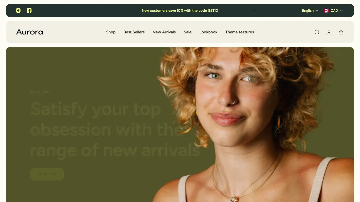
- Design: 9.3/10
- Dev: 9.6/10
- Price: $390
- Best for: fashion stores that publish editorial content alongside the catalog, provided someone will actually maintain the blog
If your store publishes as much as it sells, Aurora is the strongest pick here. It pairs a full blog and CMS with the commerce layer, and the typography system has clear scale steps between headings and body copy that make campaign pages read like magazine features rather than product listings. Design: 9.3/10 reflects a colorful, light layout that stays organized under heavy content.
Dev: 9.6/10 ties for the best build quality in this roundup. Getsitecontrol shipped multiple layout options plus pre-built layout templates, so a lookbook, a drop announcement, and a standard collection grid can each get their own structure without custom code. Quick-view modals keep size selection on the collection page, and localization is included.
Worth knowing: The demo leans on colorful accents, so if your brand palette is muted, budget time to tone the accent colors down across sections.
Pebble
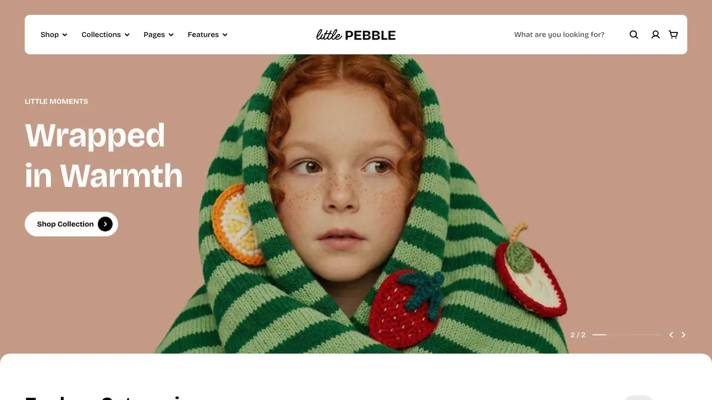
- Design: 9.3/10
- Dev: 9.6/10
- Price: $400
- Best for: kidswear and casual clothing lines, not premium or luxury positioning
FoxEcom built Pebble warmer than anything else on this list. Rounded shapes, a playful color palette, and a Family & Children category tag make it the natural choice for kidswear and casual lines, where the sharper monochrome themes further down would feel cold. The component library is a real advantage: reusable section blocks that a non-developer can rearrange without touching code.
The build earns Dev: 9.6/10 for good reasons. A CMS handles editorial content, quick-view modals let shoppers pick a size straight from the collection grid, and localization support is included for selling across regions. Overlay and modal handling stayed responsive at mobile widths in our review, which is where playful themes usually fall apart.
Worth knowing: The rounded, playful styling works against premium positioning, so a luxury or minimalist label should look at Zenith or Madrid instead.
Baseline
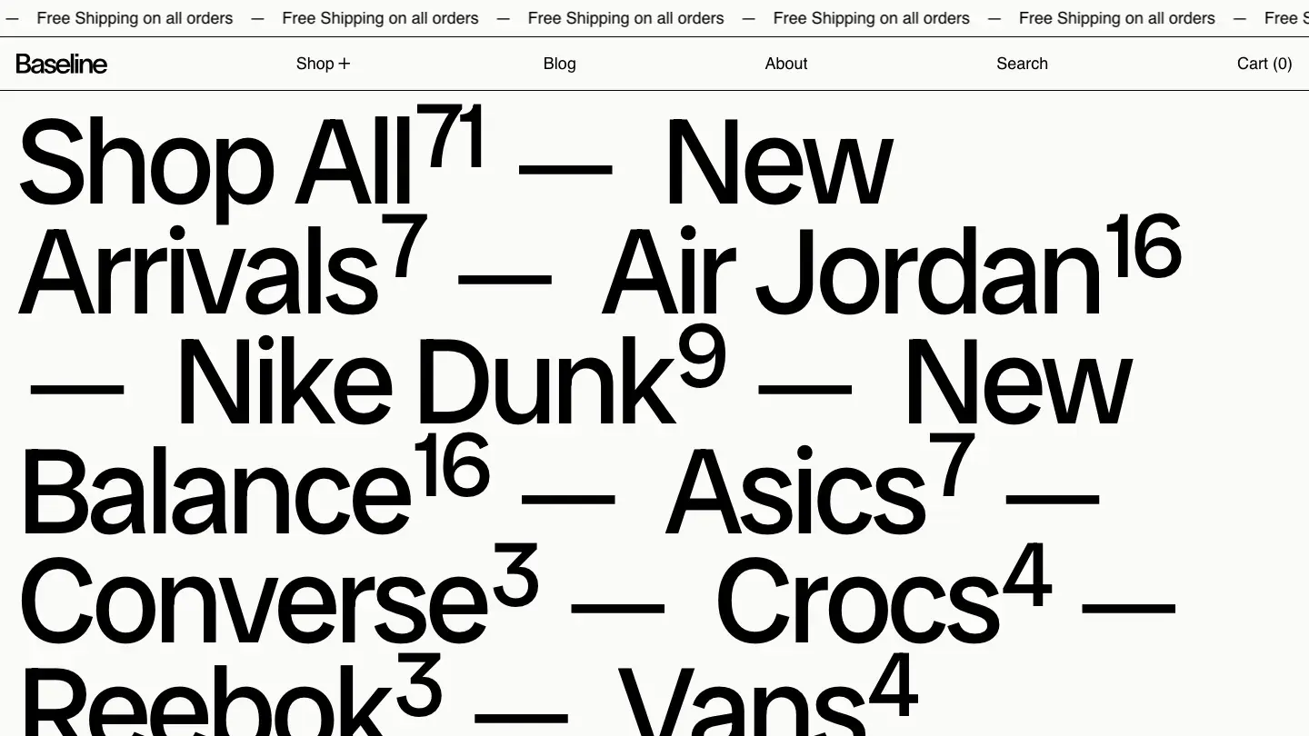
- Design: 9.5/10
- Dev: 9.3/10
- Price: $400
- Best for: streetwear and athletic brands selling in a single language and currency
Type does the heavy lifting in Baseline. Switch designed it around bold, condensed headings and a hierarchy strong enough that the demo barely needs imagery, which flips the usual fashion theme formula and suits streetwear and athletic brands whose identity is as much wordmark as photograph. Design: 9.5/10 is the second highest score here, and the Sports & Fitness category tag isn't accidental.
Switch left animation out of the build entirely. Pages are static, quick to load, and put nothing between the shopper and the add-to-cart button, which is the right trade for mobile-heavy traffic. Quick-view modals handle size selection from the grid.
Worth knowing: Localization isn't listed in the feature set, so multi-language or multi-currency stores should confirm translation app compatibility before buying.
Cascade
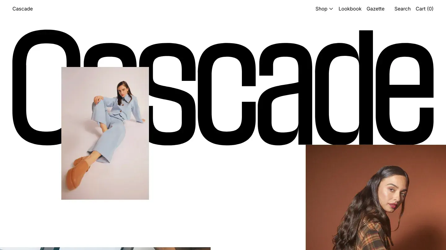
- Design: 9.3/10
- Dev: 9.5/10
- Price: $350
- Best for: capsule collections and small catalogs that don't need pre-built brand pages
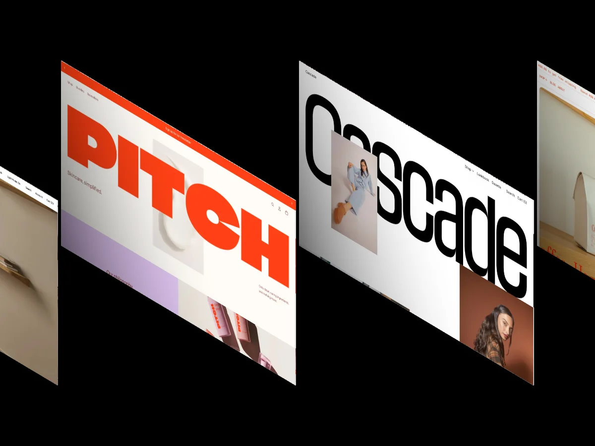
Cascade is the leanest build in this roundup, and that reads as a decision rather than a gap. Switch stripped it to nine core features: commerce, blog, animation, rich media, slideshows, quick-view modals, site search, and the scrolling behaviors that actually matter. The smaller surface area keeps pages fast and keeps the interface out of the photography's way, and Dev: 9.5/10 reflects how disciplined that restraint is.
At $350 it sits below this list's average price, and it fits capsule collections and small catalogs that don't need twelve section types to launch. The sticky scrolling and modal quick view cover the two interactions a small fashion store uses most.
Worth knowing: No form or contact page templates are listed, so plan to assemble contact and brand pages from generic sections or an app.
Avante
- Design: 9.3/10
- Dev: 9.5/10
- Price: $290
- Best for: young labels with consistent photography and a sub-$300 theme budget
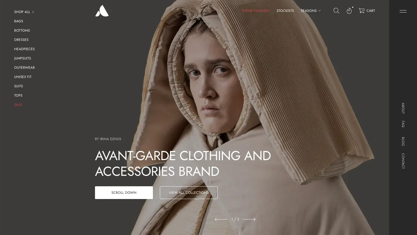
At $290, Avante is the cheapest theme on this list, tied with Vortex, and it undercuts the $336 average price of paid Shopify themes in our library while matching the scores of entries costing $100 more. Staylime's monochromatic, bold layout borrows from portfolio design, and the included projects page converts directly into a lookbook: full-bleed imagery arranged as a browsable collection story instead of a plain grid.
Design: 9.3/10 and Dev: 9.5/10 come with localization, quick-view modals, and a complete page set including about and contact templates. For a young label with strong photography, this is the value pick of the twelve.
Worth knowing: The monochromatic frame gives weak photography nowhere to hide, so inconsistent product shots will be obvious immediately.
Seventh
- Design: 9.3/10
- Dev: 9.4/10
- Price: $420
- Best for: dedicated apparel stores that want fashion-specific focus and can spend above the median
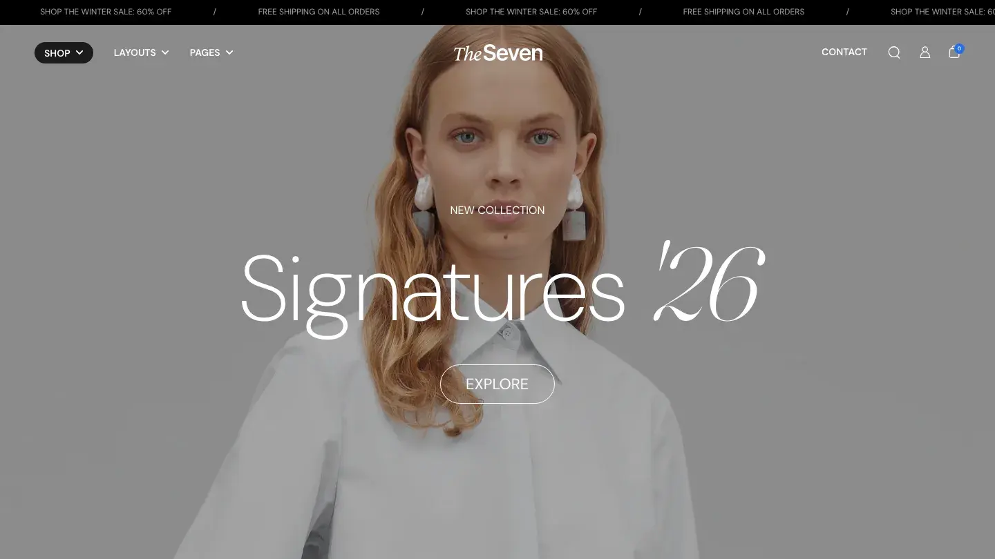
Focus is what $420 buys with Seventh. Krown Themes tagged it for exactly two categories, retail and fashion, and that narrowness shows in the details: a typographic, light layout tuned for apparel grids rather than adapted from a general commerce base. Slideshow sections handle seasonal campaign rotation, and sticky scrolling keeps navigation available through long collections.
Localization and site search are built in, which covers stores selling into more than one market. Dev: 9.4/10 sits mid-pack for this list, and the build held up cleanly at mobile widths in our review.
Worth knowing: At $420, Seventh costs more than the $360 median for paid Shopify themes, and you're paying for fashion-specific focus rather than extra features.
Phase
- Design: 9.4/10
- Dev: 9.3/10
- Price: $350
- Best for: streetwear and avant-garde labels with photography art-directed for dark backgrounds
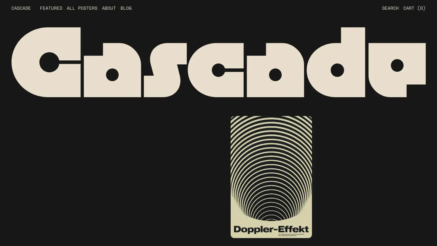
The only dark theme in this roundup, Phase is built for brands that treat a product drop like an event. Switch combined a dark base with bold typography and appear effects that reveal sections on scroll, giving collection pages a staged, editorial pacing that suits streetwear and avant-garde labels. Design: 9.4/10 is the third highest of the twelve.
The build includes a component system and dedicated typography controls, and Dev: 9.3/10 reflects a structure where the effects are reusable pieces rather than one-off hacks. Quick-view modals keep size selection fast despite the theatrical presentation.
Worth knowing: Dark backgrounds demand product photography shot or edited for them, and standard white-background catalog shots will look pasted on.
Madrid
- Design: 9.1/10
- Dev: 9.6/10
- Price: $380
- Best for: minimalist fashion brands whose identity lives in the photography, not the interface
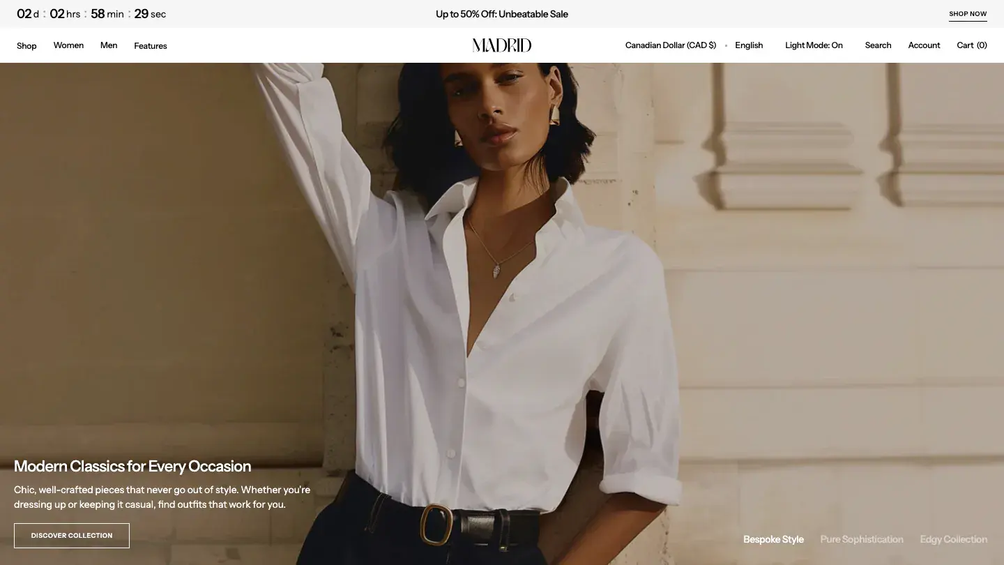
Apparent Collective designed Madrid to disappear behind your photography. The monochrome, minimal layout makes almost no design statements of its own, which sounds like criticism and isn't: for a fashion store, a theme that steps back is doing its job. Design: 9.1/10 reflects that restraint, and Dev: 9.6/10 reflects one of the tightest builds we've scored on Shopify.
The dev-leaning score profile mirrors our Shopify library as a whole, where the average Dev Score is 8.5/10 against a Design average of 8.0/10. Localization and site search are included, and sticky scrolling keeps the cart within reach on long collection pages.
Worth knowing: Two stores running Madrid on default settings can look nearly identical, so visual differentiation has to come entirely from your photography and type choices.
Courier

- Design: 9.1/10
- Dev: 9.6/10
- Price: $400
- Best for: single-market stores with considered, lower-frequency purchases that value build quality over motion
Courier carries the widest score gap in this roundup: Design: 9.1/10 against Dev: 9.6/10, a full half point in favor of the build. Switch skipped animation entirely, so pages are static and quick, and the colorful typographic styling gives collection pages more personality than Madrid without approaching Pebble's playfulness.
The engineering is the argument here. Sticky scrolling, site search, slideshows, and rich media support all ship in a structure our developer reviewers rated among the best of the twelve, and the responsive behavior needed no caveats at any width we tested.
Worth knowing: Neither localization nor quick-view modals are listed, which makes Courier best suited to single-market stores where shoppers browse product pages fully before buying.
Velour
- Design: 9.1/10
- Dev: 9.5/10
- Price: $390
- Best for: stores that want every core page pre-built, as long as a conventional structure is acceptable
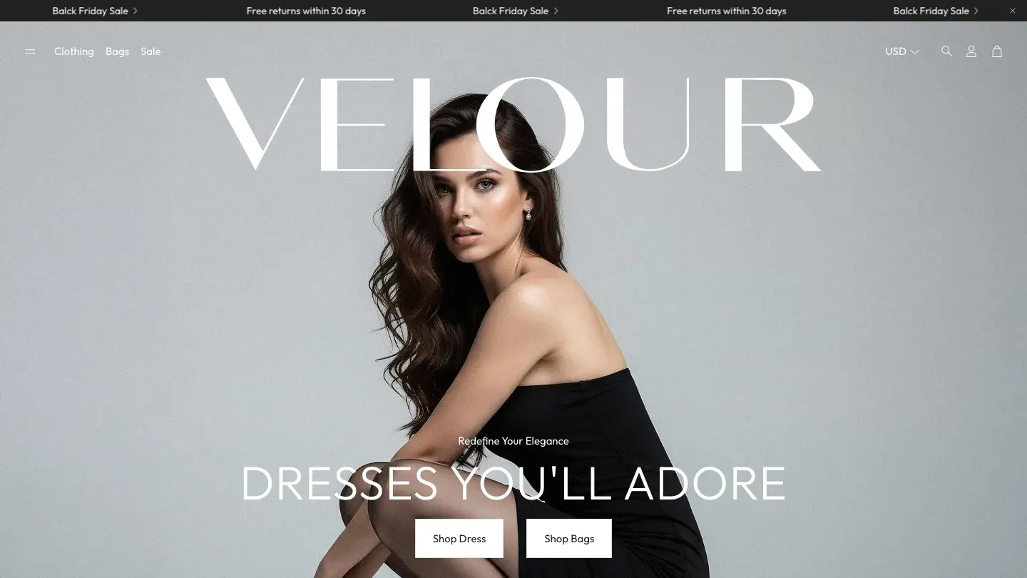
Everything a store needs on day one ships inside Velour: CMS, blog, forms, pricing sections, about and contact pages, quick-view modals, and localization. NETHYPE covered more page infrastructure than almost anything else at this price, and Dev: 9.5/10 reflects how much surface area the build handles without getting messy.
The monochromatic, bold styling sits close to Avante's, though Velour trades that theme's portfolio DNA for a more conventional store structure. Design: 9.1/10 is honest about the result: the layouts are dependable rather than distinctive, and the typography system does more differentiating work than the section designs do.
Worth knowing: Recoloring a bold monochromatic theme changes its character more than you'd expect, so test your brand palette against the demo sections before committing.
Vortex
- Design: 9.2/10
- Dev: 9.4/10
- Price: $290
- Best for: activewear and athleisure brands on a budget, if their audience shops on recent phones
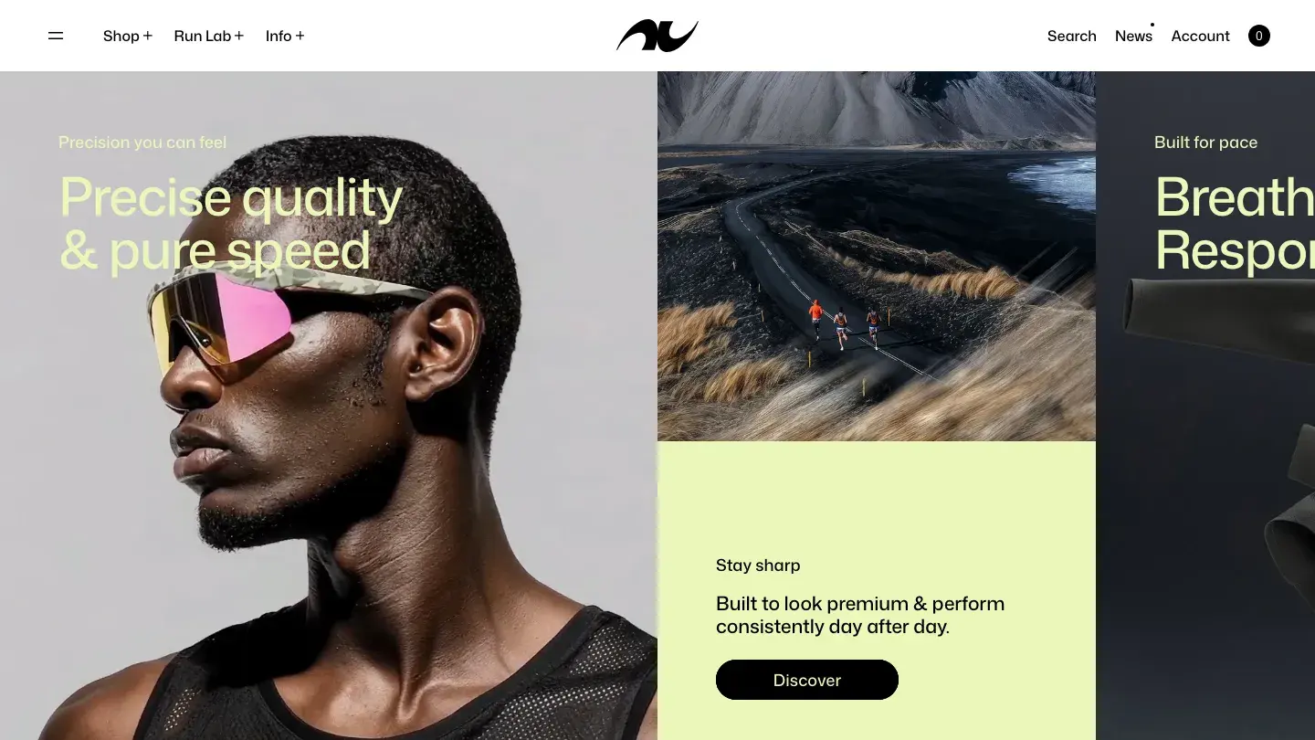
Motion is Vortex's argument. Scroll effects and appear effects animate collection pages as the shopper moves, which suits activewear and athleisure brands that want energy in the browsing experience, and the Sports & Fitness category tag confirms where Staylime aimed it. At $290 it ties Avante as the cheapest entry here.
The build backs the motion up: Dev: 9.4/10 with a component system, quick-view modals, localization, and site search. Design: 9.2/10 gives Vortex the lowest overall score on this list, which still lands it in the top third of our Shopify library, where only 31.3 percent of themes reach 9.0/10 or above.
Worth knowing: Test the scroll effects on a mid-range phone with a full collection loaded, because motion-heavy pages are where cheaper devices stutter first.
How we picked these
Every theme in our library clears the same bar before publication: an Overall Score of 7.0/10 or above. Multiple reviewers score each theme independently, designers with 10 or more years of experience assign the Design Score, developers with the same experience assign the Dev Score, and the published numbers are the averaged result. Creator reputation, sales volume, and marketplace ratings play no part in selection. The full process is documented on our methodology page, and more about why the library exists is on our about page.
For this list we filtered our 166 published Shopify themes to the Fashion & Accessories category and ranked the results by Overall Score. Nothing here scored below 9.3/10, which puts all 12 in the band we describe as production-grade. For a wider look beyond fashion, our 30 best modern Shopify themes covers the whole library.
FAQ
Is a $300 to $400 Shopify theme worth it for a clothing store?
For a store doing real volume, yes. Paid Shopify themes in our library average $336 as a one-time purchase, not a subscription, which is less than many stores spend on apps in a single quarter. The 12 themes here average $370, and every one scores 9.3/10 or above overall, which shows up as fewer app dependencies and less custom work at launch.
Can a free Shopify theme handle a fashion store?
It can for a first store or a small catalog. The 15 free Shopify themes in our library average 7.6/10 overall against 8.3/10 for paid, so the gap is real but not disqualifying. Start with our free themes roundup if budget is the constraint, and expect to upgrade once the catalog and traffic grow.
What matters most in a Shopify theme for clothing stores?
Three things decide it: how the theme presents product photography at collection density, how quickly a shopper can select a size and variant, and how the whole flow behaves on a phone. Lookbook layouts and editorial sections are valuable but secondary. A theme that fails on mobile fails, no matter how the desktop demo looks.
Why do Shopify themes tend to score higher on Dev than Design?
Across our 166 Shopify themes, the average Dev Score is 8.5/10 against a Design average of 8.0/10, and 43 themes carry a gap of more than a full point. Shopify's theme store requirements enforce technical standards but say nothing about taste. The top of this list runs the other way: Zenith, Baseline, and Phase all score higher on design than on dev.
How can I compare these themes without opening 12 demo tabs?
Every theme card on our Shopify listing plays a looping screen recording of that theme's full homepage the moment you hover over it. The video stops when your cursor moves away. You can visually compare every theme in this post, and the rest of the fashion category, without opening a single external tab.