Courier is a high-quality Shopify template for Retail & E-commerce, Fashion & Accessories, Blog & Editorial, Art & Design, Business & Startup by Switch.
Our Review of Courier
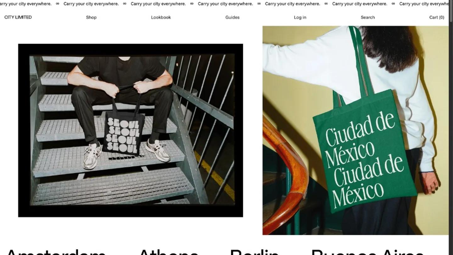
City Limited sells tote bags printed with city names, and Courier builds a clean, type-first storefront around that concept. The homepage opens with a scrolling ticker that reads "Carry your city everywhere", then drops into a simple navigation and two large lifestyle shots: one looking down a stairwell at sneakers and a tote, another showing a green bag printed with "Ciudad de Mexico" against a yellow wall. Below that, city names scroll across the screen in large serif type, each one a link to a product. The palette is mostly white and black with pops of color from the product photography and the tote bags themselves, which come in bright red, green, orange, and other hues.
The demo includes a shop collection, a lookbook page, a guides blog section, and standard account and cart pages. Product pages show a large image on the right and clean left-aligned details on the left: size options, quantity controls, an add-to-cart button, and collapsible sections for measurements and shipping. Below the fold, the homepage includes a story section with an about paragraph, a horizontal ticker of city emoji and names, product cards in a grid, and a blog preview section labeled "City Guides" with cards for Tokyo, New York, and Melbourne. There's also a logo marquee labeled "As Seen In" showing magazine wordmarks. Sticky scrolling keeps the header in place.
On a 390px phone, the layout stacks cleanly. The ticker remains, the navigation collapses to a menu icon, and the two hero images stack vertically. Product cards and blog previews flow into a single column without any visible layout breaks.
We'd pick Courier for a product line with strong visual identity and a story to tell. The design leans heavily on typography and the product photography itself, so you'll need high-quality lifestyle shots and a clear brand voice to fill the editorial sections.
Based on the live demo, viewed on desktop and on a phone. The Design and Dev scores come from separate independent reviews. See how we score templates.
Independently evaluated by our team of 6 designers and 5 developers.











Designers score design, developers score development, and each score is the average of their independent ratings. Read about our review team and how we score templates.