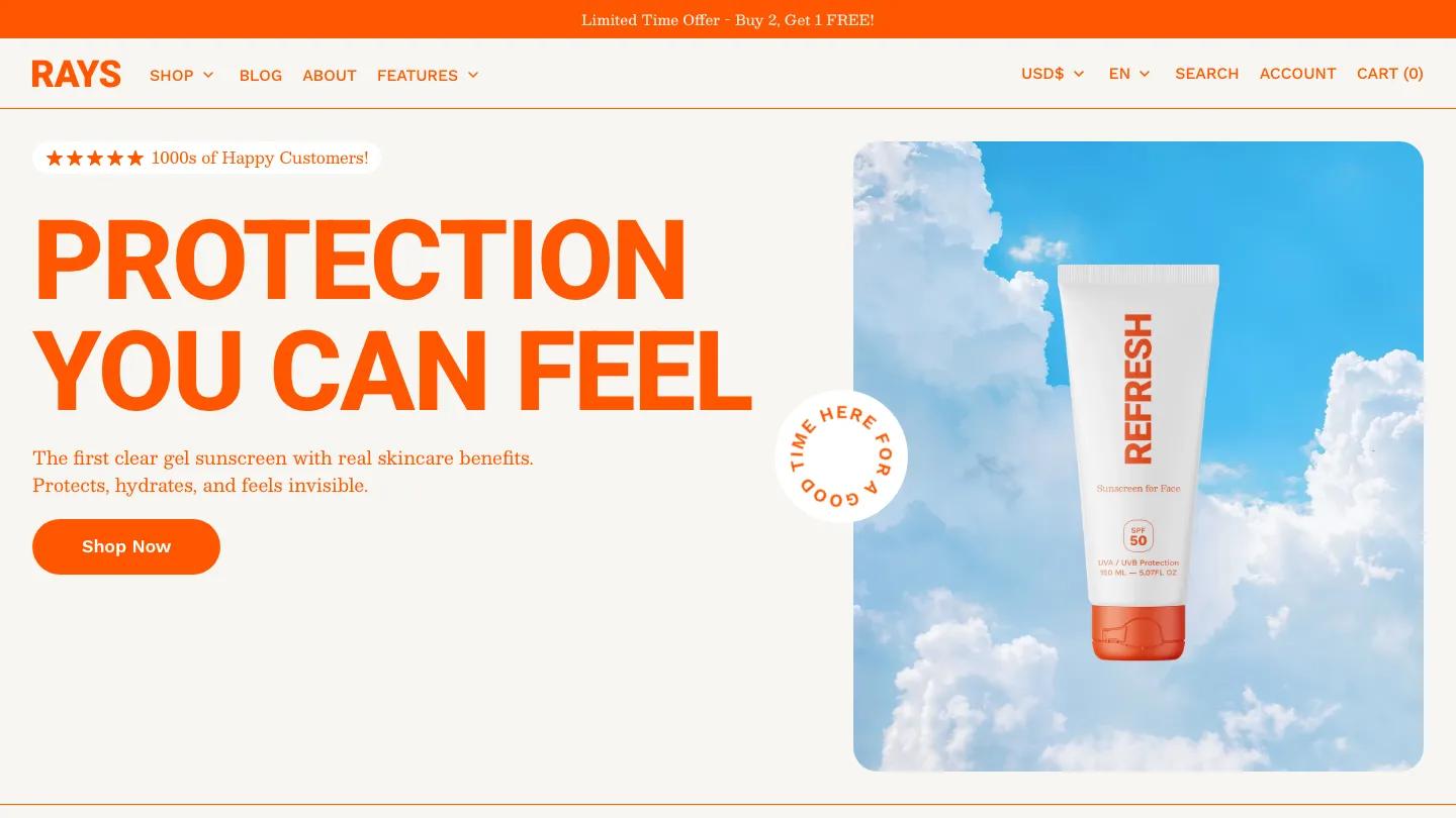
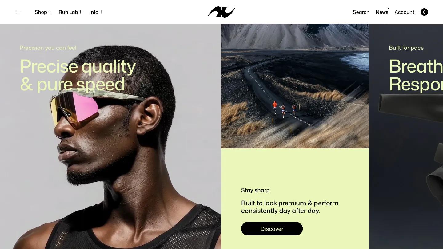
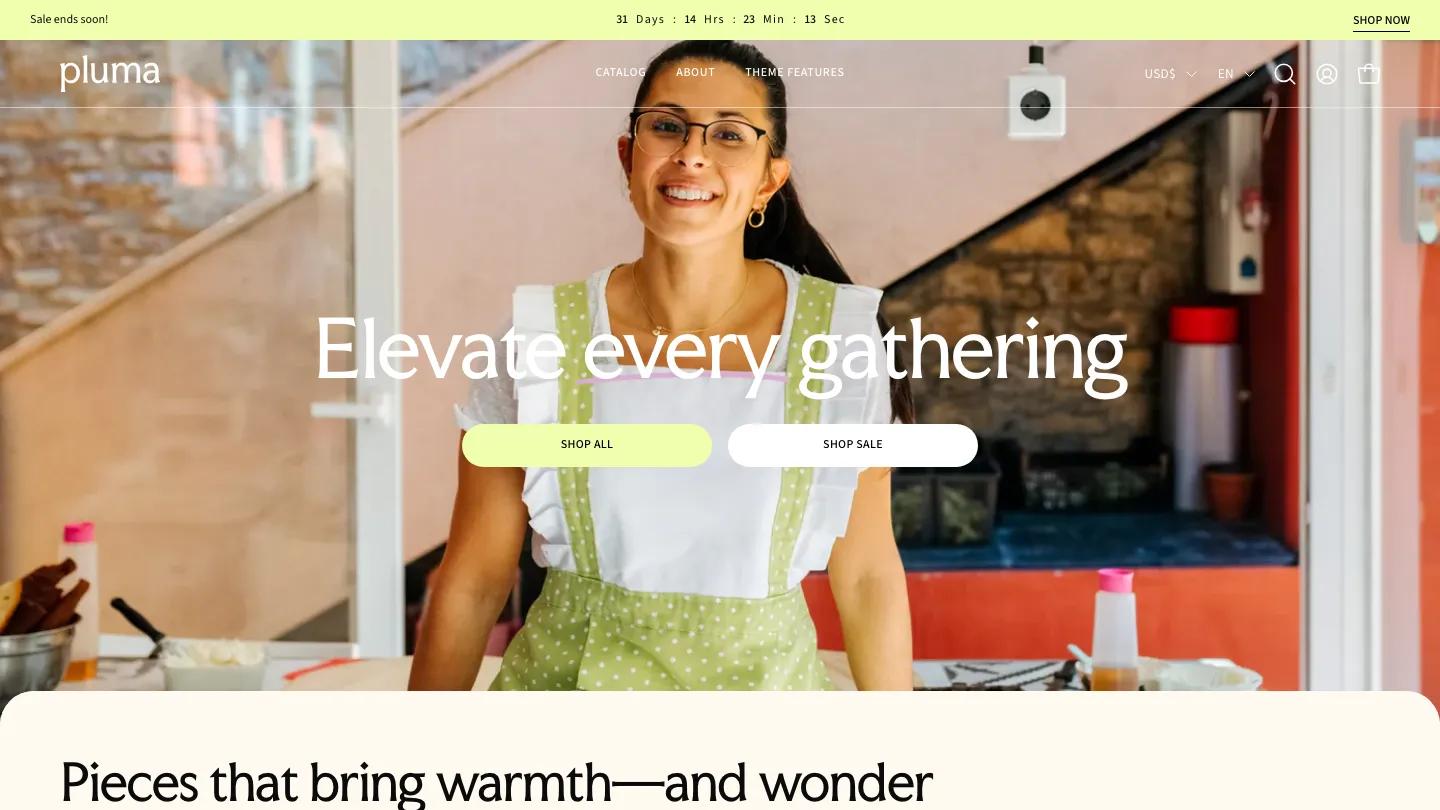
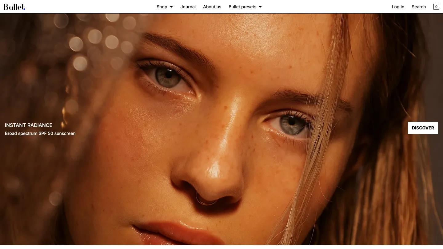
Zap is a high-quality Shopify template for Retail & E-commerce, Food & Drink by Almost Perfect Studio.
Our Review of Zap
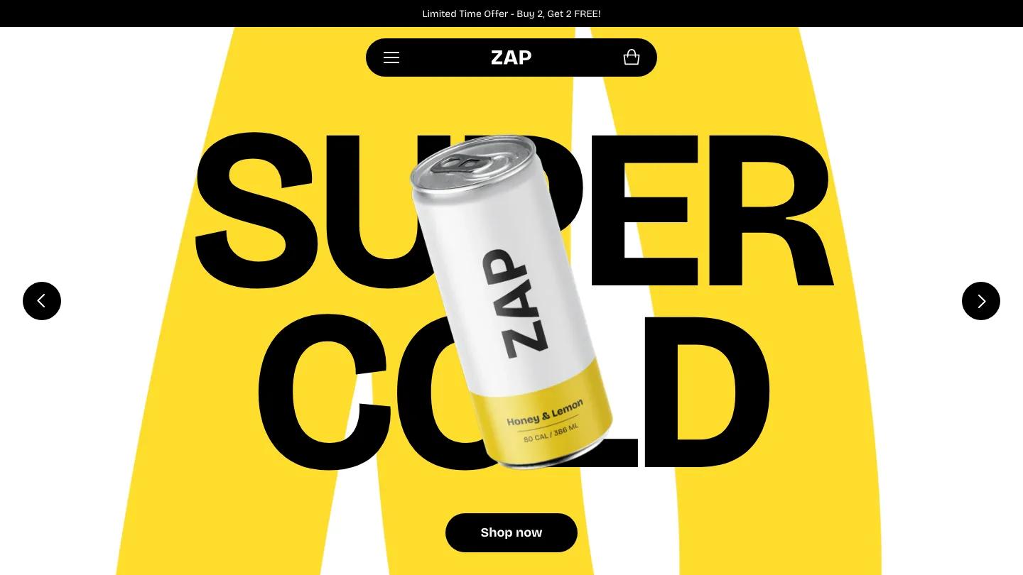
Zap is a loud, cheerful Shopify theme from Almost Perfect Studio, and its cold brew demo is built for a drinks brand with a single hero product and a sense of humour. The palette is lemon yellow, black, and white, and Bricolage Grotesque is used heavy and uppercase almost everywhere. The hero slideshow sets "Super Cold" in enormous black letters over two sweeping yellow curves, with a tilted can floating in front of the words and a pill-shaped Shop Now button below. The header is unusual: a floating black capsule holding only a menu icon, the wordmark, and a cart,.
Under the hero, a yellow marquee band scrolls short claims like Sustainably Sourced, then a product carousel shows each flavour's can on a pale grey card with a name, a price line, a one-sentence description, and small badges for discounts. A split section lists benefits such as High Protein and 0-2g Sugar beside a big photo of a can pouring into a glass. Brewed to Refresh Every Sip comes next, with stickers and small photos scattered around it, followed by a strip of publication logos and a yellow band of customer quote cards, each linked to a product. Lifestyle photos and a yellow footer with a giant wordmark close it out. The product page keeps the rounded look: thumbnails down the left, tick-marked facts, pill buttons for size and flavour, and a quantity stepper beside Add to Cart.
On a phone the capsule header stays tidy, but the can covers most of the shrunken hero headline, so the slide reads mainly as yellow.
We'd pick Zap for beverage, snack, and supplement brands with a short product line and bold packaging. Check that your photos sit well on yellow, and replace the sample reviewer names and handles before launch.
Based on the live demo, viewed on desktop and on a phone. The Design and Dev scores come from separate independent reviews. See how we score templates.
Independently evaluated by our team of 6 designers and 5 developers.











Designers score design, developers score development, and each score is the average of their independent ratings. Read about our review team and how we score templates.