SLANTSUAL is a high-quality Framer template for Professional Services, Portfolio & Agency, Art & Design, Business & Startup, Real Estate & Property, Furniture & Interior Design by Jenkate MW.
Our Review of SLANTSUAL
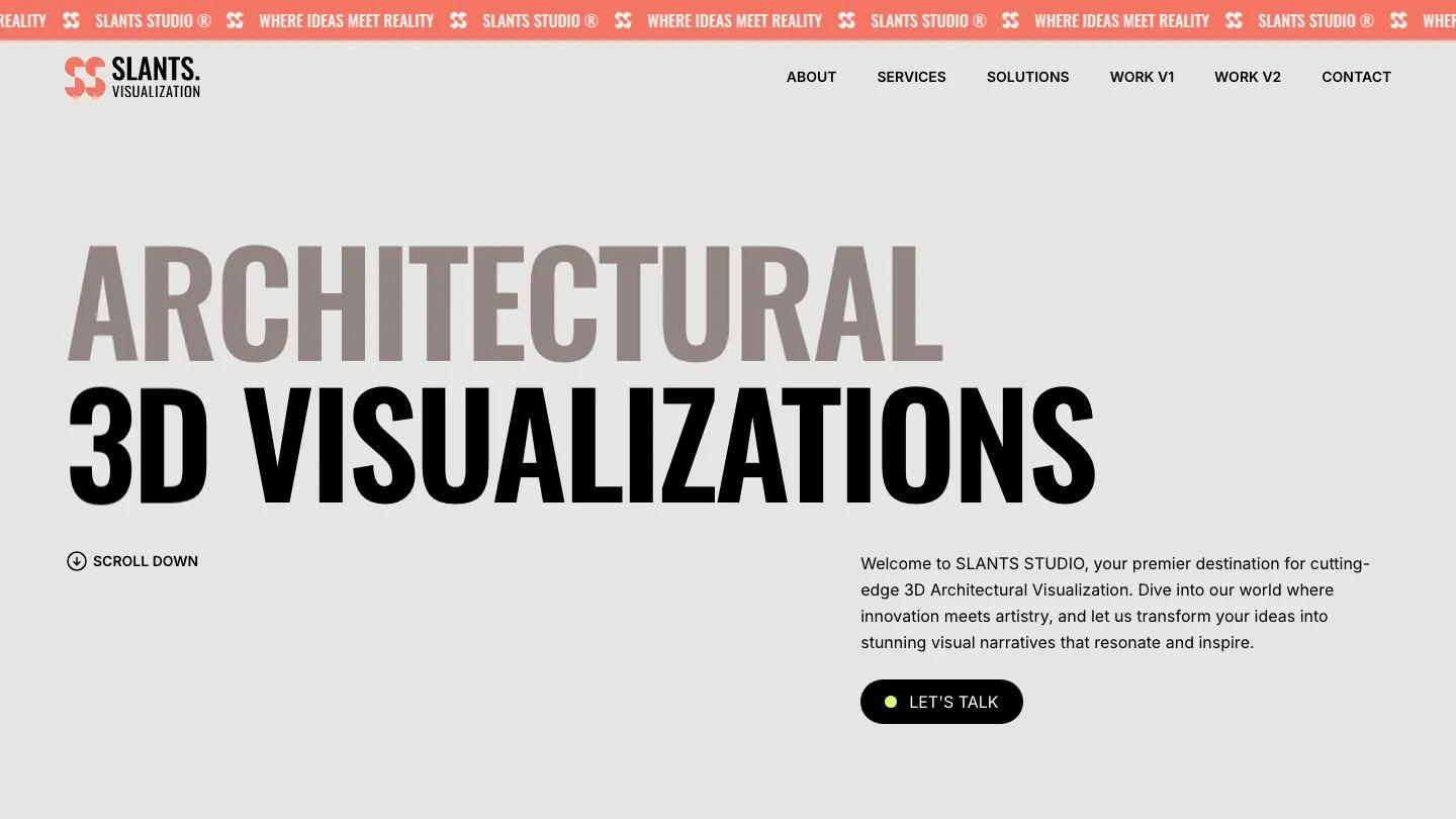
Slantsual is a studio site for an architectural visualization practice that turns plans into photoreal renders. The hero is pure type: "Architectural" in taupe and "3D Visualizations" in black, both in towering condensed Oswald capitals across a warm grey page, with a Scroll Down cue on the left and a short intro and black Let's Talk pill on the right. A coral ticker runs across the very top with the studio name and tagline, and the header pairs a coral logo mark with links for About, Services, Solutions, Contact, and two separate work layouts.
Jenkate MW builds the homepage on a ruled, two-column grid. A full-width render with oversized overlay type leads into an about block where text sits beside a mosaic of studio photos, then a Partners strip of scrolling placeholder logos. Solutions lists client types as rows with small colored squares and arrow links. Featured Work is the strongest part: each project gets a big render slider on the right and a narrow left column with the title, service, location, an image counter, and round arrow buttons. Numbered service rows, from 3D modeling to 360 virtual tours, a scrolling strip of lakeside and cliffside renders, and a black footer with contact details close it out. The About page repeats the giant two-tone heading, with a tower render and a wide team photo below.
On a phone, the headline stacks into short centered lines, the menu becomes a round black button, and the coral ticker stays pinned above.
We'd pick Slantsual for rendering studios, interior visualizers, and architecture firms with a deep library of finished images. The homepage is long and leans hard on high-end renders. The demo copy is also heavy on marketing filler, so rewrite it in your own voice.
Based on the live demo, viewed on desktop and on a phone. The Design and Dev scores come from separate independent reviews. See how we score templates.
Independently evaluated by our team of 6 designers and 5 developers.











Designers score design, developers score development, and each score is the average of their independent ratings. Read about our review team and how we score templates.