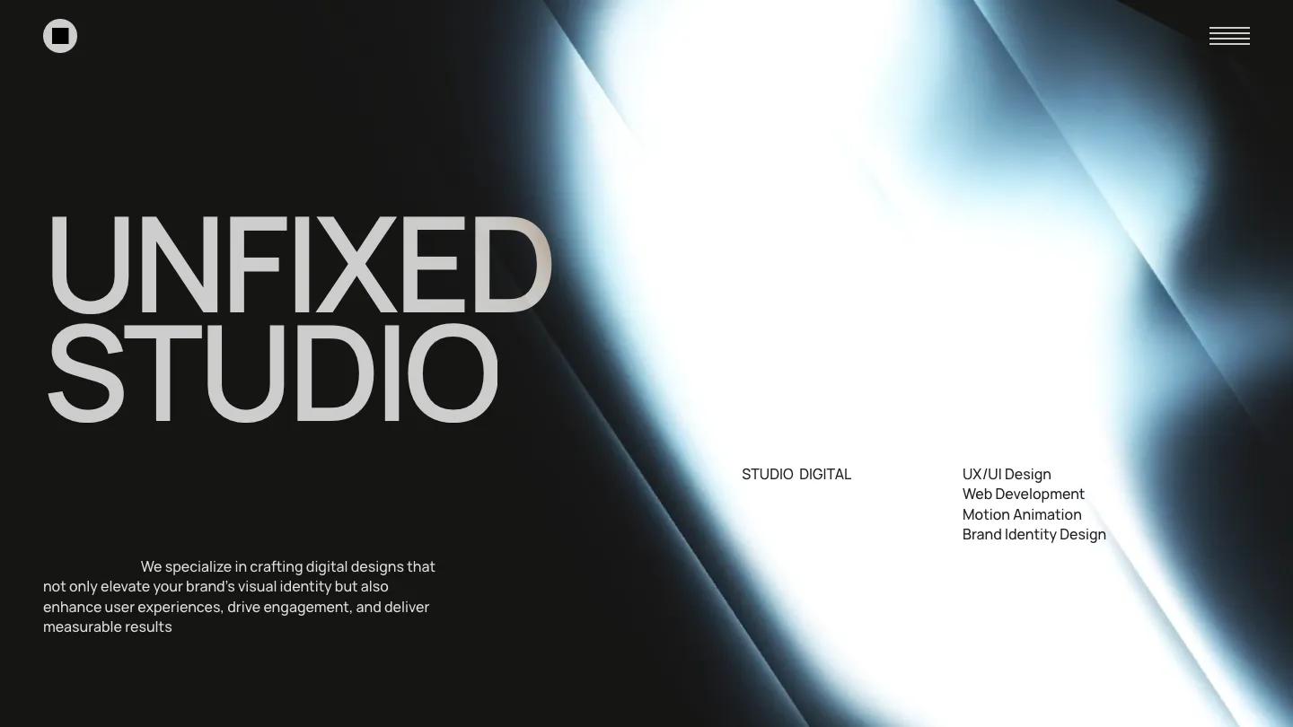
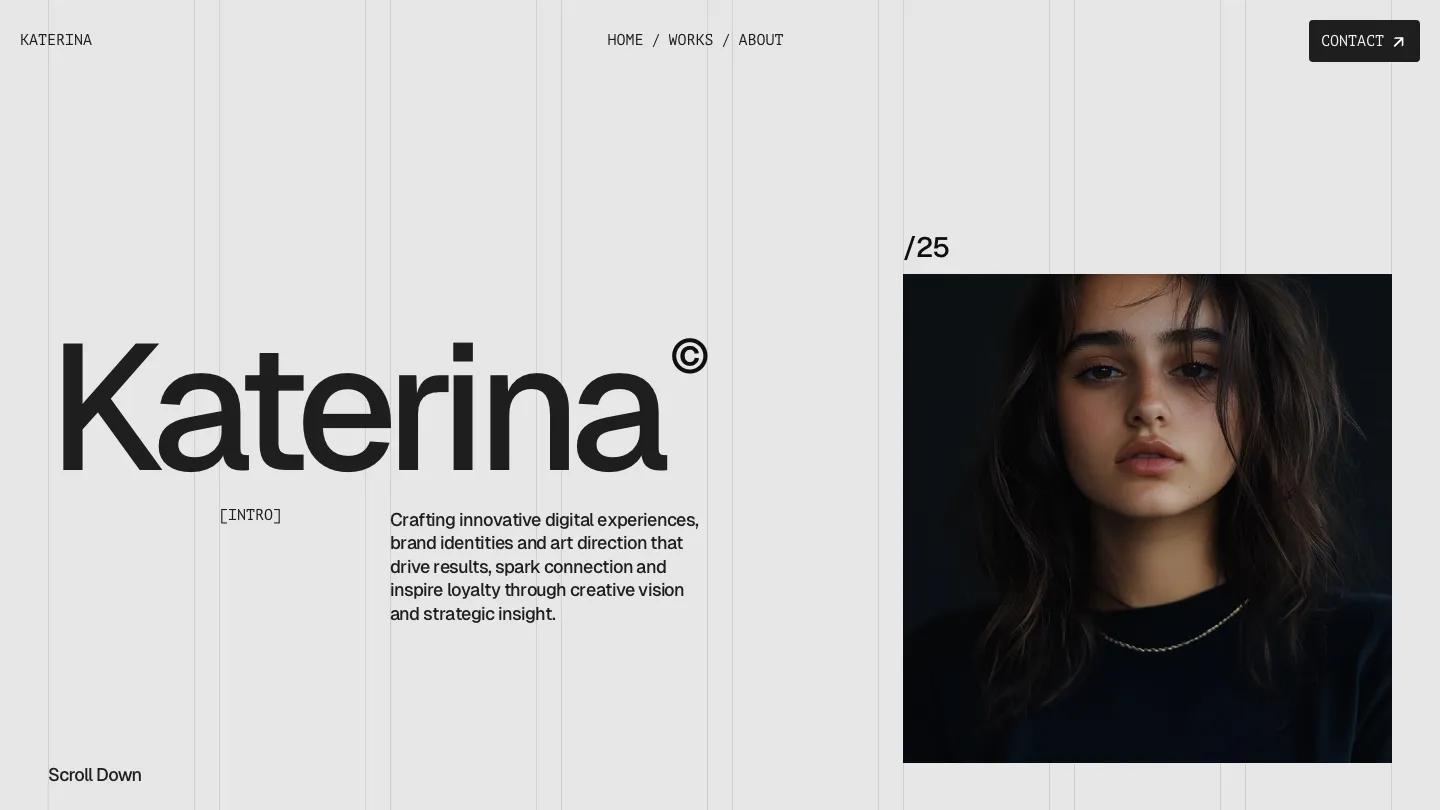
Origo.Studio is a high-quality Framer template for Portfolio & Agency, Art & Design, Professional Services, Photography & Videography, Business & Startup by Anisa Oktariani.
Our Review of Origo.Studio
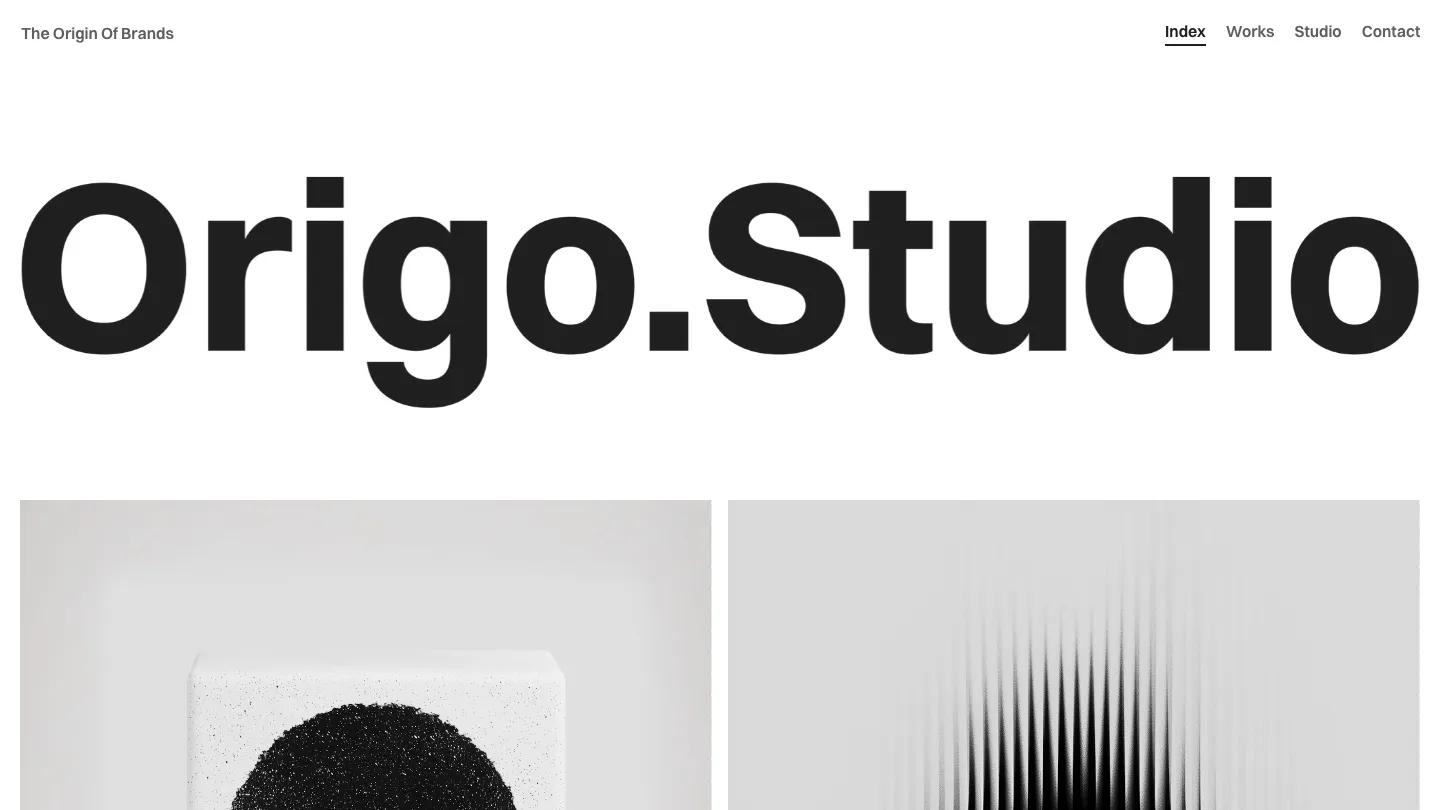
Origo.Studio is a branding studio site with almost no color in it, and that restraint is the point. The studio name fills the full width of the hero in heavy black Switzer, and right under it the project grid begins: square tiles of grey and white product shots and abstract textures, like a speckled black circle on a stone block. A small "The Origin Of Brands" tagline sits top left, and the menu on the right is just Index, Works, Studio, and Contact, with a short underline under the current page.
Anisa Oktariani staggers that first grid so some cells stay empty, which gives the work room to breathe. Each tile carries a client name and a discipline, such as Art Direction or Visual Identity. Big bold statements about strategy and identity follow, then a Capabilities list with short descriptions, two rows of small thumbnails sliding across the page, and a row of large numbered stats. A testimonial pairs a client logo box and arrow buttons with a large quote, an FAQ accordion follows, and the footer closes with "Let's define your brand's origin, together." beside a big email address. The Works page repeats the oversized name, then lists each project as a numbered row with a short summary on the left and a strip of four images on the right.
On a phone, the wordmark still spans the screen, and the grid keeps its staggered two-column rhythm with labels over each image.
We'd pick Origo.Studio for brand designers and small identity studios with a body of polished, consistent visuals. The monochrome look only holds if your imagery is muted, too. The FAQ currently answers questions about the template itself, and one testimonial shows a real airline's logo, so rewrite and replace both.
Based on the live demo, viewed on desktop and on a phone. The Design and Dev scores come from separate independent reviews. See how we score templates.
Independently evaluated by our team of 6 designers and 5 developers.











Designers score design, developers score development, and each score is the average of their independent ratings. Read about our review team and how we score templates.