Oberg is a high-quality Framer template for Personal, Portfolio & Agency, Art & Design by Semih Yilmaz.
Our Review of Oberg
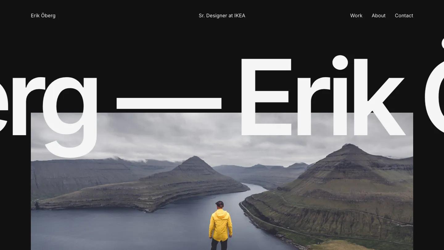
Oberg is a stripped-back personal portfolio for a digital or product designer, built almost entirely from Inter and photography. The hero is the owner's full name running as a giant black marquee across a pale grey page between long dashes, with the letters overlapping the top of a wide photo of a hiker in a yellow jacket above a fjord. The header has only three parts: the name on the left, a job title in the middle, and Work, About, and Contact on the right. The same layout also comes in a dark theme with white type on near-black.
Below the photo, a short statement about being a digital designer from Sweden is set in huge bold type, followed by a two-paragraph bio aligned to the right half. Selected Work then gets its own oversized heading and a stack of projects, each pairing a large photo with a name, a one-line brief, and a See Case link. The images alternate sides, so a turquoise rooftop shot for a real estate site sits left and a hotel bedroom for VeryCosy sits right. A See All Work link and a Let's Connect footer close the page. Semih Yilmaz keeps the Work page simple, opening with a centered Selected Work heading before the same alternating project rows.
On a phone, the layout doesn't fill the screen: the hero and intro shrink into a narrow column on the left with very small text, and the work list below uses only part of the width. We'd fix the mobile layout before launch.
We'd pick Oberg for designers who want a calm, Scandinavian-feeling portfolio with lots of white space. Swap the famous furniture brand name in the header job title for your own role, and plan for strong outdoor photography, since the hero depends on it.
Based on the live demo, viewed on desktop and on a phone. The Design and Dev scores come from separate independent reviews. See how we score templates.
Independently evaluated by our team of 6 designers and 5 developers.











Designers score design, developers score development, and each score is the average of their independent ratings. Read about our review team and how we score templates.