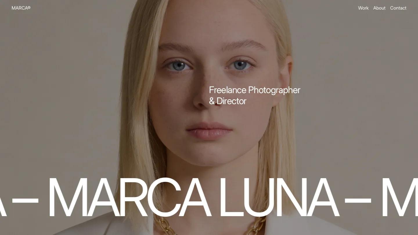
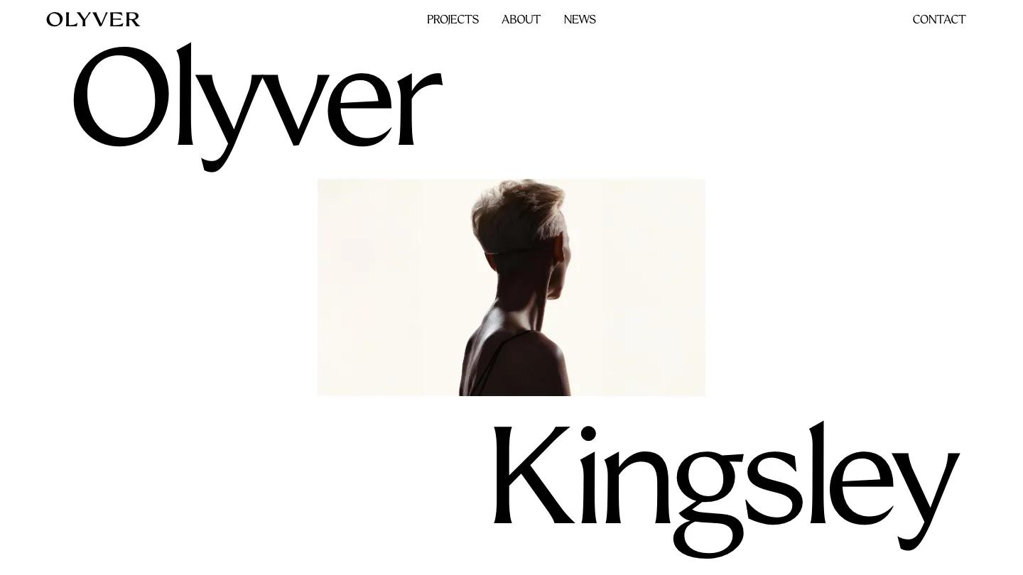
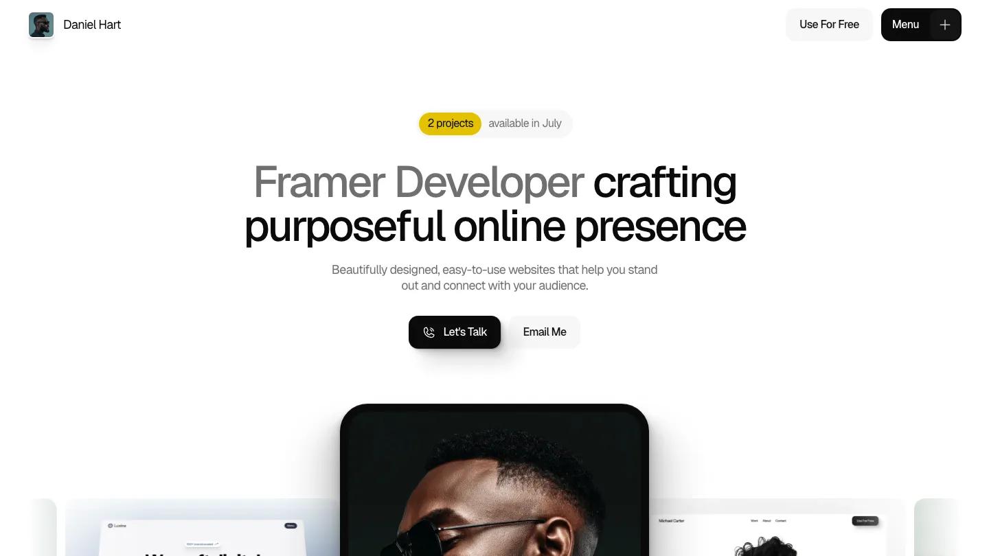
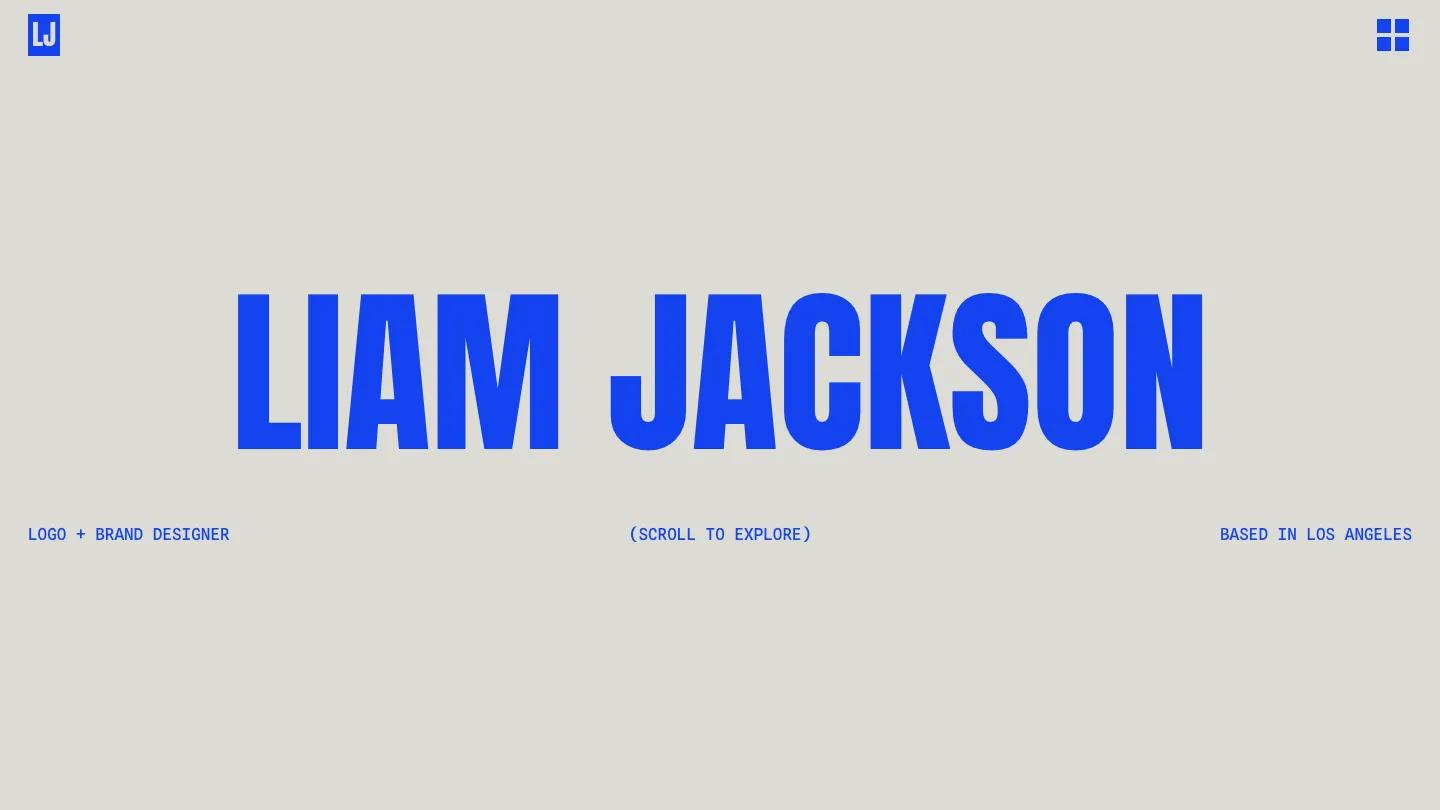
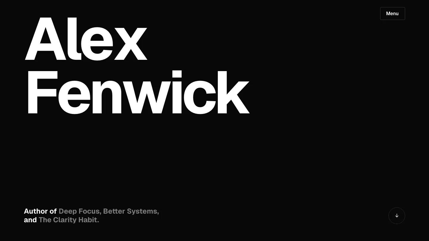
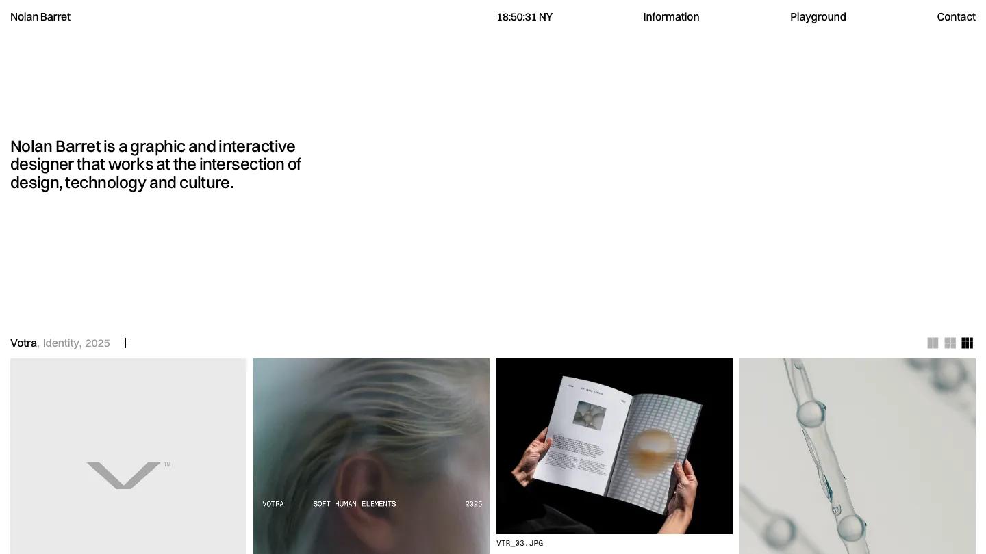
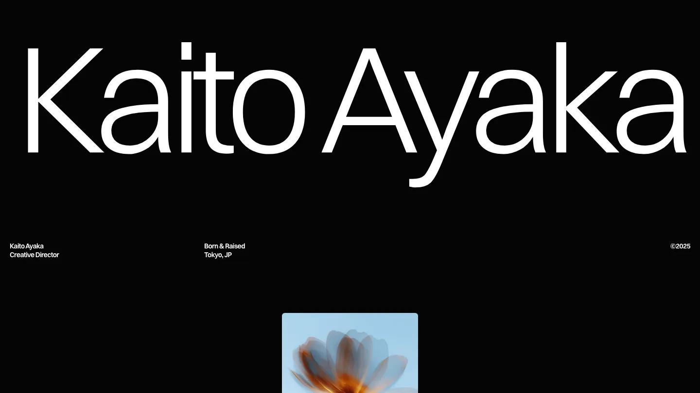
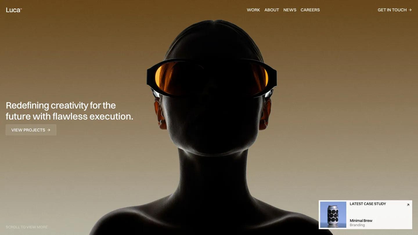
Mike is a high-quality Framer template for Personal, Portfolio & Agency, Art & Design, Professional Services, Business & Startup by Tymofii Bak.
Our Review of Mike
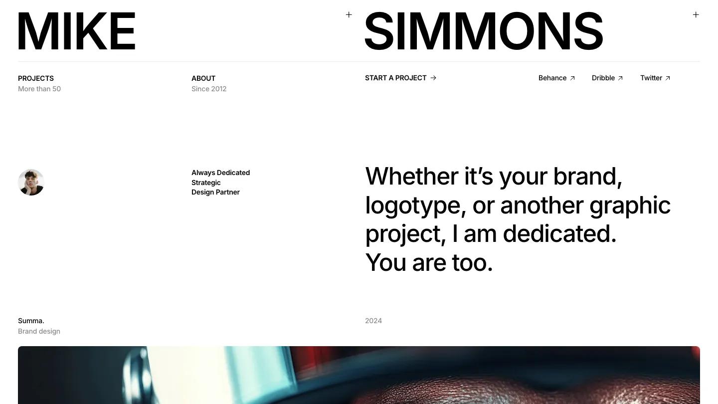
Mike is a one-person portfolio for a brand or logo designer, and it trusts plain black type to do almost all the work. The name Mike Simmons sits stacked in heavy Inter at the top left, with a thin rule underneath and a small grid of links: Projects, About with "Since 2012" in grey, Start a Project with an arrow, and three social profiles. Below that, a round portrait, a short "Always Dedicated Strategic Design Partner" tagline, and a large two-line statement set the tone. White page, black text, grey captions.
Tymofii Bak builds the rest of the homepage as a project gallery. Each case gets a big rounded image with its name, discipline, and year as a quiet caption, like Summa, a brand design piece from 2024. The demo art is varied: a desert scene with the letters of Dune spaced across thin lines, a concrete facade carrying a three-letter logo, a winter jacket photo with a clothing wordmark, and colorful panels with rotated lettering. On wider screens the cards pair up in two columns. A numbered What I Do list with a Download CV link follows, then a footer with an email address, a menu, and giant M. and S. initials. The Projects page repeats the name header and filters the work by Branding, Logo design, Graphic design, and Other.
On a phone, the stacked name stays bold, the link grid folds into a Menu label with a dots button, and the portrait and statement follow in one clean column.
We'd pick Mike for identity designers and freelance art directors with finished brand work and good photography. The whole page leans on those project images, so weak mockups would show. We'd also replace the demo name and placeholder email before launch, since both appear in large type.
Based on the live demo, viewed on desktop and on a phone. The Design and Dev scores come from separate independent reviews. See how we score templates.
Independently evaluated by our team of 6 designers and 5 developers.











Designers score design, developers score development, and each score is the average of their independent ratings. Read about our review team and how we score templates.