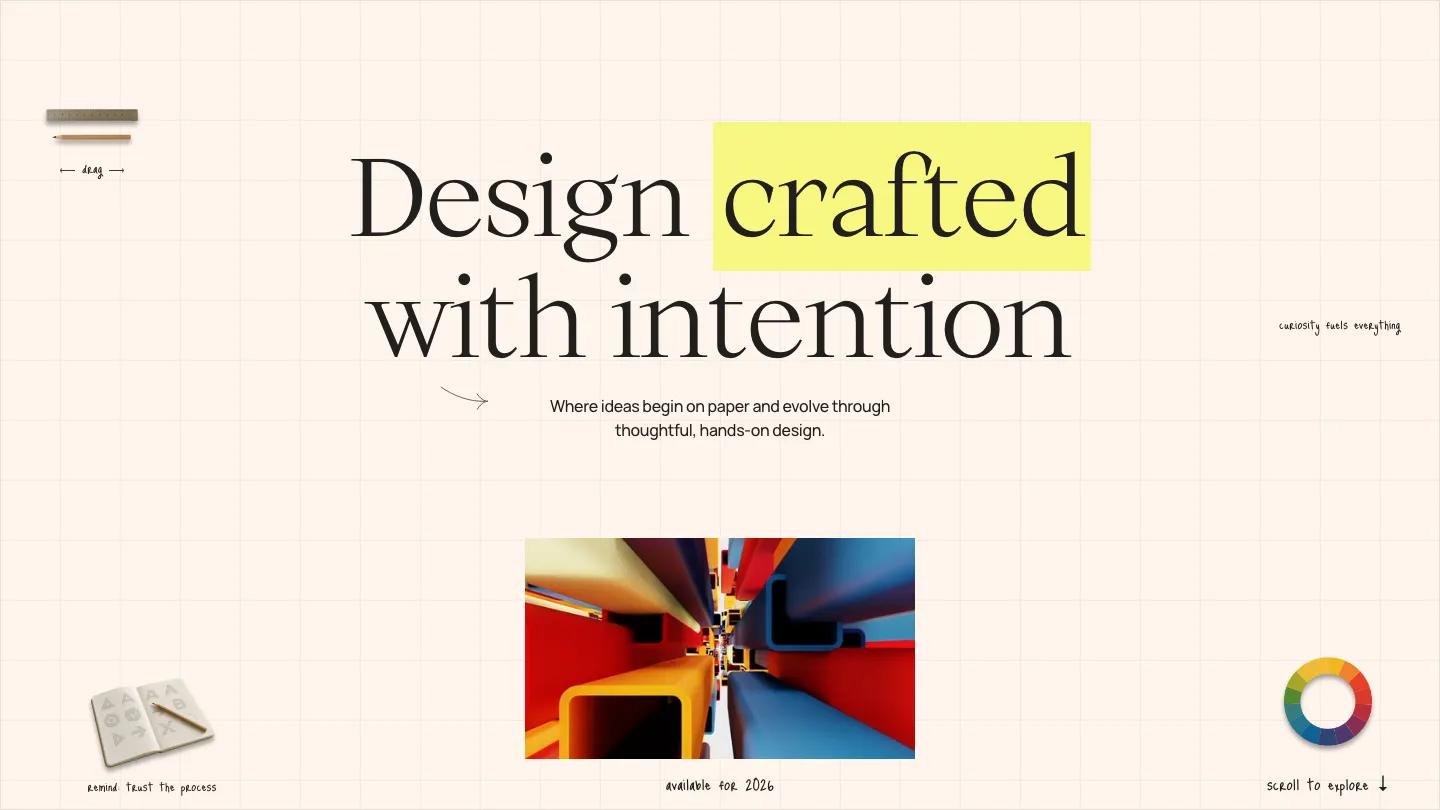
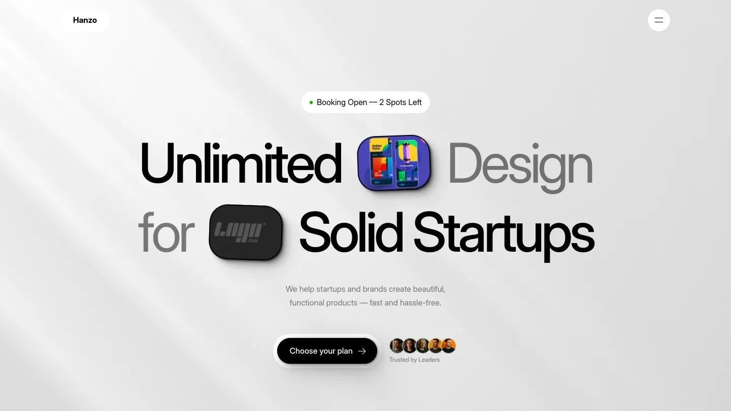
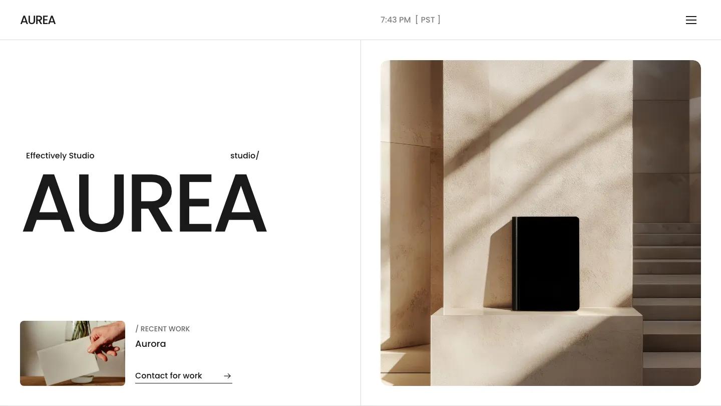
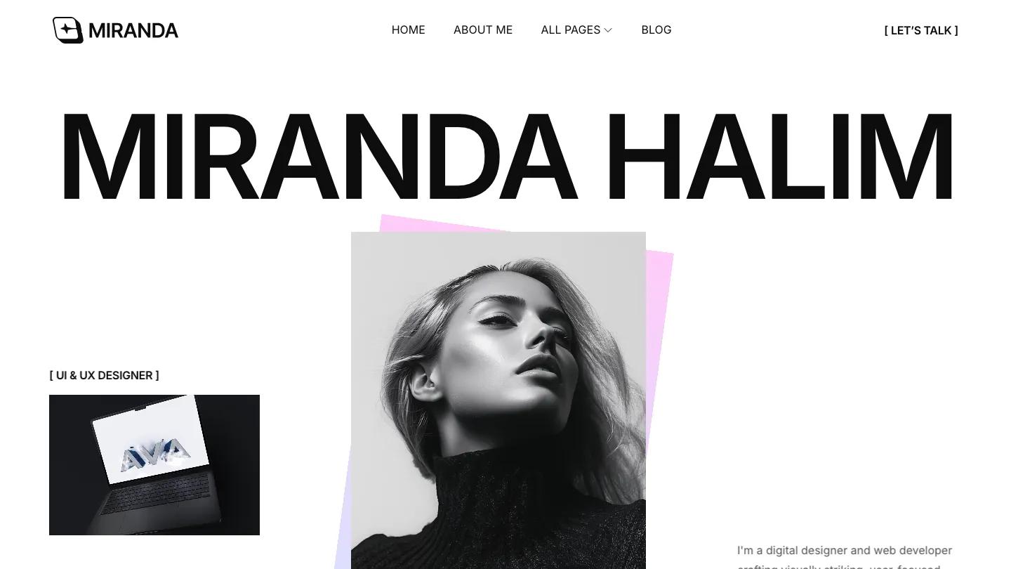
Bruja is a high-quality Framer template for Portfolio & Agency, Personal, Art & Design, Professional Services by Arkuš Design.
Our Review of Bruja
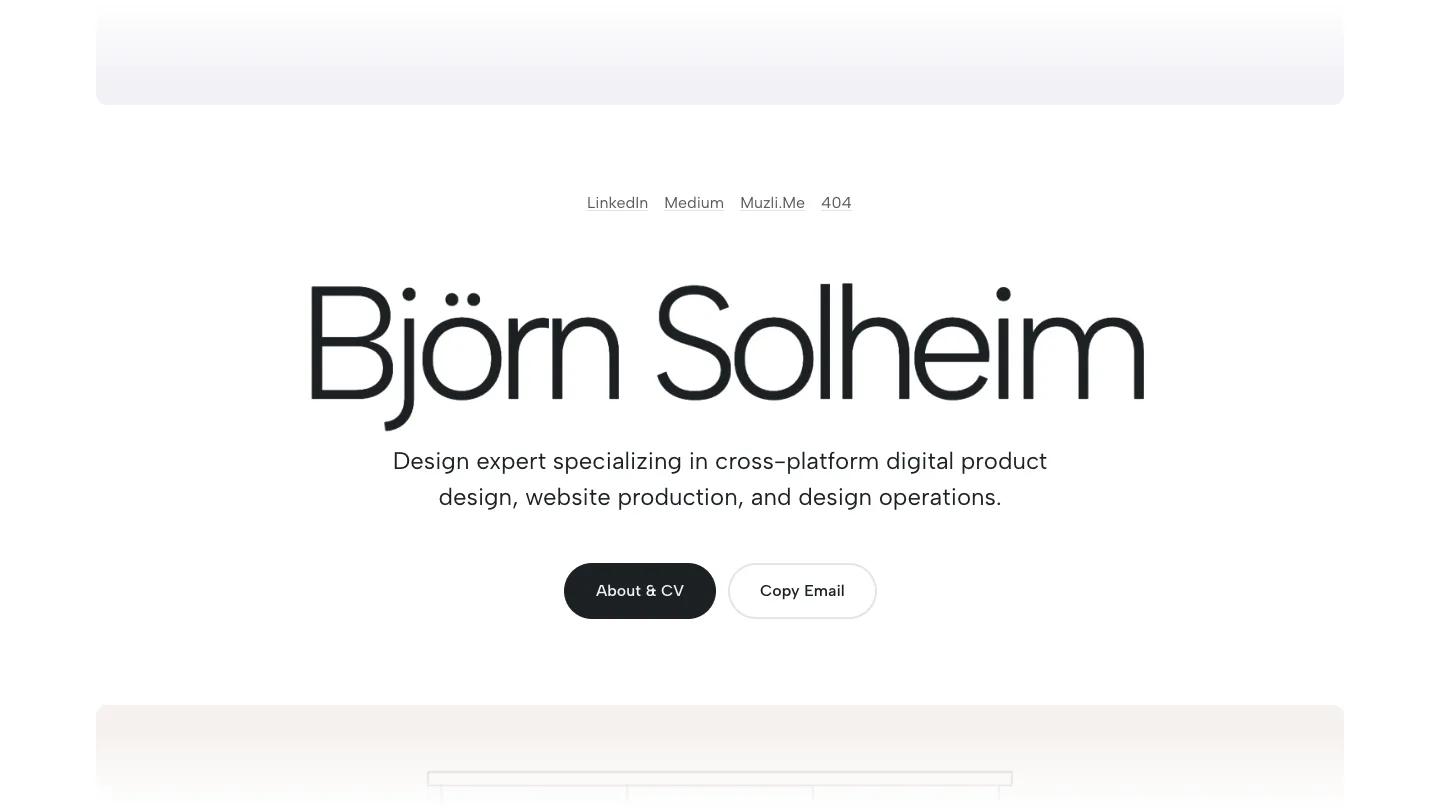
Bruja is a quiet, almost gallery-like portfolio for a product designer built on one idea: a name and a stack of work. The hero sets the designer's name in light Albert Sans at a very large size, centered on white, with a one-line specialty underneath and two pill buttons, a dark About & CV and an outlined Copy Email. Instead of a header, a row of small underlined text links sits above the name. Colors stay muted throughout: off-white, cool grey, a faint mint, and near-black.
Arkuš Design builds the rest from wide rounded panels, each tinted a slightly different pale shade. Every project panel shows a thin line drawing of a device, a phone, a smartwatch, a tablet, a widescreen monitor, or a wall of parcel lockers, with a soft blurred ink blot as the placeholder screen. The project name and a short grey description sit in the lower left corner. Scroll far enough and the list wraps back around to the name, so the homepage loops rather than ending in a footer. A project page repeats the oversized type for its title, adds a centered subtitle and a neat row of Client, My Role, Development, and Timeframe details, and places a round back arrow and menu button in the corners above a large rounded image panel.
On a phone, the name shrinks to fit a single line, the buttons sit side by side, and the project panels stack with generous margins.
We'd pick Bruja for UX and product designers working on apps, devices, and interfaces. The demo screens are all placeholder blots, so you need clean device mockups of your own. The looping scroll and lack of a regular menu may also confuse some visitors.
Based on the live demo, viewed on desktop and on a phone. The Design and Dev scores come from separate independent reviews. See how we score templates.
Independently evaluated by our team of 6 designers and 5 developers.











Designers score design, developers score development, and each score is the average of their independent ratings. Read about our review team and how we score templates.