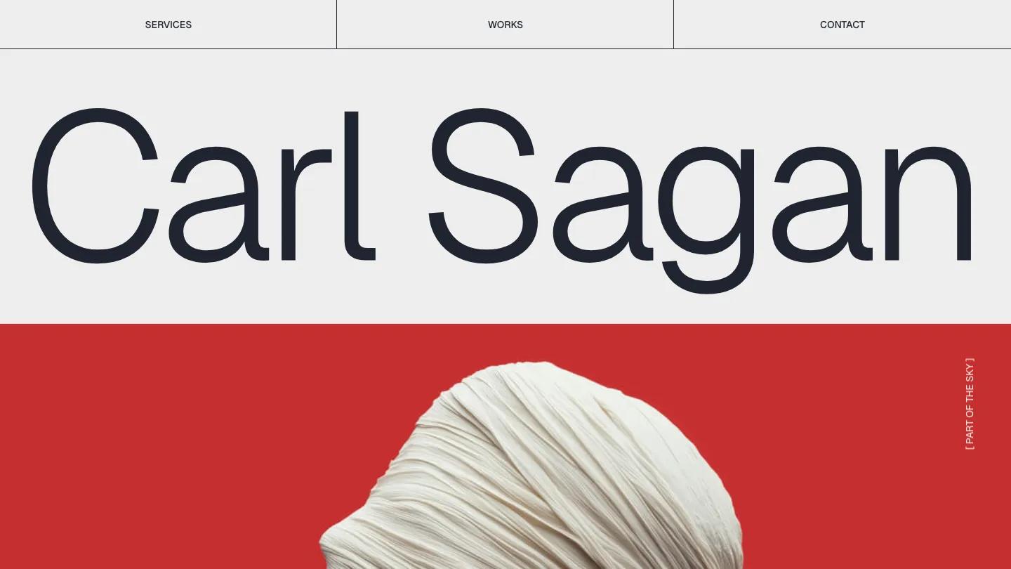
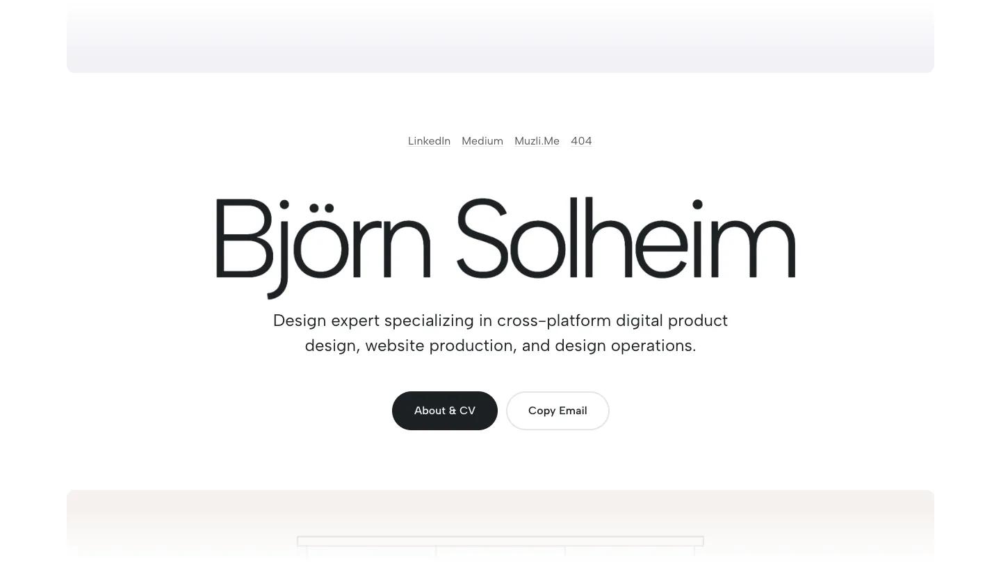
Oliver Boyle is a high-quality Framer template for Portfolio & Agency, Art & Design, Professional Services, Personal, Business & Startup by Format Supply.
Our Review of Oliver Boyle
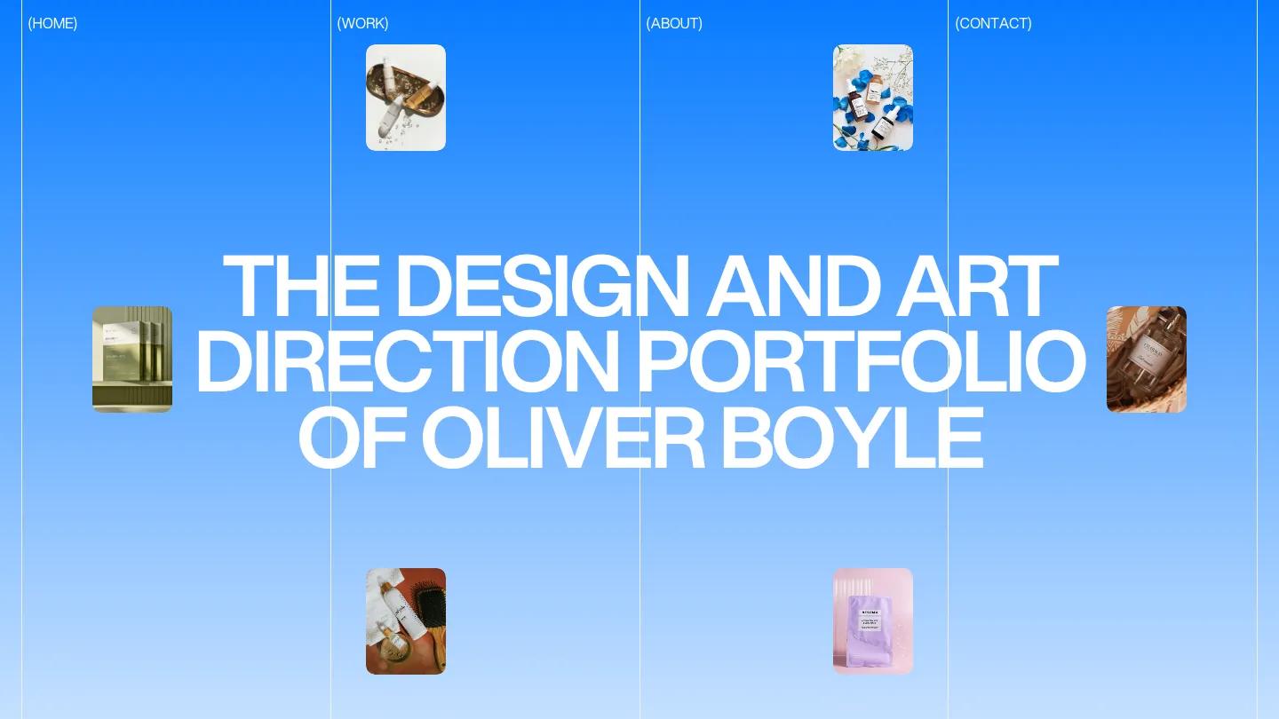
Oliver Boyle is a portfolio for an art director or brand designer, and it is drawn on a visible grid from the first second. Thin vertical rules split the page into four columns, and each column header doubles as a link: Home, Work, About, Contact, all wrapped in parentheses. The hero sky fades from saturated blue to white, and the owner's name and title sit in the middle in huge white Aspekta capitals. Small rounded product shots of serums and skincare float in the columns around the headline.
Format Supply keeps that grid running down the whole page, which keeps everything tidy. After the blue fades out, a short intro in a soft serif sits centered over the column lines. Selected Work arrives in heavy black capitals with tiny bracketed labels for Branding, Design, and Art Direction and a See All link, then large rounded packaging photos in pairs, captioned with the project name on one side and its discipline on the other. A services block is the clever part: Art Direction, Branding, and UI/UX Design stack in big capitals, and as you scroll, each turns black in turn while the others stay grey, with a short line of description below. The footer fades to lilac and gathers a contact line, social links, and the page menu. The Work page swaps images for a clean table of title, client, category, and year.
On a phone, the column lines and header links stay put, the headline breaks over five lines, and the floating product photos frame it.
We'd pick Oliver Boyle for brand and packaging designers whose work photographs well. It leans hard on product imagery, so plan on polished shots. The bright blue hero is a strong choice, so check it suits your palette before committing.
Based on the live demo, viewed on desktop and on a phone. The Design and Dev scores come from separate independent reviews. See how we score templates.
Independently evaluated by our team of 6 designers and 5 developers.











Designers score design, developers score development, and each score is the average of their independent ratings. Read about our review team and how we score templates.