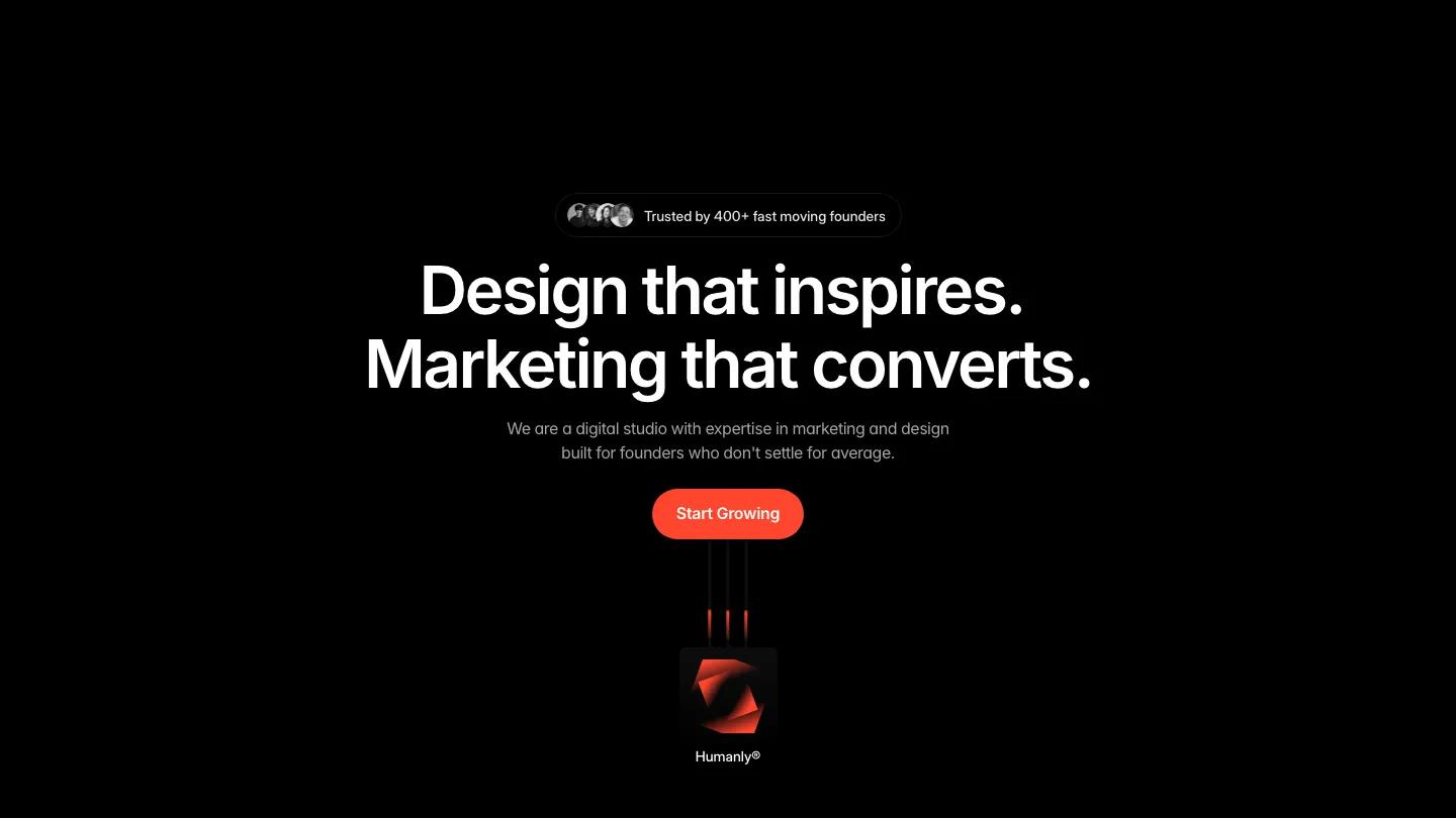
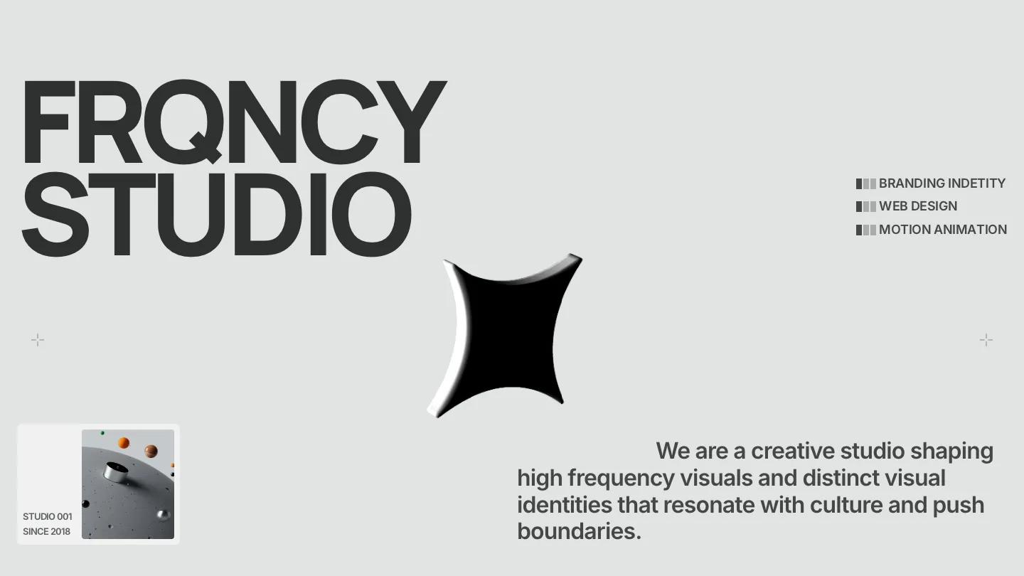
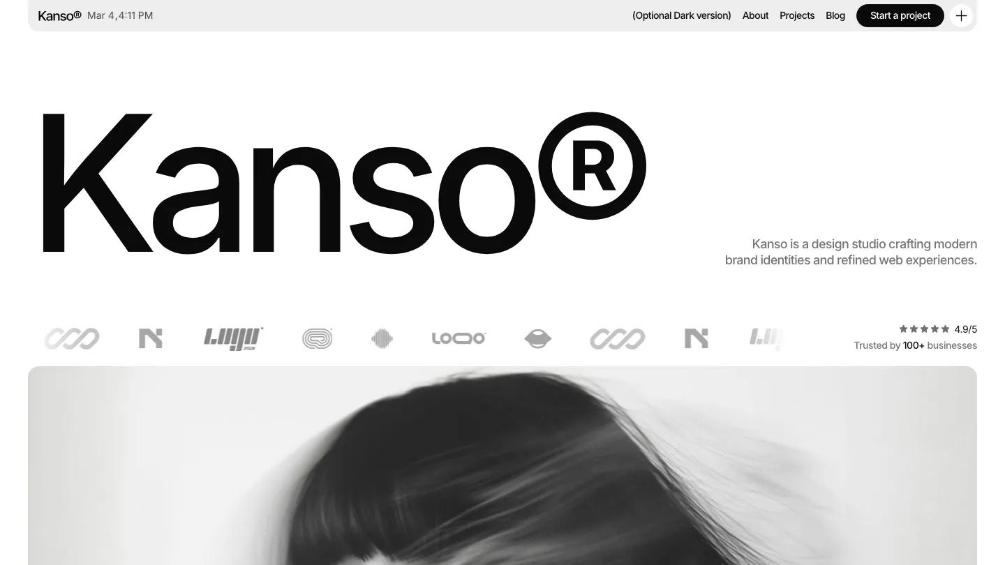
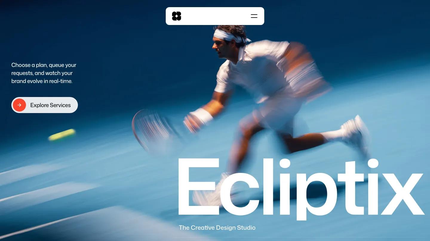
Hanzo is a high-quality Framer template for Portfolio & Agency, Art & Design, Professional Services, Business & Startup by Easyfast.
Our Review of Hanzo
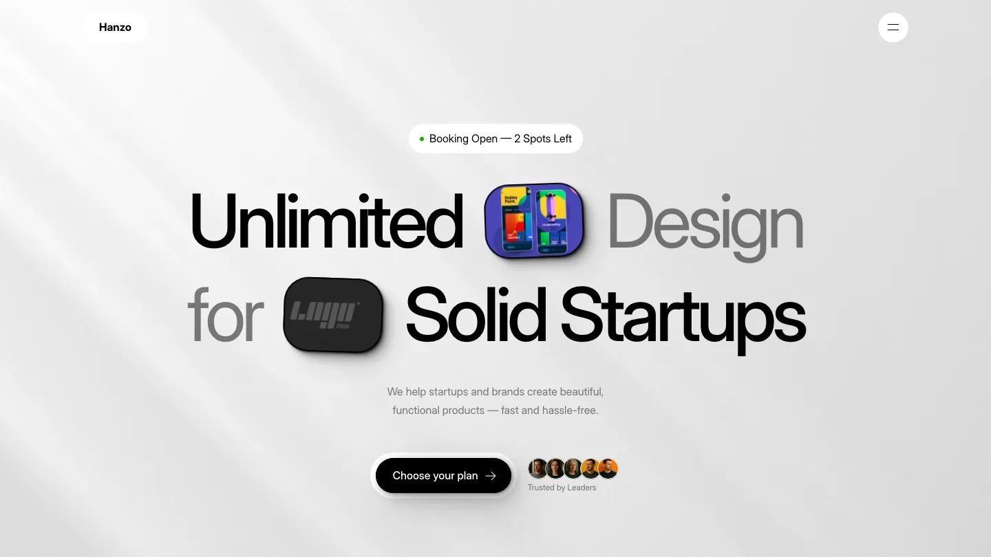
Hanzo is a portfolio for a freelance designer who sells their time as a design subscription, and it looks like a product launch page. The hero sits on a soft grey gradient with diagonal light. A small availability pill with a green dot leads into "Unlimited Design for Solid Startups" in tight Inter Display, mixing black and grey words and dropping glossy app-icon tiles between them. A black Choose your plan button and a cluster of client avatars sit underneath. The header floats as two white pills: the Hanzo name on the left, a round menu button on the right.
Easyfast gives the page a tactile feel. Here's how it works shows tilted white cards for Subscribe, Request, and Get Your Designs, joined by looping orange lines. Recent Case Studies sets project mockups on tablets inside light rounded tiles, captioned with small grey category chips like SaaS and Design System. The about block pairs a tilted portrait with a short bio and a clean experience table of roles, companies, and years. After testimonials comes a pricing area with Monthly and Custom plans and a grid of benefit icons, then an FAQ with orange plus toggles beside a tilted call-booking card, and a dark closing panel. Case study pages like Strida open with a title, tag pills, a Live Link button, and a wide device mockup.
On a phone, the headline restacks over three lines with the icon tiles still in place, and the plan button and avatars stay side by side.
We'd pick Hanzo for solo product designers running a subscription or retainer offer. The experience table lists famous brand names and a placeholder designer name, so swap those for your own history. Navigation lives behind the menu button, so make sure your call-to-action buttons carry the page.
Based on the live demo, viewed on desktop and on a phone. The Design and Dev scores come from separate independent reviews. See how we score templates.
Independently evaluated by our team of 6 designers and 5 developers.











Designers score design, developers score development, and each score is the average of their independent ratings. Read about our review team and how we score templates.