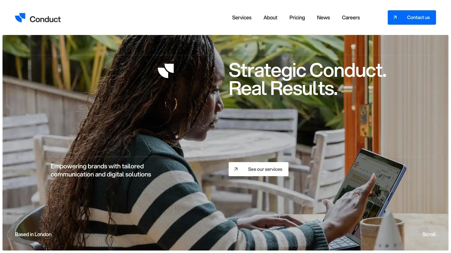
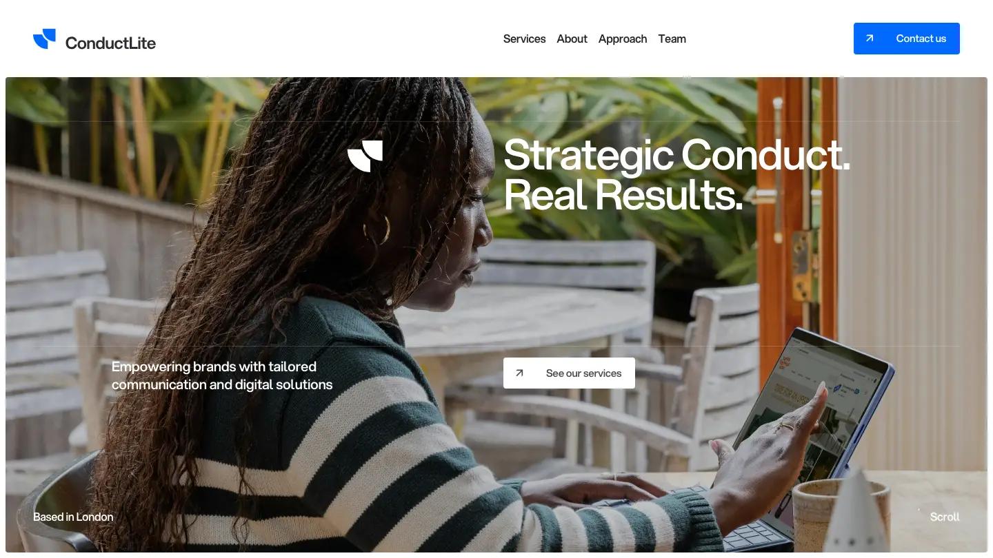
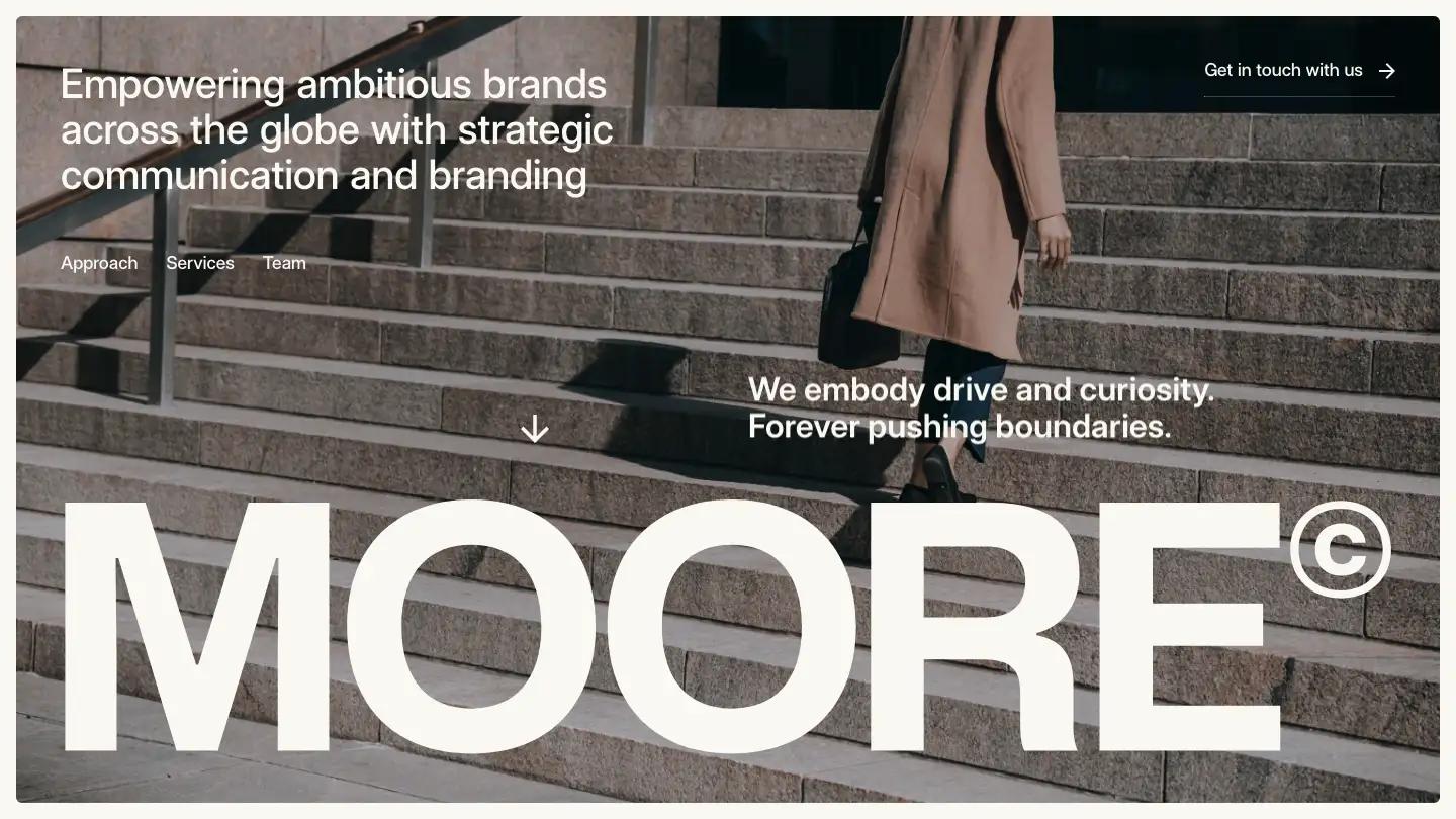
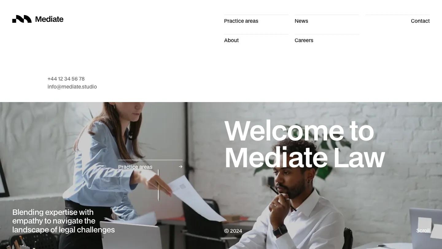
Sincere is a high-quality Webflow template for Professional Services, Portfolio & Agency, Business & Startup by Jacob Nielsen.
Our Review of Sincere
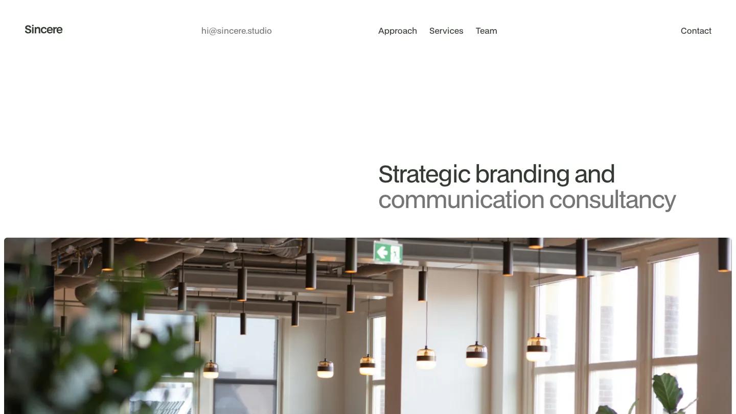
Sincere is a single-page site for a branding and communications consultancy, and its whole personality comes from restraint. The hero is just a two-tone line, "Strategic branding and communication consultancy", set in BDO Grotesk on the right half of a white page, with the second half in grey. Below it, a wide photo of a bright office with pendant lamps and potted plants stretches almost edge to edge. The header lines up a small Sincere wordmark, a studio email address, anchor links for Approach, Services, and Team, and Contact on the far right.
Jacob Nielsen paces the page slowly, with lots of white space and small bullet labels like Welcome, Clients, and FAQ marking each section. A short intro is followed by Global reach, Commitment, and Proven results columns, then a client strip on a light grey panel. The approach section is the most memorable part: a giant uppercase word scrolls past, then thin-ruled columns pair short steps with oversized grey numerals. Services become a numbered list with Strategy, Branding, Communication, and Digital solutions, each with a paragraph of copy. A numbers section, a numbered FAQ accordion with plus icons, a testimonial area, and a team section follow, before "Say hi to the team" and "Get in touch" end the page in enormous capitals. A style guide page sets out the colors and type for editing.
On a phone, the links drop to a row below the wordmark and email, the headline wraps neatly, and the office photo crops to a wide band.
We'd pick Sincere for consultancies and small agencies that sell thinking rather than portfolio pieces. The homepage is very long and carries no project imagery, so it depends on strong writing. We'd also rewrite the service blurbs, which lean on stock agency phrasing.
Based on the live demo, viewed on desktop and on a phone. The Design and Dev scores come from separate independent reviews. See how we score templates.
Independently evaluated by our team of 6 designers and 5 developers.











Designers score design, developers score development, and each score is the average of their independent ratings. Read about our review team and how we score templates.