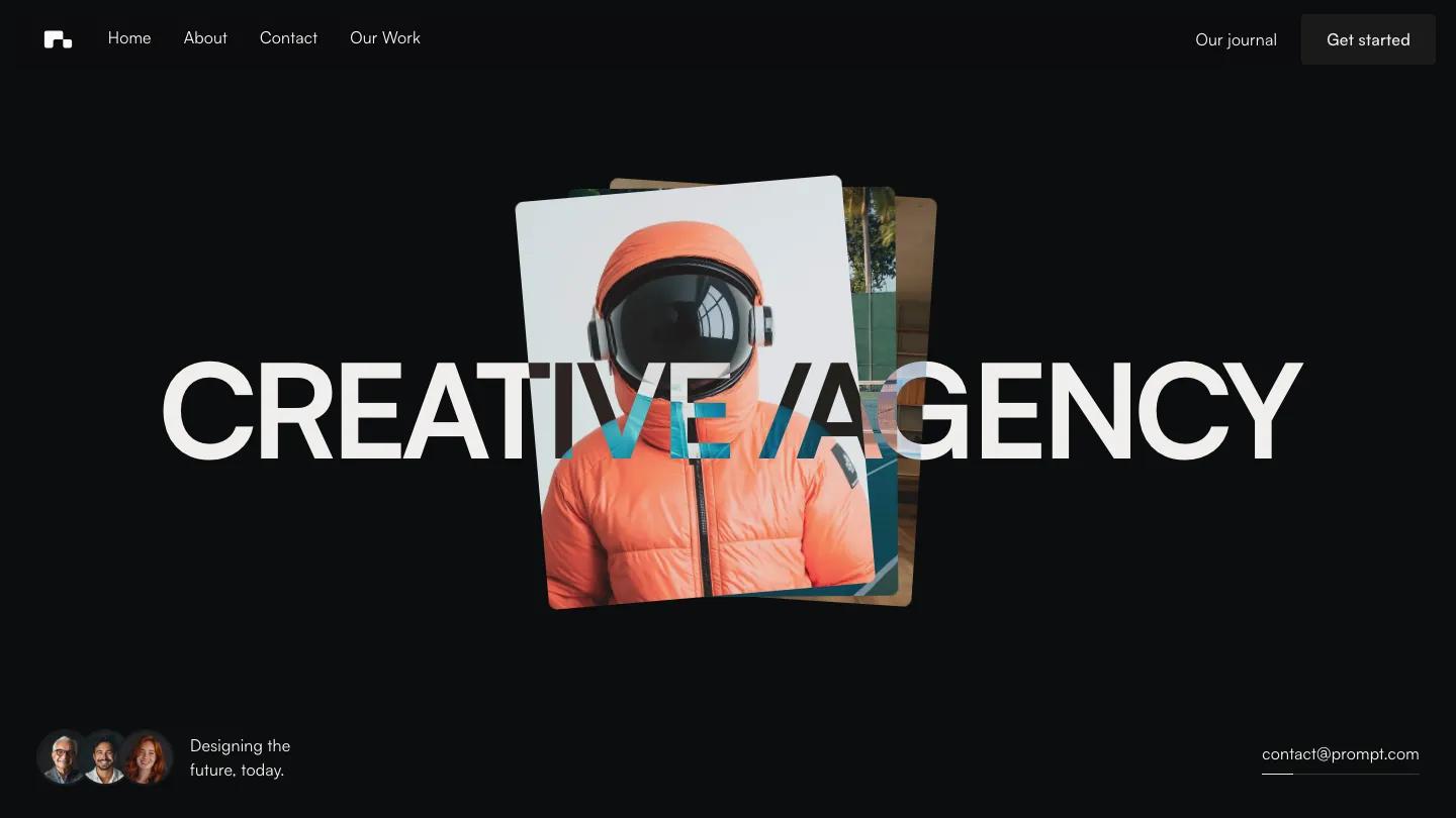
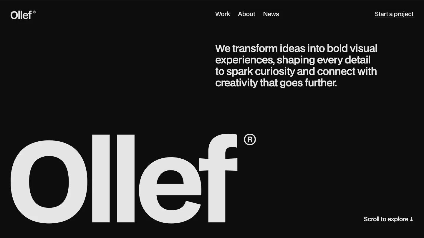
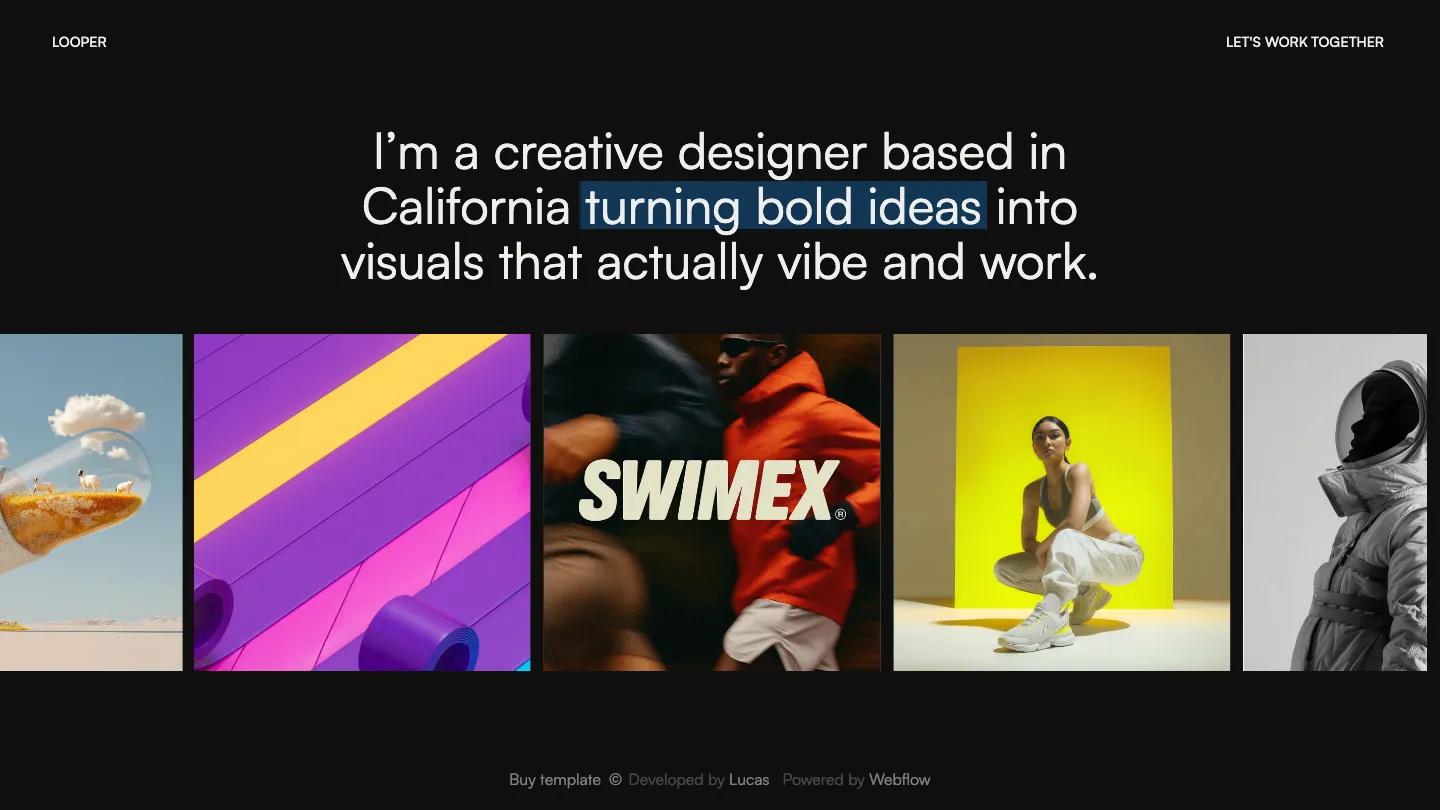
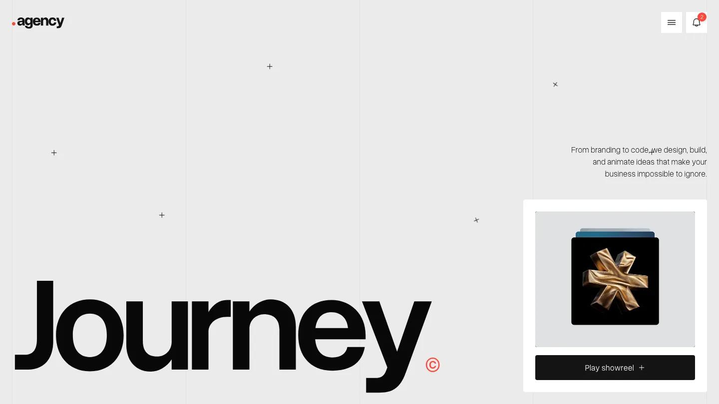
OFFGRID is a high-quality Webflow template for Portfolio & Agency, Art & Design, Personal by Lucas Gusso.
Our Review of OFFGRID
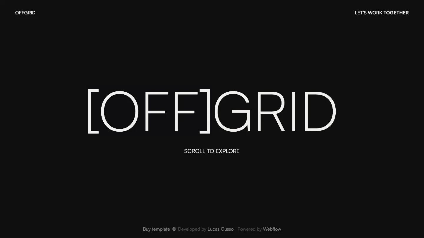
OFFGRID is a portfolio built as a single reveal. You land on a near-black screen with the name set huge and thin in Satoshi, the OFF wrapped in square brackets, and a small Scroll to Explore prompt underneath. The only header items are the OFFGRID wordmark in the top left and Let's Work Together in the top right. It feels like a title card before a film, and that restraint is the point.
Scroll down and the title lifts away while a wall of portrait thumbnails rises from below. It starts as a small cluster of tiles, then spreads out until a tight grid of images fills the whole width, with almost no gap between them. The demo work is a rich mix: sportswear campaigns, an astronaut in a field of flowers, a blue velvet armchair, a grand piano on an ice floe, packaging shots, and close-up portraits. Each tile links to its own work page, so the grid doubles as the project index. Lucas Gusso gives the contact page more structure than the homepage lets on. A large Contact Us heading sits beside email, phone, and address details, and the form opens with pill selectors for Service and Budget before the underlined name, email, and message fields and a white Let's Connect button with a round arrow beside it.
On a phone, the bracketed title shrinks to fit one line and the scroll prompt stays centered, with the rest of the screen left dark until you scroll.
We'd pick OFFGRID for photographers, art directors, and visual designers with a large archive of portrait-format images. The homepage has no about text or project titles, so visitors only get words on the contact page. You'll also need plenty of strong work, since a sparse grid would lose the effect.
Based on the live demo, viewed on desktop and on a phone. The Design and Dev scores come from separate independent reviews. See how we score templates.
Independently evaluated by our team of 6 designers and 5 developers.











Designers score design, developers score development, and each score is the average of their independent ratings. Read about our review team and how we score templates.