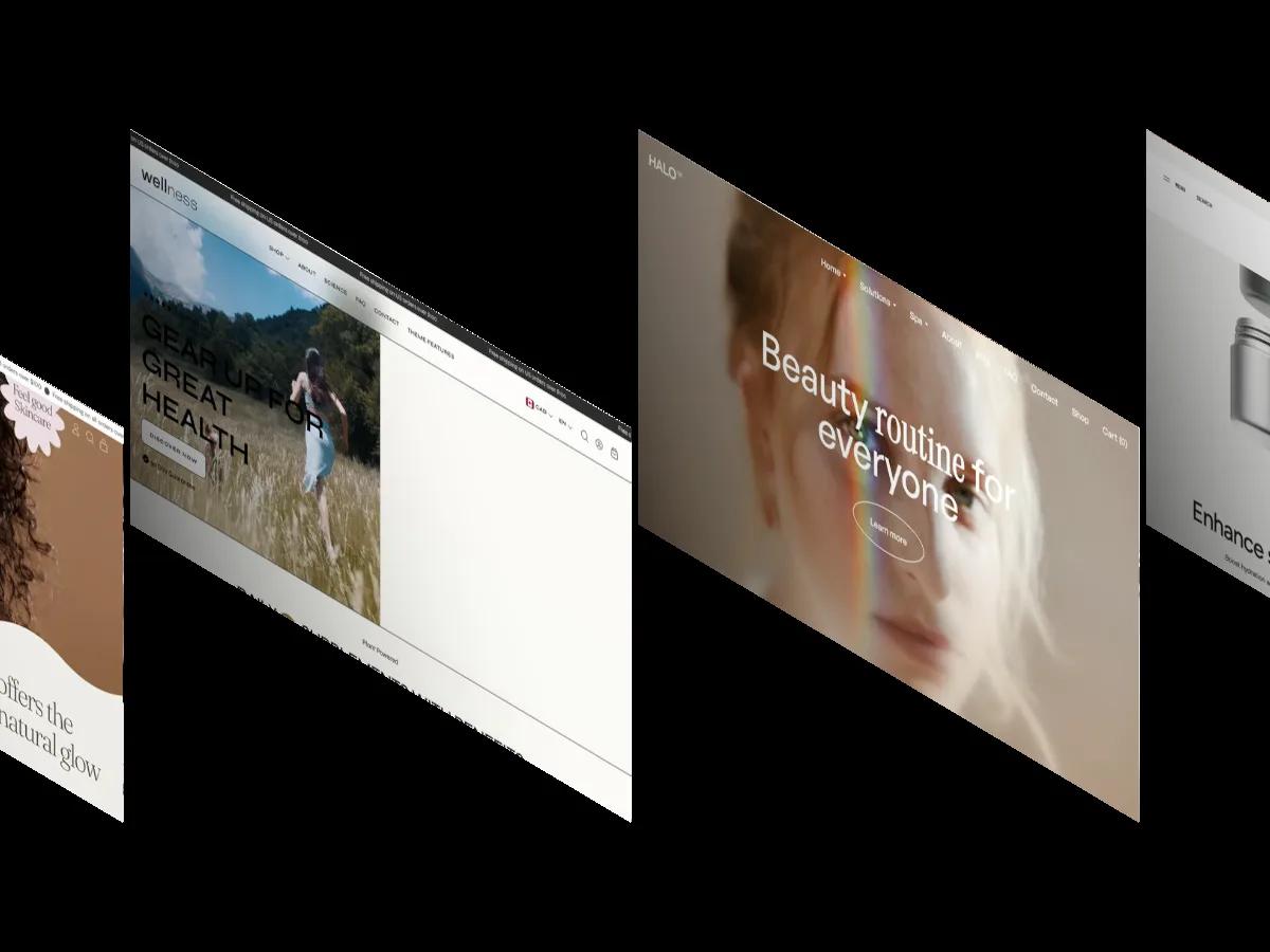
Halo is a high-quality Webflow template for Retail & E-commerce, Medical, Wellness & Health, Beauty & Personal Care by Template Supply.
Our Review of Halo
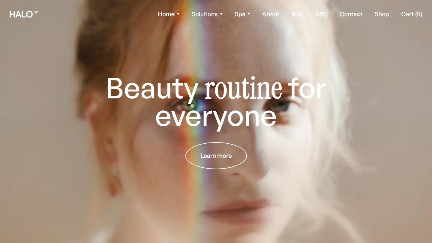
Halo is a soft, editorial store for skincare brands, spas, and beauty studios, and its hero is one close-up face. A freckled woman looks straight at you with a thin rainbow of light falling across her cheek, and "Beauty routine for everyone" sits over her in white. The type is the nice detail here: General Sans for most words, with "routine" swapped into a narrow, old-style serif, a pairing the whole site repeats. An oval outlined Learn more button finishes the hero, and the top bar holds a small HALO wordmark, Home, Solutions, and Spa dropdowns, Shop, and a Cart counter.
Template Supply builds the homepage as a slow scroll of moods on a cream background. A blurred mission statement mixes the two typefaces line by line, then "We embrace" stays fixed while the second line cycles through elegance, self love, and you, each paired with a small portrait drifting past. A full-screen video moment reads We are HALO over a soft-focus shot of a woman with dabs of cream on her face. A dark brown Exclusive Membership panel sits beside a warm portrait, and the shop row shows cream jars on pink, sand, and pale blue backdrops, with product names set large and a See all Products oval below. The second home layout keeps the same headline on cream, with small photos of a spa facial and portraits scattered around the edges.
On a phone, the face crops tighter, the headline wraps to two centered lines, and the menu collapses behind a two-line icon.
We'd pick Halo for skincare lines, spas, and beauty salons with warm, close-up photography. It leans hard on portraits, so you'll need a consistent shoot to match, and we'd check that the scrolling "We embrace" moments still feel quick on a smaller product range.
Based on the live demo, viewed on desktop and on a phone. The Design and Dev scores come from separate independent reviews. See how we score templates.
Independently evaluated by our team of 6 designers and 5 developers.











Designers score design, developers score development, and each score is the average of their independent ratings. Read about our review team and how we score templates.