Choice Extend is a high-quality Webflow template for Retail & E-commerce, Fashion & Accessories by NutsDev.
Our Review of Choice Extend
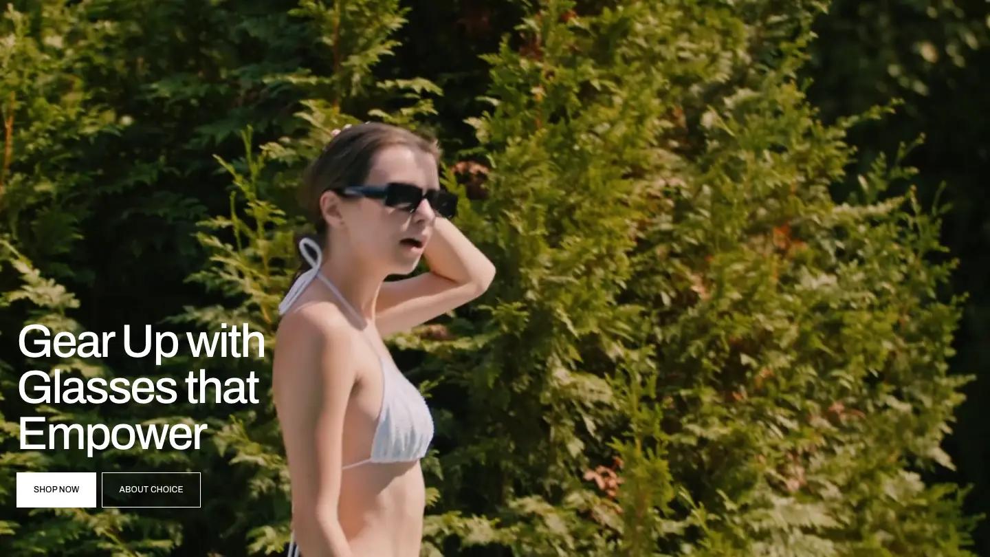
Choice Extend is an eyewear store with a fashion-magazine streak. The hero is a background video of a woman in dark cat-eye sunglasses against a wall of green hedges, and "Gear Up with Glasses that Empower" sits over it in large white Archivo, the only typeface on the site. Two square-cornered buttons follow, a solid white Shop Now and an outlined About Choice. The header is plain black on white: a bold Choice wordmark, Shop, About, Blog, and Contact in small capitals, and a bag icon with a count in brackets.
NutsDev keeps the product presentation clinical and the lifestyle imagery warm. New Arrivals shows frames on light grey tiles with code-style names like Stellar-4, prices underneath, and sale prices in red beside a struck-through original. A full-width photo banner reading Discover Every Chic Frame breaks up the grid, then Chic Bargains brings bigger cards with small Sale and Bestseller labels. Further down, the page turns into a four-square checkerboard of portraits and product panels, including a Handpicked selection of exclusive glasses block with its own Shop Exclusive button, before a blog row of square photos. The Shop All page opens with a big heading, a row of sort links for alphabetical and newest first, and the same grey product tiles.
On a phone, the video still fills the screen, the headline wraps neatly over the hedge, and both buttons stretch full width. The menu tucks behind a hamburger next to the bag.
We'd pick Choice Extend for optical shops and eyewear brands that shoot their frames on neutral backgrounds. Every product photo needs that same pale grey treatment or the grids will look patchy. The about copy in the checkerboard is filler marketing text, so plan to write your own.
Based on the live demo, viewed on desktop and on a phone. The Design and Dev scores come from separate independent reviews. See how we score templates.
Independently evaluated by our team of 6 designers and 5 developers.











Designers score design, developers score development, and each score is the average of their independent ratings. Read about our review team and how we score templates.