Amber is a high-quality Webflow template for Food & Drink, Technology & Software, Art & Design, Business & Startup by Jacob Nielsen.
Our Review of Amber
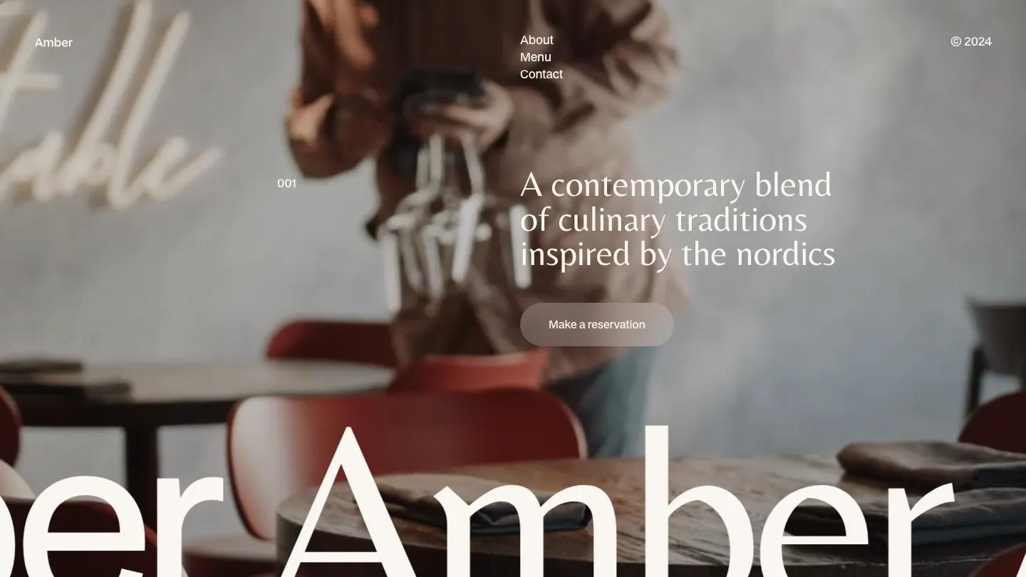
Amber is a restaurant site with a quiet Scandinavian mood, built for a single dining room that wants to feel calm and considered. The hero runs a soft, slightly blurred photo of a server carrying wine glasses past red wooden chairs, and the name Amber scrolls along the bottom edge in giant cream letters set in BDO Grotesk. Over the photo, a light serif says "A contemporary blend of culinary traditions inspired by the nordics", with a frosted Make a reservation pill underneath. Navigation is minimal: the name on the left, About, Menu and Contact stacked in the middle, and a copyright year on the right.
Jacob Nielsen pairs that grotesk with the serif throughout, on a warm cream background. An intro sets one long serif paragraph beside a tiny label, then photo bands with captions like "Inspired by tradition, crafted with precision" overlap smaller inset images, a nice layered effect. A two-column block invites guests to discover the flavors, with a taupe See our values button. Our Menu arrives in huge black grotesk letters, followed by Starters, Main Courses and Desserts tabs, with each dish listed by name and price over a short ingredient line in grey. Values closes the page as ruled rows for sustainability, craftsmanship and experience. The Styleguide page keeps the cream palette and shows the charcoal and taupe swatches.
On a phone, the hero holds up well, with the serif line, reservation button and scrolling name all fitting, and the stacked menu links stay visible in the corner.
We'd pick Amber for wine bars, bistros and tasting-menu restaurants with good interior photography. The reservation button needs a real booking link, and a couple of demo headings have run-together words worth fixing. The big serif paragraphs also need short, careful copy.
Based on the live demo, viewed on desktop and on a phone. The Design and Dev scores come from separate independent reviews. See how we score templates.
Independently evaluated by our team of 6 designers and 5 developers.











Designers score design, developers score development, and each score is the average of their independent ratings. Read about our review team and how we score templates.