Motion is a high-quality Shopify template for Retail & E-commerce, Fashion & Accessories, Sports & Fitness, Blog & Editorial by Archetype Themes.
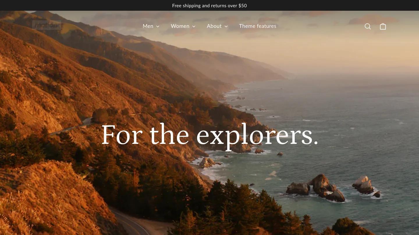
Our Review of Motion
Motion is Archetype Themes' theme for brands that want movement on the page, and its Apparel demo outfits an outdoor clothing label. The hero is a full-bleed slideshow; one slide shows caps, a beanie, folded fleece, and an enamel mug laid out by an orange tent, with "New season, new terrain" in white Instrument Sans and a spaced-out subtitle. A bright orange shipping bar sits above a light header with a bold wordmark and New In, Explore, Discover, and Theme Features dropdowns.
Built for What's Next opens the homepage with a product carousel of quarter-zips, hiking pants, and crew socks, each on a soft gray backdrop, with a round blue arrow and a solid blue View All button. Wear and Carry blocks lead to an Into the Wild video band, then a buy-one-get-one promotion with a countdown. The Hike Collection section is a nice touch: overlapping photos of backpacks and red trail socks are scattered like a collage beside two blue buttons. The Long Way Round places a white text card over a hiker in a patchwork jacket, followed by customer reviews and a row of blue line icons for materials, movement, and returns. The product page uses uppercase headings, color and size boxes, shipping and stock notes, an outlined Add to Cart button, and a blue Buy It Now.
On a phone, the slideshow fills the top with a hiker's poles and jacket, and the product carousel shows one card with the next peeking in.
We'd pick Motion for outdoor, activewear, and travel brands with plenty of lifestyle photography and video. The design depends on that imagery, so a catalog of plain packshots will feel flat. Check that the electric blue buttons suit your palette too, since they appear throughout.
Based on the live demo, viewed on desktop and on a phone. The Design and Dev scores come from separate independent reviews. See how we score templates.
Independently evaluated by our team of 6 designers and 5 developers.











Designers score design, developers score development, and each score is the average of their independent ratings. Read about our review team and how we score templates.
More Like This
AI and Writing Statistics 2026: What the Research Actually Says
Framer vs Webflow: What 725 Scored Templates Tell Us About Each Platform
13 Best Photography Website Templates for Webflow and Framer (2026)
10 Best Restaurant Website Templates for Webflow (2026)
13 Best Portfolio Website Templates for Webflow and Framer (2026)
12 Best Interior Design Website Templates for Webflow, Framer and Shopify (2026)