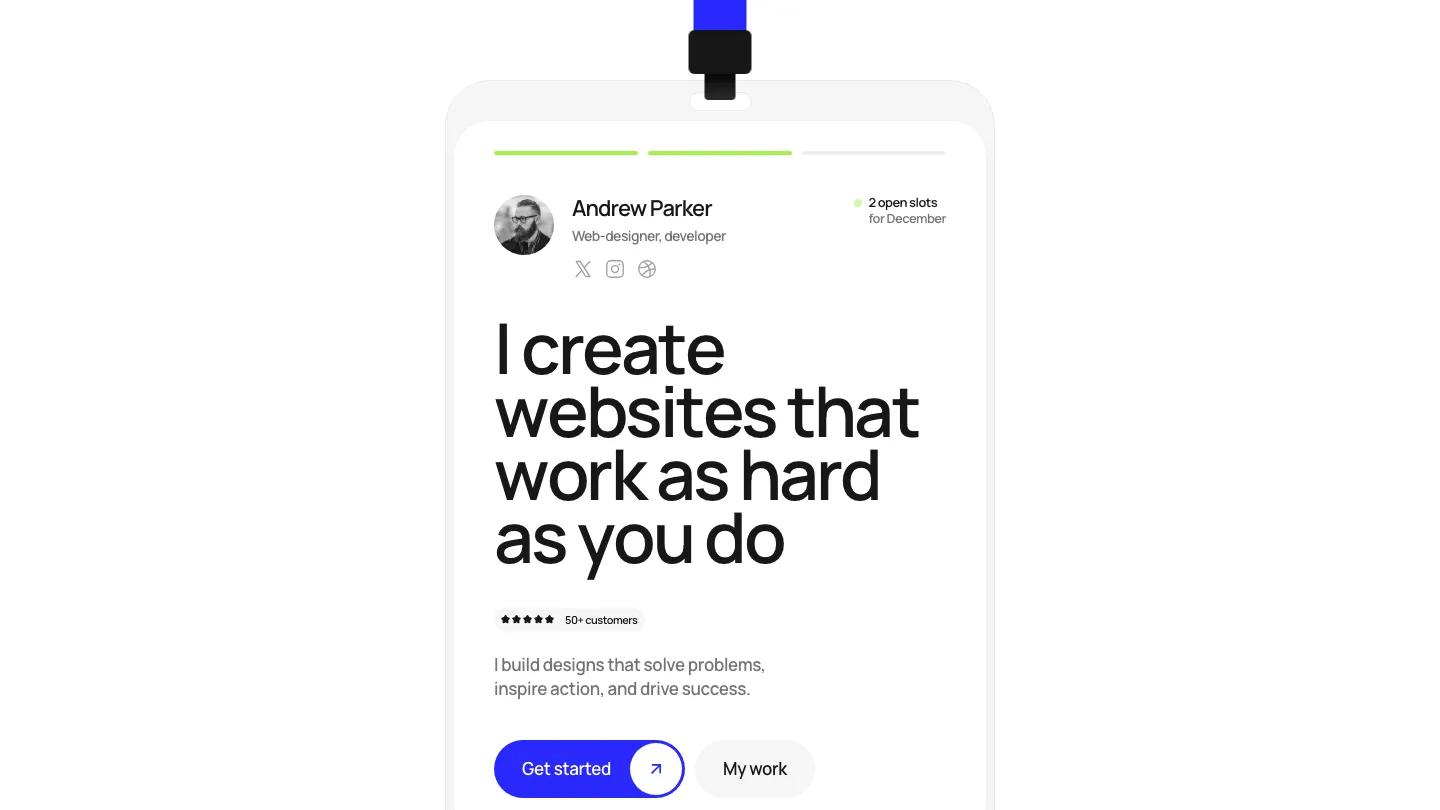
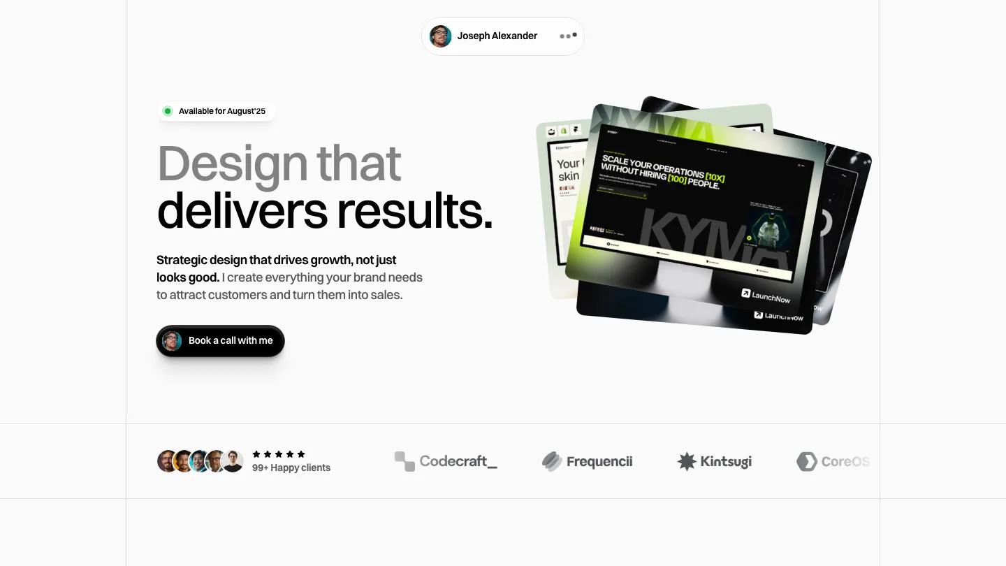
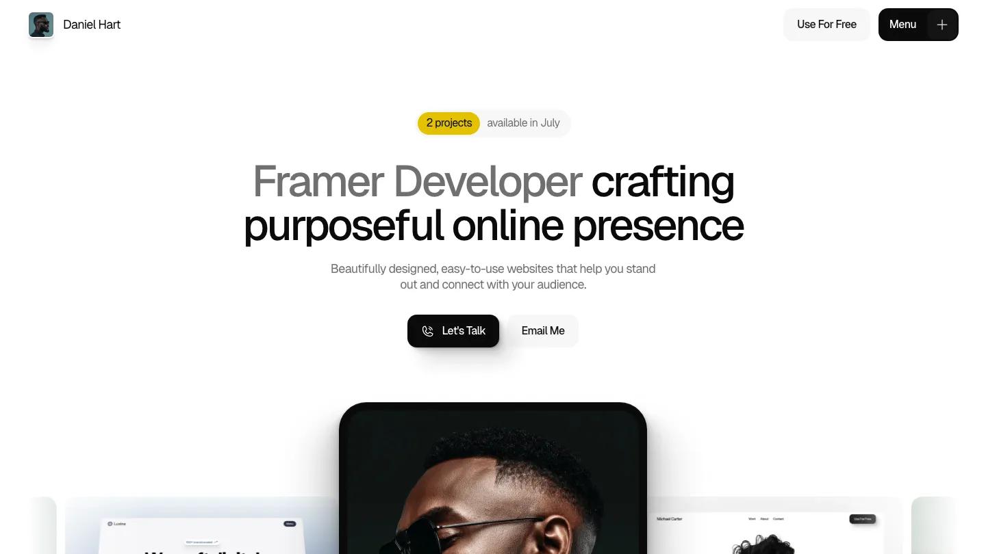
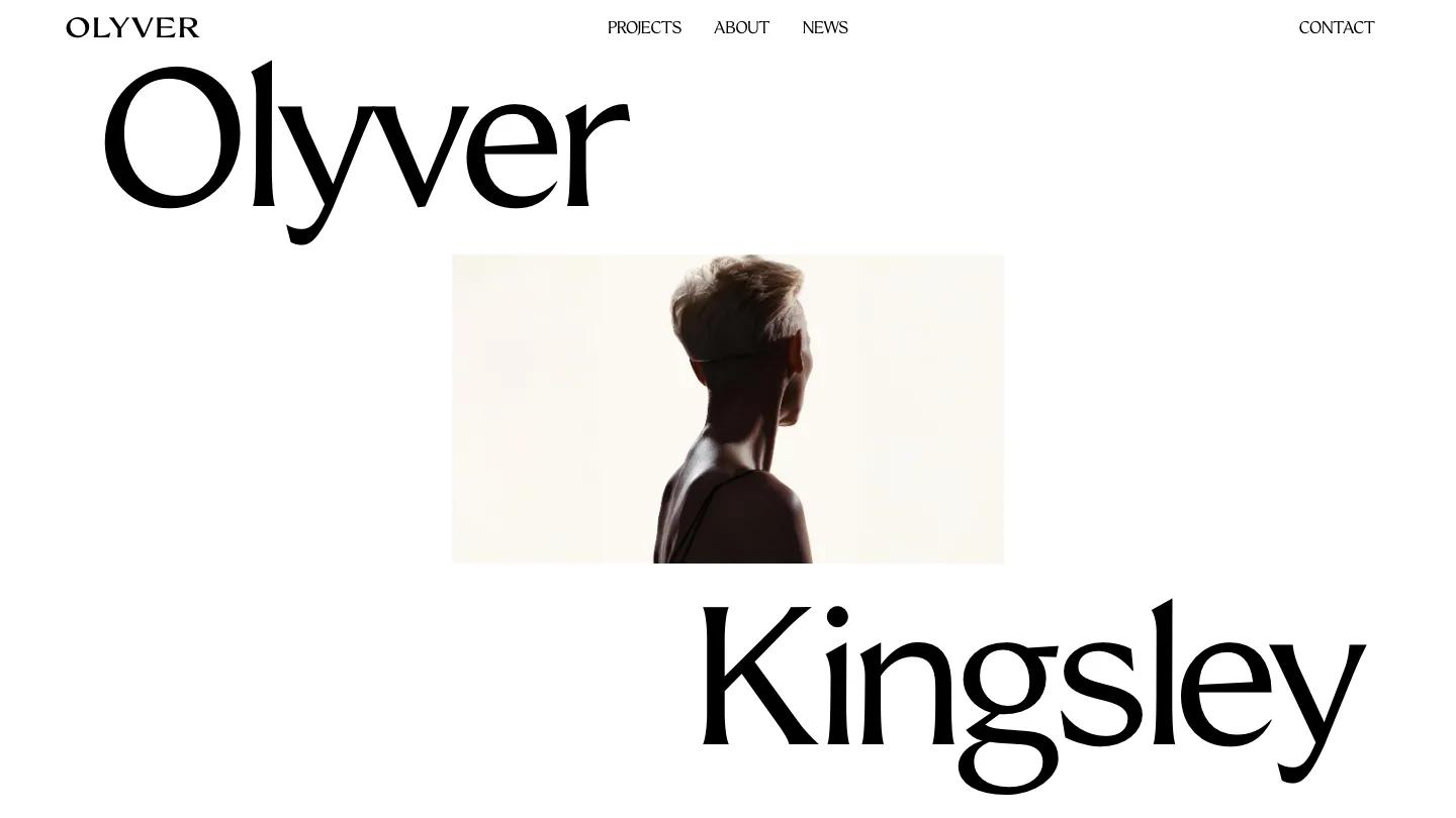
MatteoLucien is a high-quality Framer template for Personal, Portfolio & Agency, Art & Design, Photography & Videography, Professional Services, Business & Startup by Aidan Creates.
Our Review of MatteoLucien
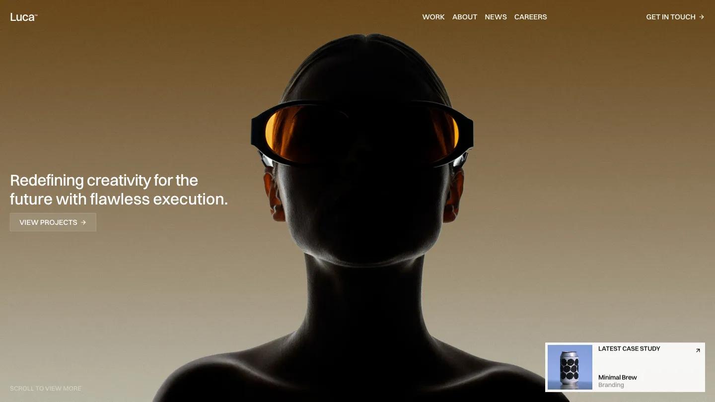
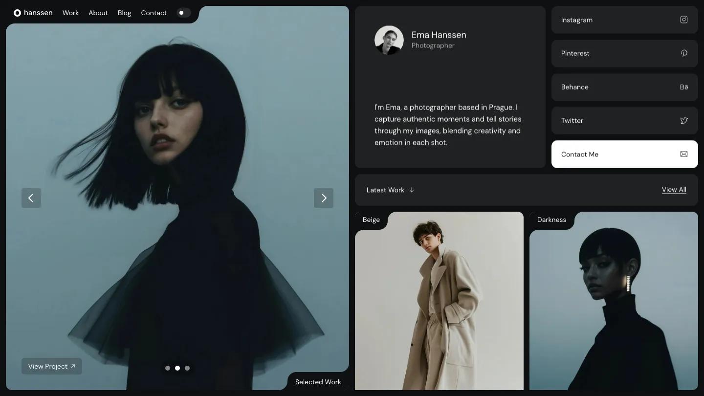
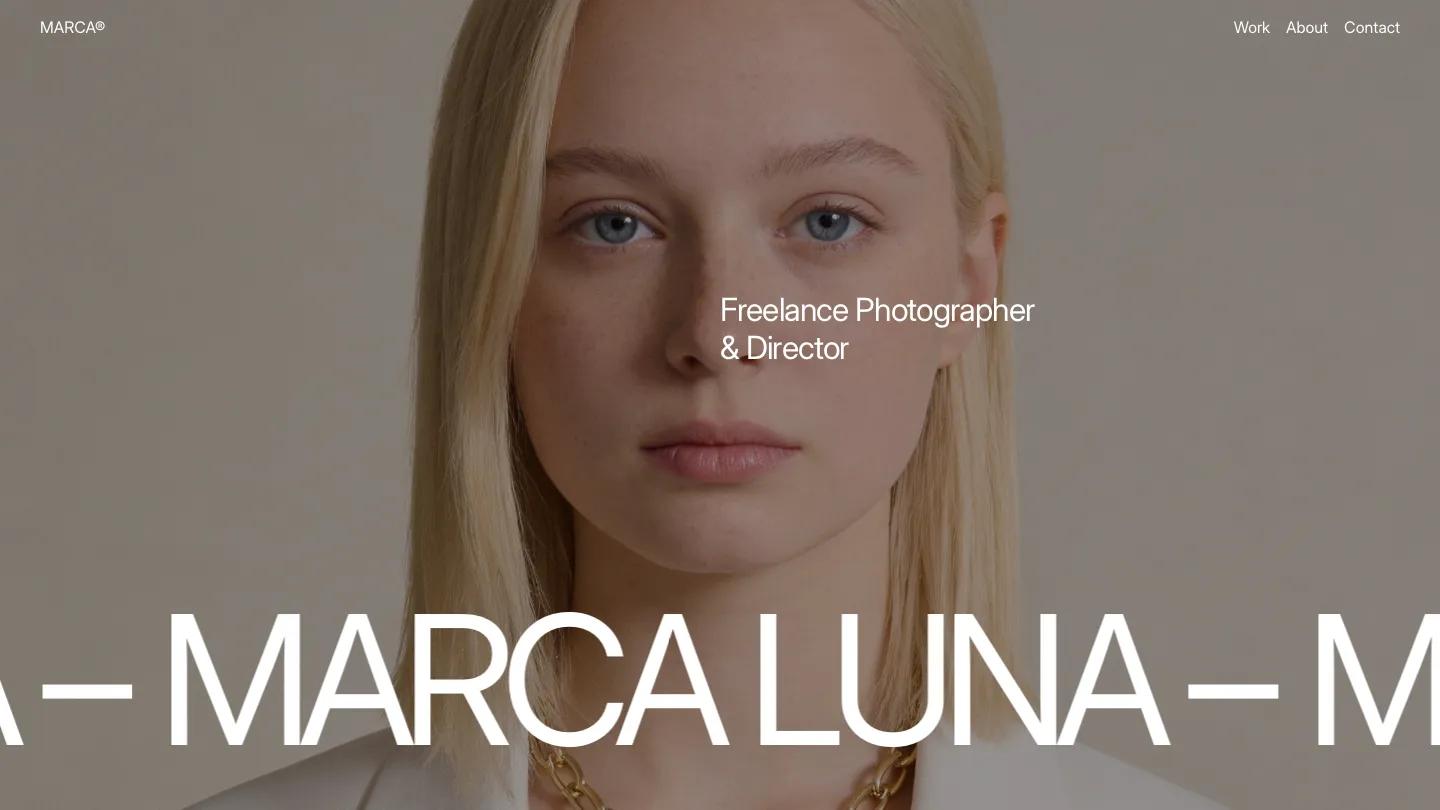
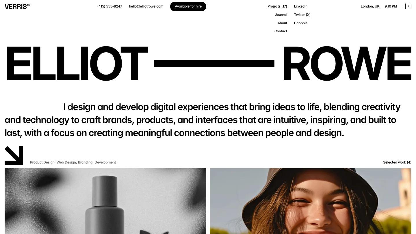
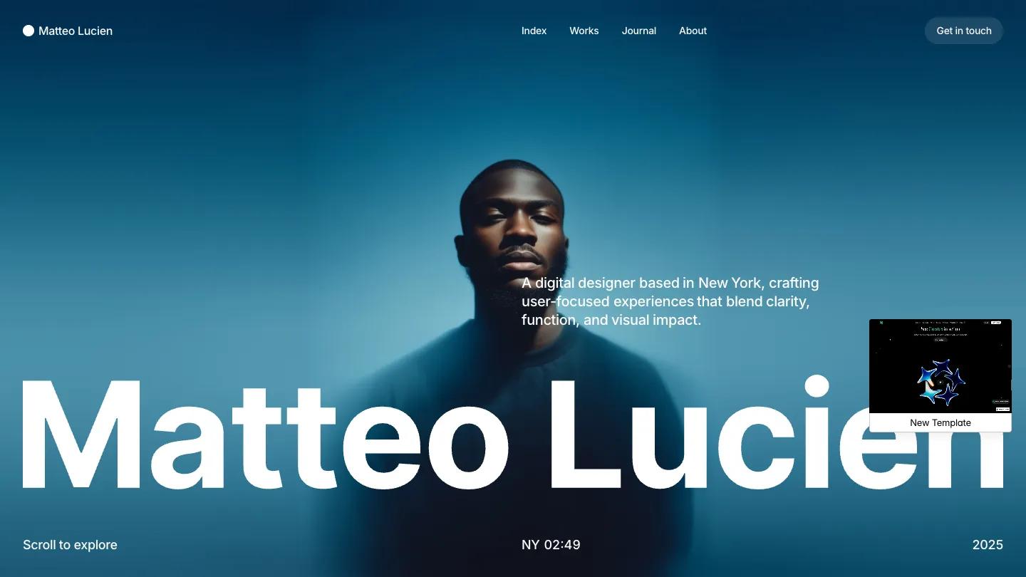
MatteoLucien is a Framer portfolio by Aidan Creates for a digital designer, and its hero is a full-bleed portrait washed in deep teal blue. The name runs across the bottom in heavy white Inter, large enough to touch both edges, with a short intro line above it on the right. Small details fill the corners: Scroll to Explore on the left, a live New York clock in the middle, and a Get in Touch pill in the header that turns bright lime once you scroll onto white.
From there the page switches to a white background. A Who We Are block pairs a small photo with two paragraphs about the studio, then the portfolio shows big two-column project images with the name on the left and the disciplines on the right. The photography is soft and film-like: hikers above a turquoise lake, a dancer against blue sky. A full-width white flower on navy carries "Let's make something awesome together" with a button, and a Journal row shows posts with dates and read times. The footer lists contact details, the time zone and social links. The works page adds a grid and list switch above the projects. We like the lime accent. It shows up only on the header button, so it's easy to find without fighting the photos.
On a 390px phone the portrait fills the screen, the intro sits above the name, which shrinks to one line, and the navigation folds into a two-line menu icon.
We'd suggest it for a designer or small studio with good, moody photography to show. A thing to watch: it's written for "we" and "I" at once, so the hero, about block and footer need a pass to settle on one voice.
Based on the live demo, viewed on desktop and on a phone. The Design and Dev scores come from separate independent reviews. See how we score templates.
Independently evaluated by our team of 6 designers and 5 developers.











Designers score design, developers score development, and each score is the average of their independent ratings. Read about our review team and how we score templates.