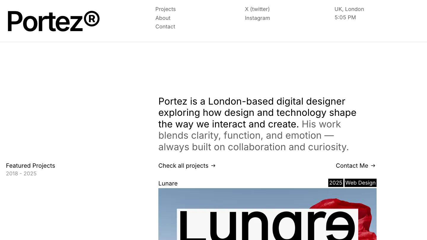
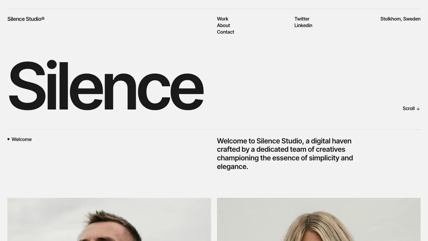
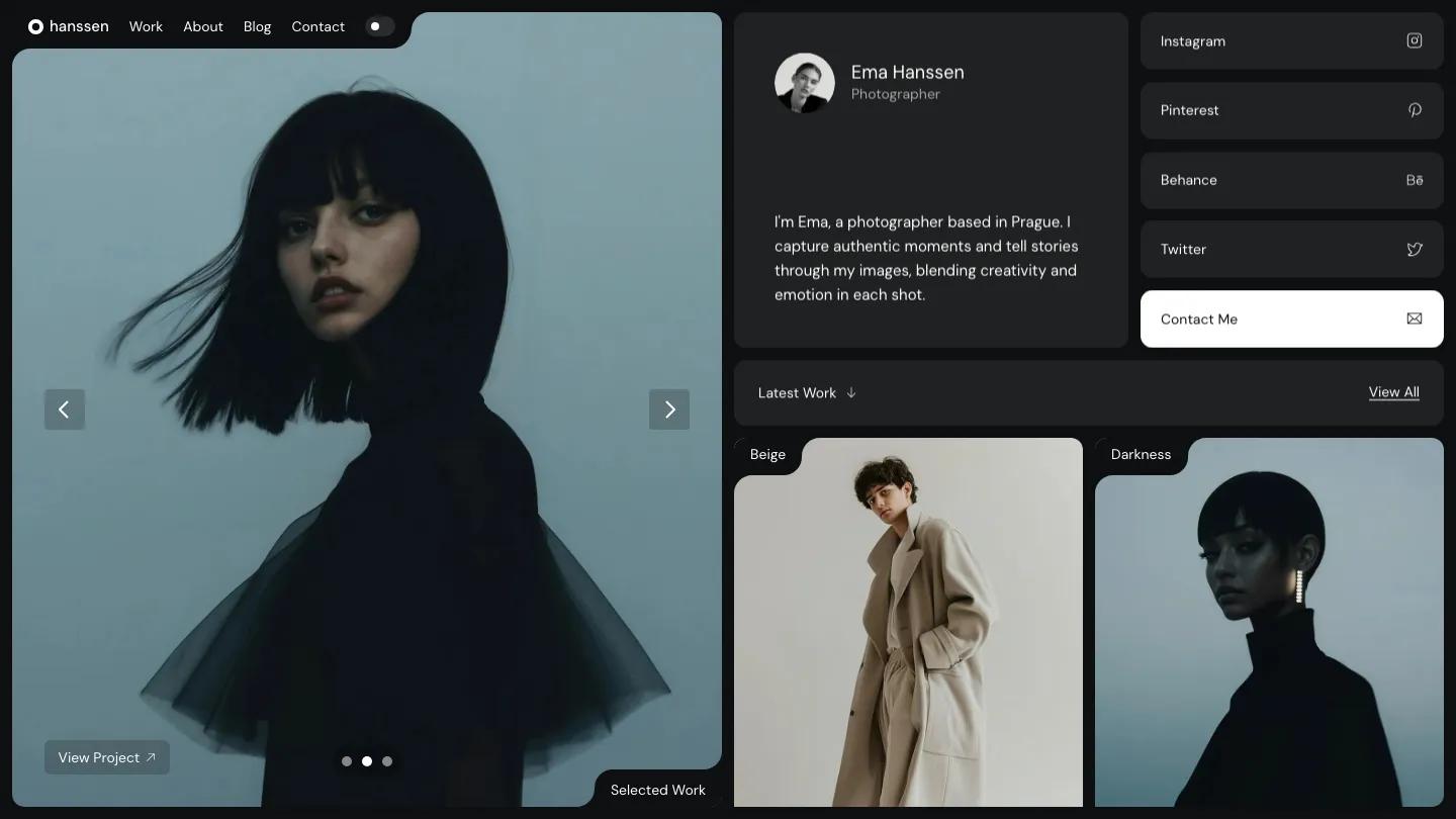
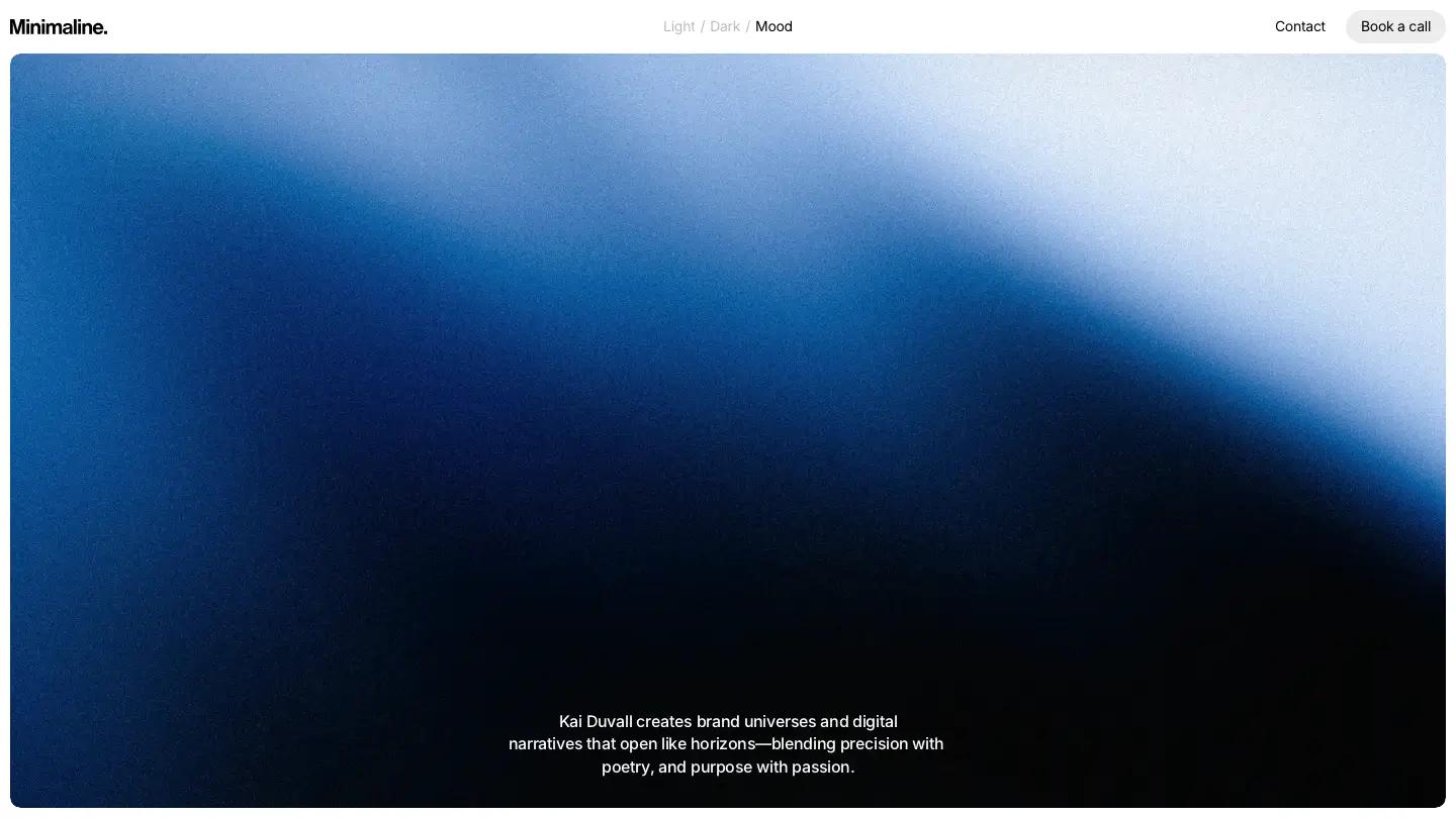
Pearl is a high-quality Framer template for Personal, Portfolio & Agency, Art & Design, Professional Services, Business & Startup by Dawid Pietrasiak.
Our Review of Pearl
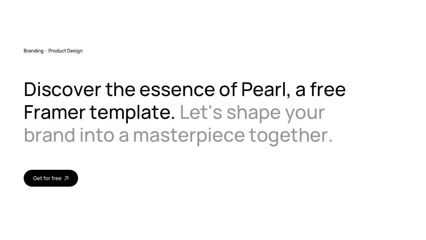
Pearl is a quiet, type-led portfolio for a product designer or a small branding studio, and it makes its case with almost nothing but words. The hero is one long sentence in Manrope at a large size, split in two tones: the first half in solid black, the second fading to a soft grey. A black pill button sits below it on an otherwise empty white page. The header is just as spare, with a lowercase pearl wordmark, Work, About, and Contact in the middle, and a black pill on the right.
Dawid Pietrasiak builds the rest of the homepage from a few repeated parts. Projects come first, in rounded pale grey tiles that frame app screens and logos, with the client name in small grey text and the project title underneath, like Healthcare Mobile App or Technical Infographic. A Designing Success statement with an Our Work button follows, then a Services accordion with thin dividers and down arrows for Branding, UX/UI Designs, Motion & Animation, and Mobile. An Our Story block leads into a wall of monochrome client logos, and the footer turns black for "Let's start creating together." The Work page repeats the Designing Success heading above the same rounded project tiles.
On a phone, the two-tone headline wraps into a tidy stack, the header collapses to the wordmark and a hamburger, and the project tiles go single column.
We'd pick Pearl for UI and brand designers who want their case studies to carry the page without decoration. The hero copy promotes the template itself, so rewrite it first, and the logo wall uses real company marks you'll need to swap for your own clients. There is very little color anywhere, so your project images have to supply it.
Based on the live demo, viewed on desktop and on a phone. The Design and Dev scores come from separate independent reviews. See how we score templates.
Independently evaluated by our team of 6 designers and 5 developers.











Designers score design, developers score development, and each score is the average of their independent ratings. Read about our review team and how we score templates.