FRESHLYBAKED is a high-quality Framer template for Portfolio & Agency, Fashion & Accessories, Retail & E-commerce, Blog & Editorial, Professional Services, Business & Startup, Art & Design by Dee SPNR.
Our Review of FRESHLYBAKED
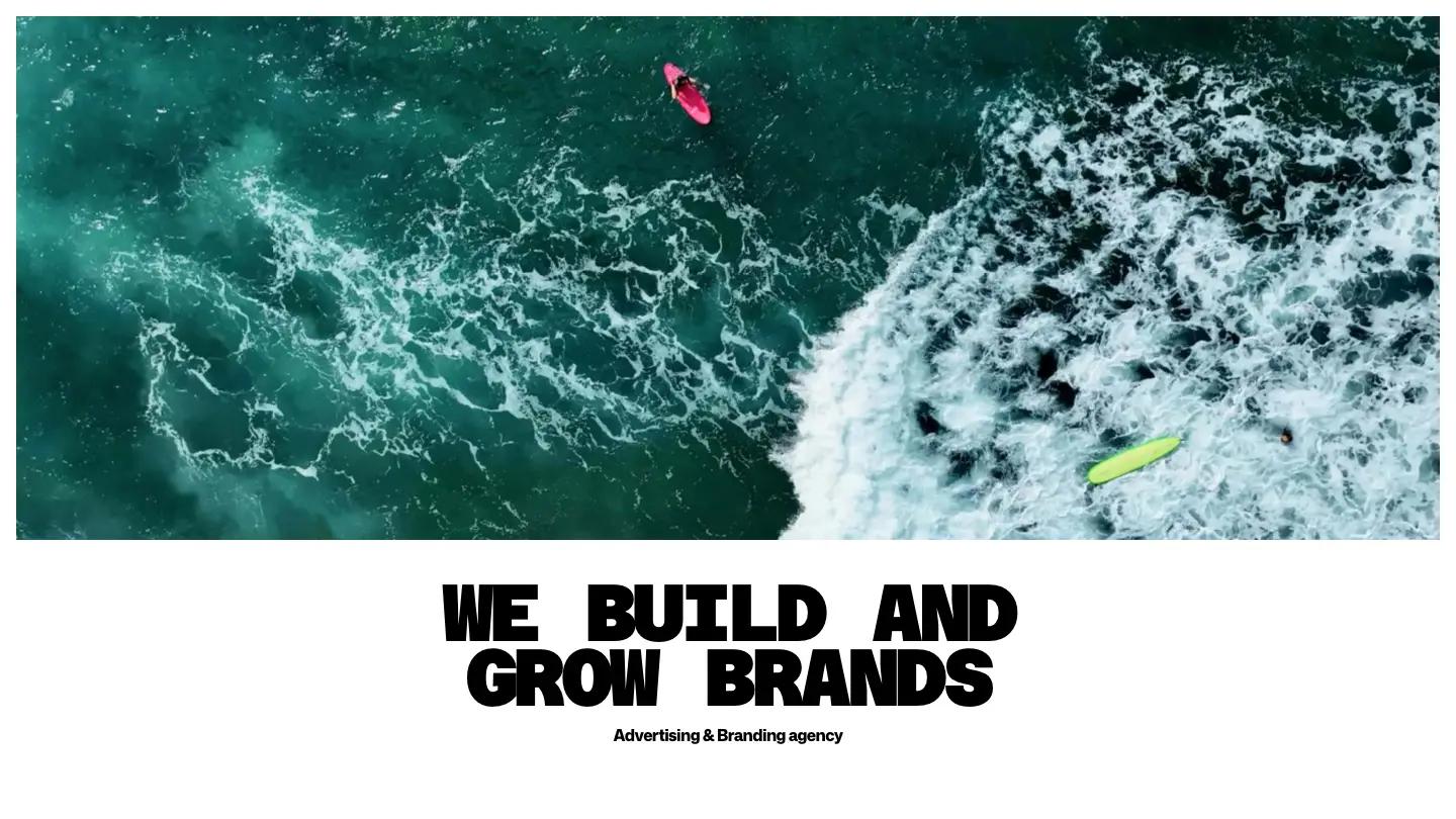
FRESHLYBAKED is a loud, poster-style site for an advertising and branding agency, and it puts motion first. The hero is a wide video panel that cuts between extreme close-ups, from a human eye to glistening carrots and a spread of crackers and spices. Underneath, "We build and grow brands" sits in heavy, wide Azeret Mono capitals with "Advertising & Branding agency" in small type below. There is no top header. Instead, a slim bar floats at the bottom of the screen with the wordmark on a neon yellow-green tab and a Menu button.
Dee SPNR keeps the structure simple and leaves the drama to type and imagery. We Do is a scrolling word wheel: service names like Product Design, Art Direction, and Copywriting rotate past, the active one in black and the rest fading to grey. The work follows as a two-column grid of large, uncaptioned images, such as a neck tattoo beside ceramic plates. Recent Notes lines up journal cards with grey Article or News labels beside a black See All pill, and the page ends on a huge closing call to action. A project page opens with the client name in giant black letters, a one-line pitch, a Live Website pill, a details row with discipline and year, then full-width photography.
On a phone, the hero video and floating wordmark bar carry over, but a promo card for the creator's other templates covers most of the first screen until it is closed.
We'd pick FRESHLYBAKED for creative agencies with a strong reel of campaign imagery. The homepage is long, with lots of white space between big moments, so thin content will feel sparse. We'd also fix a misspelled word in the We Do list and replace the placeholder project years.
Based on the live demo, viewed on desktop and on a phone. The Design and Dev scores come from separate independent reviews. See how we score templates.
Independently evaluated by our team of 6 designers and 5 developers.











Designers score design, developers score development, and each score is the average of their independent ratings. Read about our review team and how we score templates.