TD_Moro is a high-quality Framer template for Portfolio & Agency, Professional Services, Business & Startup by Tom D.
Our Review of TD_Moro
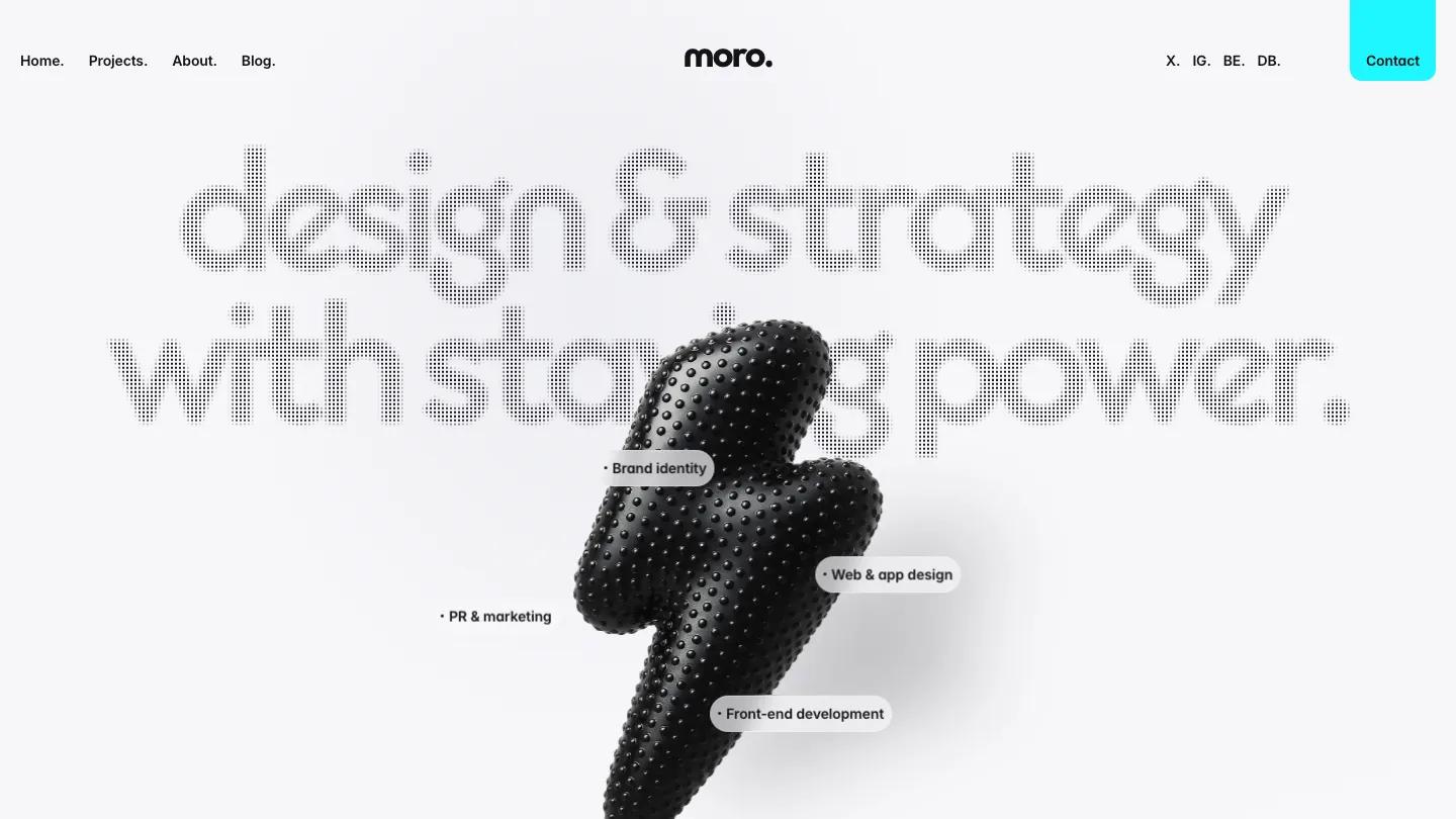
TD_Moro is a studio site for a brand and digital design agency, and it has one memorable trick: headings drawn in a fine halftone dot pattern. The hero reads "design & strategy with staying power." in big rounded Outfit lettering made of those dots,. Below it floats a glossy black 3D lightning bolt, with service pills such as Brand Identity and Front-end Development hovering around it. The header keeps Home, Projects, About, and Blog on the left, the lowercase moro. wordmark in the center, social links, and a bright cyan Contact tab hanging from the top right corner.
Tom D. packs a lot into a long homepage. Stat counters and a logo grid lead into Our Projects, a bento of white cards where each project gets a name, rounded tag pills like Visual Identity or Packaging, and a large image, broken up by a dark Join the Grid card with a Book a Call button. A dark process section draws Discovery to Launch as a Gantt-style timeline with a cyan marker line, a smart way to show how work runs. Testimonials, a founder story, a team grid, and stacked pricing cards for a retainer or a one-off project follow, then blog cards and a dark closing panel. The projects page reuses the dotted heading over the same tagged bento cards.
On a phone, the dotted headline wraps over four lines, the bolt and its pills stay intact, and the header reduces to the wordmark, the cyan Contact button, and a menu icon.
We'd pick TD_Moro for branding studios and small product teams who want to show process and pricing alongside the work. The page is very long, so trim sections you don't need. Check the dotted headings on your screens, since that light texture can look faint when small.
Based on the live demo, viewed on desktop and on a phone. The Design and Dev scores come from separate independent reviews. See how we score templates.
Independently evaluated by our team of 6 designers and 5 developers.











Designers score design, developers score development, and each score is the average of their independent ratings. Read about our review team and how we score templates.