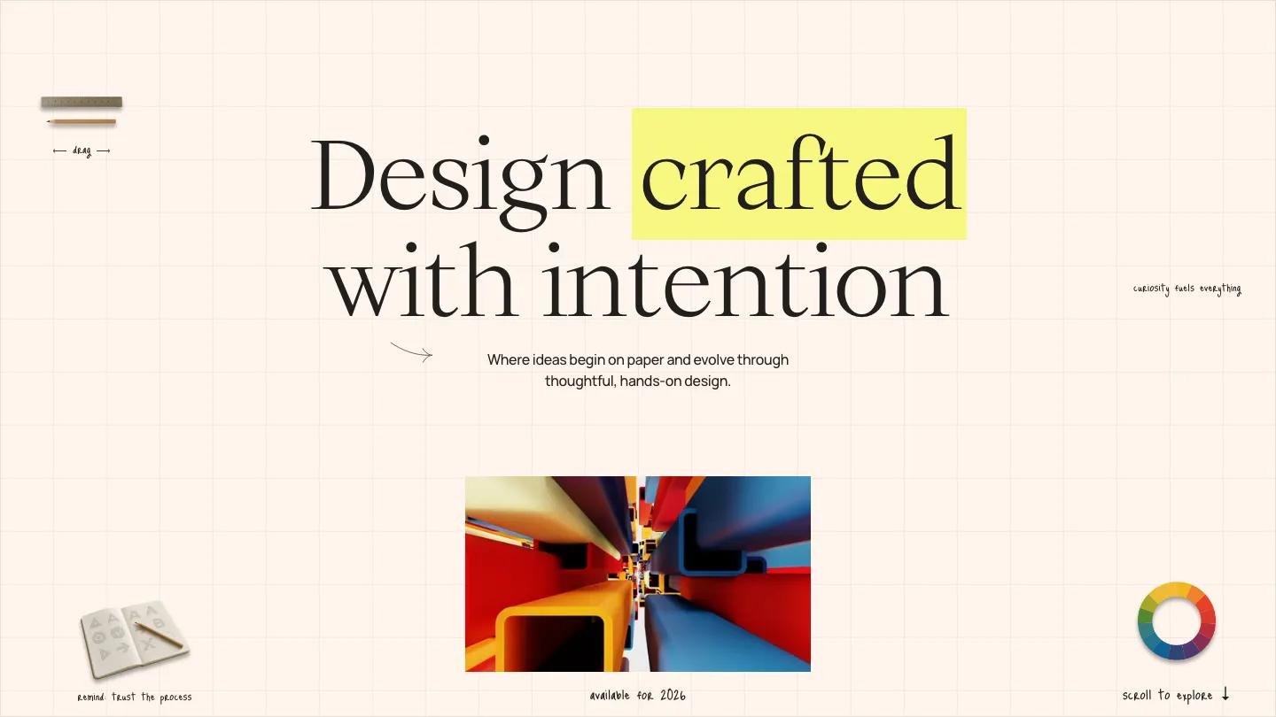
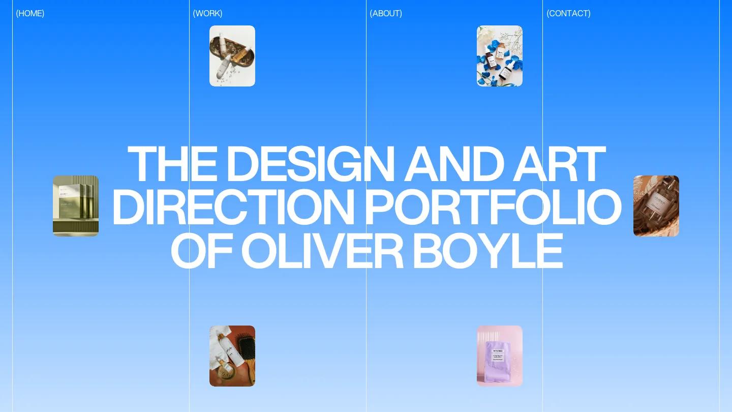
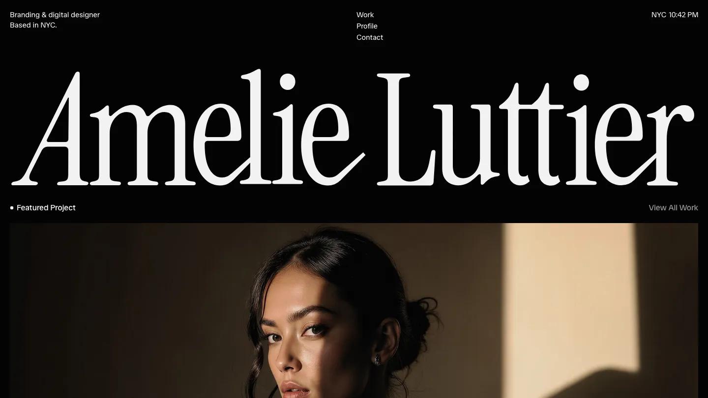
FFMinimal is a high-quality Framer template for Portfolio & Agency, Art & Design, Personal, Photography & Videography, Professional Services, Business & Startup by Favorit × Frame.

Our Review of FFMinimal
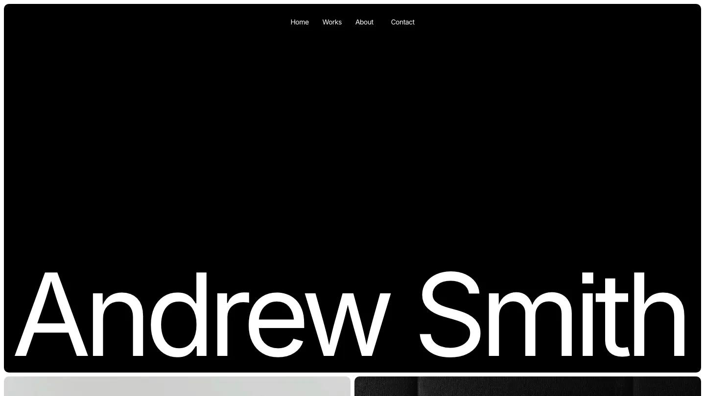
FFMinimal does exactly what the name promises. Favorit × Frame built this Framer template for a photographer or art director, and the whole homepage is a name, a photo grid, a list and a closing line. The name is set huge in Inter Tight, black on white, stretching most of the way across the screen, with Works, About and Let's Talk links spread evenly along the top.
Below it sits a two-column grid of large photos with softly rounded corners: a jeep on a dune at dusk, white sneakers against a grey sky, black and white surf, pink mountain peaks, a figure in a red-lit room. As you scroll, the background fades from white to black, which makes the darker images glow. A Publications table follows, with the outlet, the type of work and the year in three neat columns. Then "Let's make" appears, a white circle grows to fill the screen and "Magic" lands in the middle in giant black type, a fun closing beat. The Works page drops images entirely and lists client names in enormous type, one per line. We like that scroll-driven color change. It's one simple effect, but it gives a very sparse page a sense of moving through something.
On a 390px phone the name still runs almost edge to edge, the top links squeeze into one row, and the photos stack in a single column.
We'd pick FFMinimal for an editorial or commercial photographer with a strong, consistent body of work. Before you buy, plan your own credits: the publications table is filled with big-name magazines and campaigns as sample content, and the layout looks thin if you only have a few real entries to put there.
Based on the live demo, viewed on desktop and on a phone. The Design and Dev scores come from separate independent reviews. See how we score templates.
Independently evaluated by our team of 6 designers and 5 developers.











Designers score design, developers score development, and each score is the average of their independent ratings. Read about our review team and how we score templates.