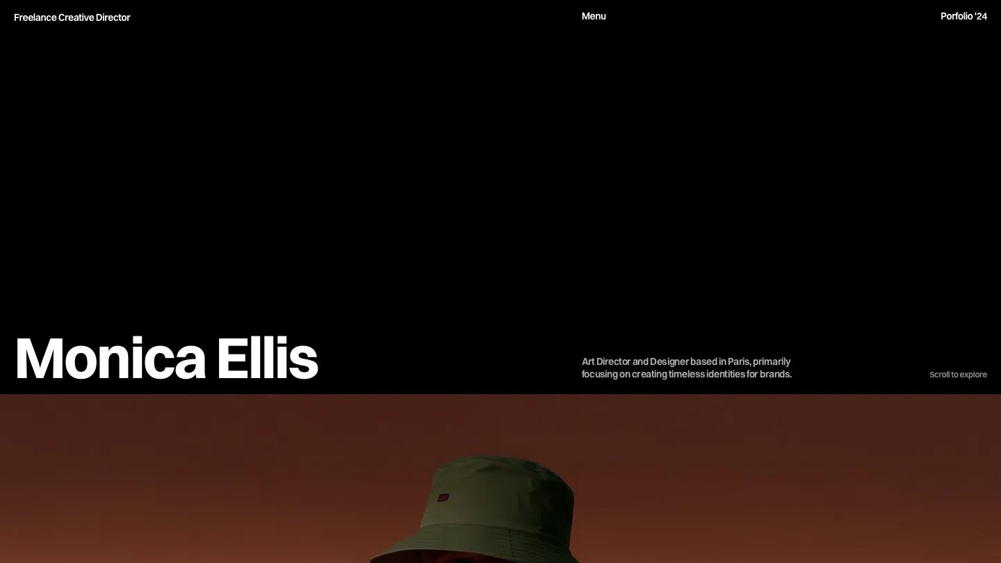
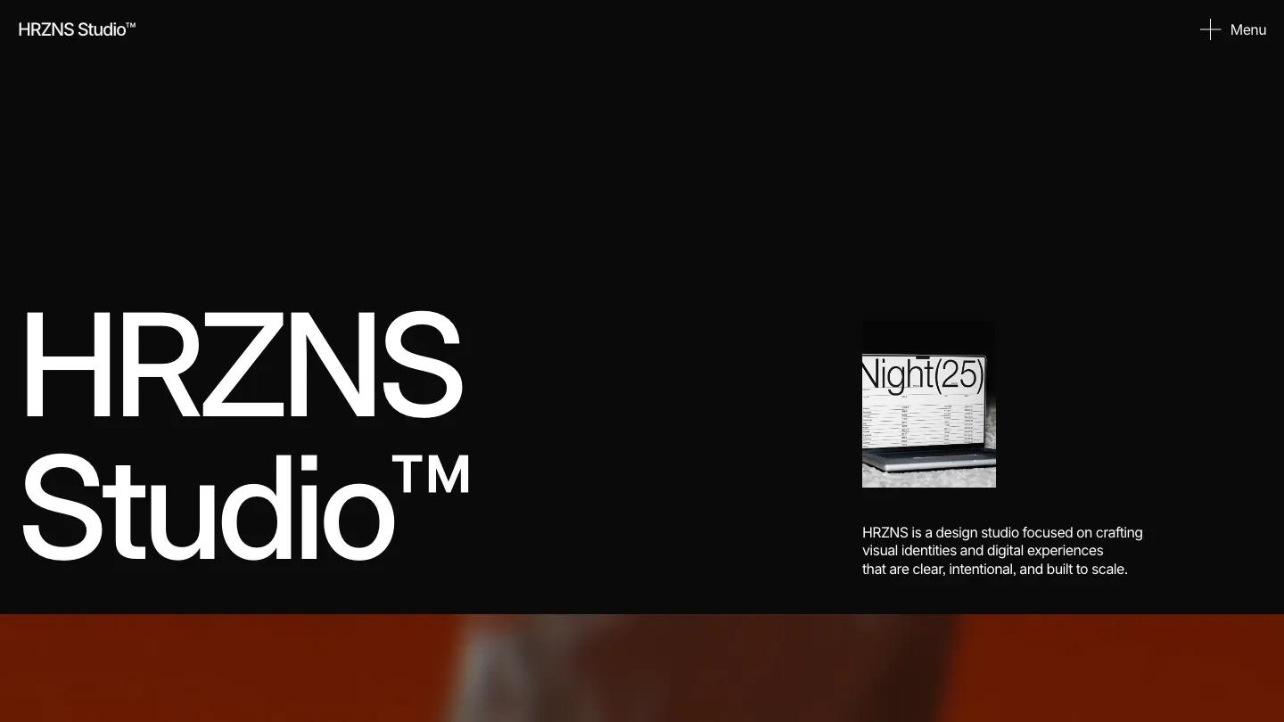
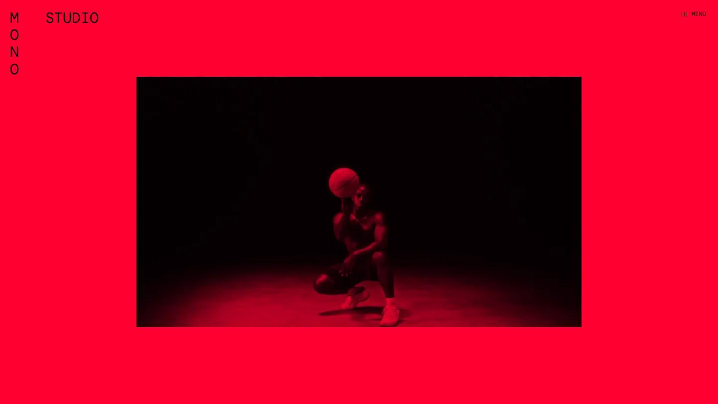
amelie is a high-quality Framer template for Portfolio & Agency, Art & Design, Personal, Photography & Videography, Professional Services by Refactor Studio.
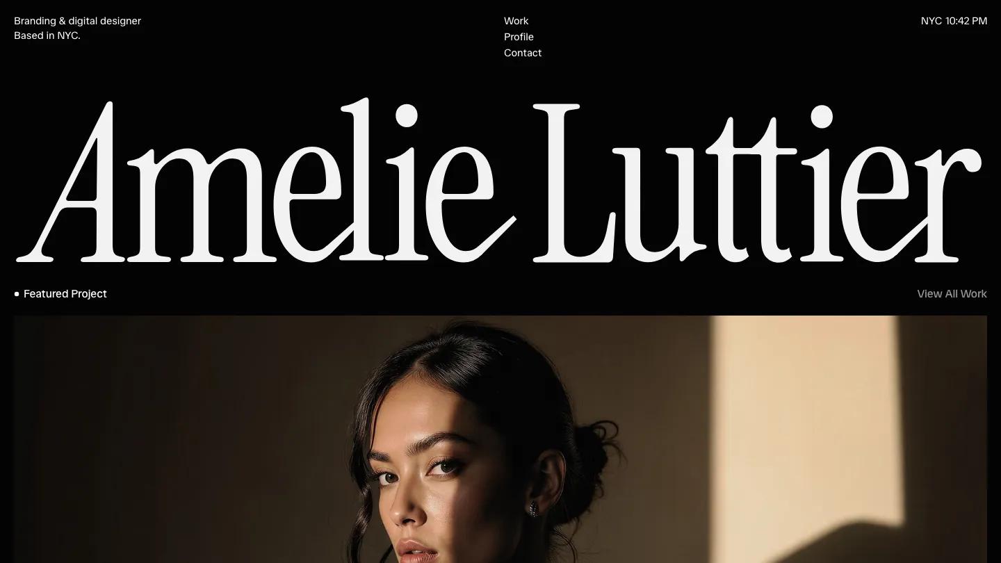
Our Review of amelie
Amelie is a portfolio for an independent brand designer, and it feels more like a printed monograph than a website. There is no big hero image. Instead, a short centered statement in Spectral, a soft bookish serif, explains who the designer works with, set in grey on a warm off-white page. The header is split in three: Home and Work on the left, the designer's name in wide-tracked capitals in the middle, and Profile and Contact on the right, all in spaced caps.
Refactor Studio lets the project grid do most of the work. Cases sit in two columns of large, square-edged images, and each one is a brand reveal: a wordmark over a dim restaurant interior, a white emblem on dark textured leather, a serif logo on solid black. Underneath, a spaced-cap project name sits on the left and a serif discipline label like Hospitality or Luxury Menswear on the right. The tiles vary in height, so the grid steps down the page. Further down, a longer bio paragraph pairs with a black and white portrait, What I Do lists disciplines as large serif rows with thin rules, and Awards and Recognition is a tidy three-column table of project, award, and year. A grey Let's Talk band closes it. The Projects page, Selected Work, moves the same cards into three columns.
On a phone, the statement stays centered and readable, the name moves to the left of a hamburger icon, and the projects stack one per row with their labels intact.
We'd pick Amelie for identity designers, art directors, and small branding studios with polished case imagery. The awards table only works if you have recognition to list, so be ready to remove it. The demo also uses a personal name and real award bodies, so replace both.
Based on the live demo, viewed on desktop and on a phone. The Design and Dev scores come from separate independent reviews. See how we score templates.
Independently evaluated by our team of 6 designers and 5 developers.











Designers score design, developers score development, and each score is the average of their independent ratings. Read about our review team and how we score templates.