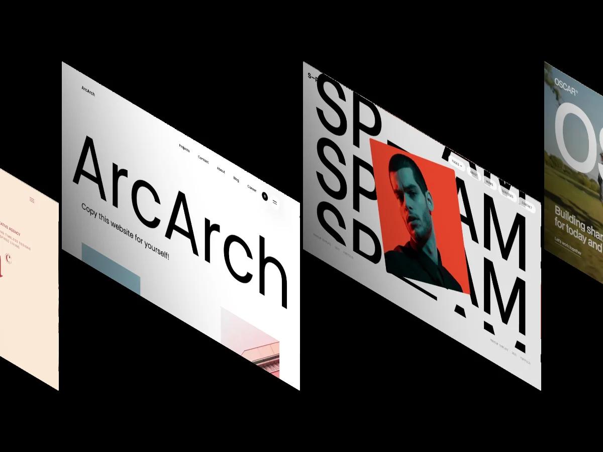
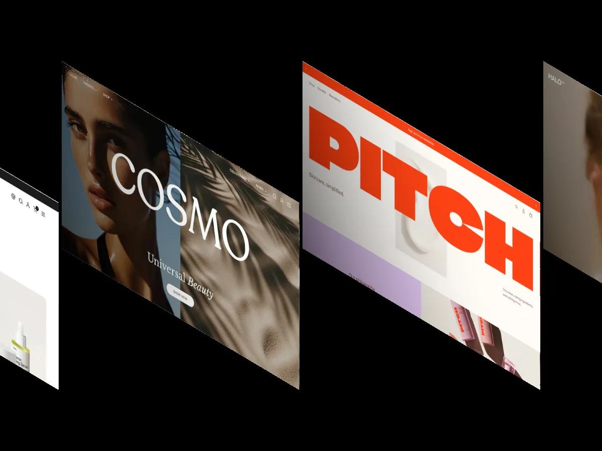
Zuno is a high-quality Webflow template for Technology & Software, Beauty & Personal Care, Wellness & Health, Business & Startup, Professional Services by JP.
Our Review of Zuno
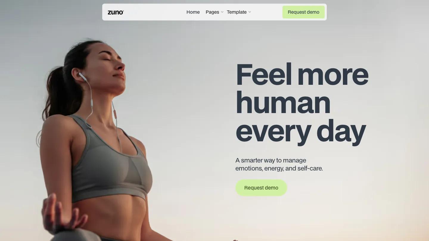
Zuno is built for wellness apps, health tech platforms, or personal care products that want a calm, confident presence. The hero pairs a large photograph of someone in athletic wear with oversized type in a dark blue-gray, set in a single geometric sans that handles both display and body copy. The palette stays quiet: soft greens for buttons, pale neutral backgrounds, and plenty of breathing room. The homepage is short, just three screens, and opens with a simple statement about managing emotions and self-care.
The template includes three homepage variations, three about pages, and three feature pages, plus login, signup, contact, and request demo layouts. Each homepage variation shifts the hero image and messaging but keeps the same structure. The feature pages show how to present app functionality or service details in a grid or single-column format. We like the consistency of the type system, which keeps the interface feeling cohesive even when content changes. The template includes background video support and a contact form. The CMS is tagged as a feature, but the homepage doesn't pull from a collection, so if you need a blog or case studies, you'll set those up on inner pages yourself.
On a phone, the hero text stacks cleanly above the call-to-action button, and the layout stays readable without cramming elements together. The green buttons remain prominent against the light background, and the type scales down without losing clarity.
We'd pick Zuno for a minimal product launch or a service site that doesn't need a lot of content variety. The demo uses professional product photography of athletic wear and wellness scenes, so you'll want images of similar quality that match your own brand. If you need a blog index, portfolio grid, or detailed pricing table, check that you're comfortable building those sections from scratch.
Based on the live demo, viewed on desktop and on a phone. The Design and Dev scores come from separate independent reviews. See how we score templates.
Independently evaluated by our team of 6 designers and 5 developers.











Designers score design, developers score development, and each score is the average of their independent ratings. Read about our review team and how we score templates.